with
Putting ourselves in the traveller’s shoes
Thousands of Vueling users spend every day in the airports all over Europe. And Vueling, in its constant quest to improve the user’s experience, set us the project of redefining the whole process and user experience, from the moment you purchase the ticket to when you board the plane.

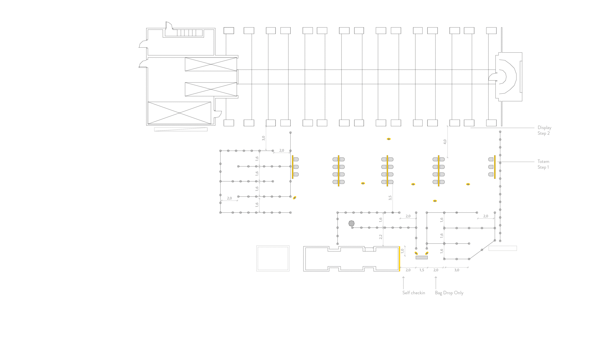
The commitment to excellence
Vueling wants to be the best airline in service in the coming years, starting with Barcelona airport. This is why it is important to know how to correctly manage what information the user needs and above all when they need it, taking into account the plurality of the Vueling users.

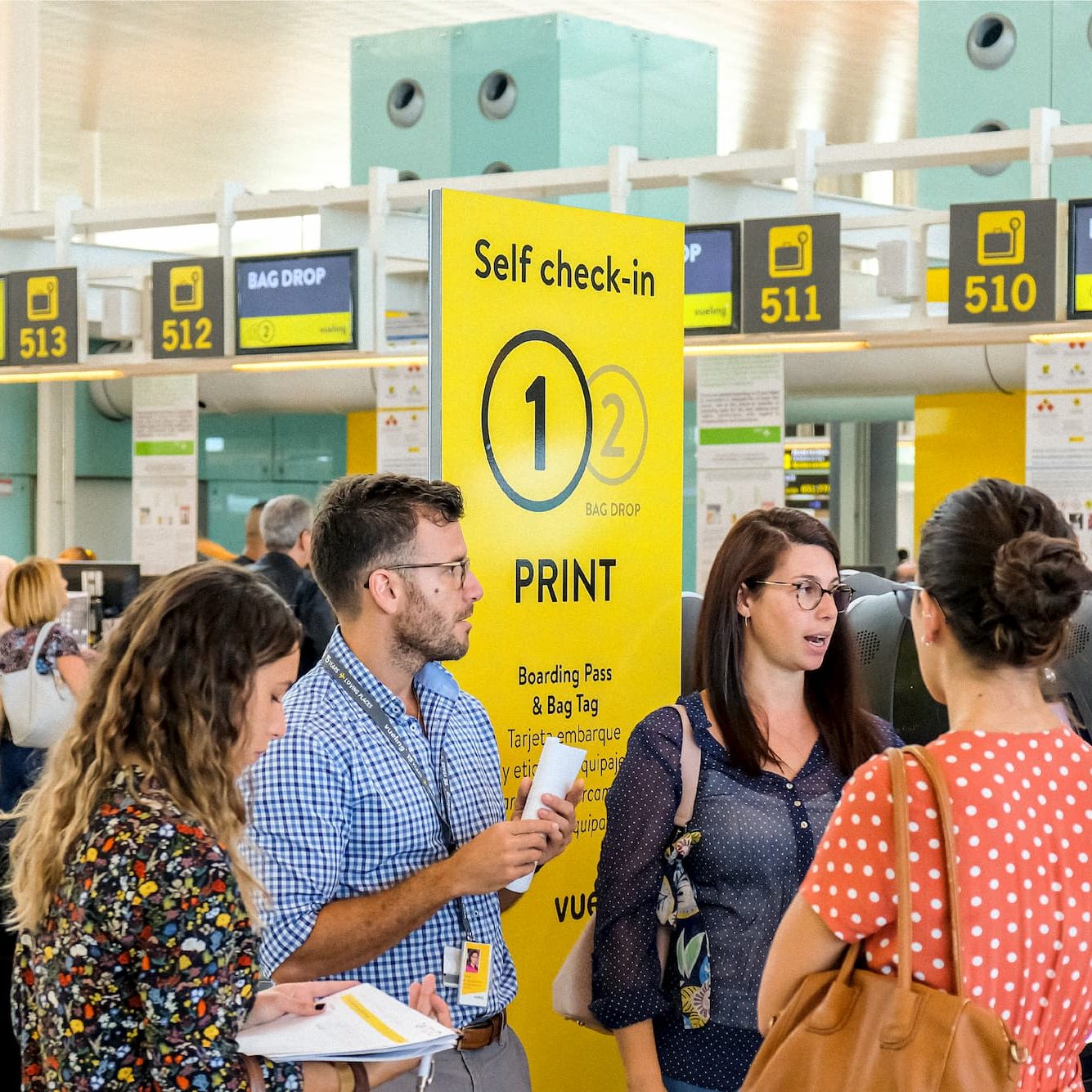
Customer Journey
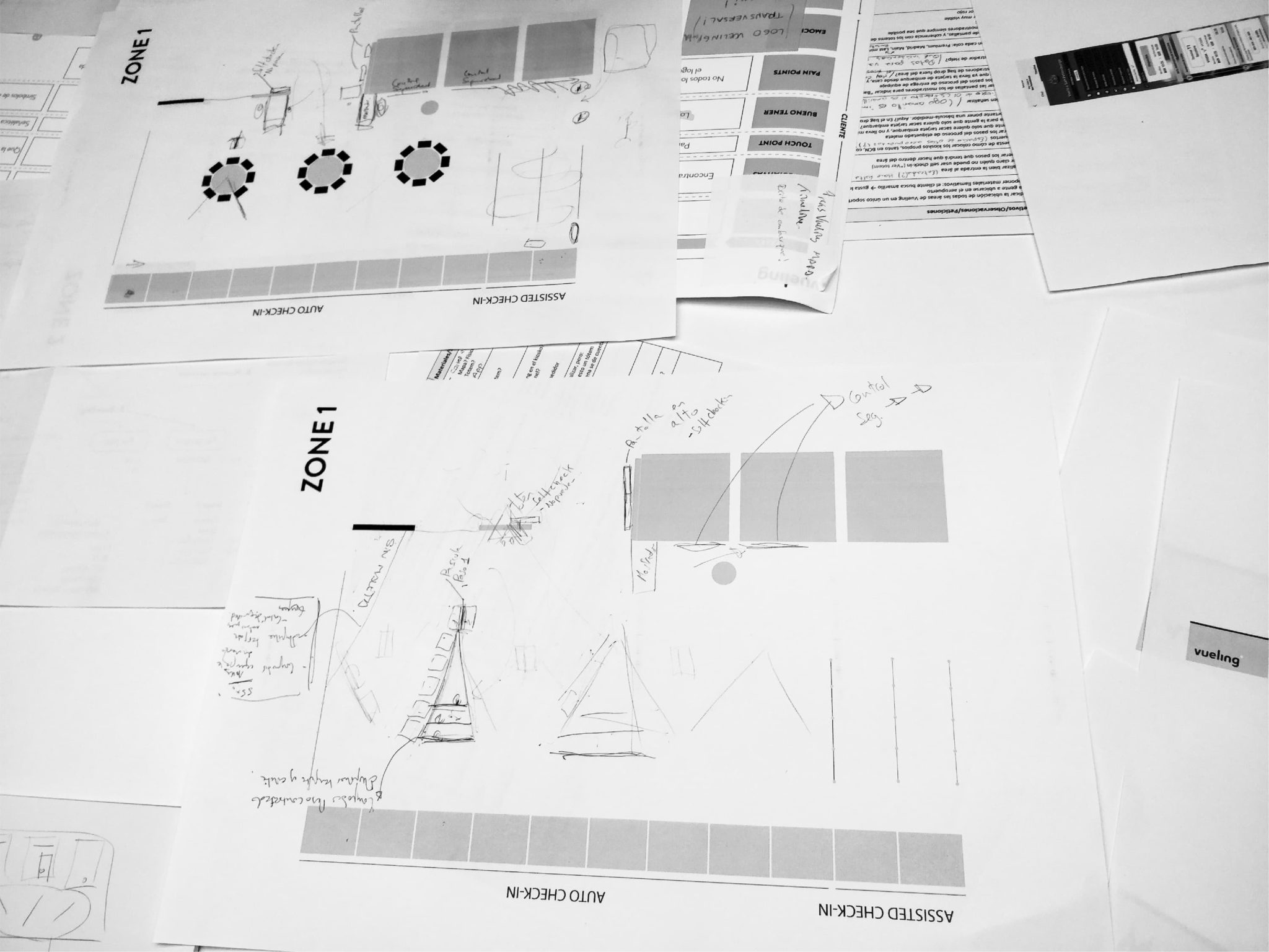
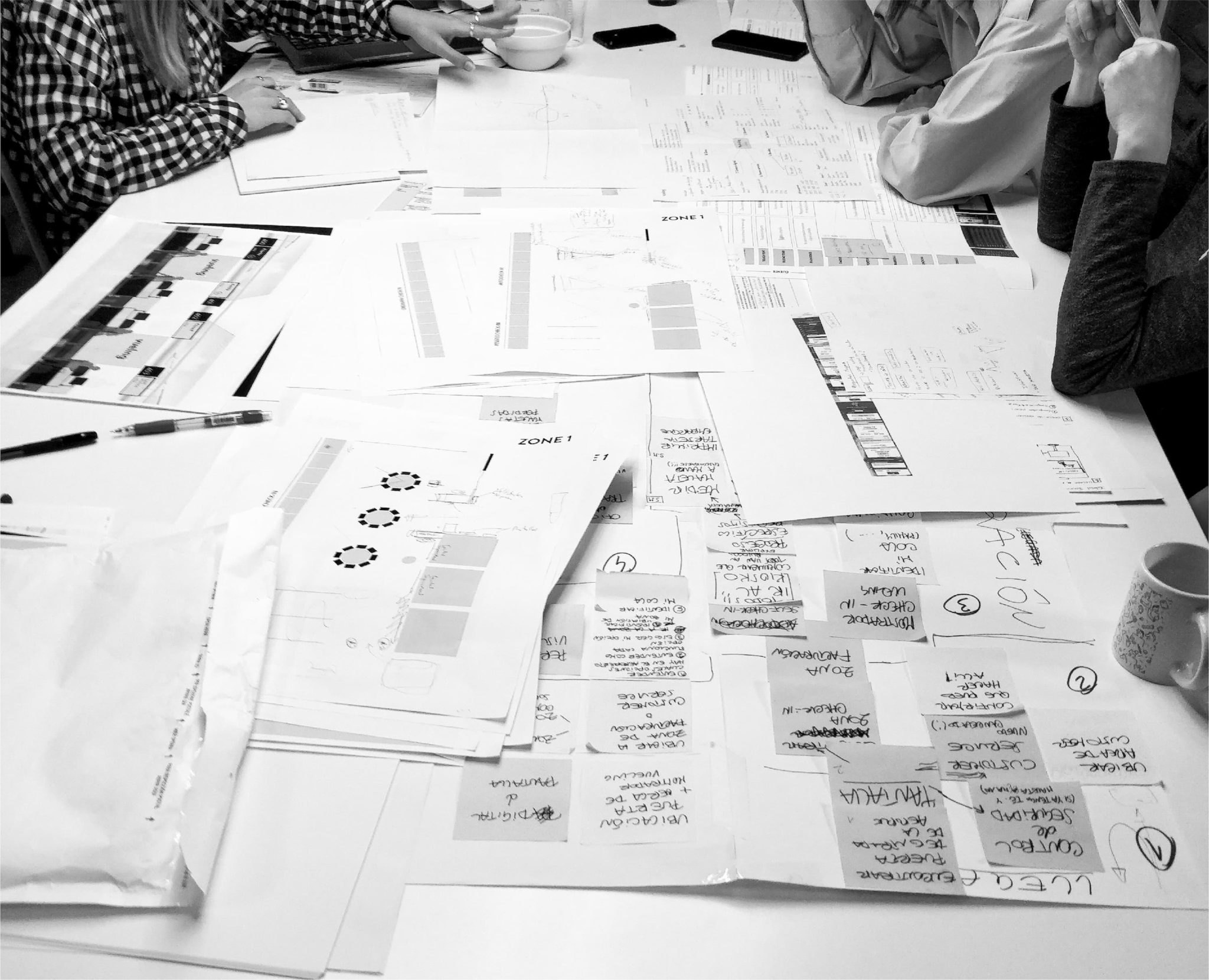
Put in a nutshell, the key to everything was the process of the journey. To do this, we analysed the best practices in 7 of the key airports for Vueling. The main hub of Barcelona, Madrid, London, Paris Orly, Brussels, Rome, Oslo and Amsterdam. This qualitative analysis enabled us to identify pains & gains of the customer journey and the brand perception in the airport. 5 main insights were obtained:
- The Vueling client looks for yellow
- It is important to prioritise the information
- There are too many visual impacts
- People don’t read
- The flow of the processes must be clear
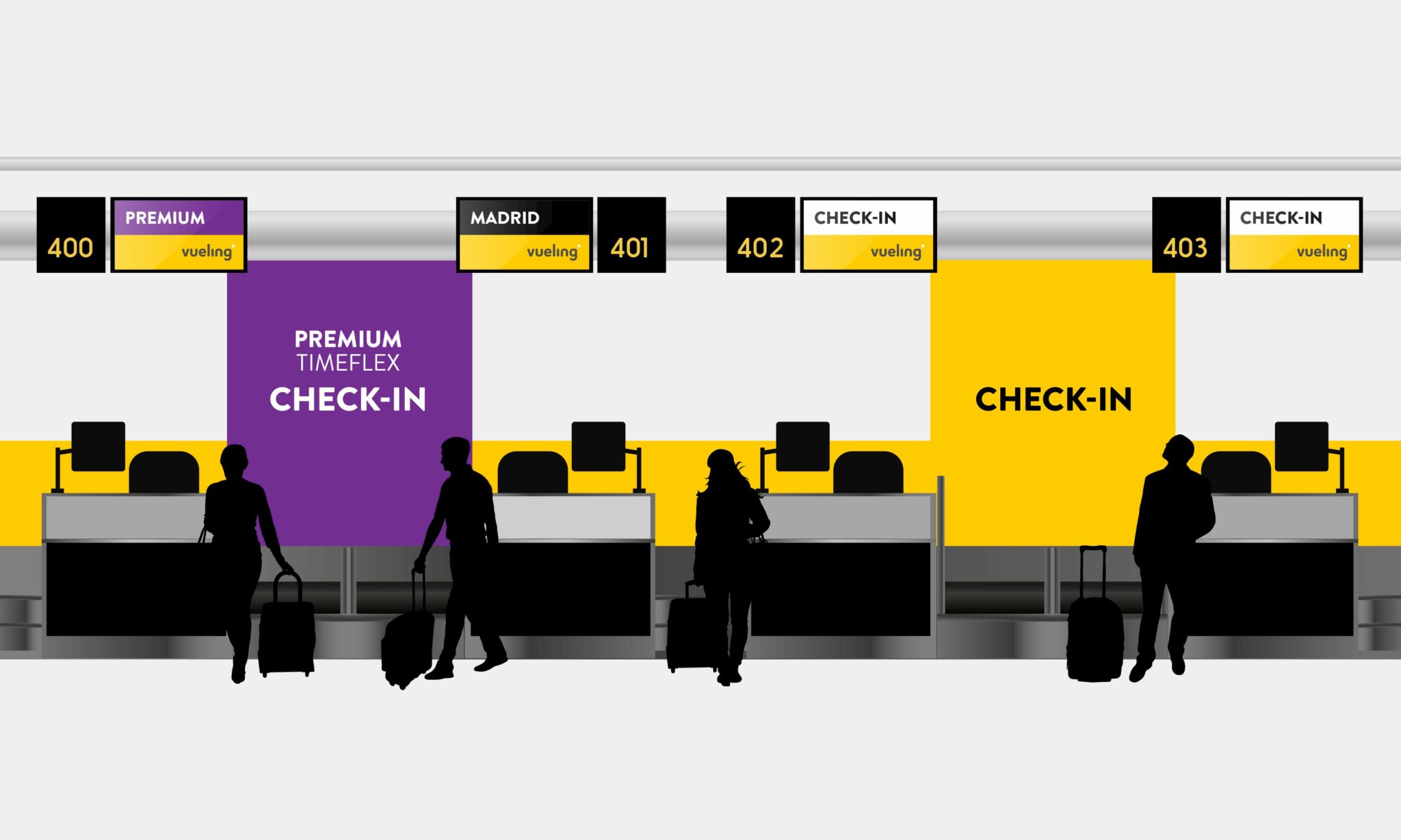
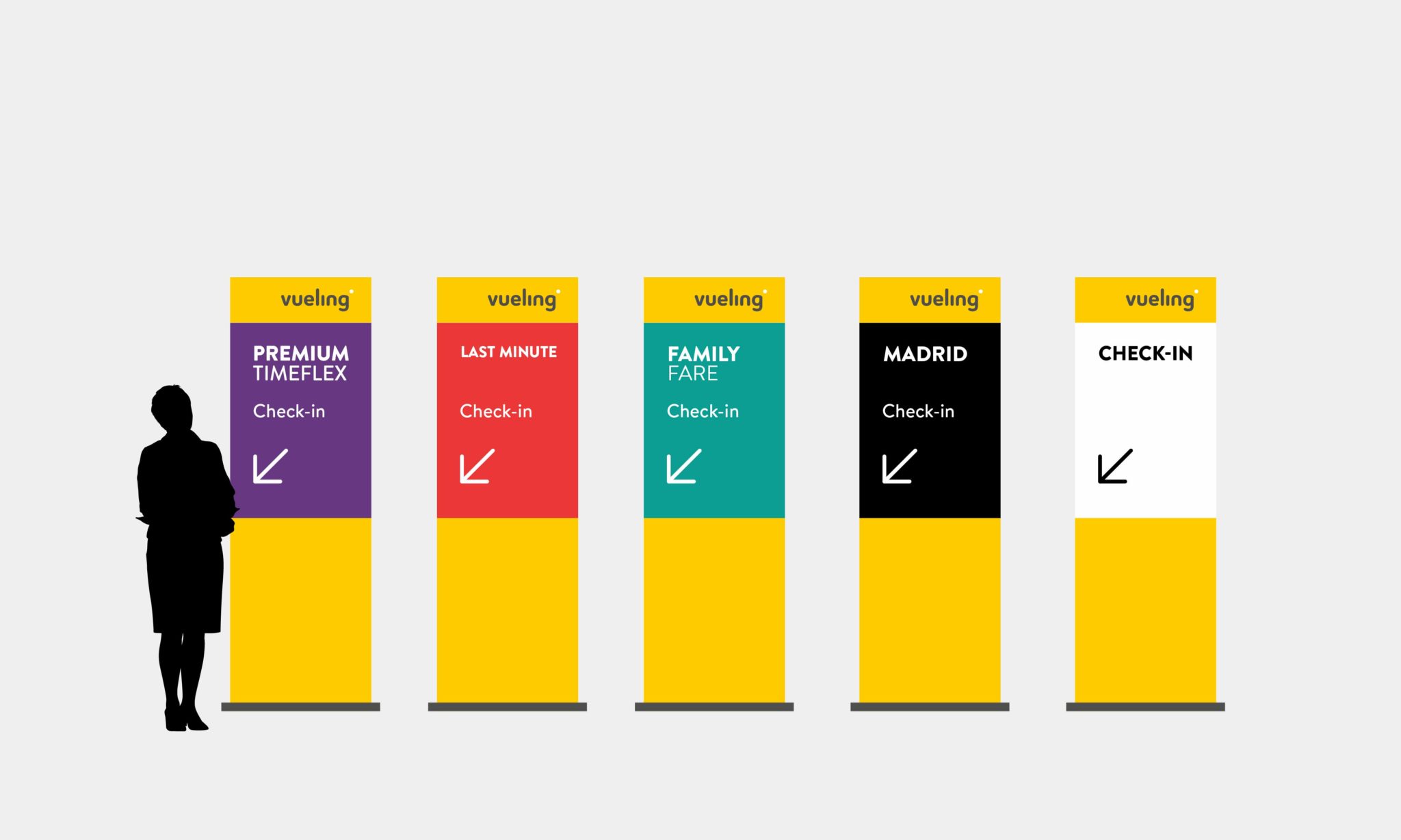
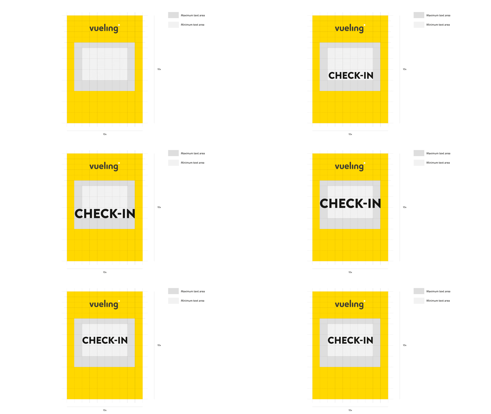
A new system of information and orientation
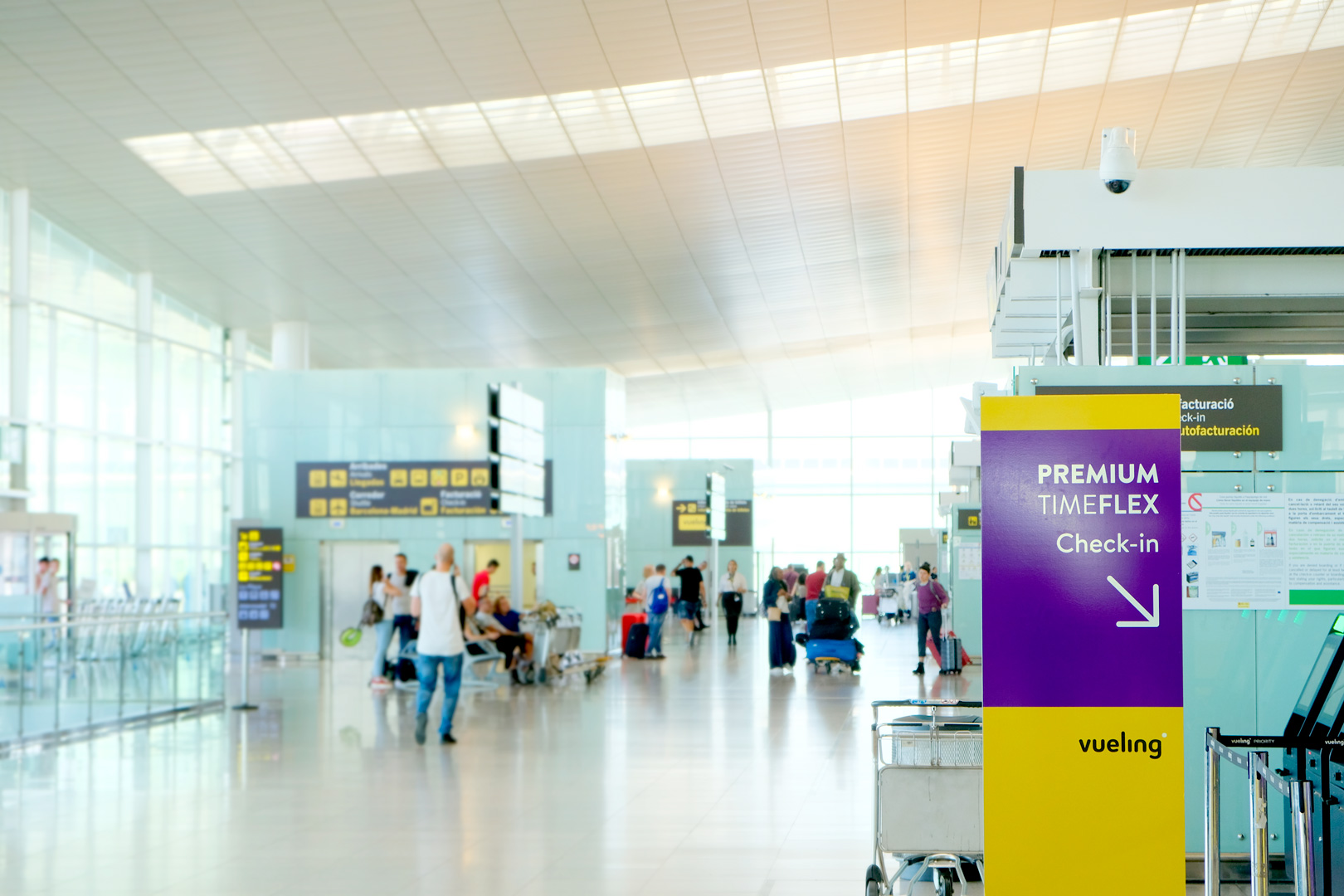
This new system, in line with the visual identity of Vueling and based on the principles of signage and wayfinding, brings a clear improvement to the client experience:
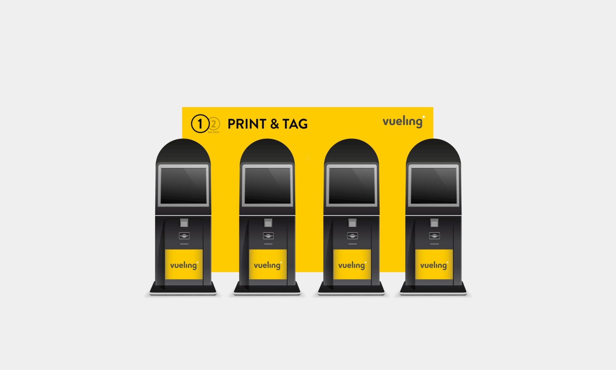
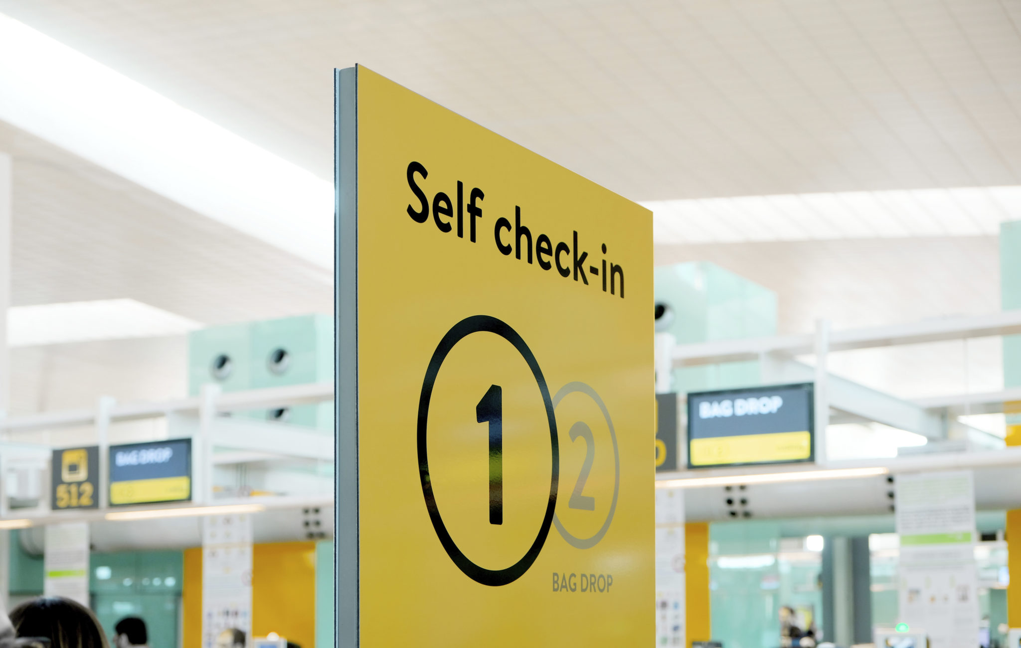
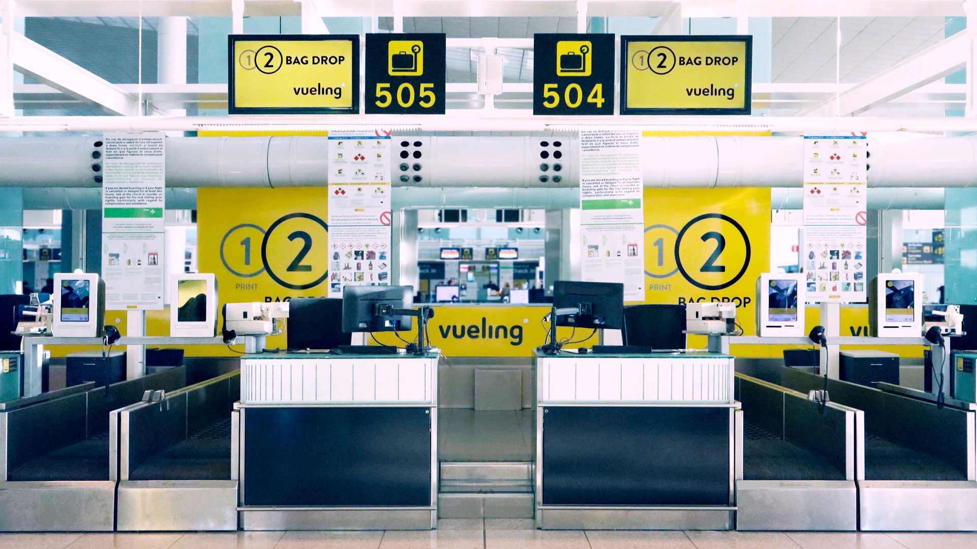
- The Vueling zone is seen with clarity, and clearly differentiates the different areas (check-in, self check-in, customer service).
- There is more order in the hierarchy of information.
- The creation of a colour code and its implementation in the different supports improves the organization of the people, providing consistent information.
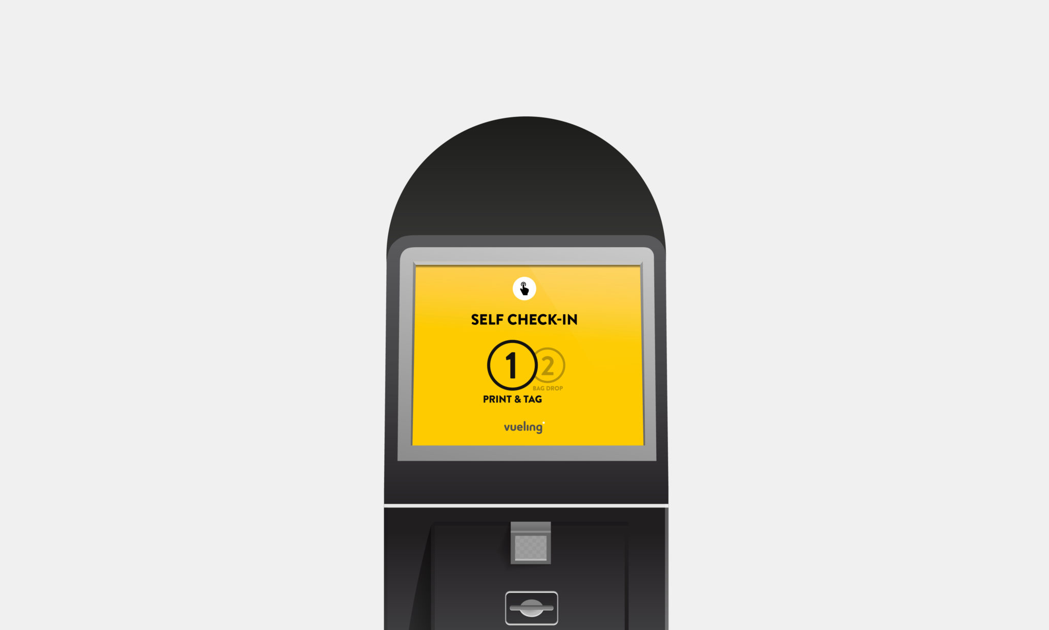
- The use of icons simplifies the messages, avoiding complex texts.
- The inclusion of numbers in the steps of the processes orders the flow of users and enables the process to be carried out clearly.
