with
«Natural bio-stimulant technology»
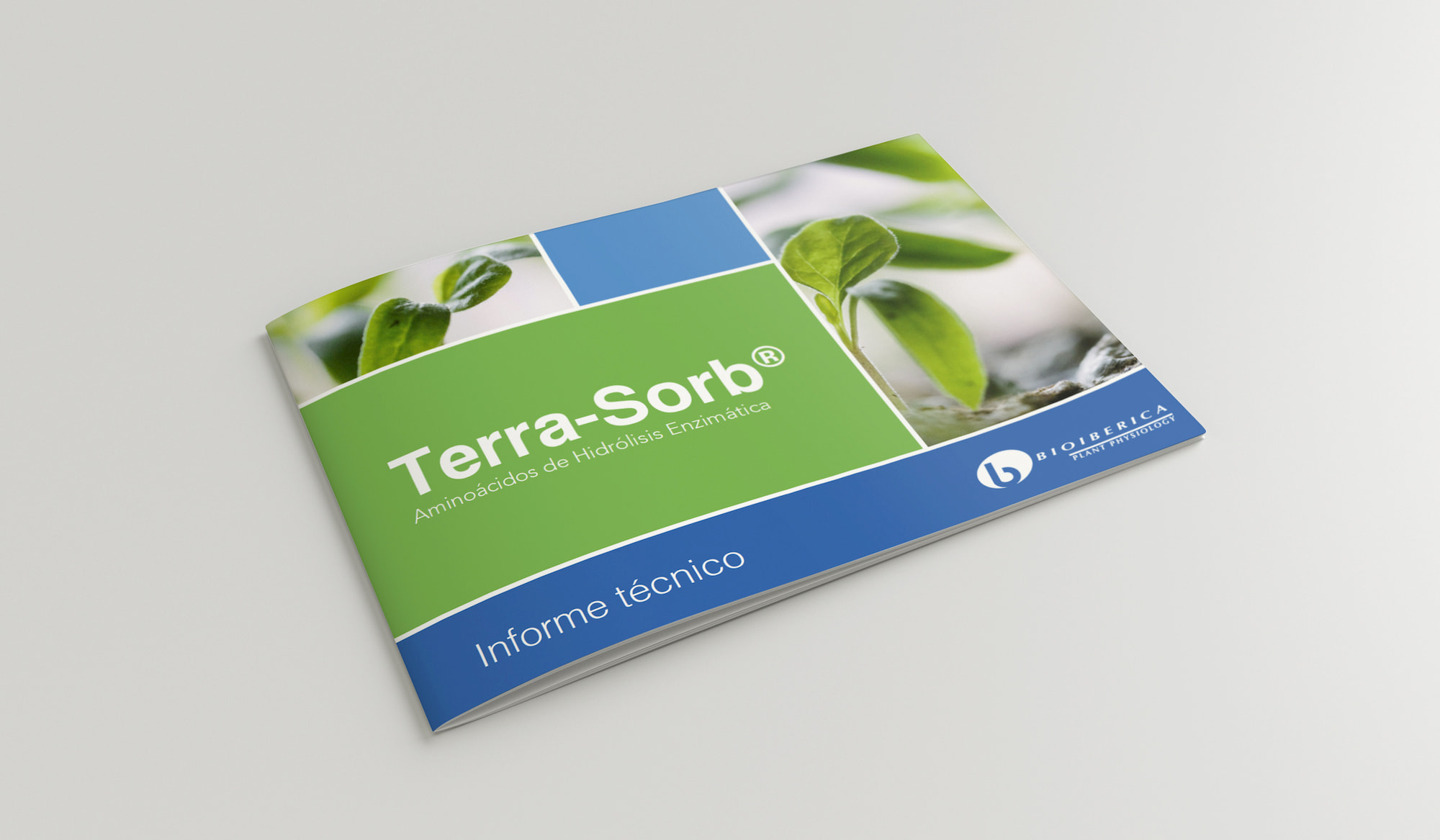
Bioiberica is a pharmaceutical company that manufactures and commercialises its own products in the domestic and international market exporting to over 50 countries.
Its Plant Physiology division has spent more than 20 years working in the field of agronomy offering solutions for fighting plant stress and biological attractions for controlling plagues. Its differentiation in amino acid products is the extractive technology it uses: enzymatic hydrolysis, which offers a natural and unique solution in the attainment of bioactive compounds.
The challenge
Our challenge was to create a global brand for this technology: a distinctive brand, renowned and relevant, aligned to the defined positioning and which enables Bioiberica to compete better and lead the segment. From the brand strategy and creation of the brand name and identity, to the design of all the applications.
Together with the client, we co-define the brand concept and its essence (“Natural bio-stimulant technology”) as well as the main attributes over which to construct its identity: quality – global sustainability – reliability – exclusive process – production – pharmaceutical guarantee – specialisation. Moreover, we establish the guidelines for the coexistence between this “ingredient” brand and the product brands.
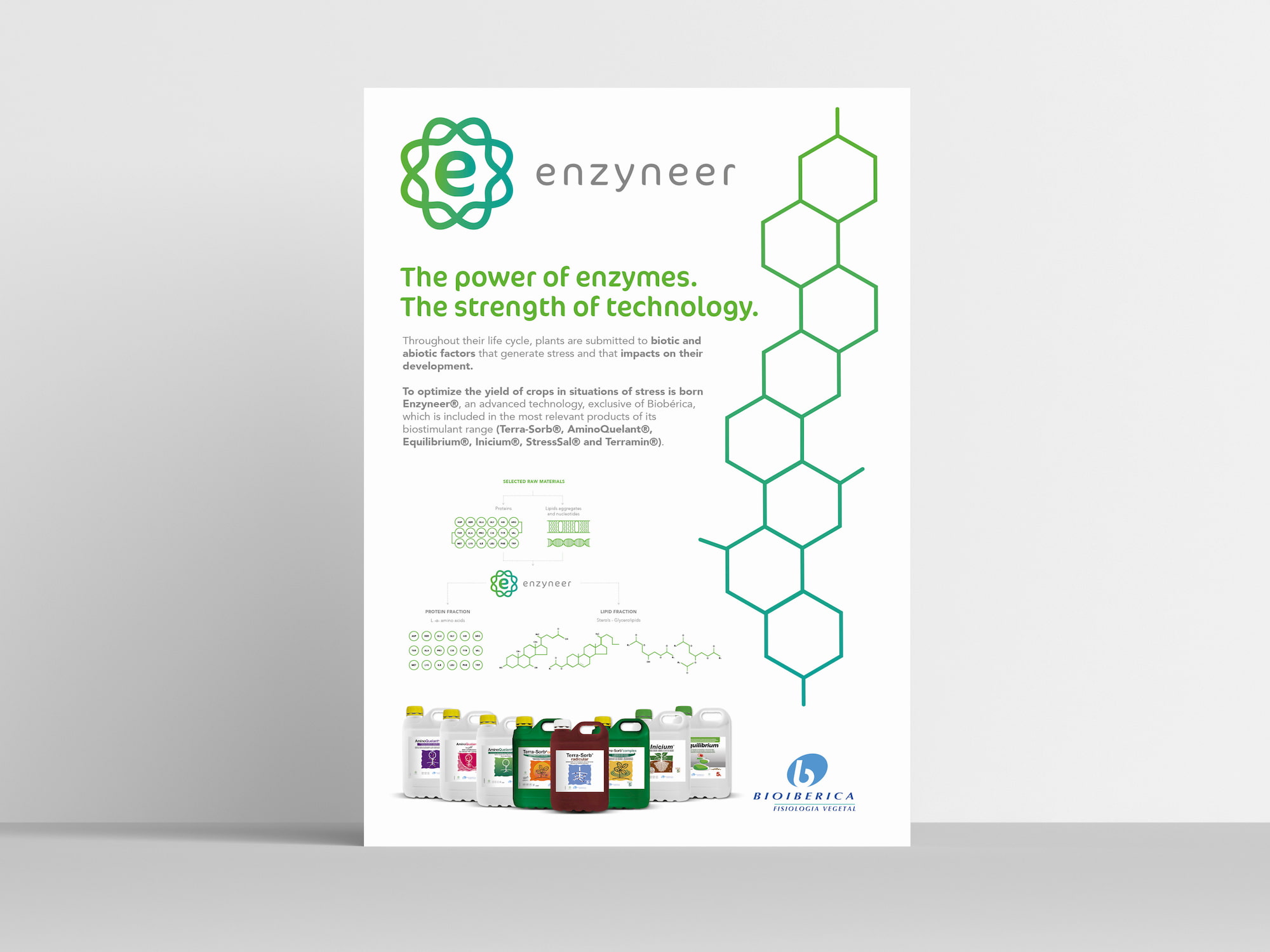
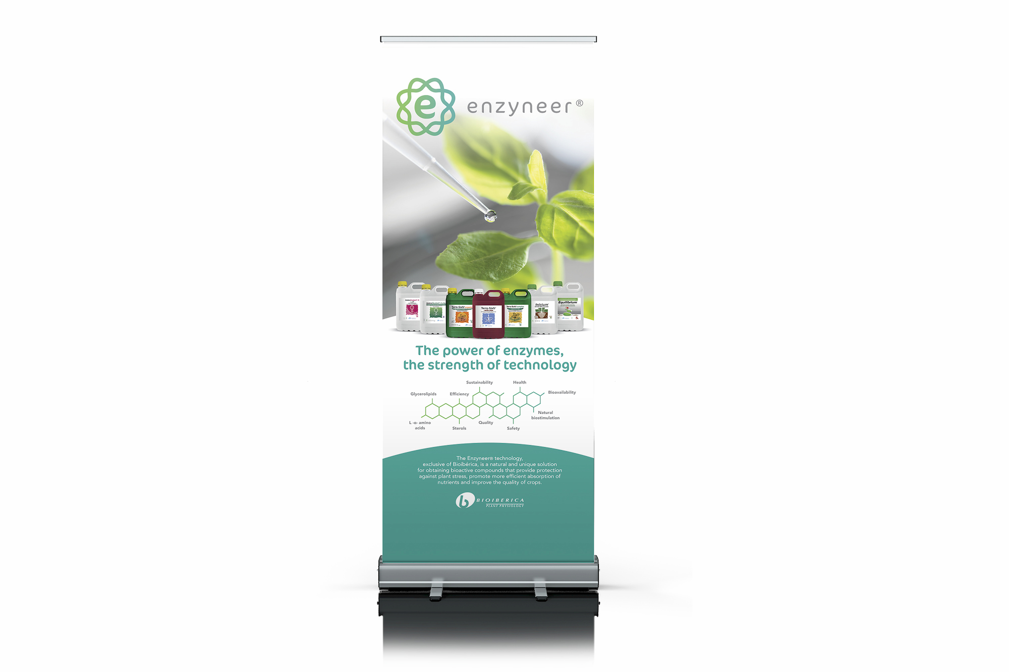
Afterwards, and aligned to the brand concept, we create the name, valid from a legal, linguistic and marketing point of view: Enzyneer®, an evocative name that speaks to us of the “engineer of enzymes” and to which a tagline accompanies it: “The power of enzymes, the strength of technology”.
Visual identity
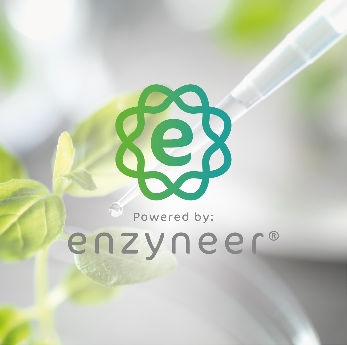
Finally, we work the visual identity of the brand. The logotype represents the union of the biology, the corporate brand and the naturalness of the product. It is expressed with a chain of DNA that inspires the form of a flower that collects the letter E, this symbol next to “Powered by”, working as a seal in some of the applications. As regards the brand colours, they describe the main attribute of the technology: natural, in relation to the corporate colours of Bioiberica.
We provide its visual universe with clean, inspiring photographs that evoke technology and naturalness.
With Enzyneer®, Bioiberica strengthens its positioning giving value to the bio-stimulant technology with which it nourishes its products.
con
Enzynner
«Tecnología bioestimulante natural»
Bioiberica es una empresa farmacéutica que fabrica y comercializa sus propios productos en los mercados nacional e internacional exportando a más de 50 países.
Su división de Fisiología Vegetal lleva más de 20 años trabajando en el campo de la Agronomía ofreciendo soluciones para combatir el estrés vegetal y atrayentes biológicos para el control de plagas. Su diferenciación en productos de Aminoácidos es la tecnología extractiva que utiliza: La hidrólisis enzimática, que ofrece una solución natural y única en la obtención de compuestos bioactivos.
El reto…
Nuestro reto fue crear una marca global para esta tecnología. Una marca distintiva, notoria y relevante, alineada al posicionamiento definido y que permita a Bioiberica competir mejor y liderar la categoría. Desde la estrategia de marca y creación del nombre e identidad visual, al diseño de todas las aplicaciones.
Co-definimos junto con el cliente el concepto de marca y su esencia (“Tecnología bioestimulante natural”) así como los principales atributos sobre los que construir su identidad: Calidad – Sostenibilidad global – Fiabilidad – Proceso exclusivo – Producción – Garantía farmacéutica – Especialización. Además, establecimos las pautas para la convivencia entre esta marca “ingrediente” y las marcas de producto.
Posteriormente y alineado al concepto de marca, creamos el nombre, válido desde un punto de vista jurídico, lingüístico y de marketing: Enzyneer®, un nombre evocativo que nos habla del “ingeniero de enzimas” y al que acompaña un tagline: “El poder de las enzimas, la fuerza de la tecnología”.
La identidad visual
Y por ultimo, trabajamos la identidad visual de la marca. El logotipo representa la unión de la biología, la marca corporativa y la naturaleza del producto. Se expresa con una cadena de ADN que inspira la forma de una flor que recoge la le letra E, este símbolo junto al “Powered by:” actúa como sello en alguna de las aplicaciones. En cuanto a los colores de la marca, describen el atributo principal de la tecnología: natural, en relación con los colores corporativos de Bioiberica.
Dotamos su universo visual de fotografías limpias, inspiradoras y que evoquen tecnología y naturalidad.
Con Enzyneer®, Bioiberica refuerza su posicionamiento dotando de valor la tecnología bioestimulante de la que se nutren sus productos.