with
Founded in 1969
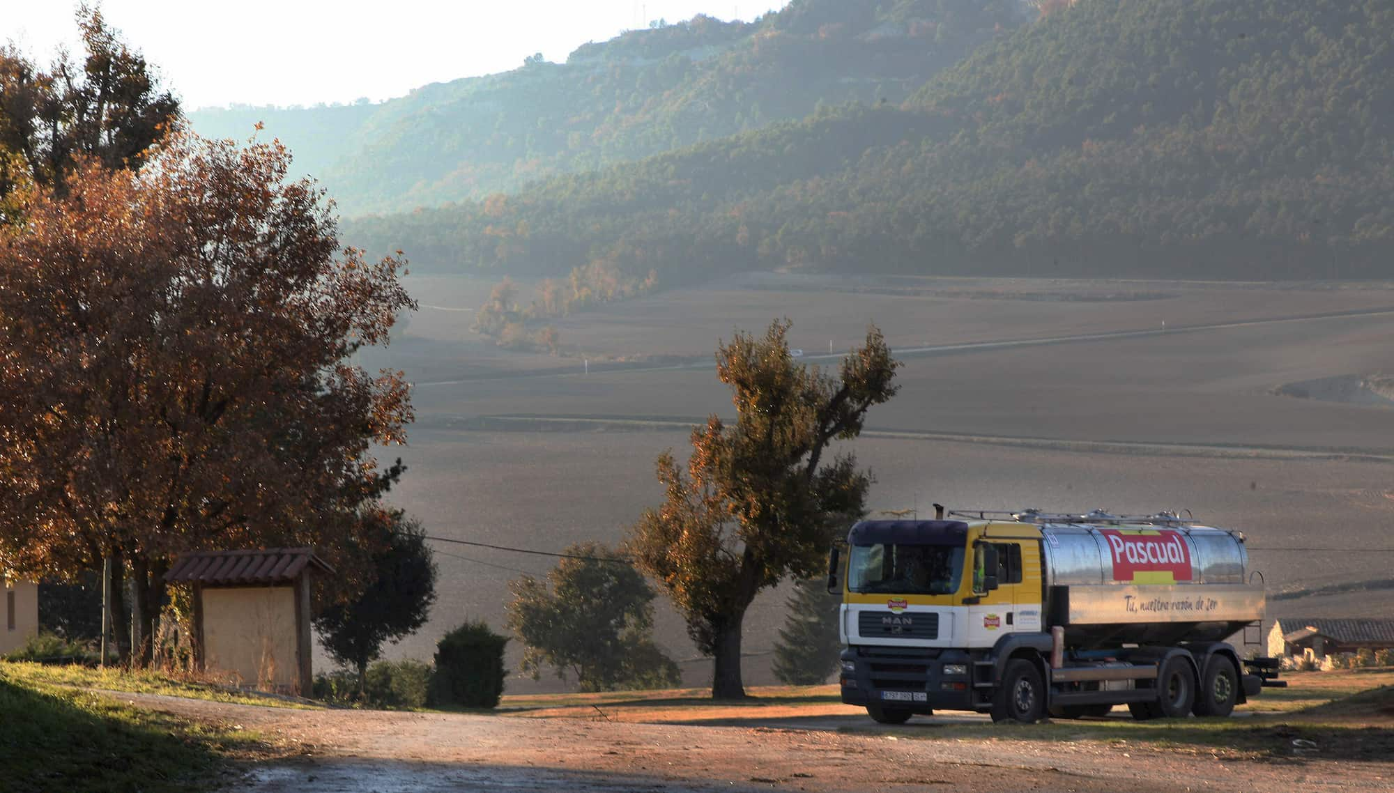
Calidad Pascual, the new name of Grupo Leche Pascual, is a family company founded in 1969 which offers a wide range of innovative and market-leading food and drink brands.
The new corporate identity is in line with the current reality of the company, as set out by the 2015 Horizon Strategic Plan, and will enable Pascual to successfully position itself in a new competitive, economic and social environment without abandoning its traditional values.
New brand
The new brand represents the two main guiding principles behind Pascual: Quality, seen as an all-encompassing and integrated aspect, and people as its primary concern.
Calidad Pascual is thus consolidating its position as a leading company associated with the concept of quality in its broadest sense, allowing it to stay by people’s side throughout their lives, looking after their health, nutrition, quality of life and wellbeing through its leading food and drink products.
New identity
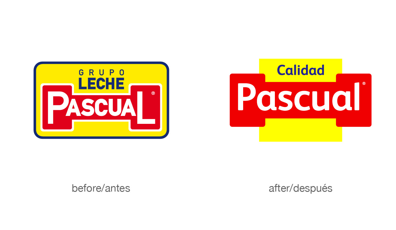
The new corporate identity respects and at the same time provides a visual evolution of the previous brand, which is well-recognised and one of the reasons for the company’s success. It also strengthens Pascual in the new environment, highlighting its values and goals.
The values
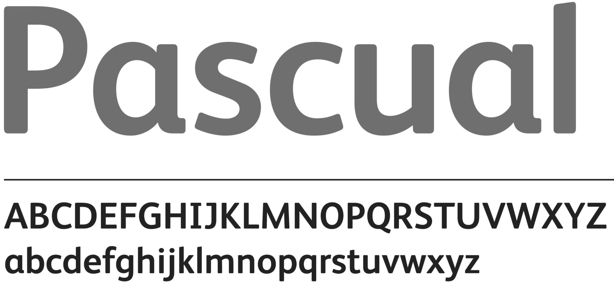
- At your side. The uppercase letters of the previous logo have been replaced with lowercase letters to make it more friendly and approachable, modernising its image and harmonising its structure..
- Consistency. A natural evolution of its predecessor, the new image has kept the distinctive colourful mix of yellow and red as an expression of the light, warmth and passion which defines its identity. Calidad Pascual is moving into the future without losing its essence.
- Openness. The opening up of its shapes also represents Calidad Pascual’s desire to open up to people; to life. Dynamic, optimistic and honest, with renewed hope, it has shed its former rigidity and has a friendlier appearance.
- Soundness. As an umbrella of leading brands in the food and drink market with a focus on health and nutrition, the brand has adopted the values of soundness, sobriety and reliability required by these products, with the necessary flexibility to take in other brands in the future.
- More than just milk. Calidad Pascual is much more than just milk. And its new brand reflects this. Removing the word “milk” from the brand affords it the opportunity to take in new products, new brands and new challenges. Everything is possible.
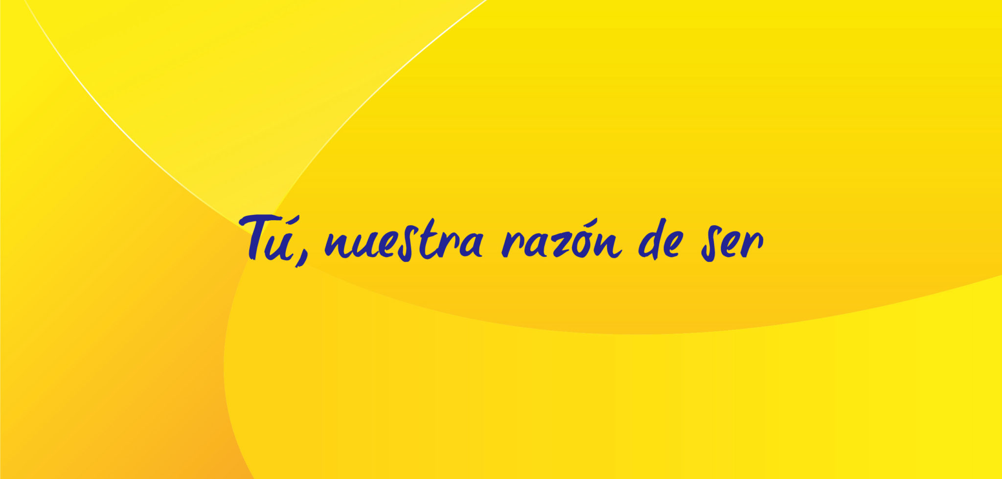
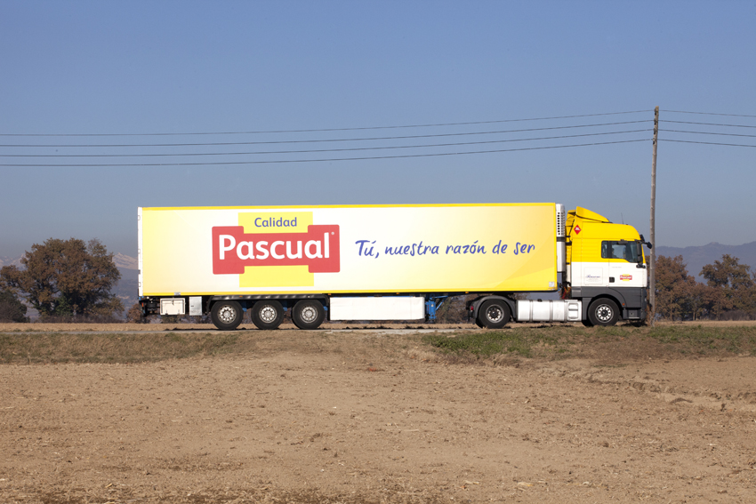
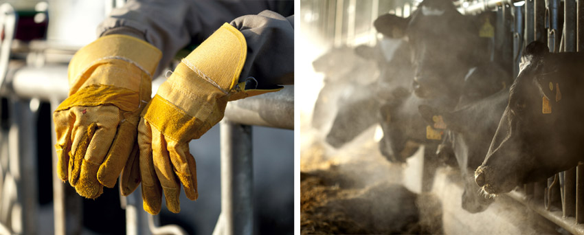
What’s more, our challenge has been to provide it with a visual world (type fonts, corporate backgrounds, colours, photographic style, etc.) to accompany it in all points of contact, allowing the brand to act with consistency and rigour. This visual world will help express the values of Calidad Pascual.
con
Pascual
Fundada en 1969
Calidad Pascual, nueva denominación de Grupo Leche Pascual, es una empresa familiar fundada en 1969 que engloba un amplio portafolio de marcas de alimentación y bebidas, innovadoras y líderes en el mercado.
La nueva identidad corporativa está en línea con la realidad actual de la compañía, derivada del Plan Estratégico Horizonte 2015, y que permitirá a Pascual posicionarse con éxito en un nuevo entorno competitivo, económico y social sin renunciar a sus valores tradicionales.
Nueva marca
La nueva marca representa los dos ejes principales de Pascual: la calidad, entendida de forma total e integral, y las personas como su objetivo central.
Calidad Pascual consolida así su posicionamiento como compañía líder asociada al concepto de calidad en su más amplia dimensión para estar más cerca de las personas a lo largo de toda su vida, con el objetivo de cuidar de su salud, nutrición, calidad de vida y bienestar, a través de productos líderes en alimentación y bebidas.
Nueva identidad
La nueva identidad corporativa respeta y supone una evolución a nivel visual de la marca anterior, que es reconocida y ha supuesto una de las razones del éxito de la compañía. Además, permite fortalecer a Pascual en un nuevo entorno, poniendo de relieve sus valores y objetivos.
Los valores
- Próxima. La tipografía en mayúsculas del anterior logotipo cede a favor de una tipografía en minúsculas, más amable y cercana, que moderniza su imagen y armoniza su estructura.
- Coherente. Evolución natural de su antecesora, la nueva imagen conserva como rasgos diferenciadores el juego cromático amarillo y rojo como expresión de la luz, la calidez y la pasión que definen su identidad. Calidad Pascual avanza hacia el futuro sin perder la esencia.
- Abierta. La apertura de sus formas es también la apertura definitiva de Calidad Pascual hacia las personas, hacia la vida. Dinámica, optimista y sincera, con ilusiones renovadas, abandona una cierta rigidez y se muestra más afable.
- Sólida. Como paraguas de marcas líderes en el mercado de alimentación y bebidas con un enfoque en salud y nutrición, la marca asume los valores de solidez, sobriedad y garantía que éstas exigen, con la flexibilidad necesaria para amparar cualquier otra marca en el futuro.
- Más que leche. Calidad Pascual es mucho más que leche. Y su nueva marca así lo refleja. Suprimir la palabra “leche” de la marca supone añadirle la posibilidad de amparar nuevos productos, nuevas marcas, nuevos retos. Todo es posible.
Además, hemos dotado a la marca de un universo visual (tipografías, fondos corporativos, colores, estilo fotográfico, etc), que la acompaña en todos los puntos de contacto donde la marca actúa con coherencia y rigor. Este universo visual ayudará a expresar los valores de Calidad Pascual.