with


Quality
& elegance
The German brand Liebherr is a specialist in high-quality fridges and freezers. It is a prestigious brand that seeks to boost its positioning of quality and elegance, while also aiming to be attractive to new generations.
Visual universe
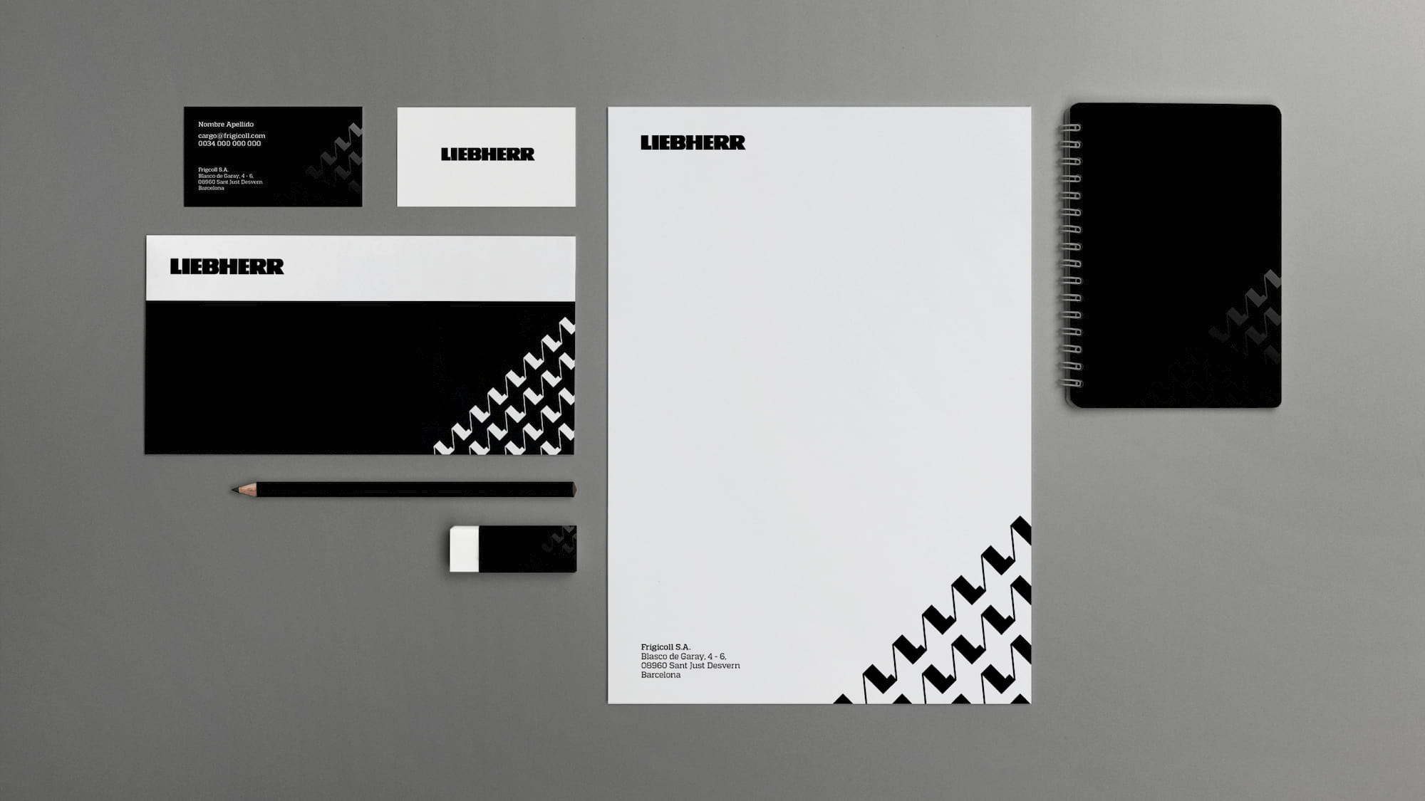
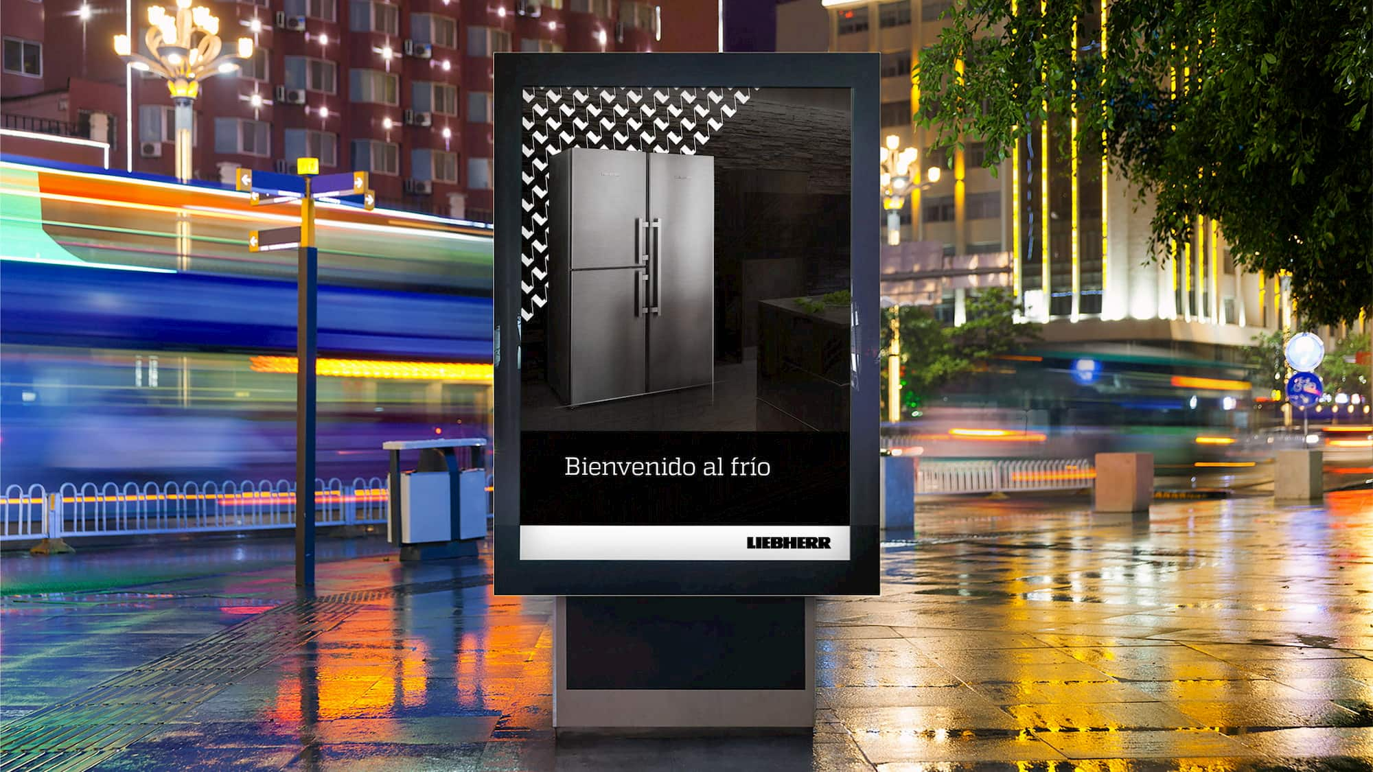
The challenge was to create a unique visual universe, relevant and differentiating, with appropriable branding elements to surround the brand with a coherent and consistent visual identity and aligned to the positioning. The bicolour visual universe becomes unique due to the corporate pattern, produced from the initial of the brand, making each of the corporate pieces totemic.

Design & precision
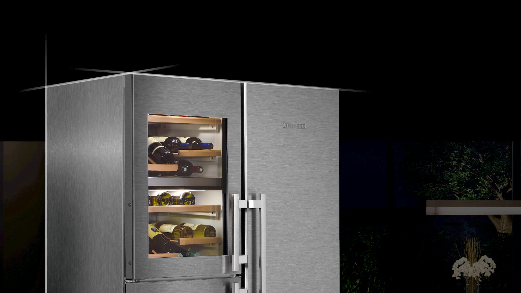
The use of thin lines that accompany the sides of the product images provide a technical touch to the Liebherr photographs, and the design and precision behind each of the products. Moreover, in order to place the spotlight on the product in each corporate execution, we chose a low black shade that highlights the leading actor of the pieces: the product itself.


con
Liebherr
Calidad y elegancia
La marca alemana Liebherr es especialista en frigoríficos y congeladores de alta calidad. Una marca de prestigio que busca potenciar su posicionamiento de calidad y elegancia, pero que a su vez quiere ser atractiva a las nuevas generaciones.
Universo visual
El reto estaba en crear un universo visual único, relevante y diferencial, con elementos de branding apropiables para rodear la marca de una identidad visual coherente y consistente y alineada al posicionamiento. El universo visual bicolor, se convierte en único gracias al pattern corporativo, generado a partir de la inicial de la marca, haciendo totémicas cada una de las piezas corporativas.
Diseño y precisión.
El uso de trazos finos que acompañan los vértices de las imágenes de producto, aporta un toque técnico a las fotografías Liebherr, y el diseño y la precisión que hay detrás de cada uno de los productos. Además, para poner el foco sobre el producto en cada una de las ejecuciones corporativas, se opta por dar un bajo tono negro que resalta al protagonista de las piezas. El producto.