https://www.youtube.com/watch?v=FMqrWjj_VC8
El Caserío, marca icónica de confianza para las familias españolas, llama a la puerta de Columna para solventar una desconexión con el consumidor. Tras años bajo el posicionamiento “De El Caserío me fío”, la marca siente la necesidad de reconquistar esa confianza, recuperar la percepción de naturalidad y simplificar su propuesta al consumidor.
Una nueva marca
La marca no había sufrido ninguna modificación en los últimos 10 años, por ello fue necesario un profundo análisis del contexto, los competidores, la compañía, los consumidores y el canal. Así, a través de varias entrevistas y un workshop, identificamos el insight principal sobre el cual íbamos a construir el concepto estratégico de marca: “Todo está más bueno si le añades un poco de queso”.
Construimos el posicionamiento de la marca e identificamos los principales valores, atributos y personalidad de la marca.
Evolucionamos el target de la marca para dirigirnos a “los cheese lovers”, aquellos que le añaden queso a todas y cada una de sus recetas. Aquellos que, sin ser muy gourmets, valoran el sabor de las cosas buenas, y buscan poder añadir un toque de “diversión” a sus platos de manera fácil.
Como parte del reposicionamiento de la marca, retrabajamos la segmentación del portfolio de productos. Pasamos de tener un portfolio dividido en 4 gamas: lonchas, rallados, porciones y snacks a organizar nuestro portfolio según las necesidades del consumidor con dos gamas: tradicional y natural. La gama tradicional respondía a los productos que ofrecen un mayor convenience de nuestro portfolio, mientras que la gama natural abarcaba aquellos productos más cualitativos y naturales.
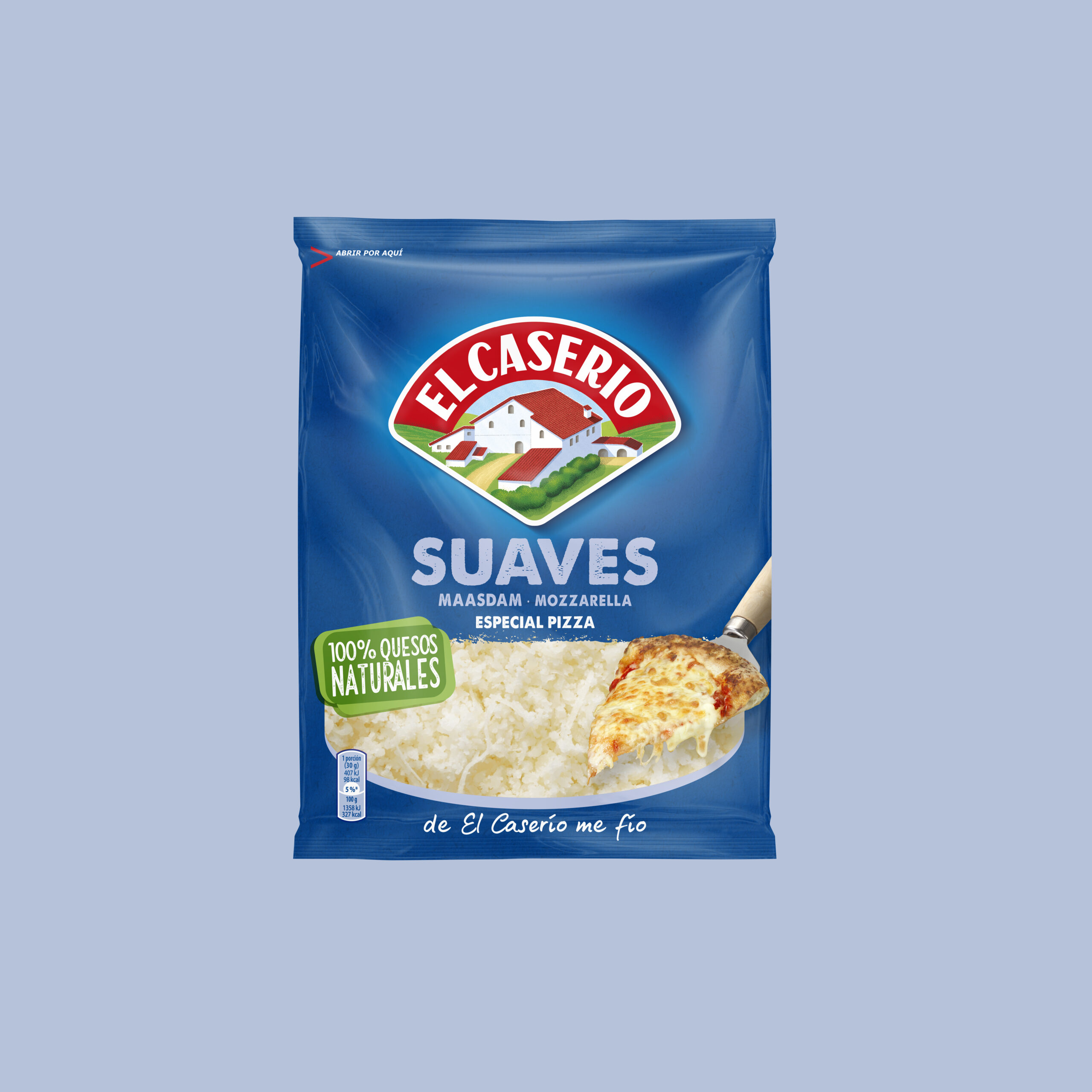
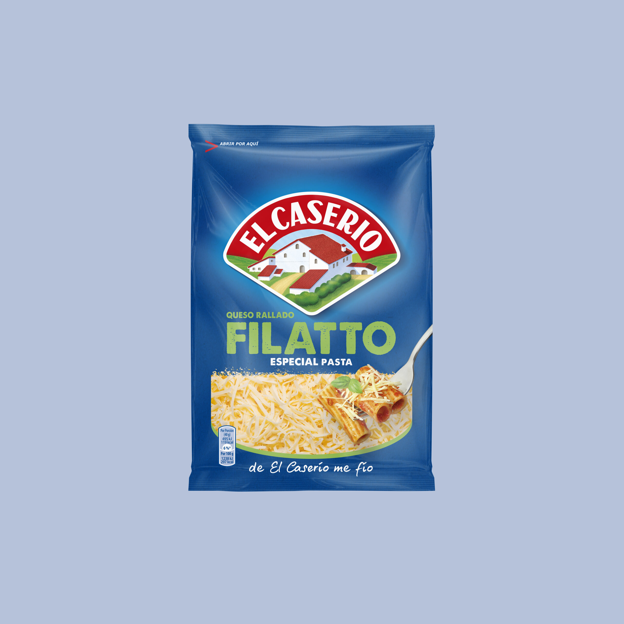
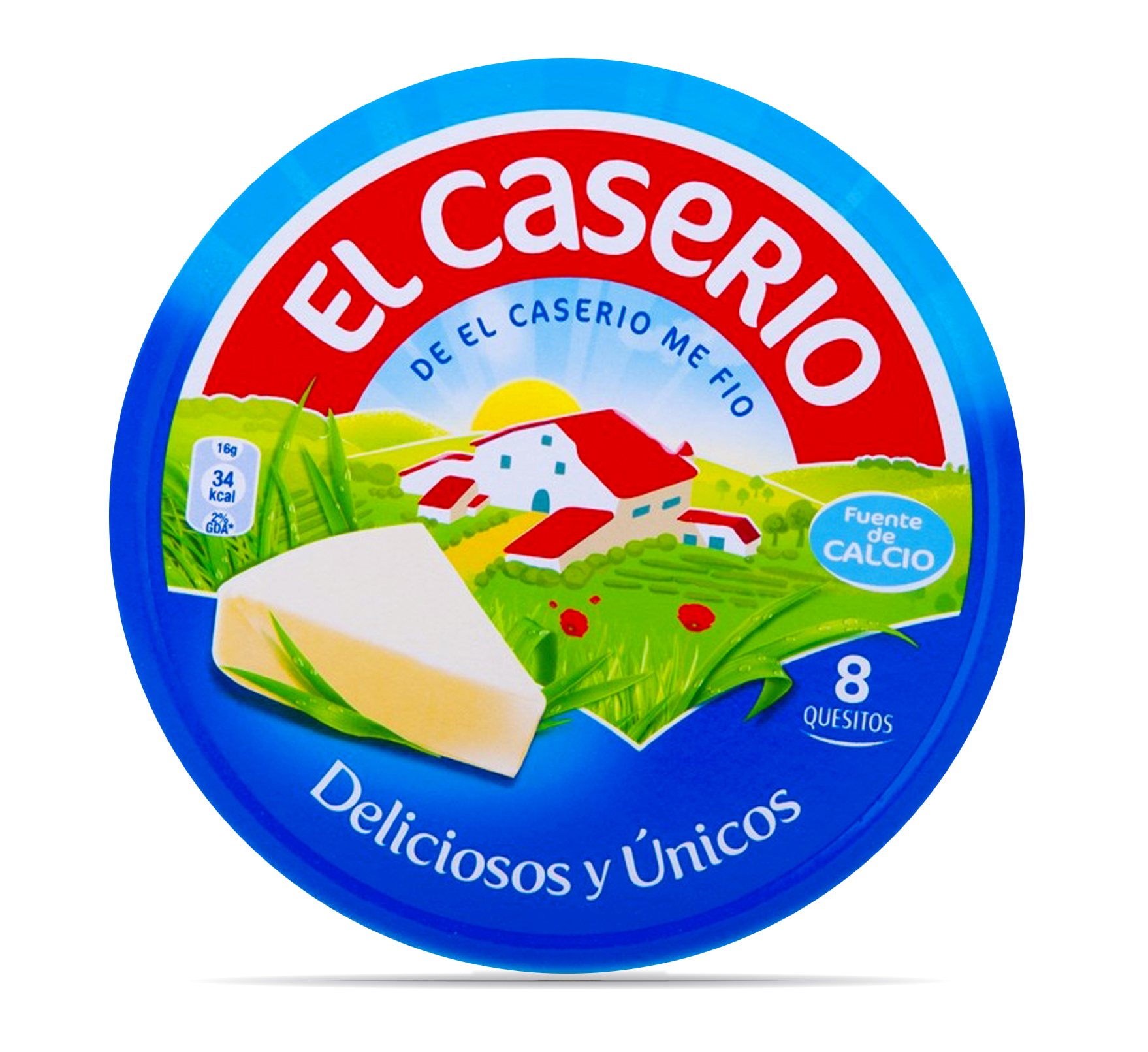
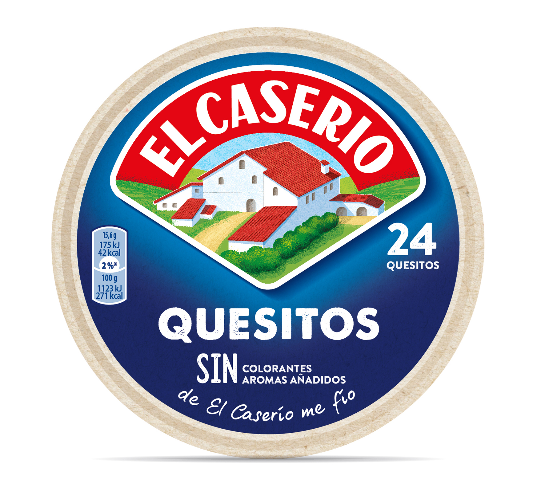
Como consecuencia del nuevo posicionamiento de marca se retrabajó en el logotipo con el objetivo de ganar iconicidad y percepción de naturalidad.
Se recuperó la tipografía mayúscula de los primeros diseños de packaging de la marca, ganando autenticidad y legibilidad en el logotipo. También se redibujó la ilustración icónica con el objetivo de simplificar elementos y por tanto dar visibilidad al key visual principal de la marca: nuestro caserío. Además, se retrabajó el borde exterior del logotipo para conseguir una forma más amable, que pudiera vivir mejor en diferentes formatos y que además tuviera una forma que recordara al producto icónico de la marca: los quesitos.
Un nuevo diseño de packaging
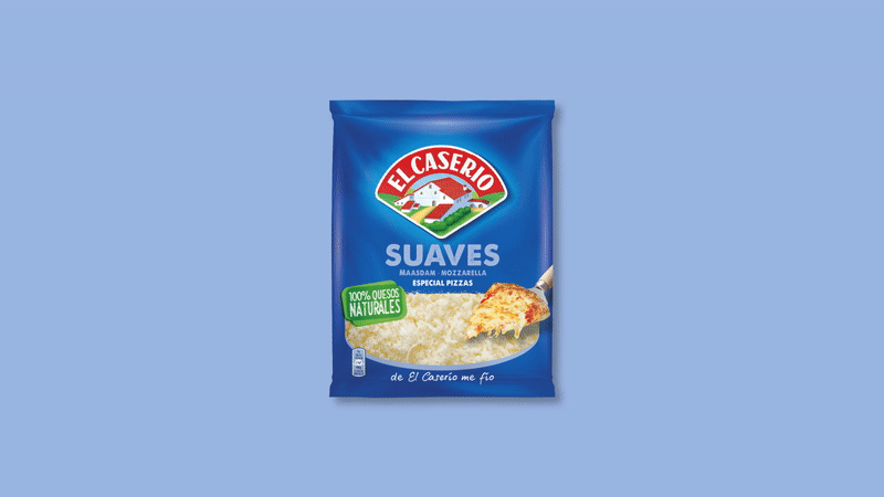
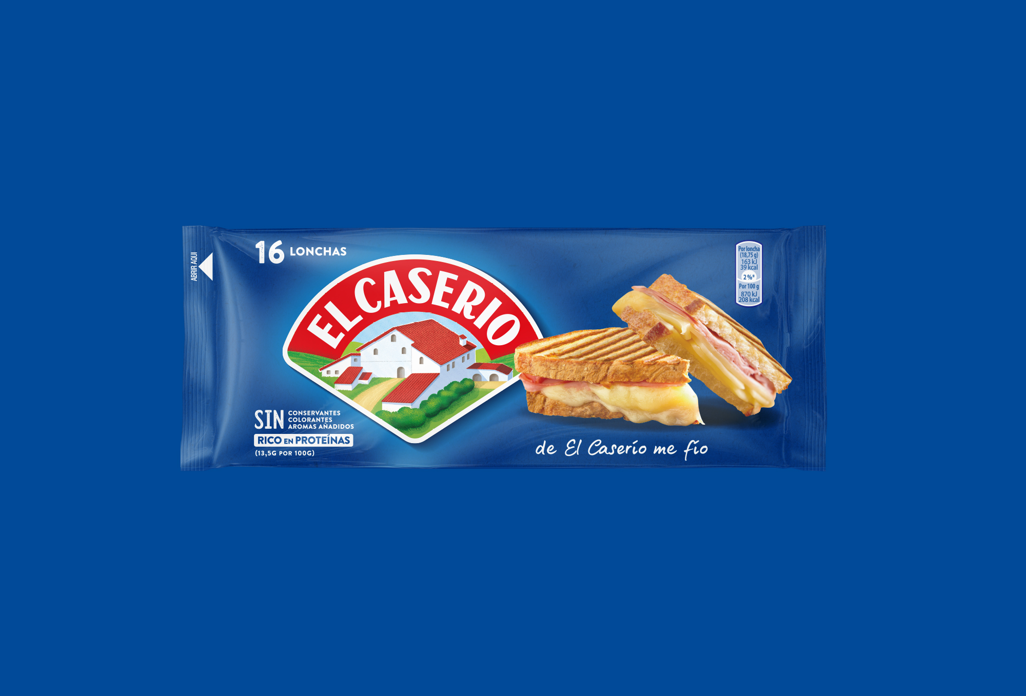
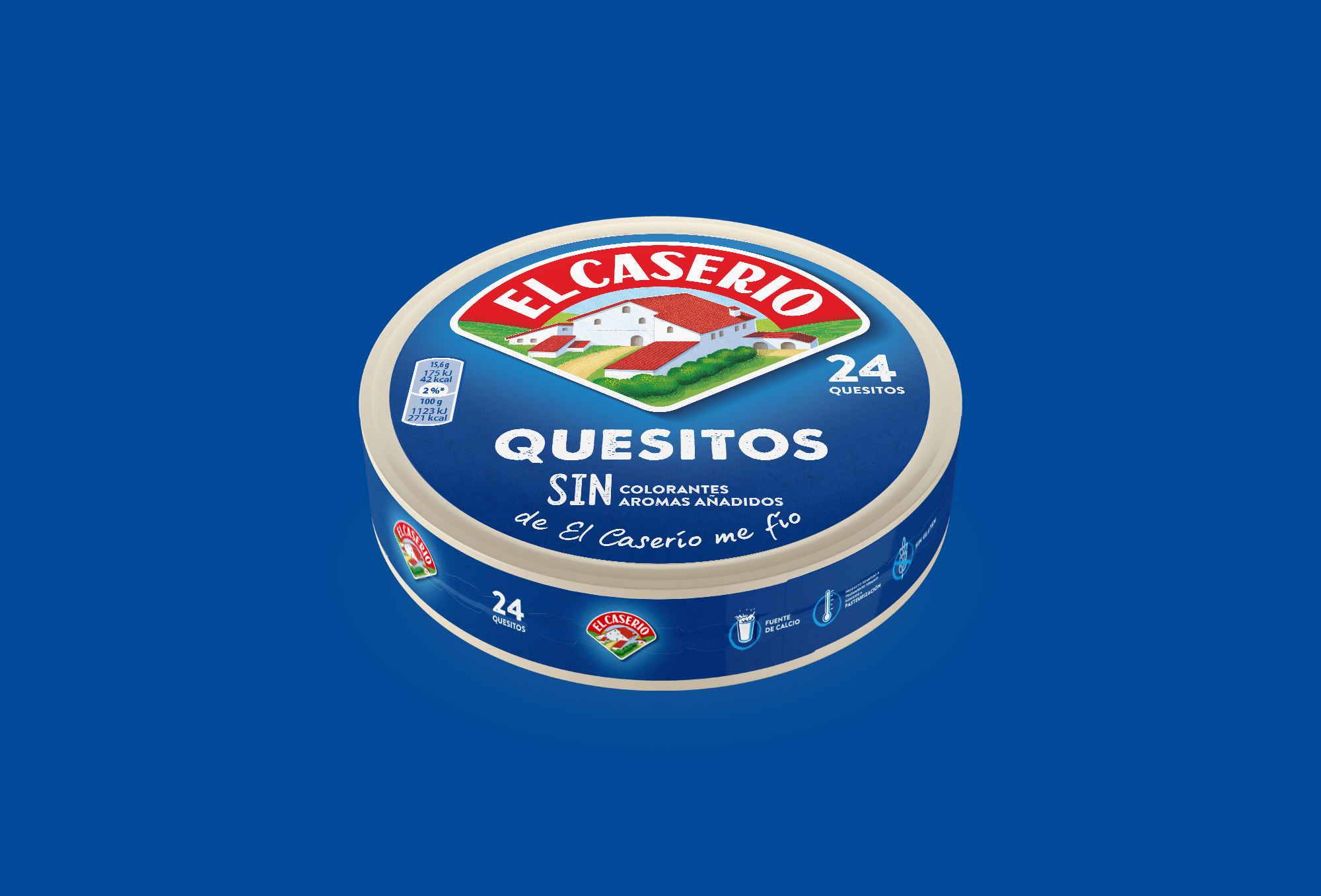
El proyecto también tuvo afectación en los diseños de packaging de la marca. Se hizo una labor de simplificación de niveles de comunicación sobre el diseño de pack, para potenciar el legado de la marca y sus mensajes principales.
Descriptivos grandes y claros, combinados con fotografías de producto más apetecibles y actuales y una textura de fondo que nos ayudará a dar autenticidad y naturalidad a la marca.
Con ello, El Caserío deja de ser un ingrediente más de las recetas y pasa a ser el ingrediente que lo eleva, que le da vida a tus creaciones. Porque al final la vida es mejor con queso, ¿no?