¡Más Fontaneda que nunca!
Fontaneda
Los antecedentes
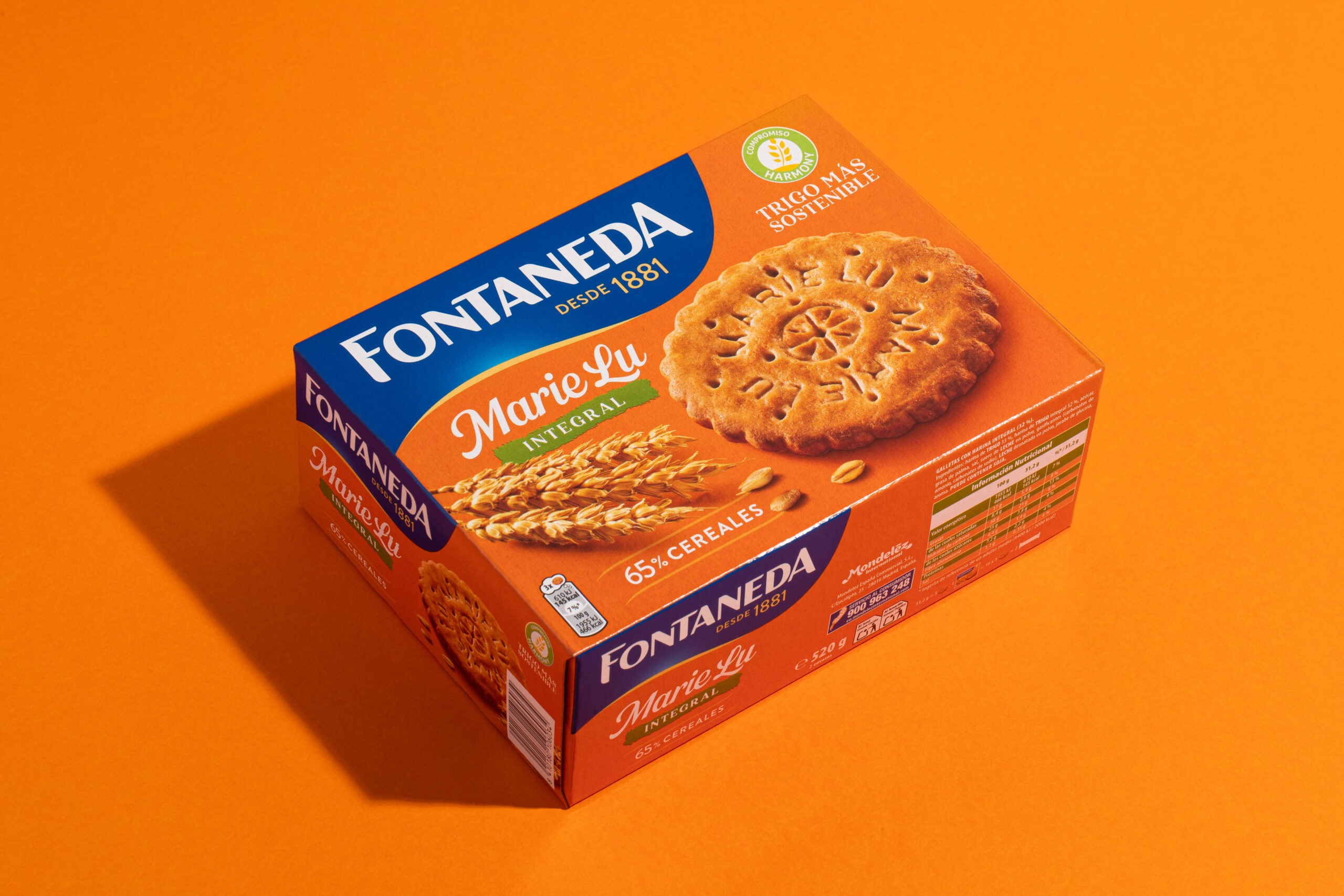
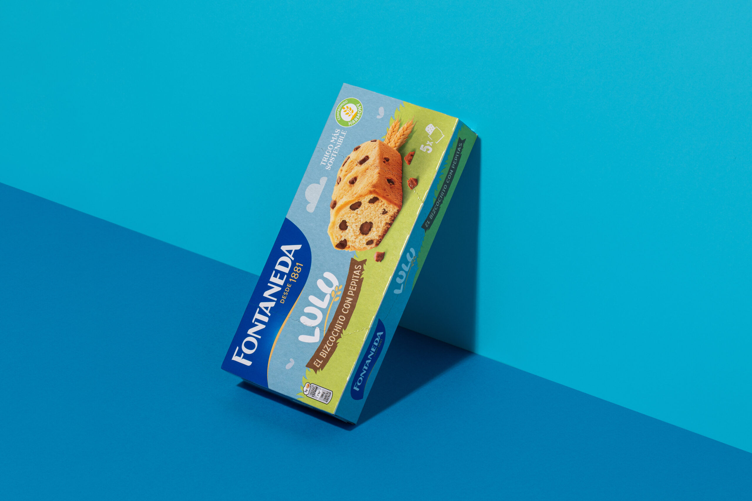
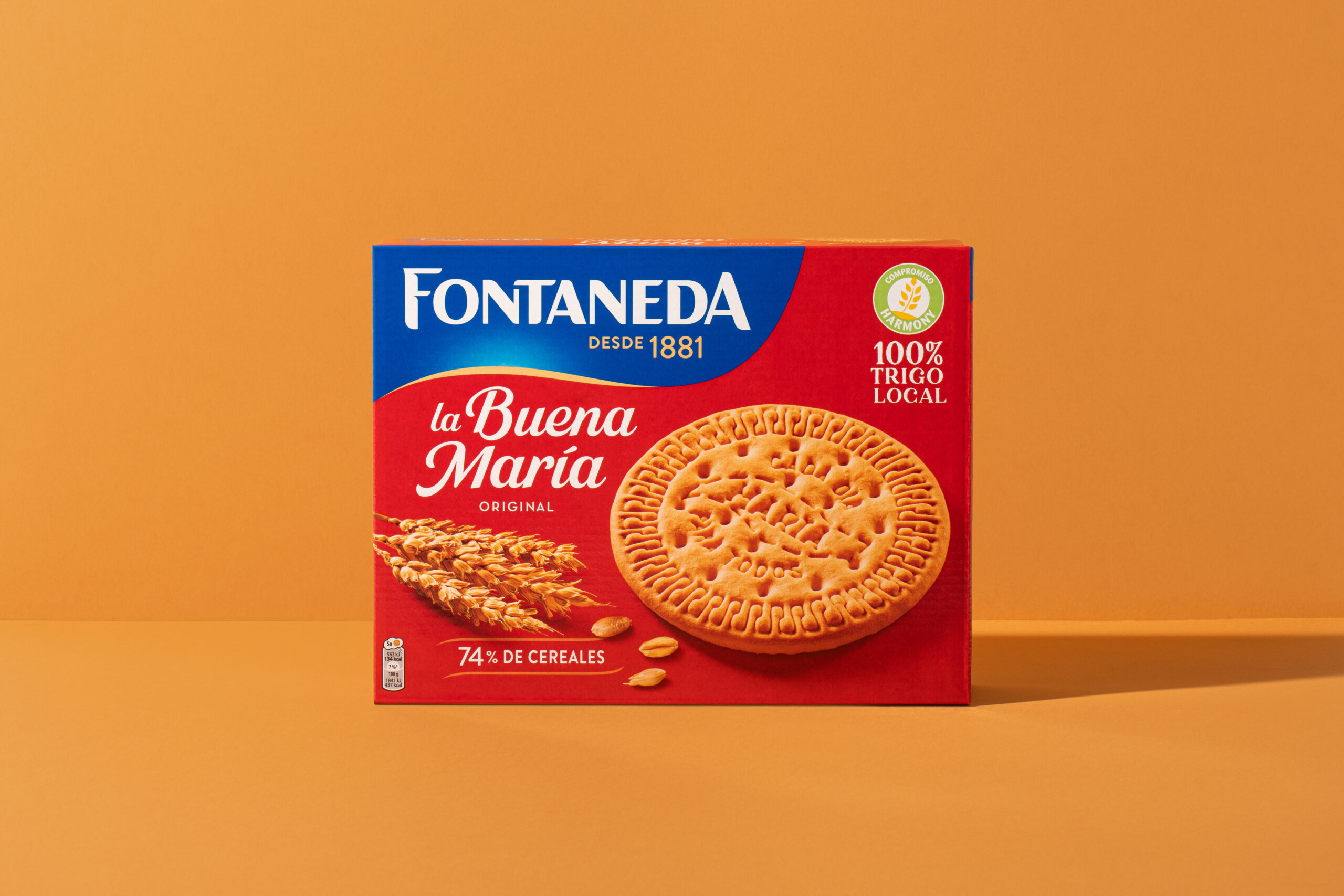
Fontaneda lleva más de 140 años alimentando a nuestras familias.
Con un nuevo y completo portafolio de “Bakery”, ofrece las opciones más tradicionales, icónicas e irresistibles para cada momento.
El reto
El reto consistía en incrementar la notoriedad y relevancia de la marca en el lineal, resaltando el nuevo posicionamiento de la marca: «Cuidando lo nuestro cuidamos de ti”.
La solución
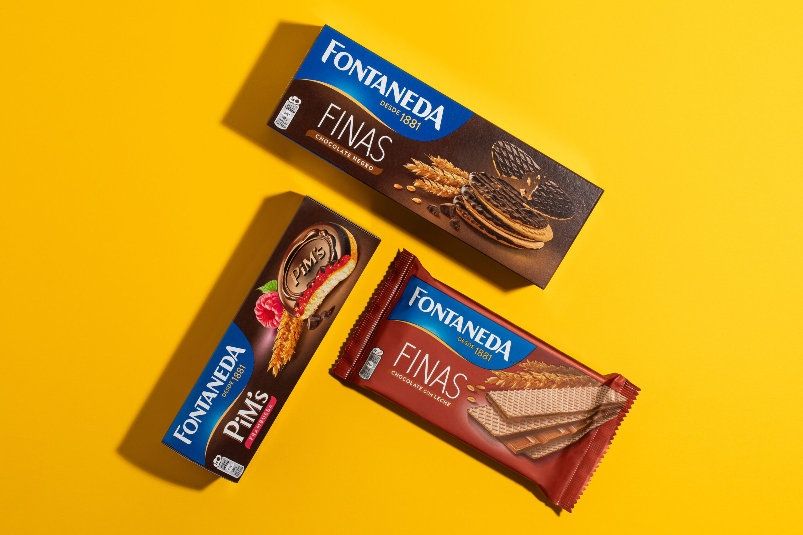
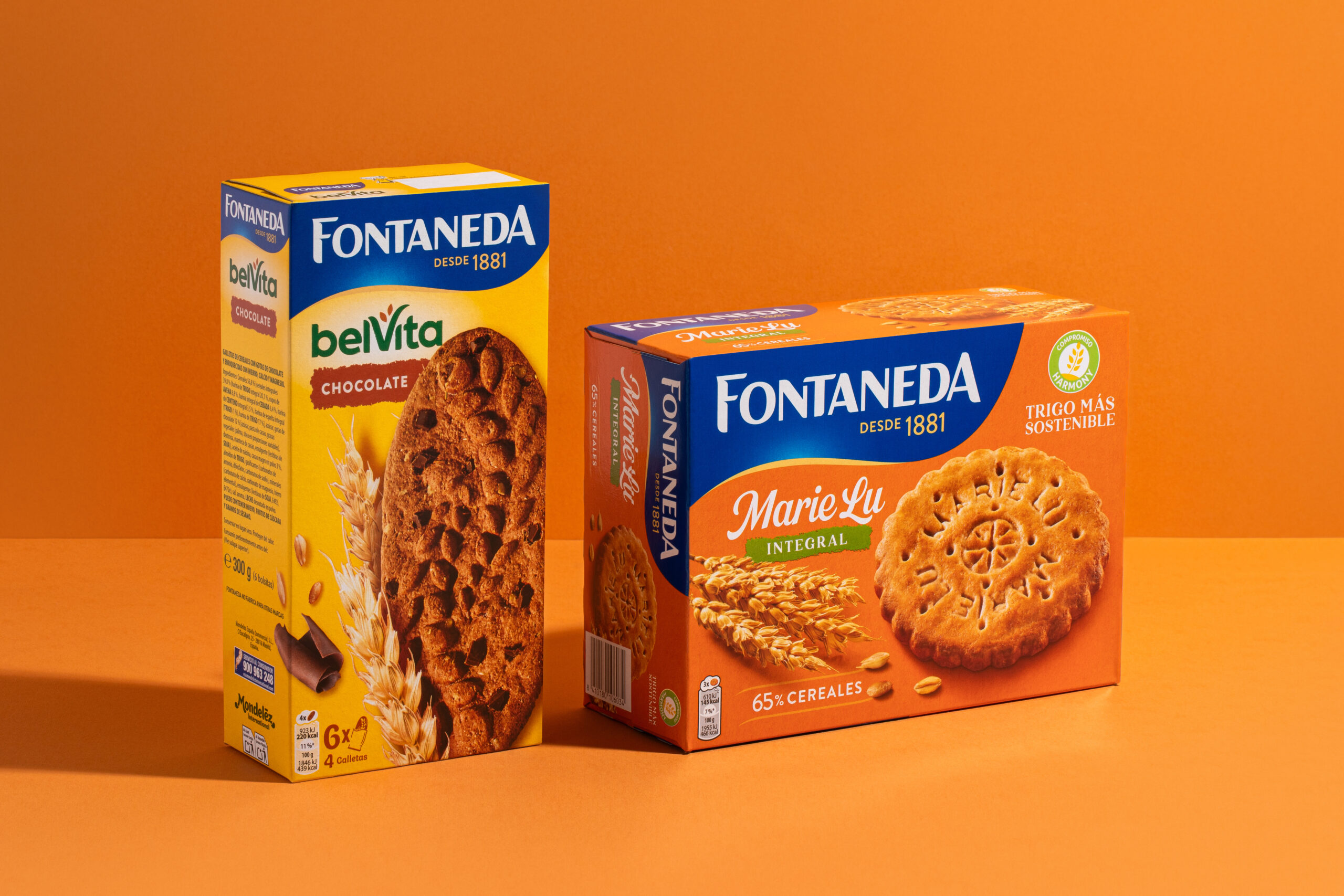
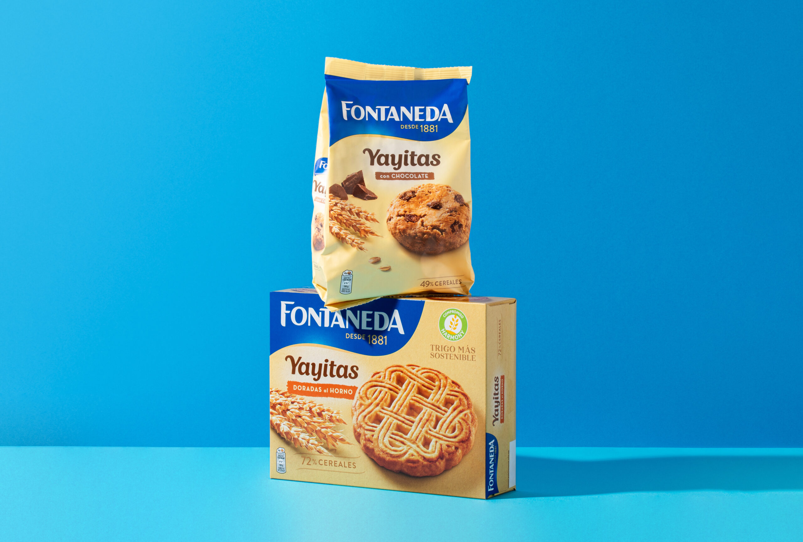
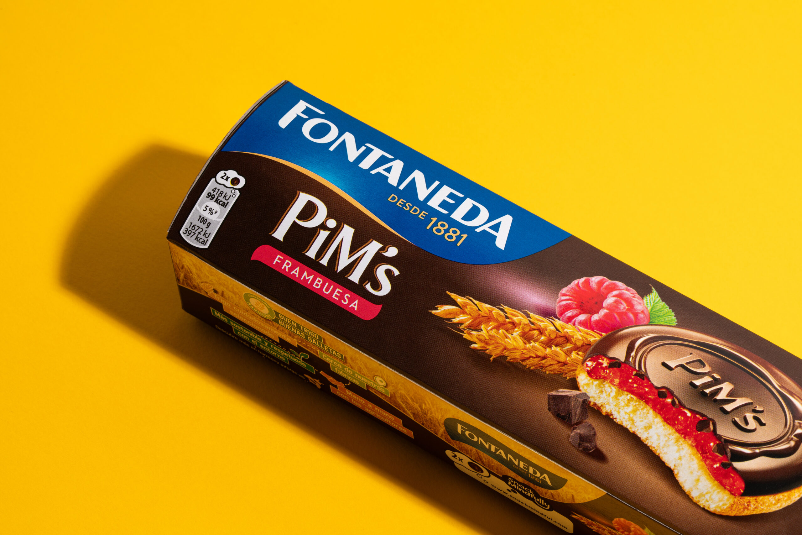
Tres grandes pilares: la simplicidad, con un sistema de packaging que eleva la notoriedad de marca en el lineal. El cuidado, trasladado a través de una nueva estructura de diseño, que representa y clarifica nuestro portfolio. Y la naturalidad, trasladada gracias un proyecto fotográfico que eleva los productos, y los pone en valor, acompañados del ingrediente principal: el trigo.
Simpleza y superioridad en estado puro, tan propios de la marca, que nos hacen ser más Fontaneda que nunca.