with

The context
As a response to an increasingly more aware consumer who is concerned about the ingredients in products they choose for their child, Dodot thought about developing the most natural and pure range of the brand. Aqua Pure is a new product in the DODOT “super premium” segment. It goes for a formula that combines organic cotton and 99% water. The result? Wipes that contain only minimal ingredients for effective yet gentle cleaning.
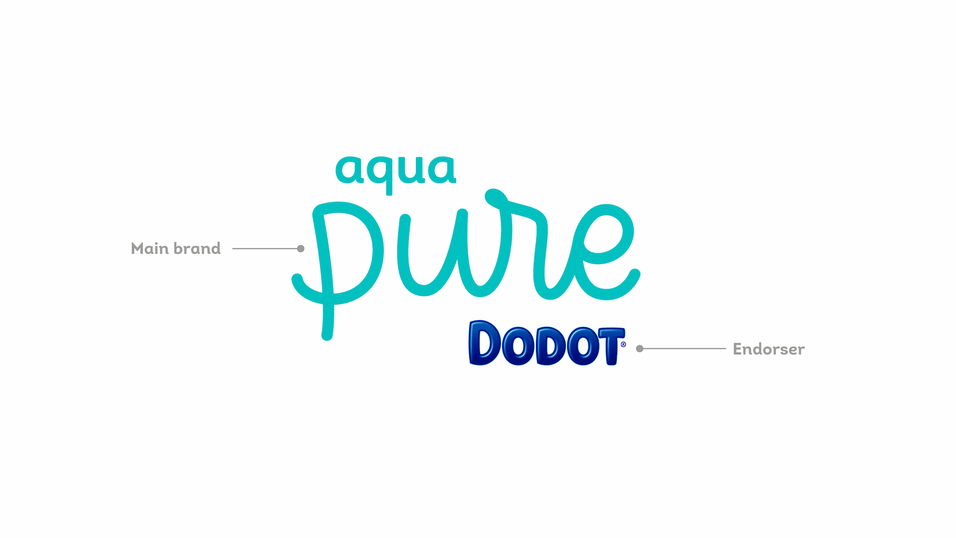
Aqua Pure has been developed to provide an answer to the most discerning consumers: less ingredients with the traditional efficiency. As regards the role of the brand, we define that Dodot must act as an endorser, as a seal of quality and guarantee of the high performance of the product.


Soft and emotional
The packaging design had to be softer, more emotional and more natural than the other DODOT products, but it had to continue transmitting the superiority of a product belonging to the brand. The challenge was in transmitting clearly the main advantage of the product: 99% water.
Naturalness
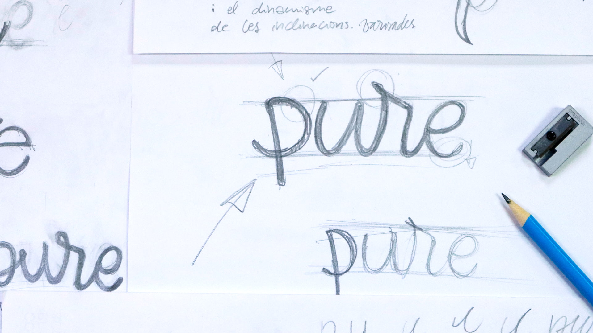
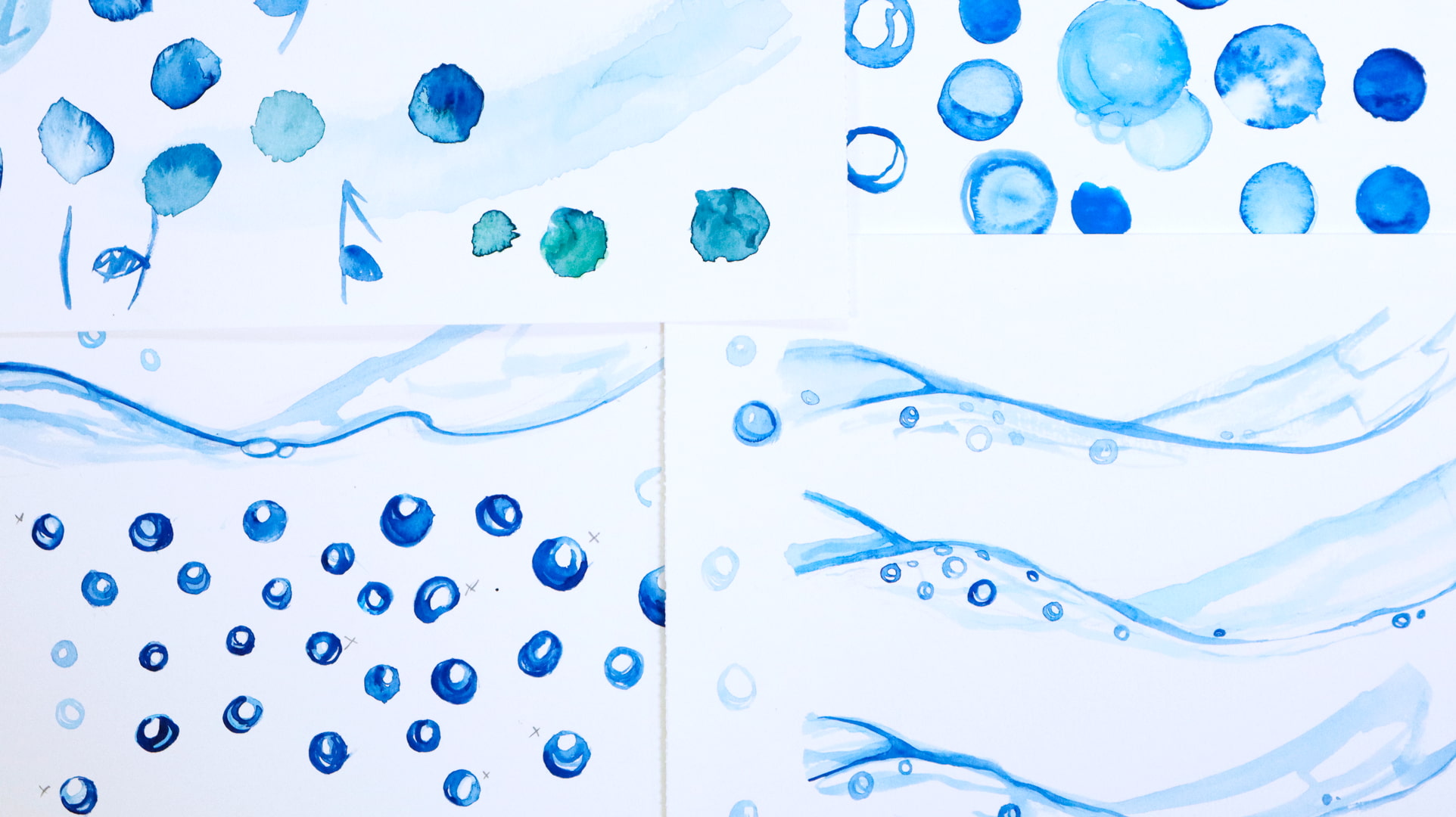
The naturalness of the product would be transmitted with the creation of a new, more hand-made language. The use of hand-made strokes, with watercolours, speaks of the softness and delicacy of the cotton. The logotype, also drawn by hand, is simple and flat; and through the use of pastel colours and a clear and rounded calligraphy, we perceive the purity and protection of our babies.
A hand-made reinterpretation of the “Dodot curve” and with a touch of green, link our product to the rest of the range. The replacement of the blue Dodot brand block on the upper part for white speaks to us of purity and cleanliness; the two main values of the product.


