with


Illusion & fun
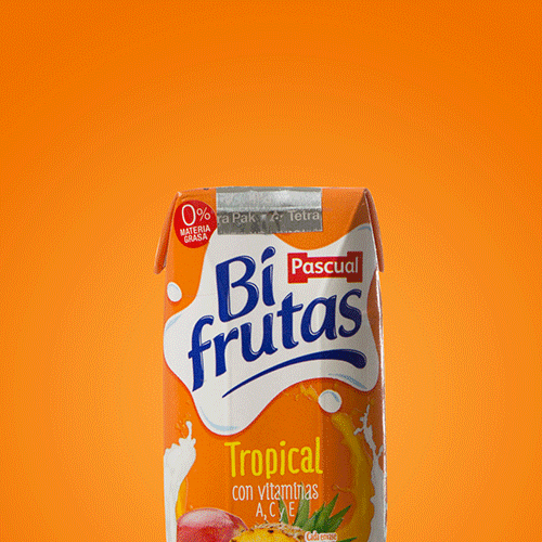
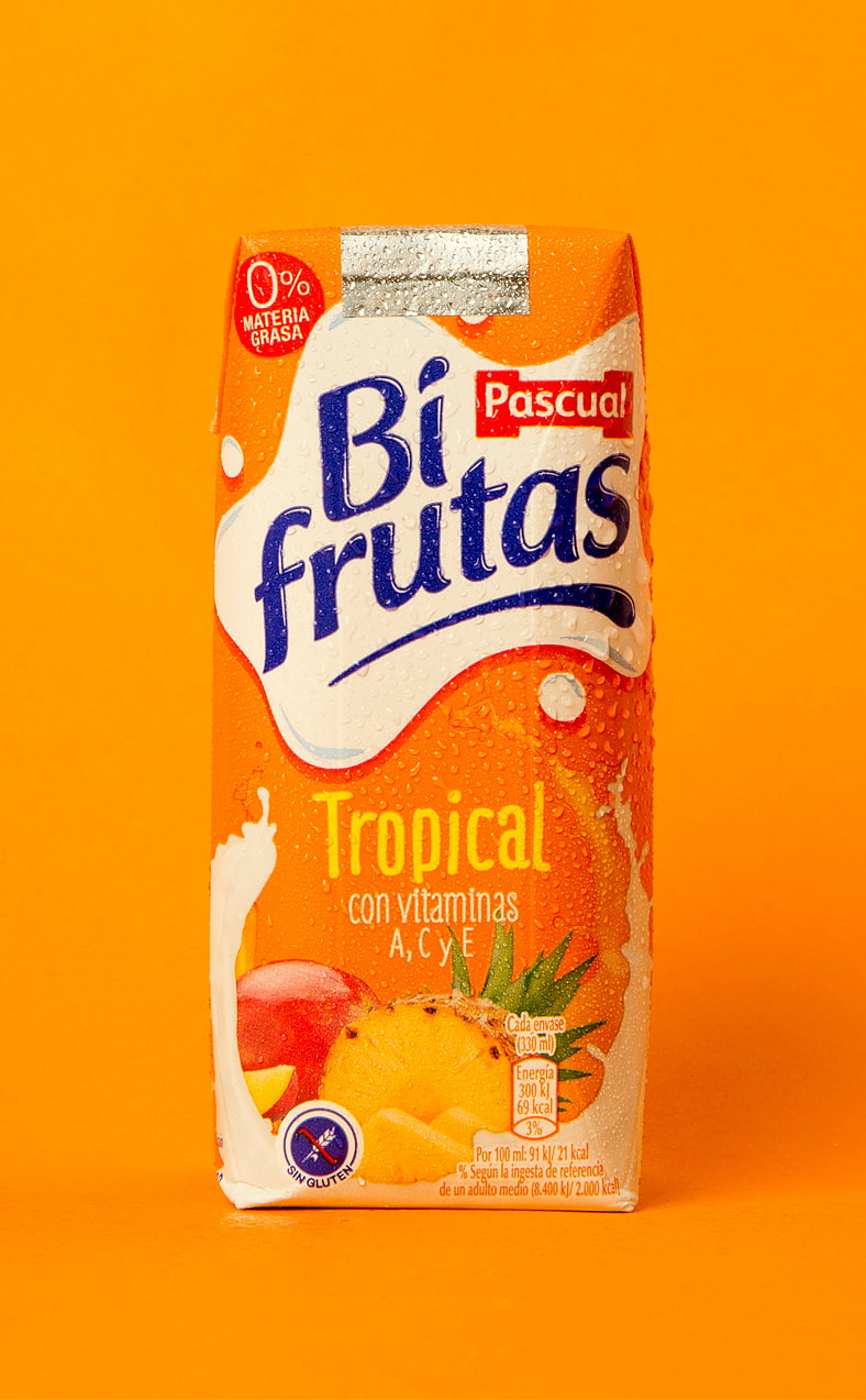
Bifrutas, the mixed drink made from fruit juice and milk, renovates its image to come closer to children and teenagers while highlighting its brand atributes. Lust for life, optmism and fun are all values supporting the visual identity we worked on.

The challenge…
The challenge for Columna consisted in evolving the brand to make it more dynamic, energetic and eventually resonate with consumers. The graphic treatment in this redesign involved reworking the type in Bifrutas to add movement, symplify and make each letter more uniform. The white background shape was redrawn to gain more volume to communicate more appetite appeal. Finally, Pascual’s logo (mother company) is kept within the brand as an endorser.
The result…
Together, all visual elements build a brand that conveys trust and tells the story of a refreshing drink for those ready to live life to the fullest. In keeping with this new and refreshing brand identity, the packaging design for various formats was created.
con
Bifrutas
Ilusión y diversión
La Bebida de zumo y leche Bifrutas renueva su imagen para potenciar sus atributos y acercarse a su target madres, niños y adolescentes. La ilusión, el disfrute, el optimismo y la diversión son algunos de los valores que sustentan la marca y definen la identidad gráfica sobre la cual hemos trabajado.
El reto…
El reto de Columna consistió en evolucionar la marca para darle más dinamismo, energía y reforzar el vínculo con los consumidores. La intervención gráfica consistió en retrabajar el lettering de la palabra Bifrutas, simplificando elementos para darle más movimiento y uniformidad. La mancha blanca del logotipo se redibujó para dotarla de más volúmen y apetitosidad. Por último se incorporó la marca de Calidad pascual como «endorser» dentro del nuevo logo.
El resultado…
Todos los elementos visuales en conjunto construyen una marca que transmite confianza y comunica el beneficio de una bebida que refresca a aquellos que tienen ganas de beberse el mundo. A partir de la nueva marca se rediseñó el packaging en sus distintos formatos prisma, lata y horeca.