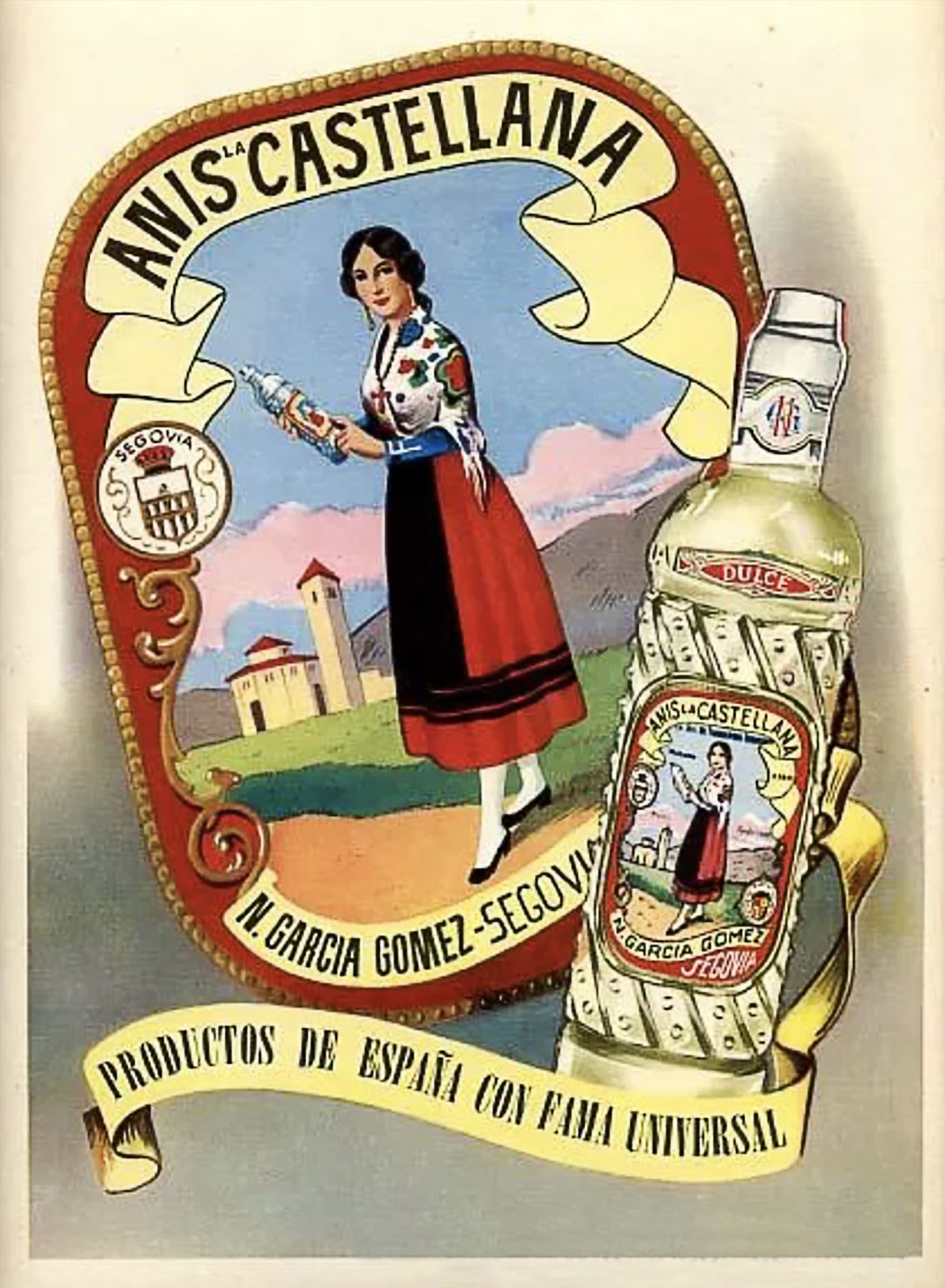
La Castellana, an iconic anise brand, was founded in 1894 by the family of Nicomedes García in Segovia.
The company was born from the founder’s dream: “To create a quality product that endures over time, the result of true craftsmanship, and that contributes to the growth of the land where he was born.”
Everything about the brand speaks of love for the craft, of quality, and of a way of life that transcends time.
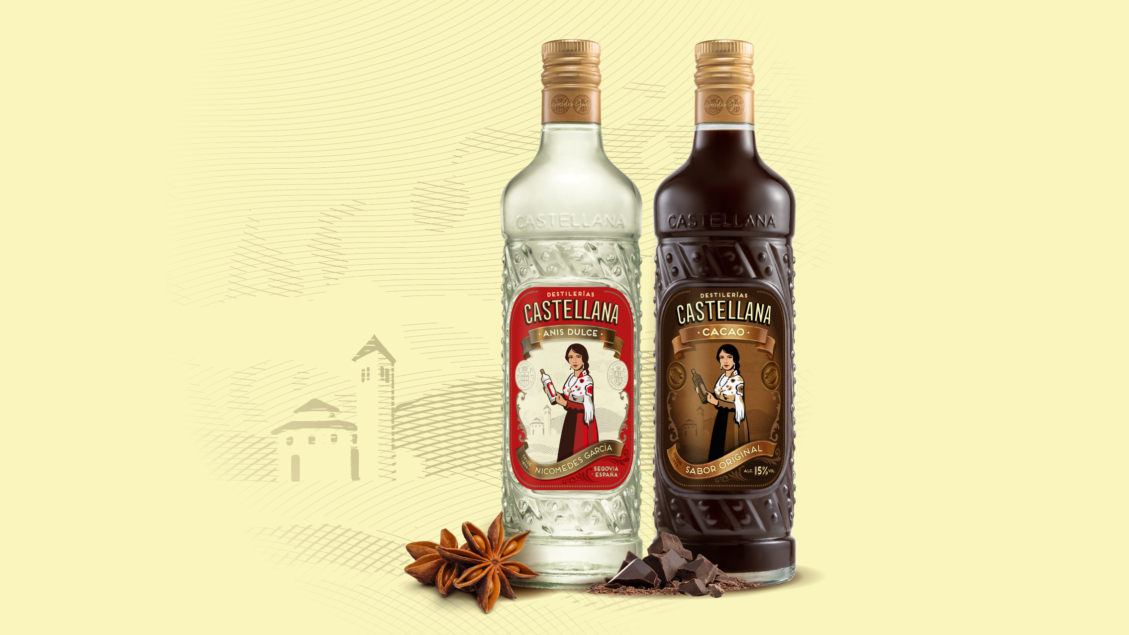
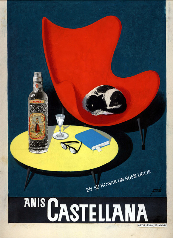
Its iconic bottle and “La Castellana” figure featured on the packaging design had accompanied the brand for over 100 years.
Beam Suntory approached us with a challenging project. The goal was to relaunch the brand and create a new brand architecture aligned with future non-anise product territories, such as La Castellana Cacao—created to extend and enrich a very local moment: “la sobremesa” (after-dinner conversation).
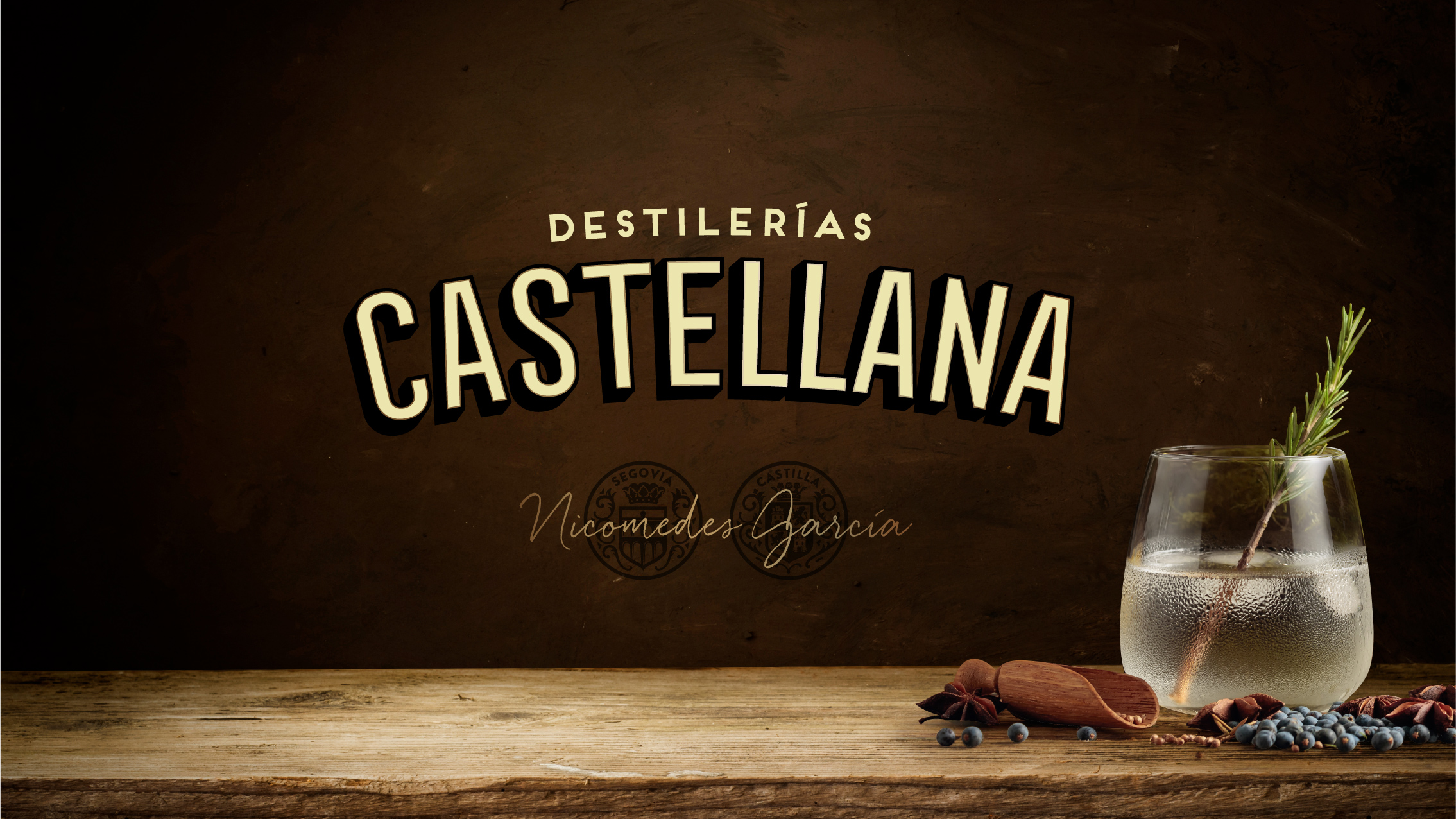
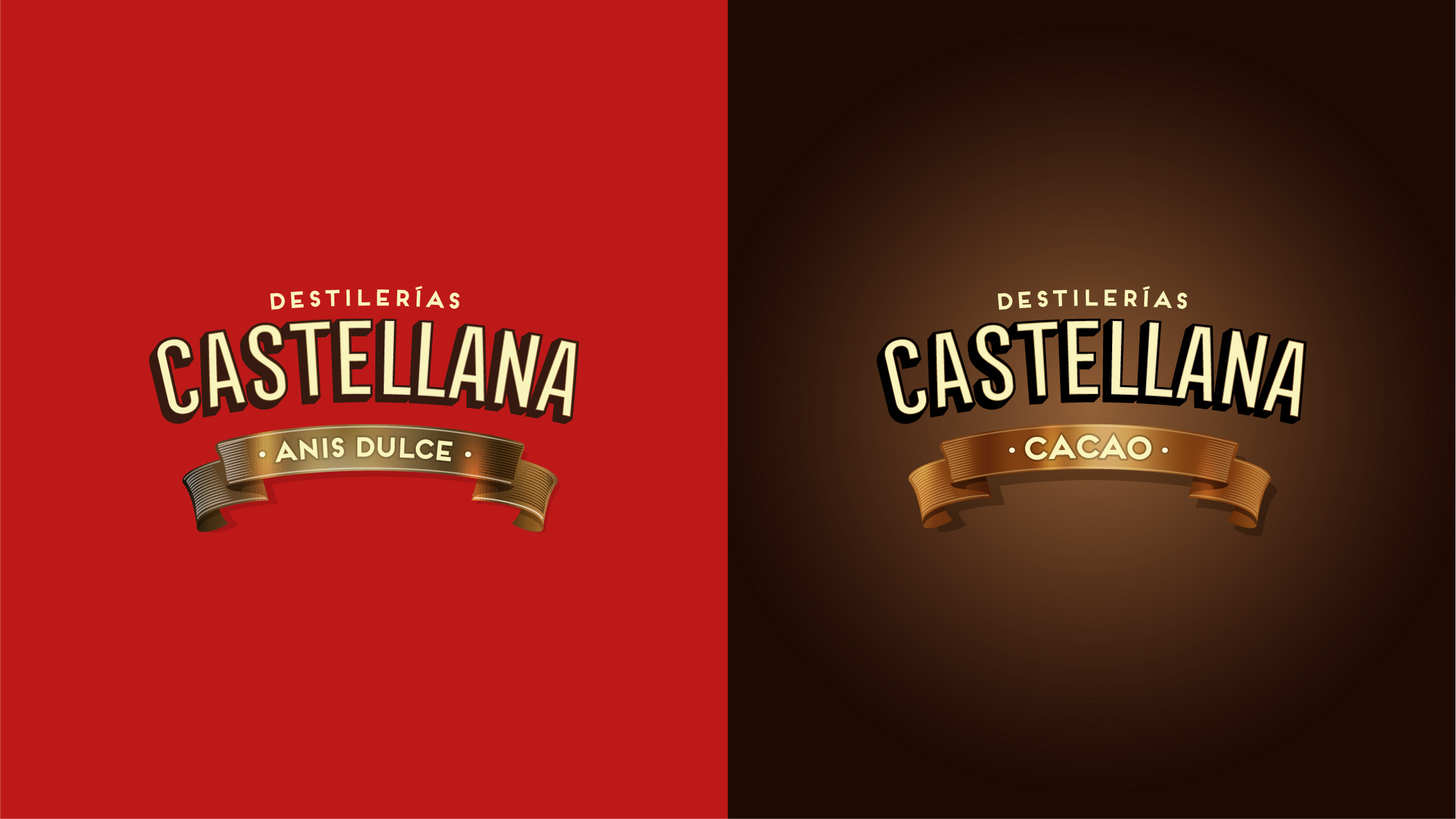
Introducing Destilerías Castellana
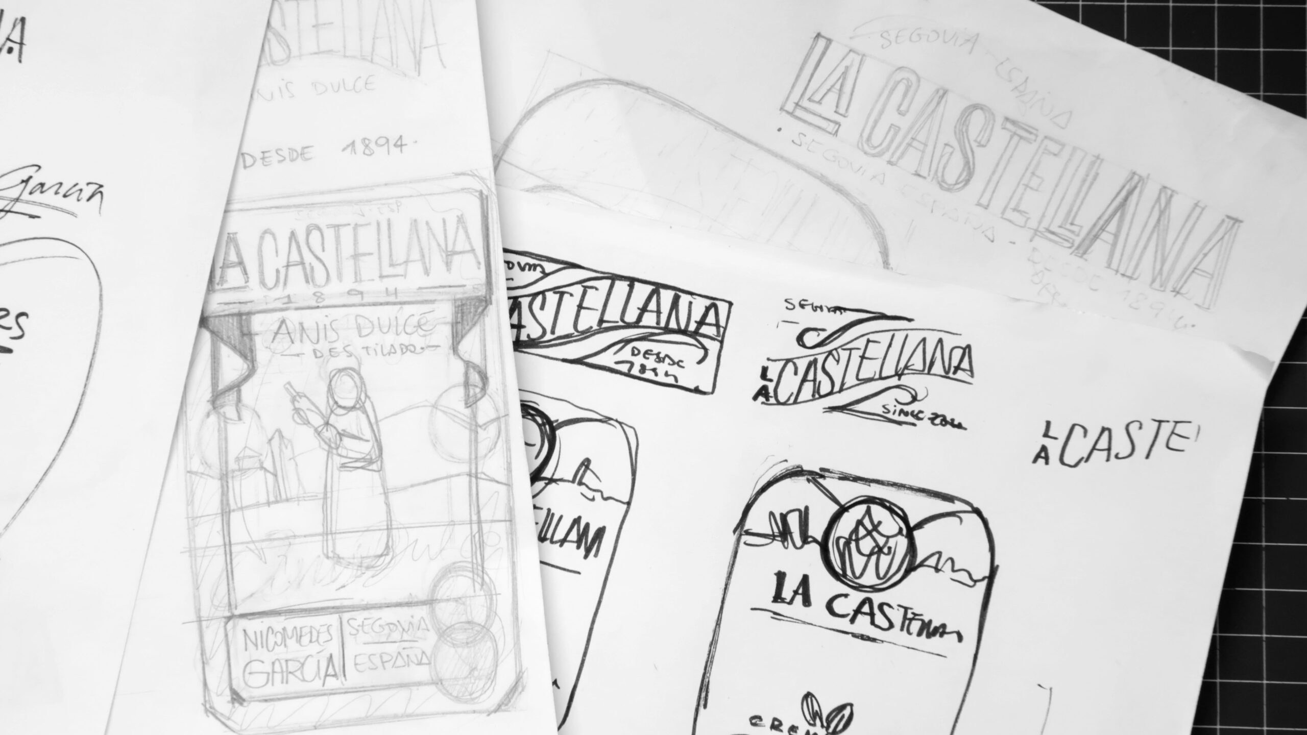
The project began with in-depth research into the brand’s 100+ year history, aiming to uncover its essence, reinterpret it, and project it forward. During the process, together with the Beam Suntory team, we discovered old invoices signed by “Destilerías Castellana” and realized the brand needed to take a step back in time.
We needed to evolve its name back to “Destilerías Castellana,” which it once was, granting the brand enough credentials to go beyond the anise category and the expertise needed to open up its portfolio to meet new consumer needs.


A new paradigm, a new design
The design work was meticulous and highly respectful of the brand’s visual language. We needed to enhance the brand’s iconicity, building on its heritage and the legacy it had carried for nearly a century.
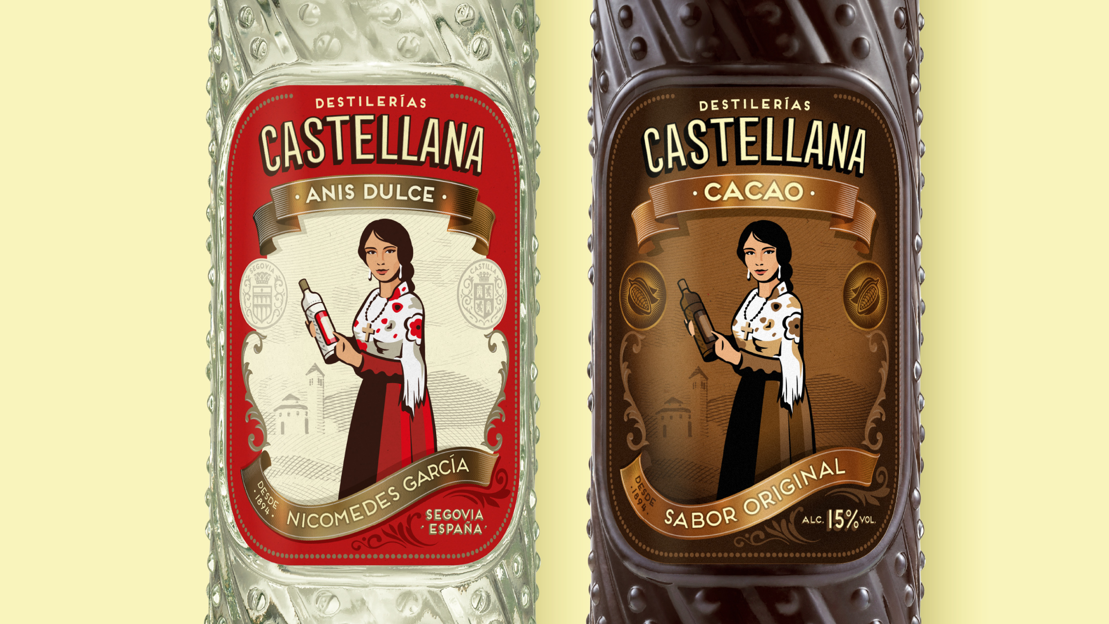
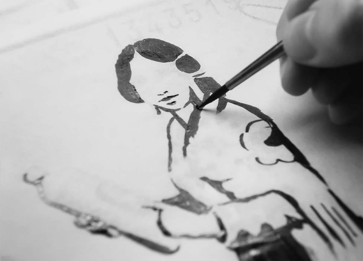
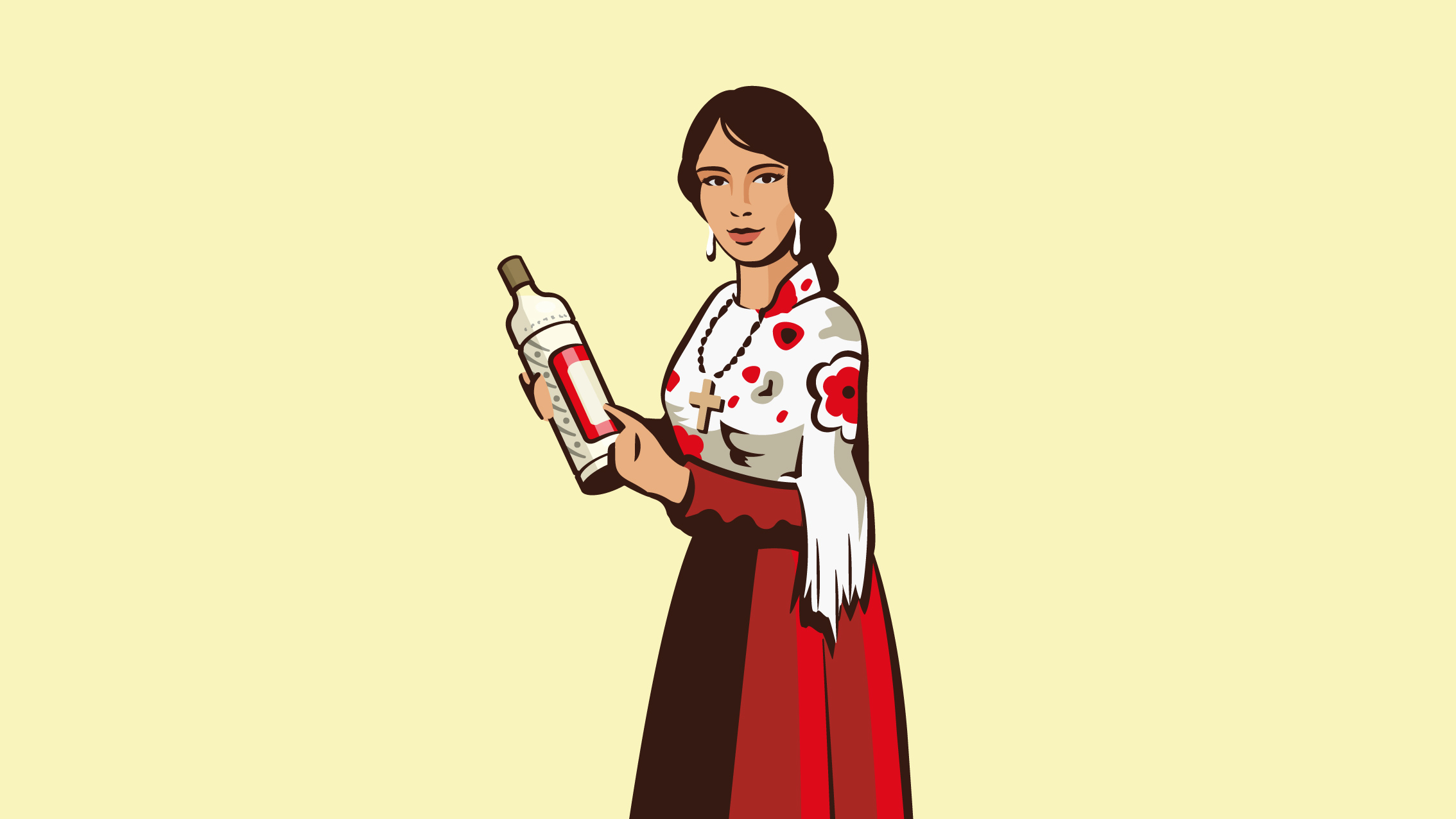
From the start, one thing was clear: the female character on the label had to become the brand’s key visual. We reworked the illustration of “La Castellana” to turn her into an icon—more distinctive, more prominent, and above all, with more character. We wanted her to be charming, but also to express personality—a bit like our products: pleasant on the palate but with an unmistakable twist.
We maximized the size of our new key visual and simplified it to improve recognition at small sizes and from long distances.

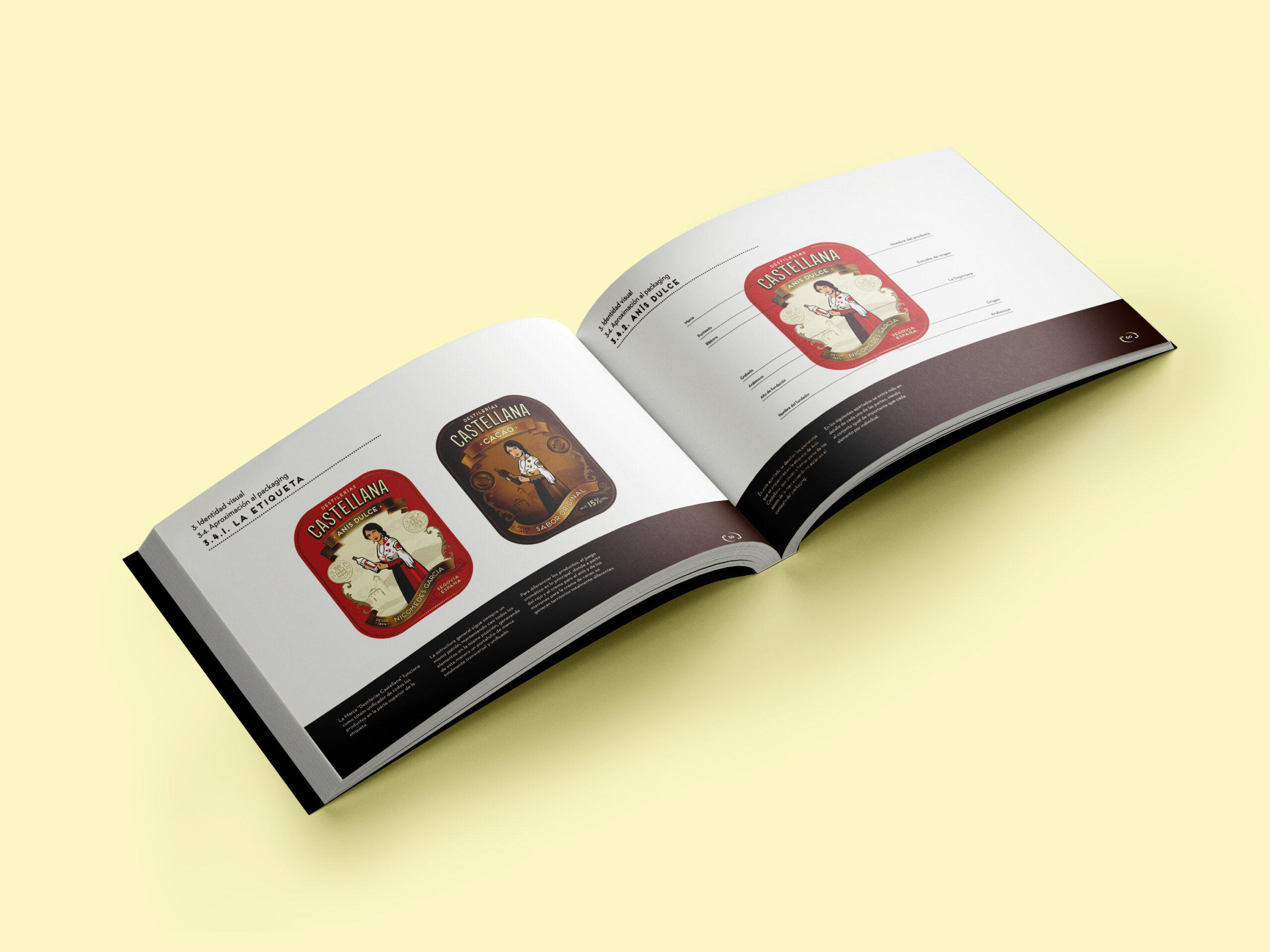
The label, a tribute
As for the rest of the label’s design, we approached it with the brand’s new positioning in mind: Honest, unpretentious; made to be enjoyed, savored, slowly and with great pleasure.
And so the label design is full of details and small tributes to the founder and his hometown: Segovia. It seeks to highlight the value of heritage, which allows us to craft a product and design that is both current and appealing to today’s consumer.
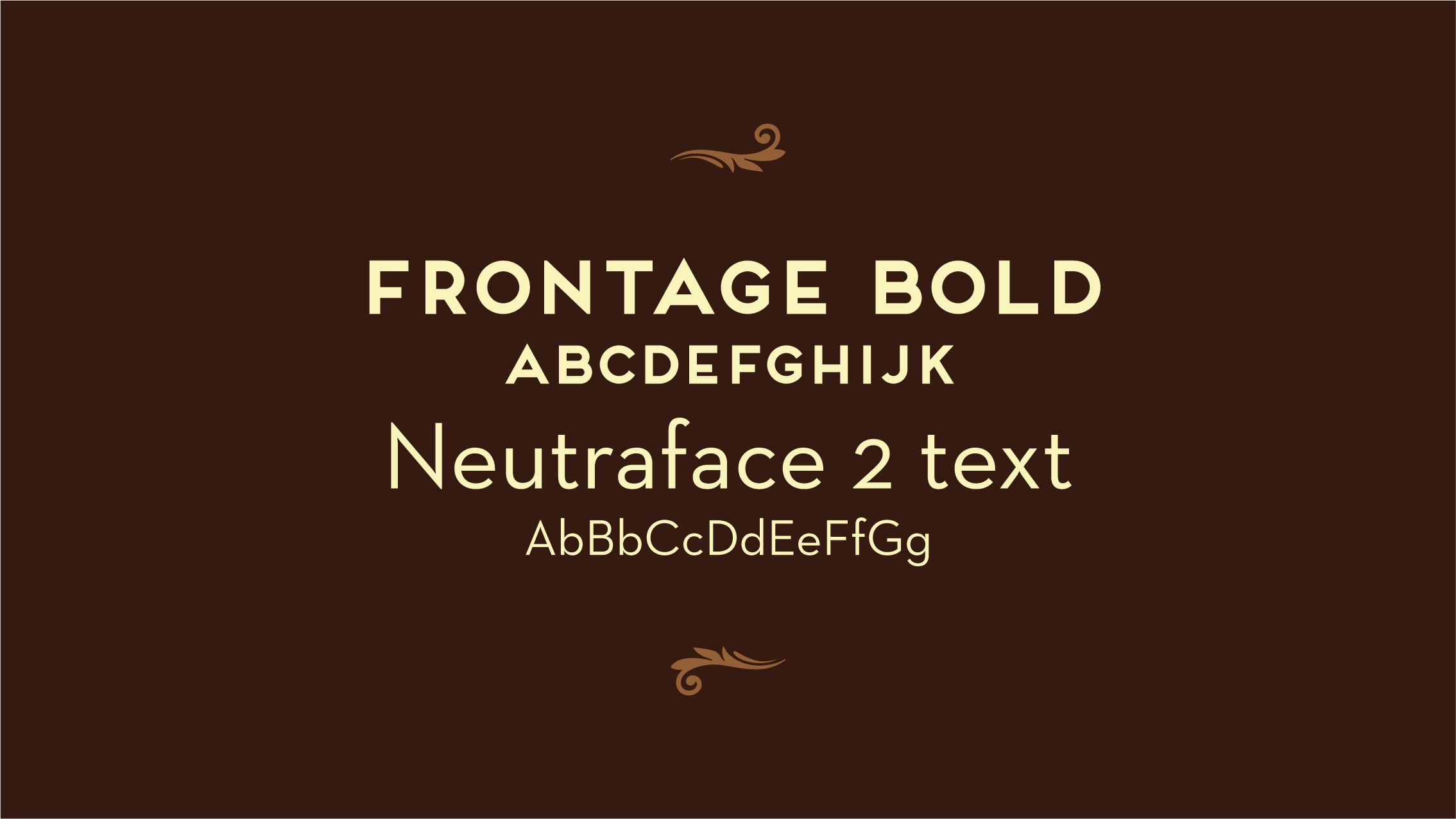
The brand’s typography was also redrawn by hand based on Frontage Condensed, refining every point with the craftsmanship the brand deserves. The result: a balanced yet robust composition. Slightly reminiscent of the past, but modern and on trend.
Finally, we had to identify unifying and differentiating design elements that would allow us to expand the range. Creating assets so each of our product variants could speak the language of its respective category.
Thus, we developed two highly differentiated designs, yet with a deeply shared heritage.
The result? A design to savor, sip by sip. Rich in nuance and slightly complex. But undoubtedly, made to be enjoyed slowly.