https://www.youtube.com/watch?v=LZf1uM7gQGg
Pergamon is not only a tribute to Galen, but also to other historical figures associated with medicine and science in antiquity. In terms of signage, we transformed functionality into aesthetics, in perfect harmony with the building’s raw materials: concrete, iron, wood, earth, wild vegetation. A design that gives the whole space a museum-like, livable, and warm style.
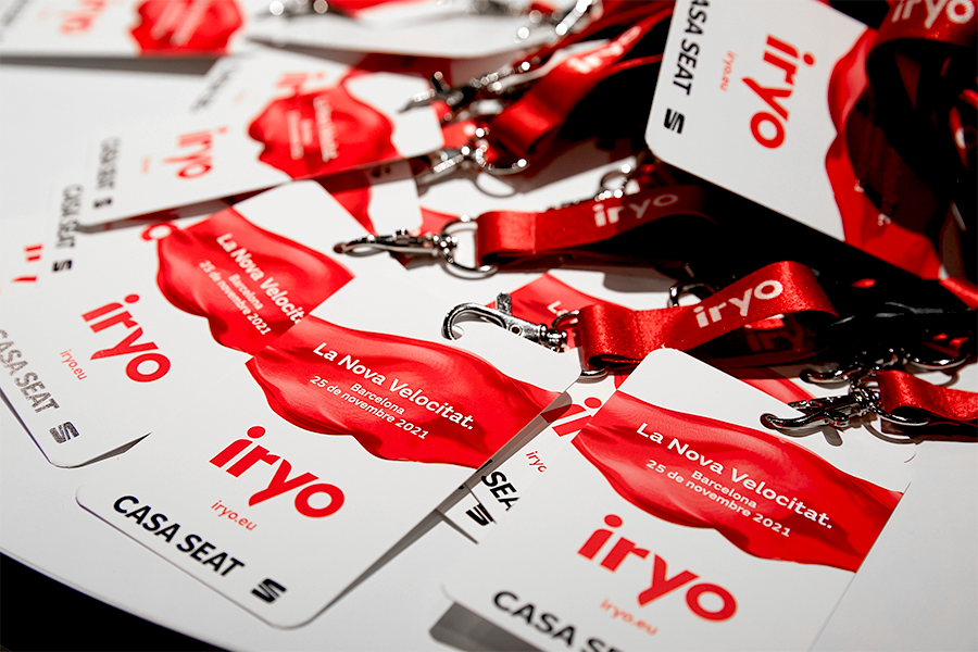
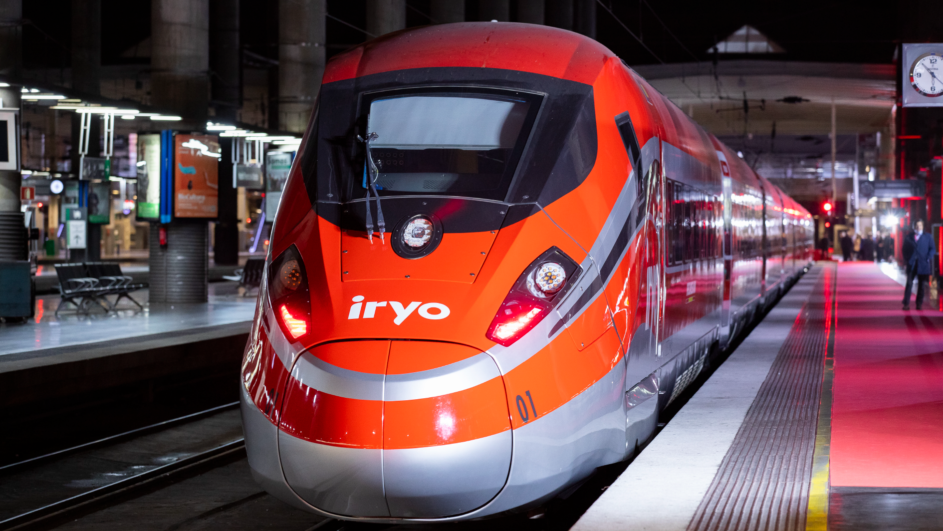
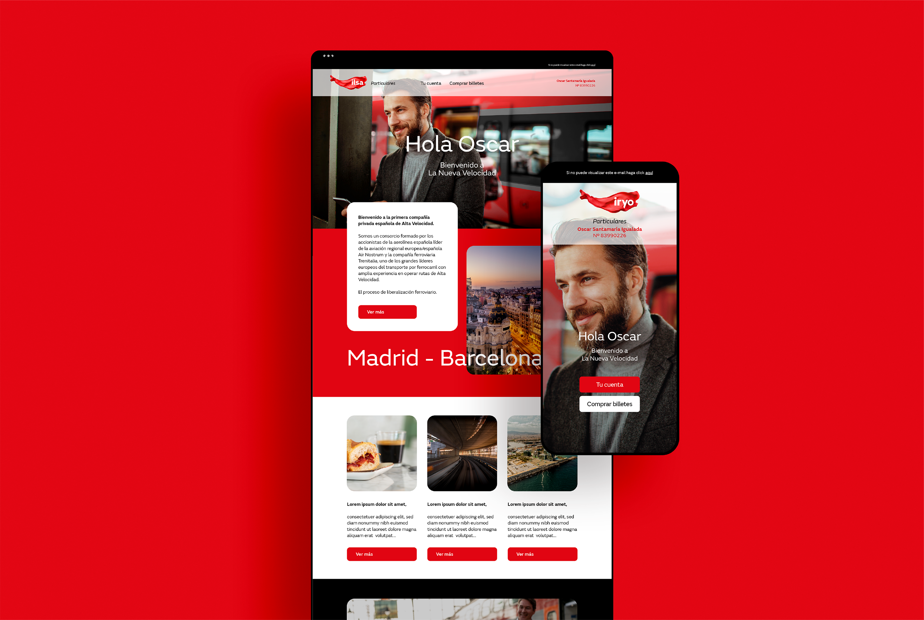
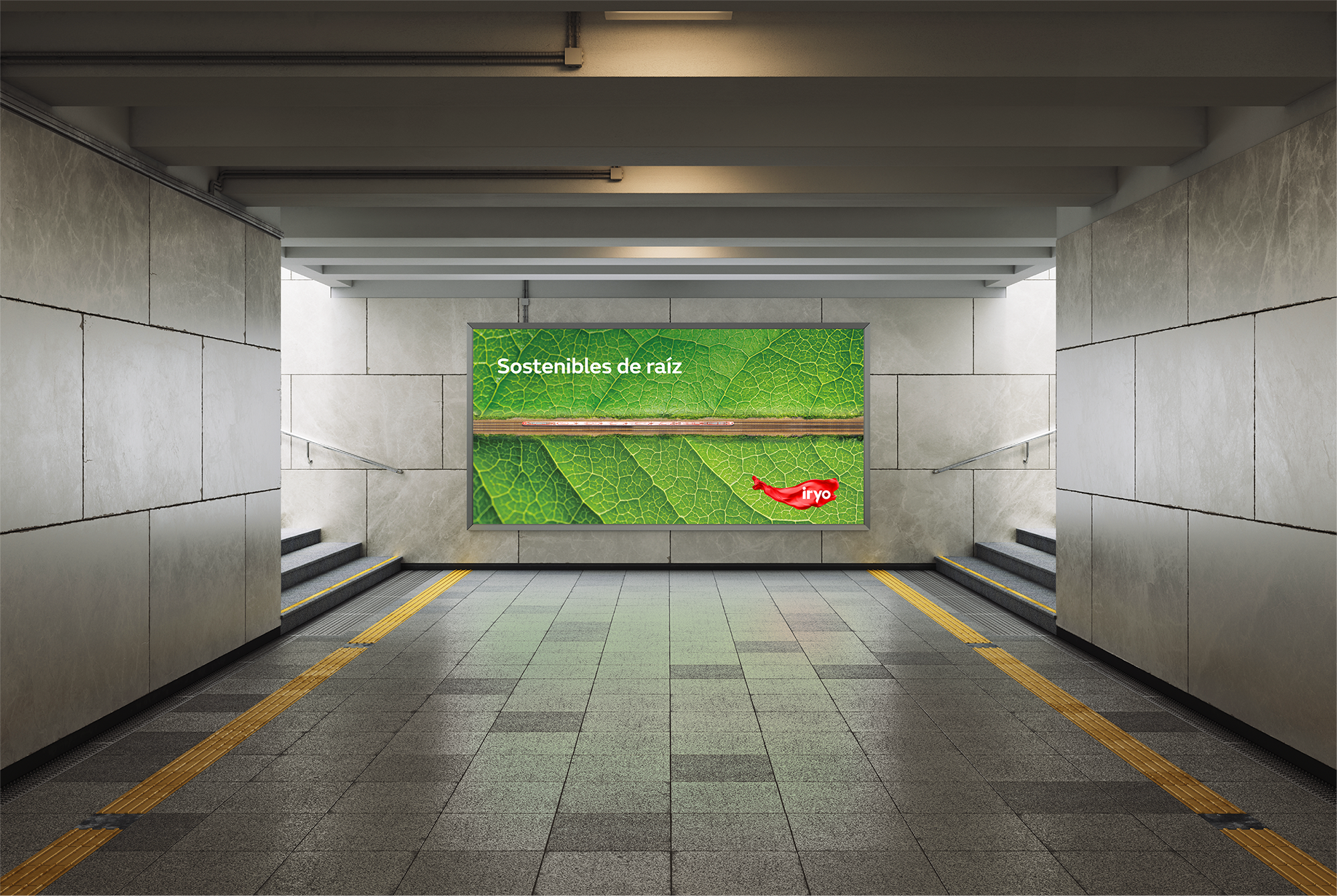
It is within this context that ILSA — a consortium formed by shareholders from Air Nostrum and the railway company Trenitalia — enters the market, deciding to launch its new commercial brand, led by the most modern, quiet, and sustainable train fleet in Europe.
https://www.youtube.com/watch?v=caxWN0tNCs0
The challenge
To create the new commercial brand for ILSA, the new player in Spain’s high-speed rail market.
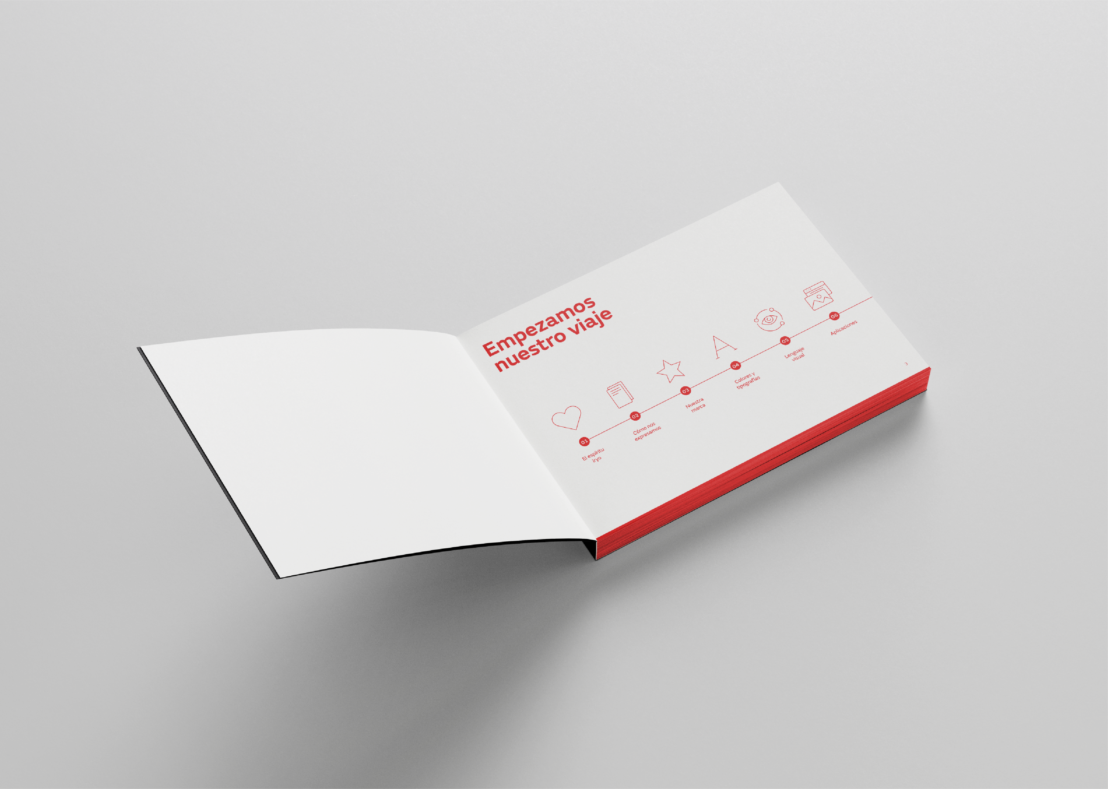
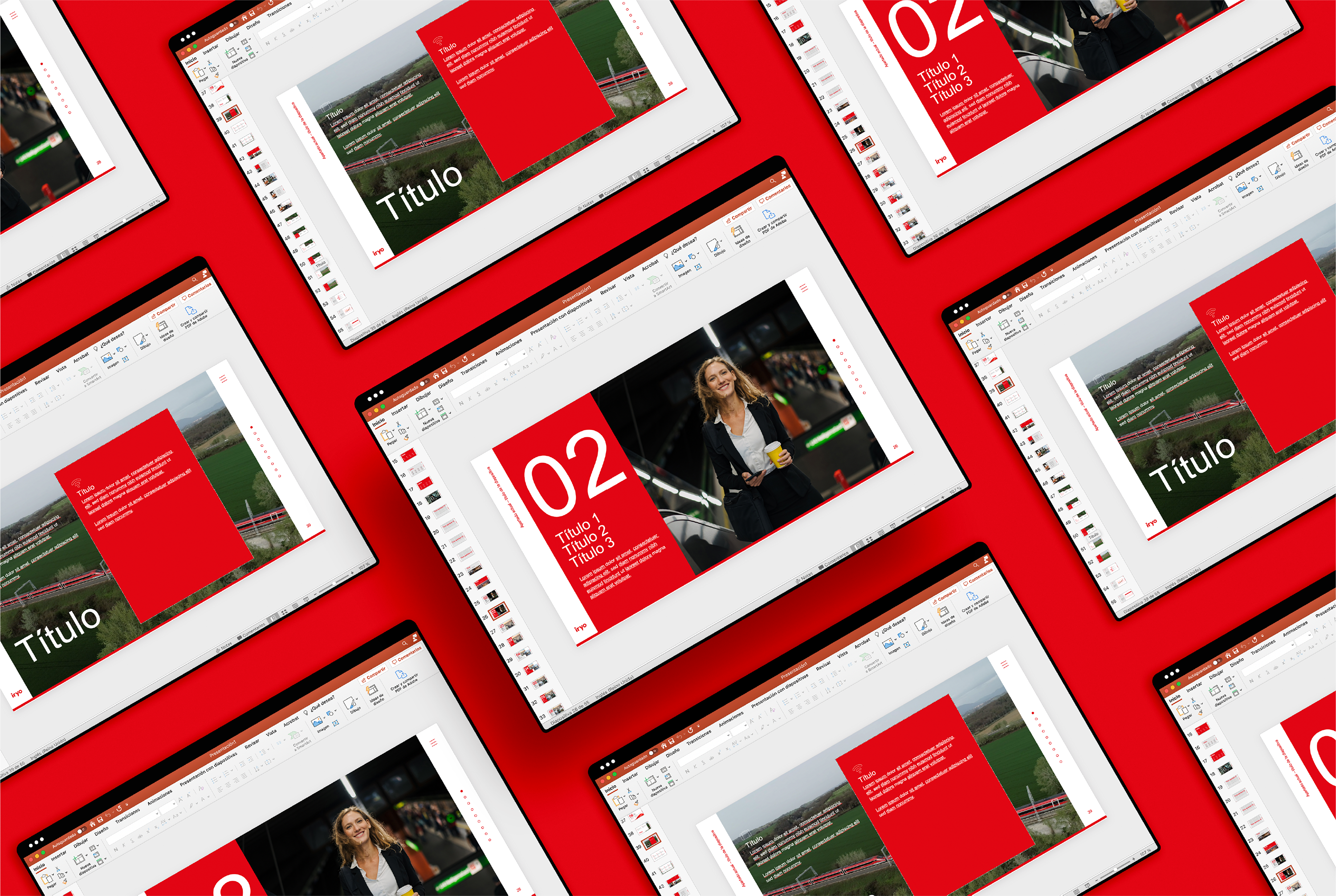
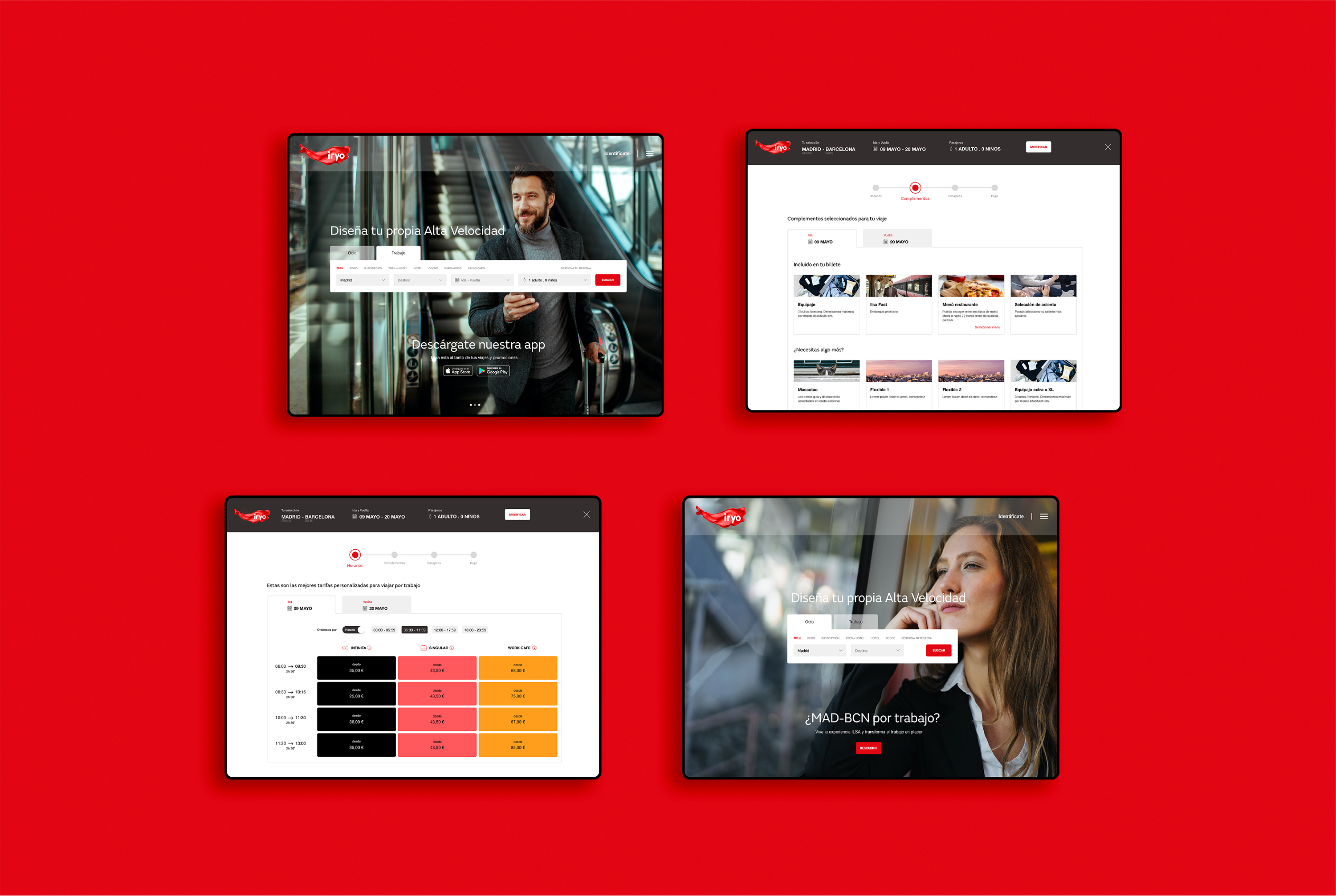
A comprehensive and complex project covering everything from the creation of the name, brand concept, and strategy, to its actual launch. And, of course, providing solutions for any needs that may arise in the day-to-day operations of such a far-reaching brand.
The challenge? To generate a differentiated positioning from other new competitors in the market, away from already explored territories. All with a clear purpose: to create a before and after in the high-speed sector in Spain.
The freedom to choose
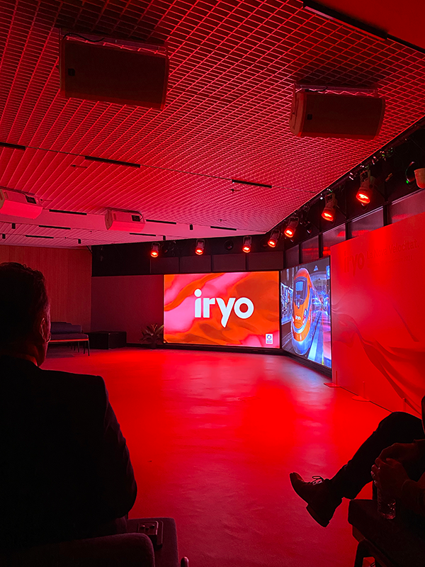
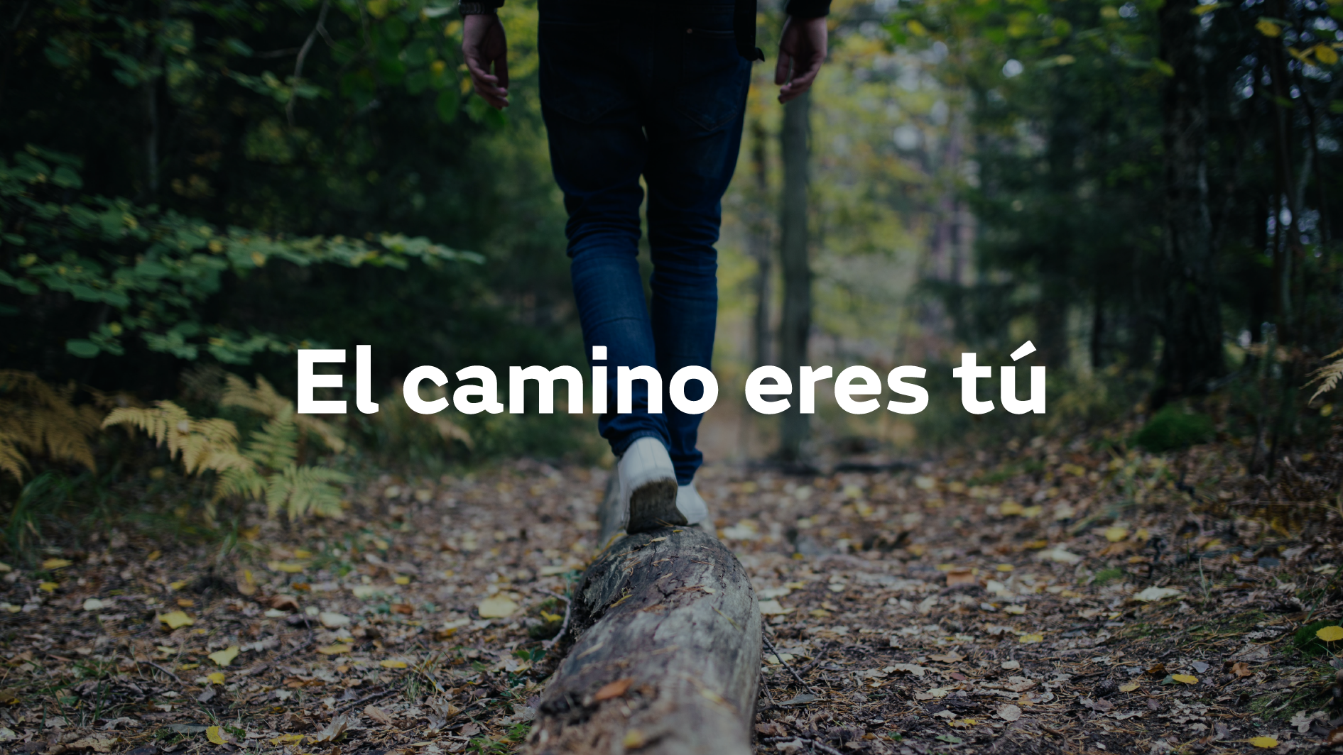
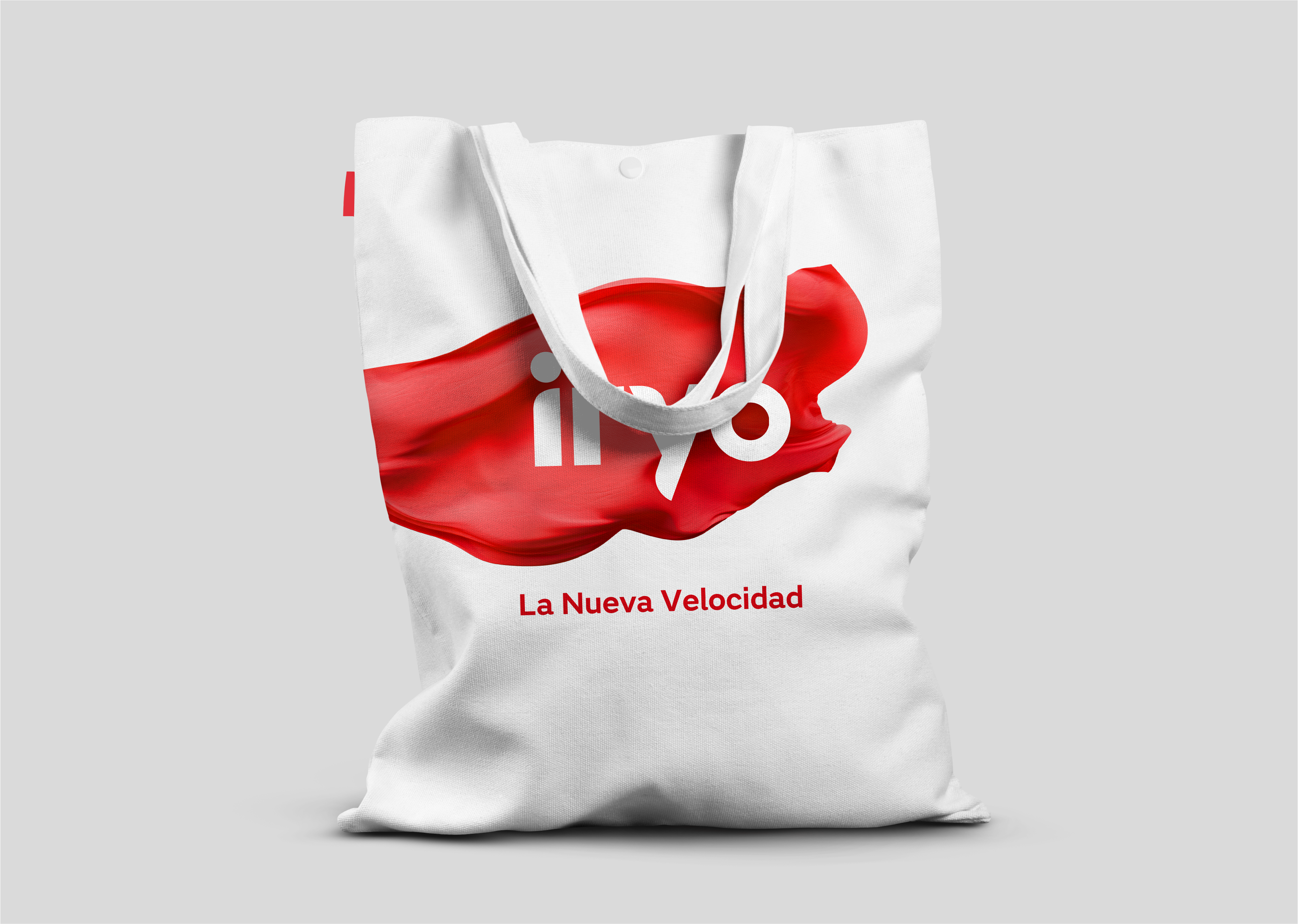
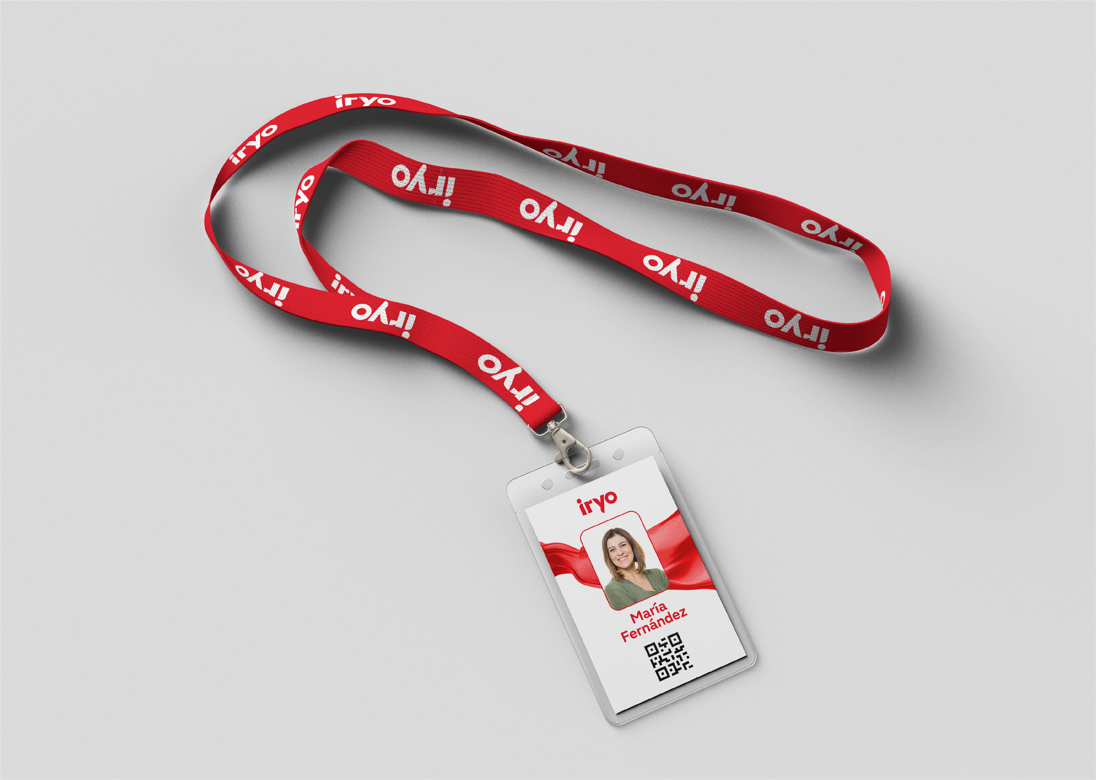
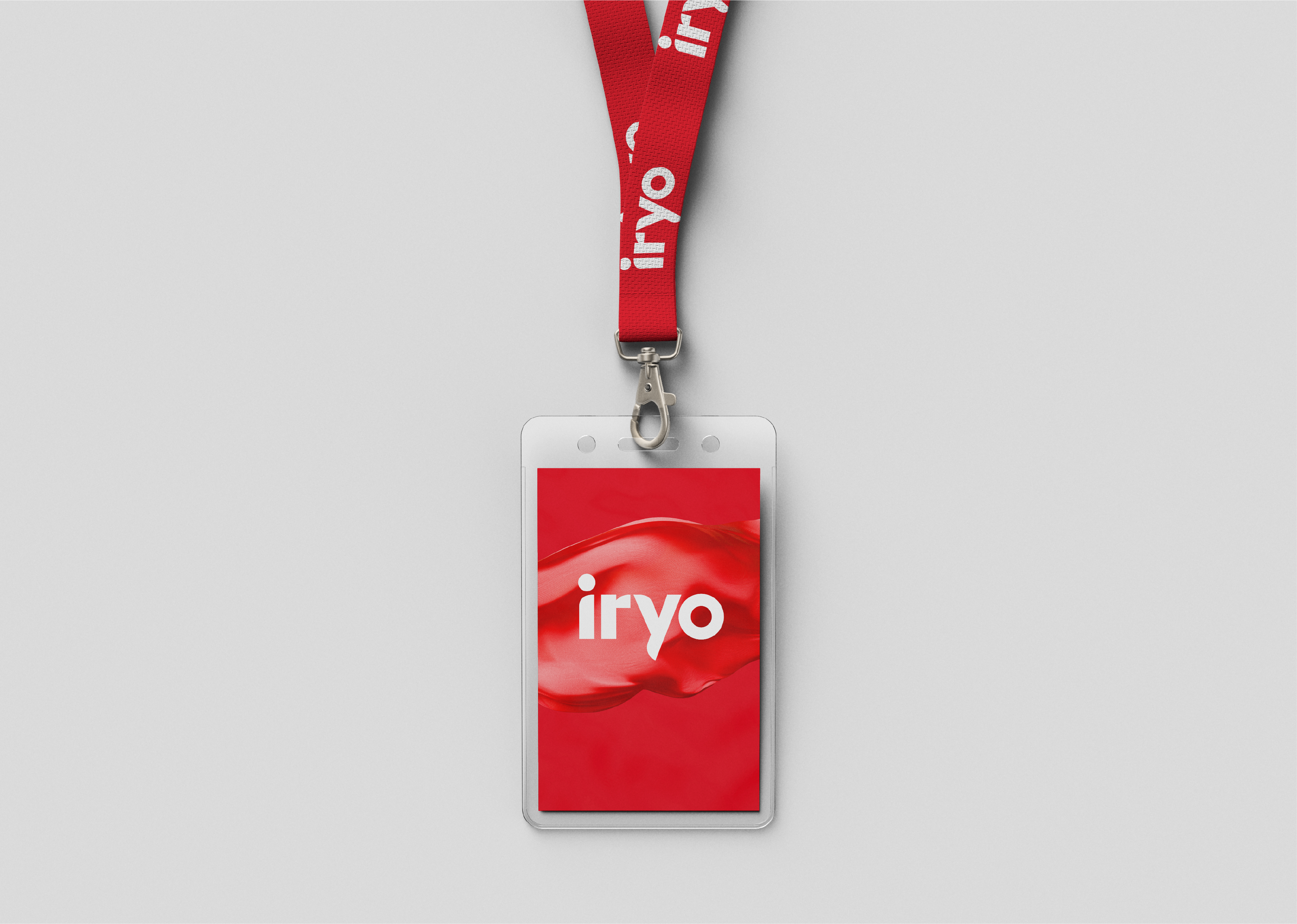
The result is a brand concept based on the freedom to choose one’s own path. More than the destination, it’s the journey we decide with every step we take. It’s personal, yet shared, and as Machado wrote, the path is made by walking. This concept is embedded in the brand name itself — iryo — and in its core essence: “you are the journey.”
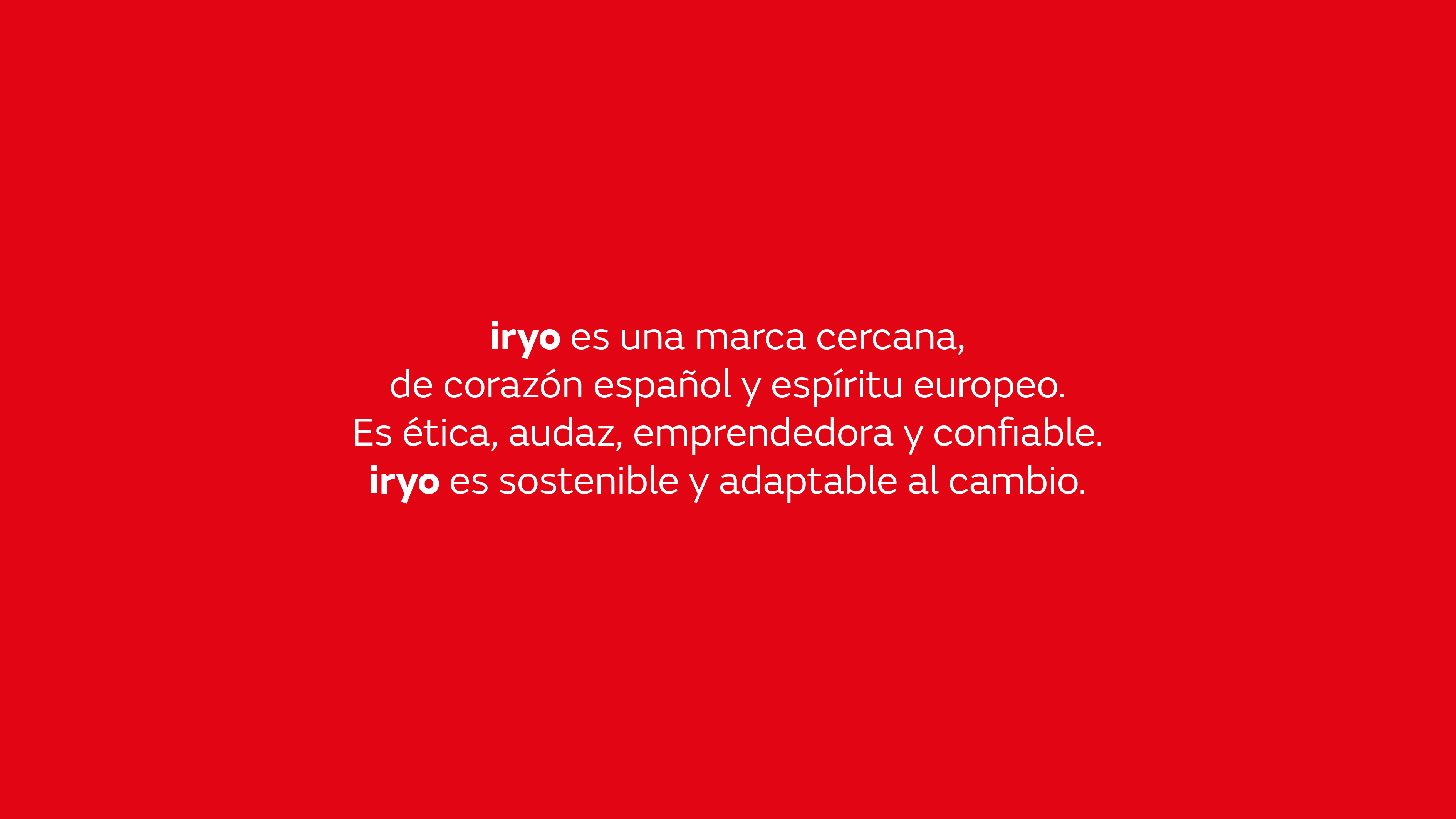
iryo represents a form of mobility unlike anything we’ve known. A brand that embraces new ways of living, connecting, and moving. iryo opens the door to a new era of mobility: the New Speed.
El naming
The name is built upon fundamental values and pillars: people, passion, life, and technology. Formed by the words “ir” (to go) and “yo” (I), it speaks to the simplicity of what’s essential. The use of lowercase further reinforces its service-driven identity, always close to people and placing them at the center.
With a fluid and abstract sound, the brand projects internationally and transcends language barriers.
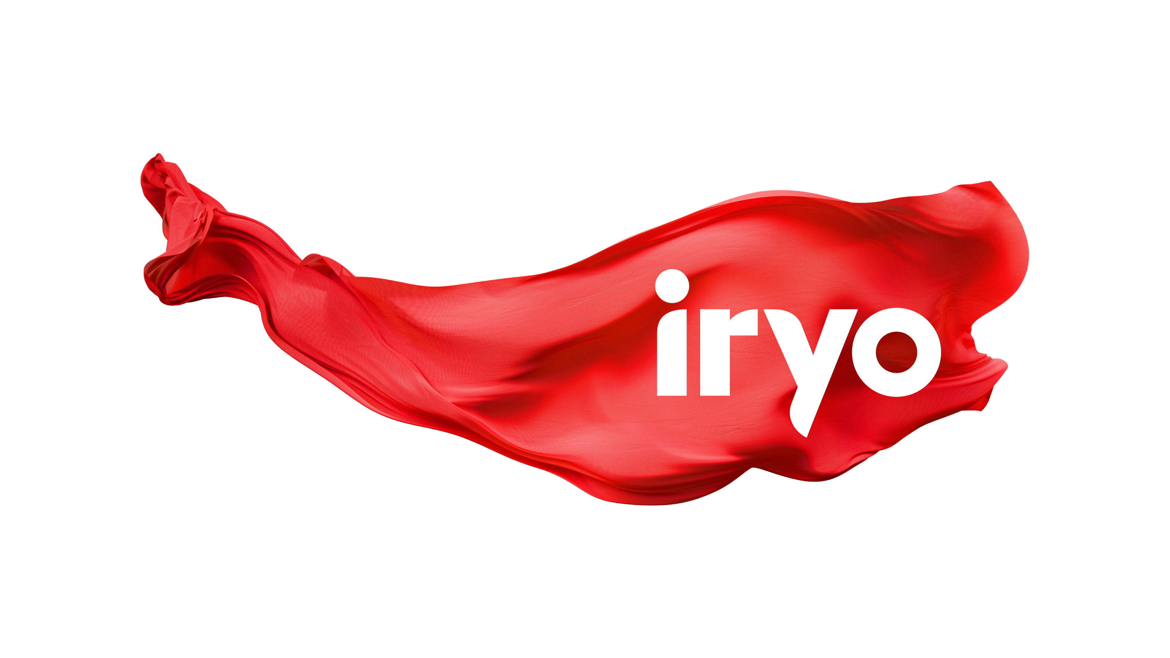
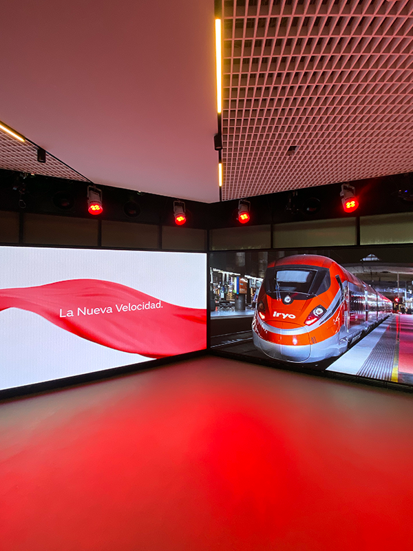
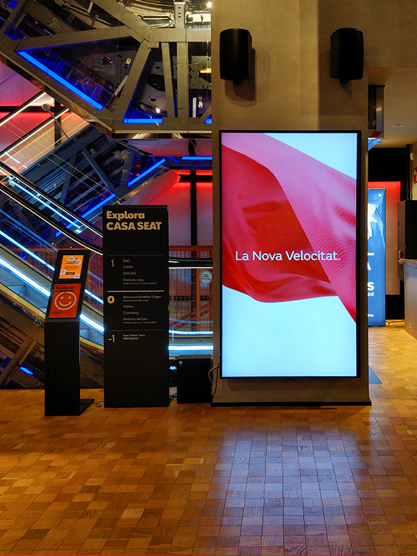
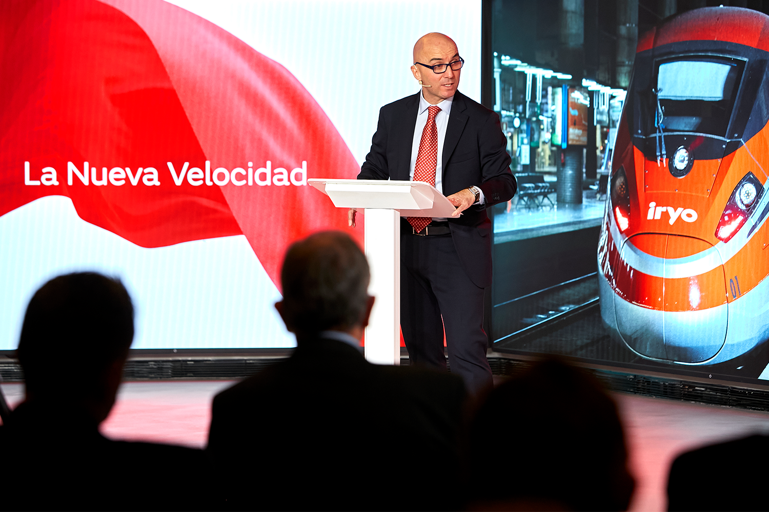
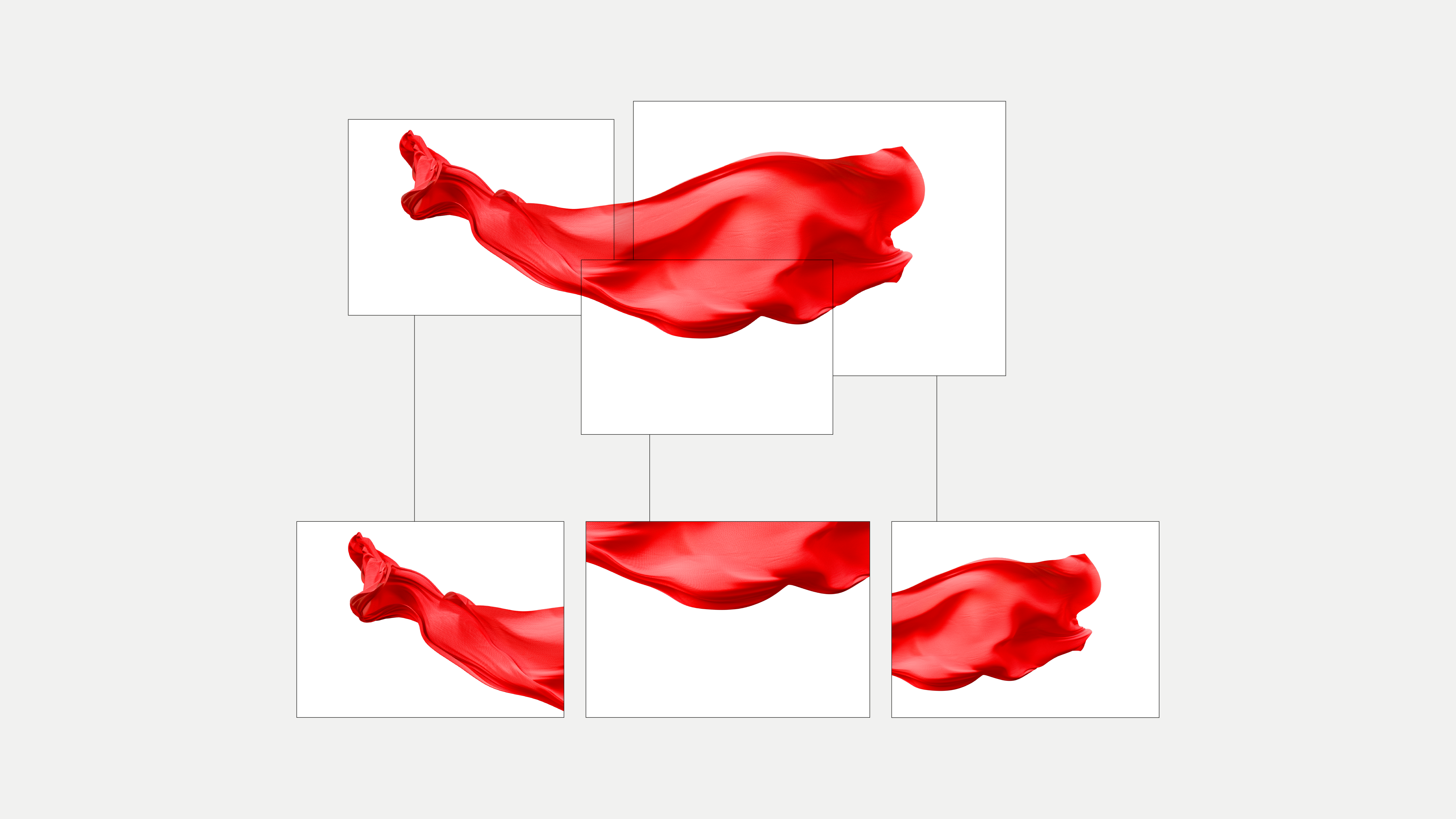
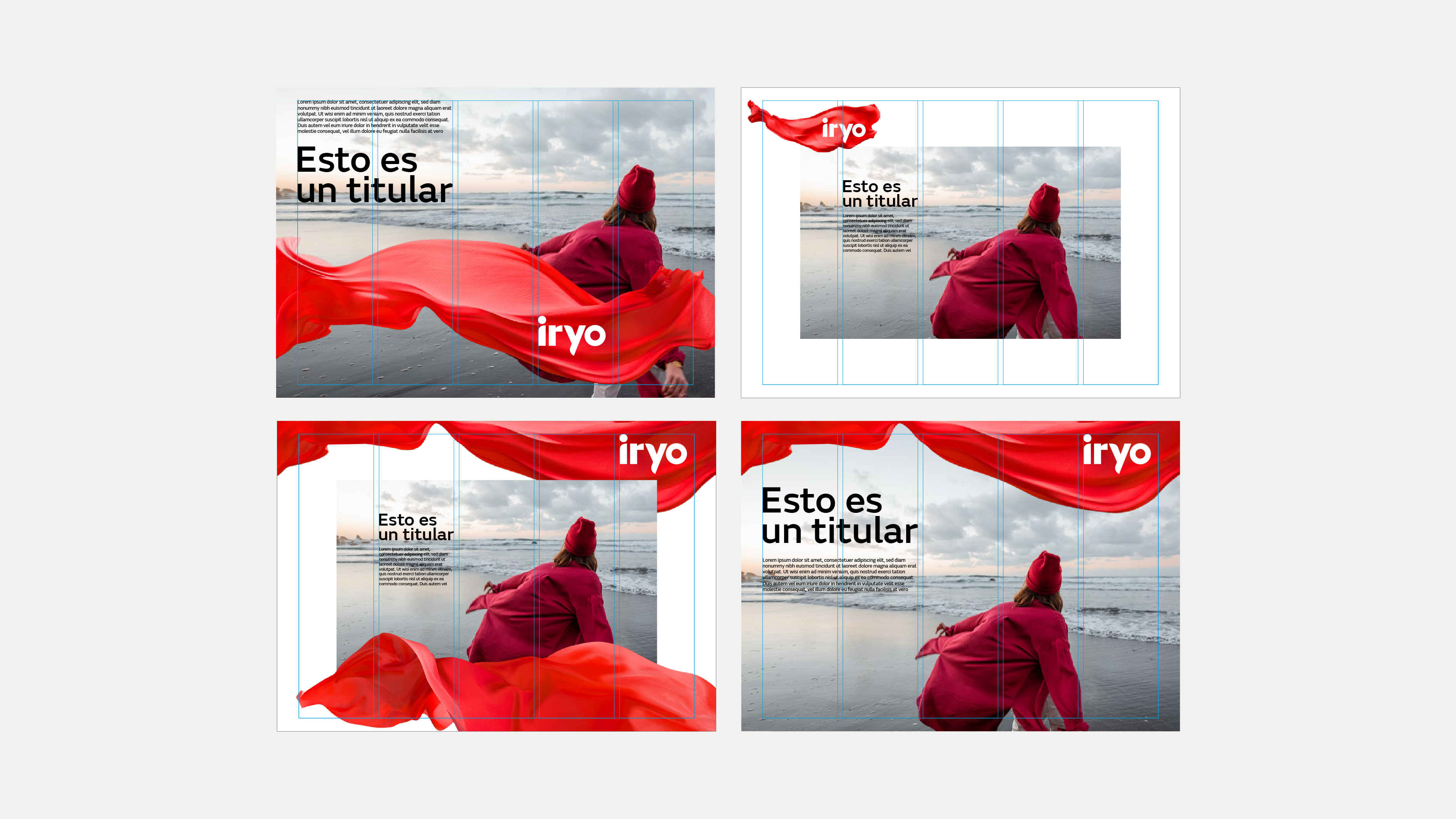
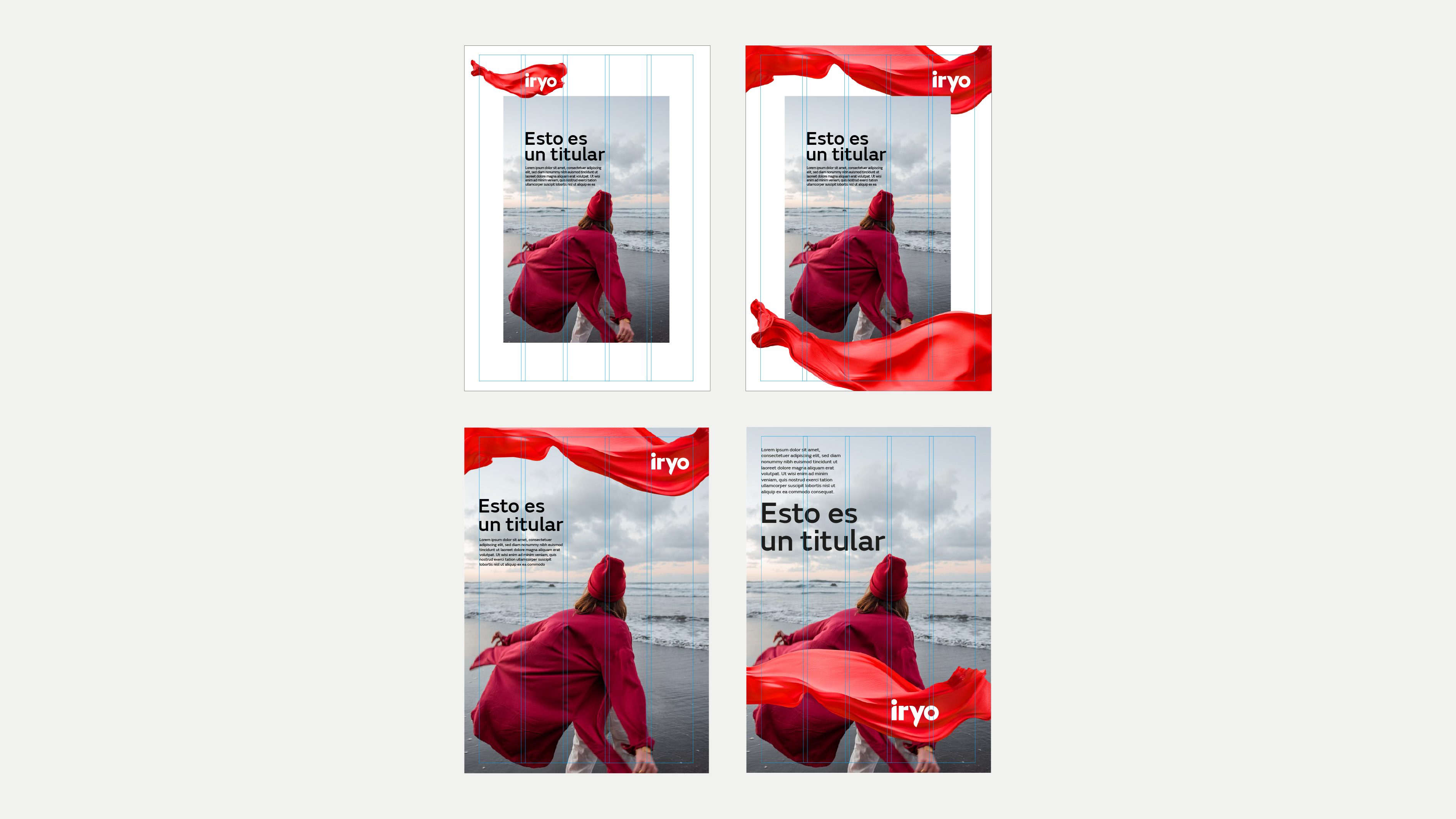
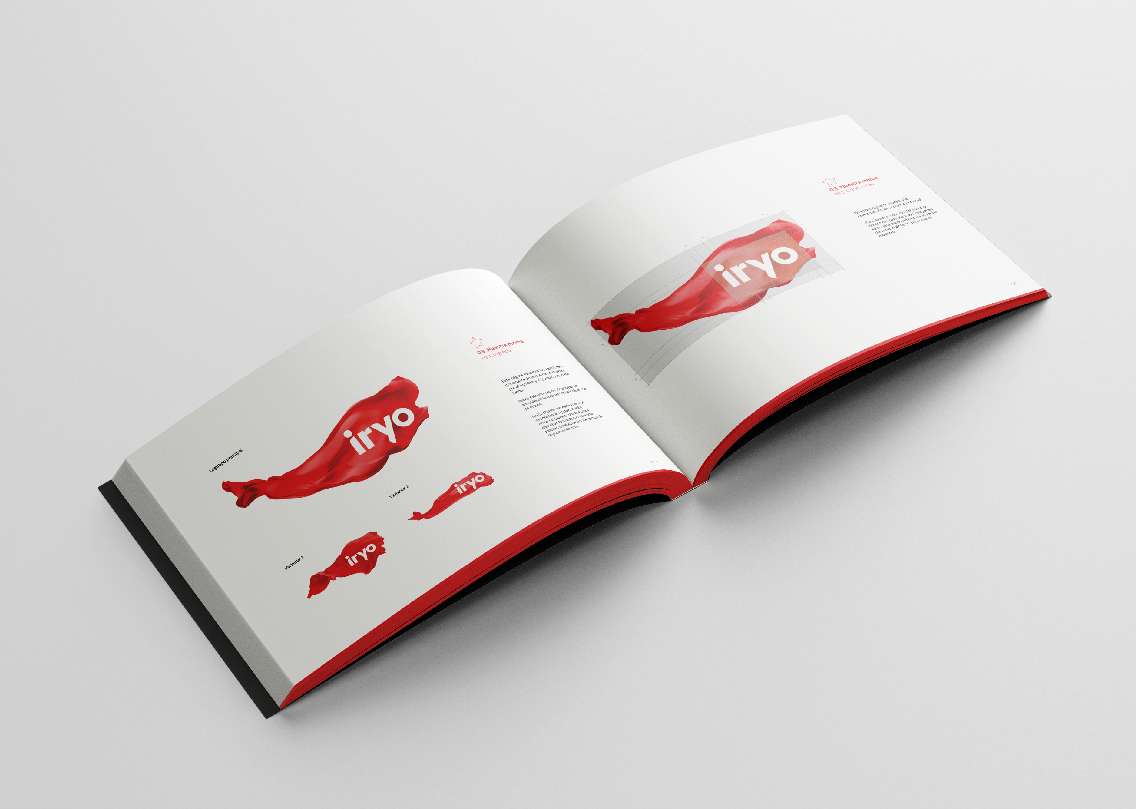
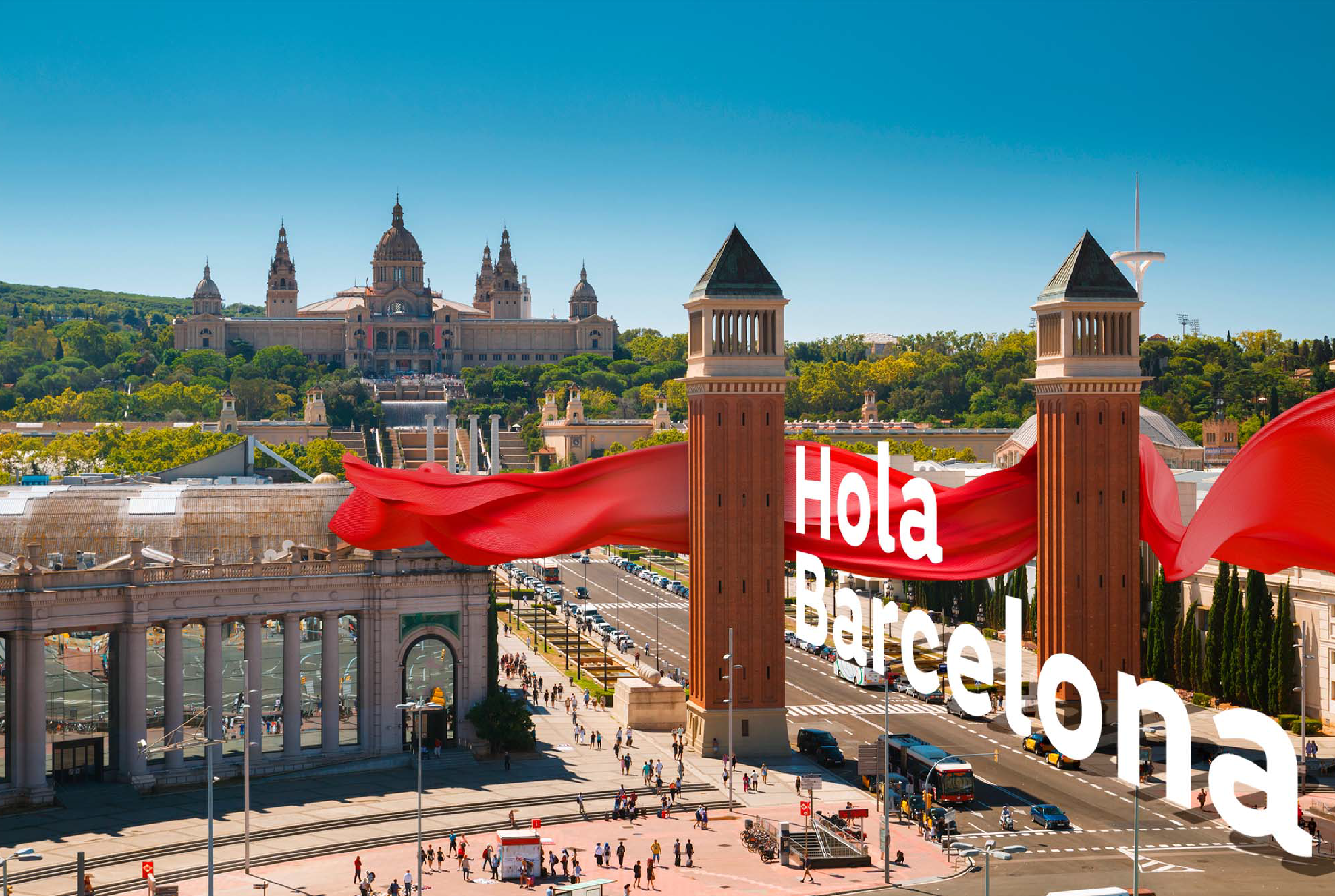
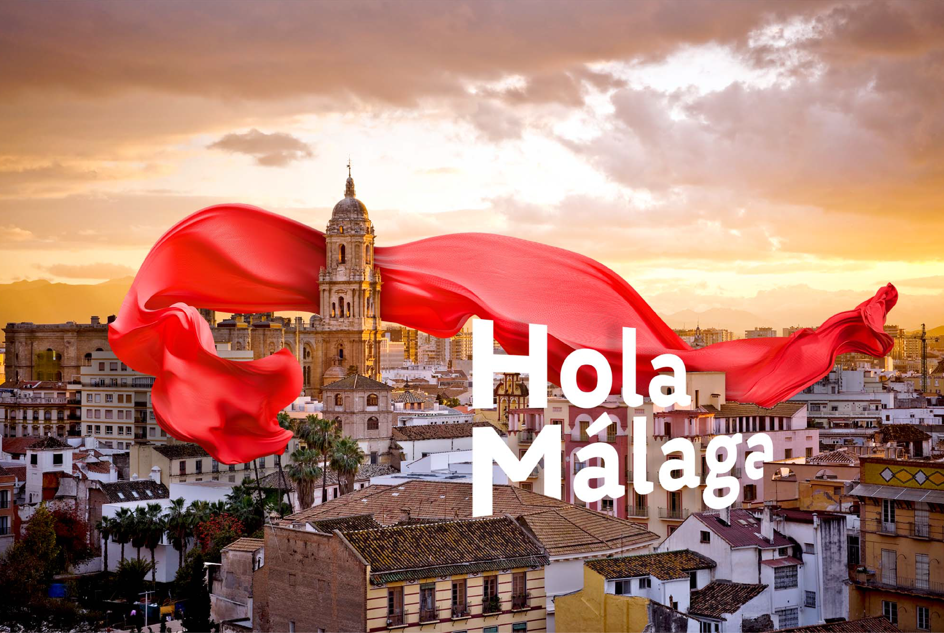
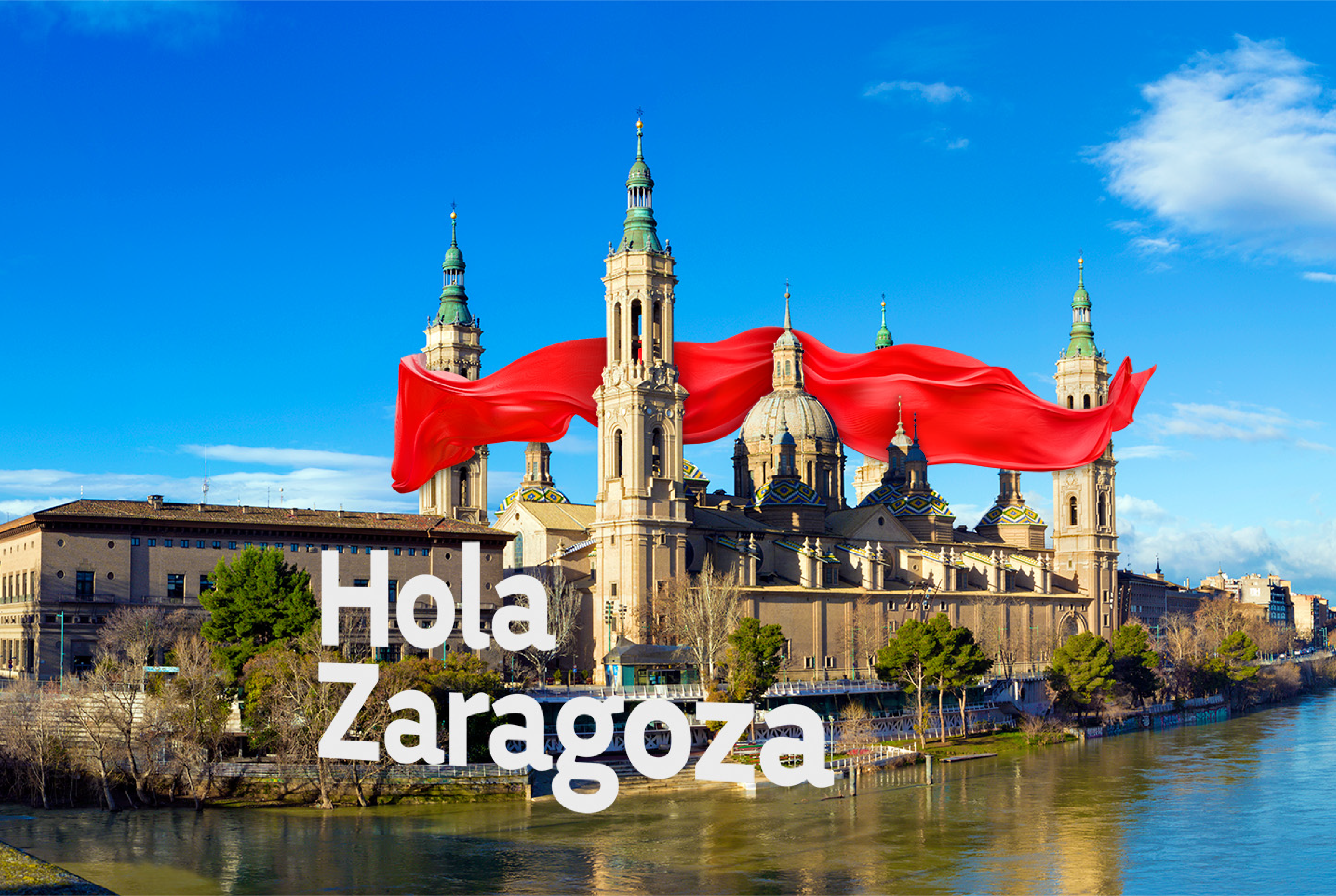
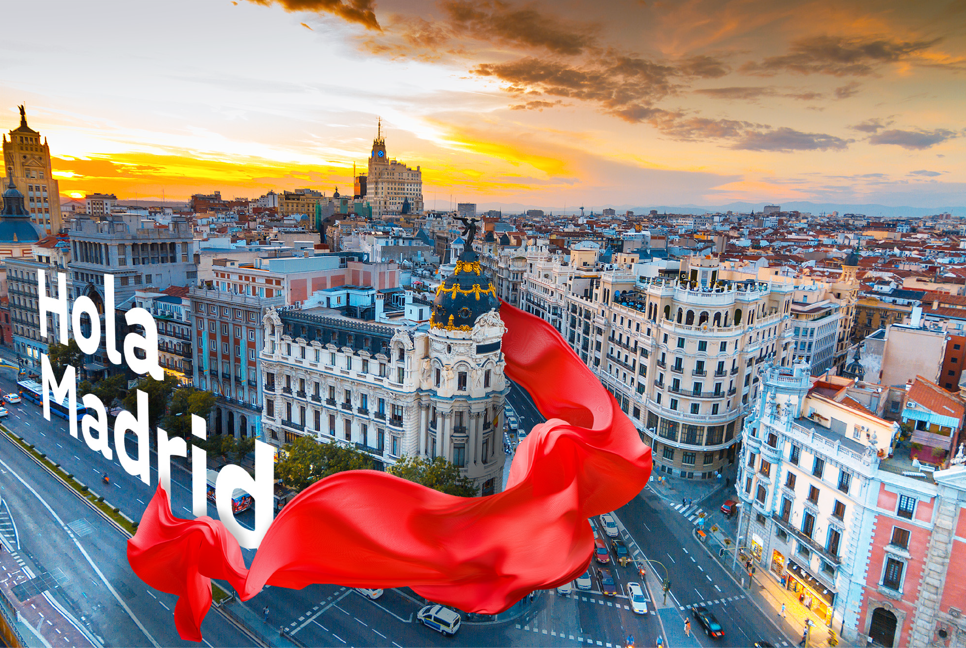
A brand in the wind
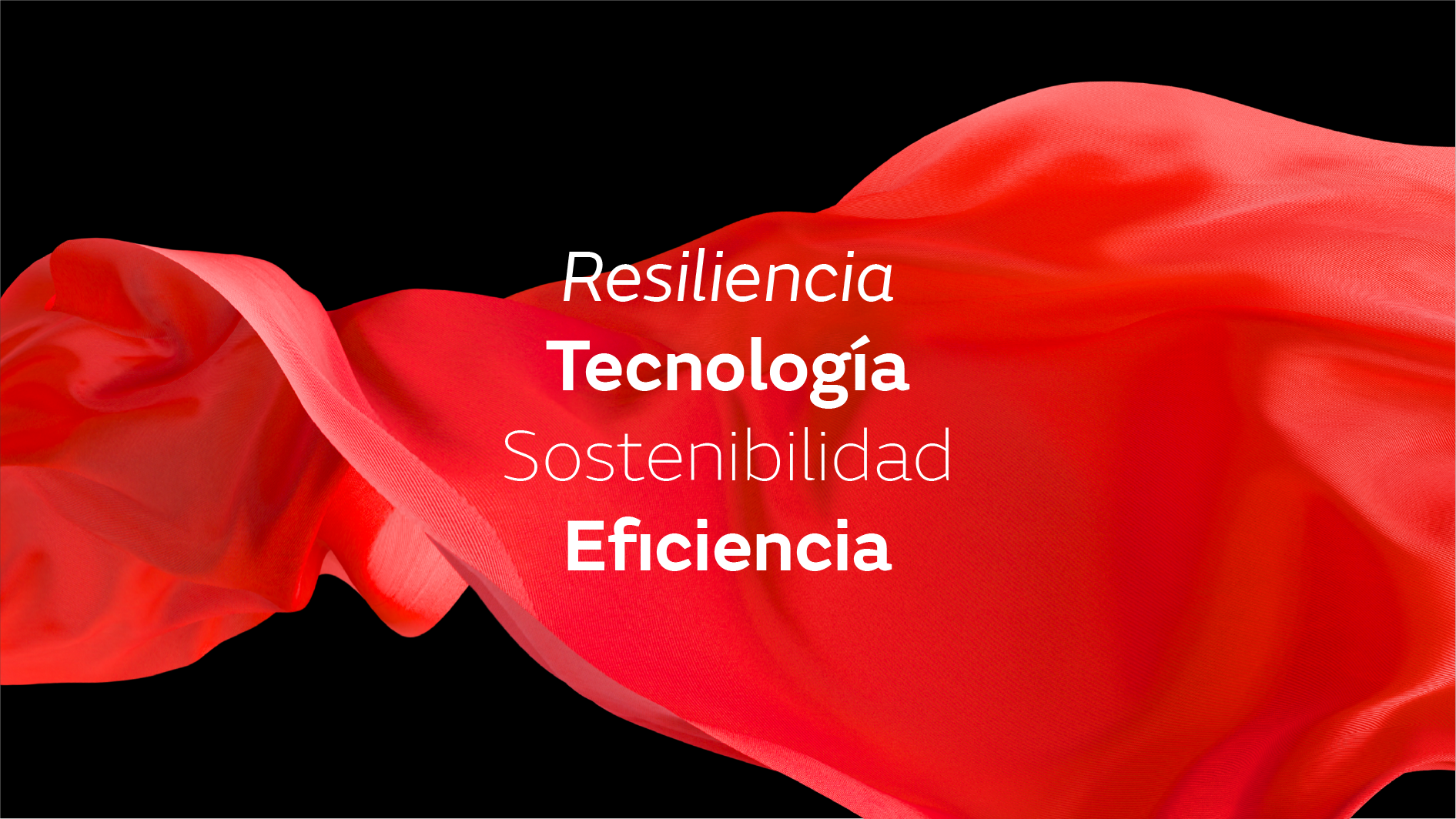
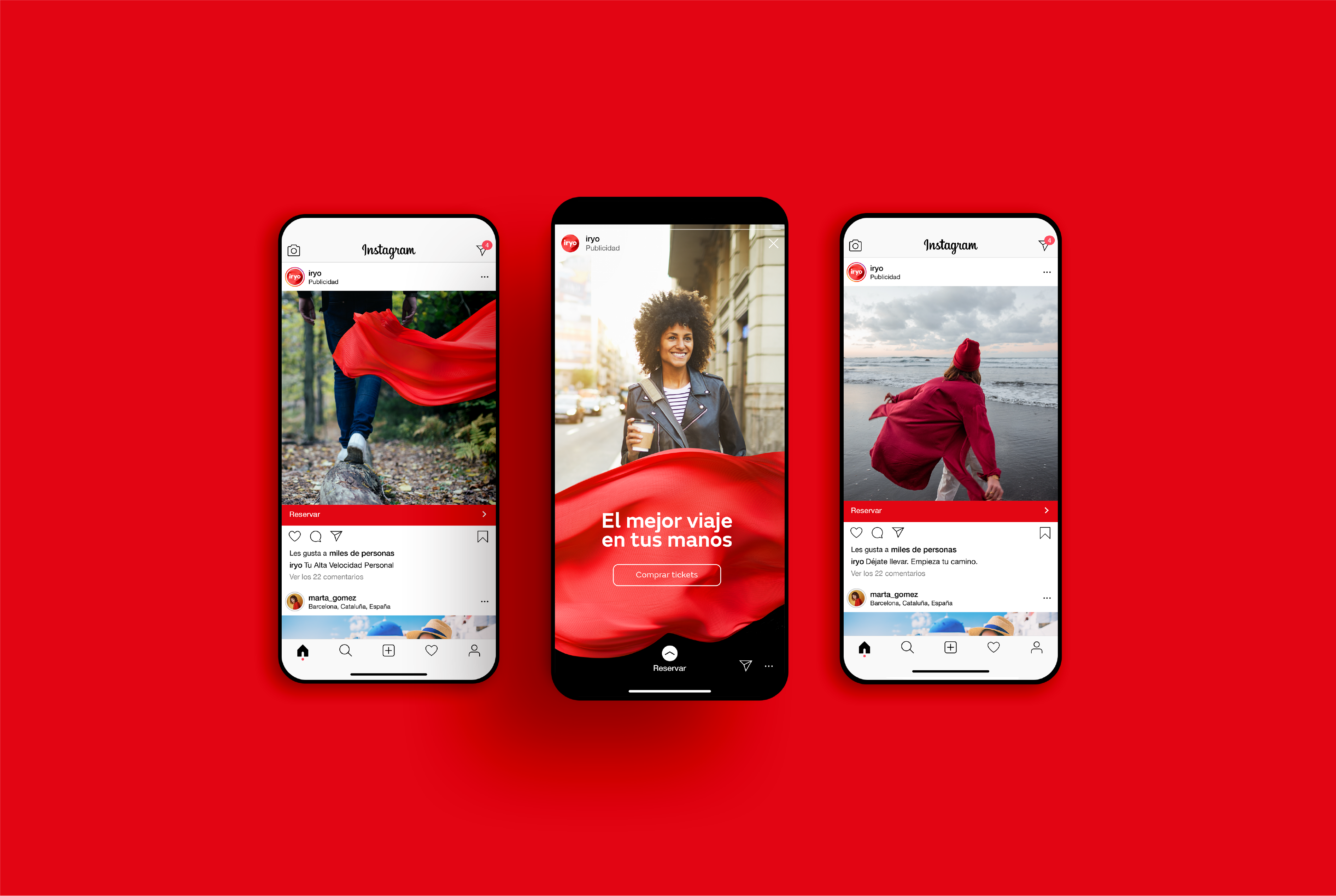
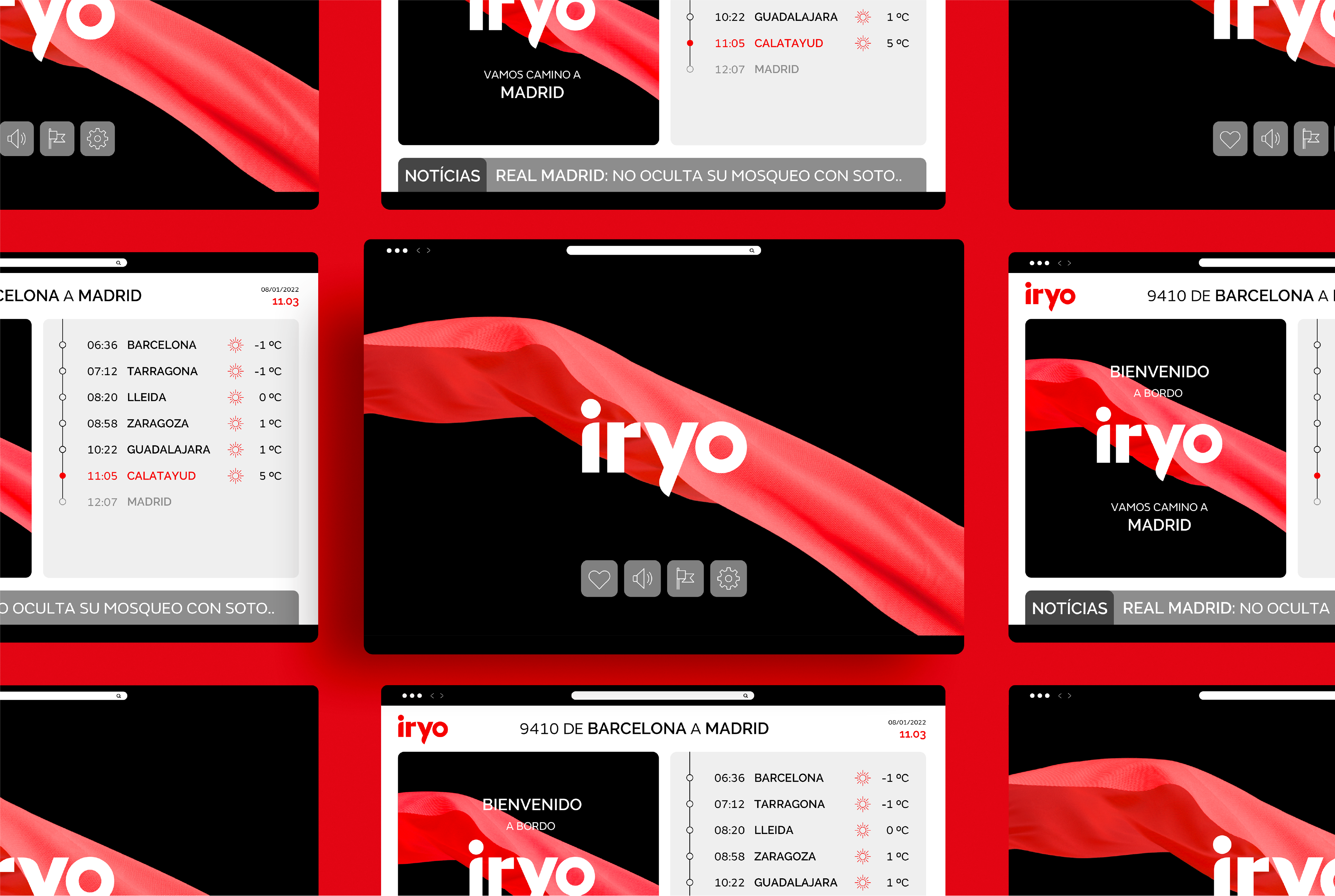
We avoided conventionalism. That’s why the main visual element is a scarf blowing in the wind. The wind as a force of nature, a symbol of high speed and sustainability. The scarf as a metaphor for movement itself — adaptable, flowing, and naturally passing through the elements. Visually, the use of slow-motion imagery in our communications allows us to speak of speed through a more elegant, comfortable, and human lens.
This key visual, fundamental and cornerstone of the identity, expresses the brand’s flexible, adaptable, and sustainable nature, forming a unique and fluid identity in constant motion. In doing so, we chart our own path with a distinctive identity, whose main elements adapt to every environment and application — a reflection of iryo’s broad offering of products and personalized experiences.
https://www.youtube.com/watch?v=UVOqAZiyDAk
https://www.youtube.com/watch?v=lGSHFMfG7NM
El universo visual
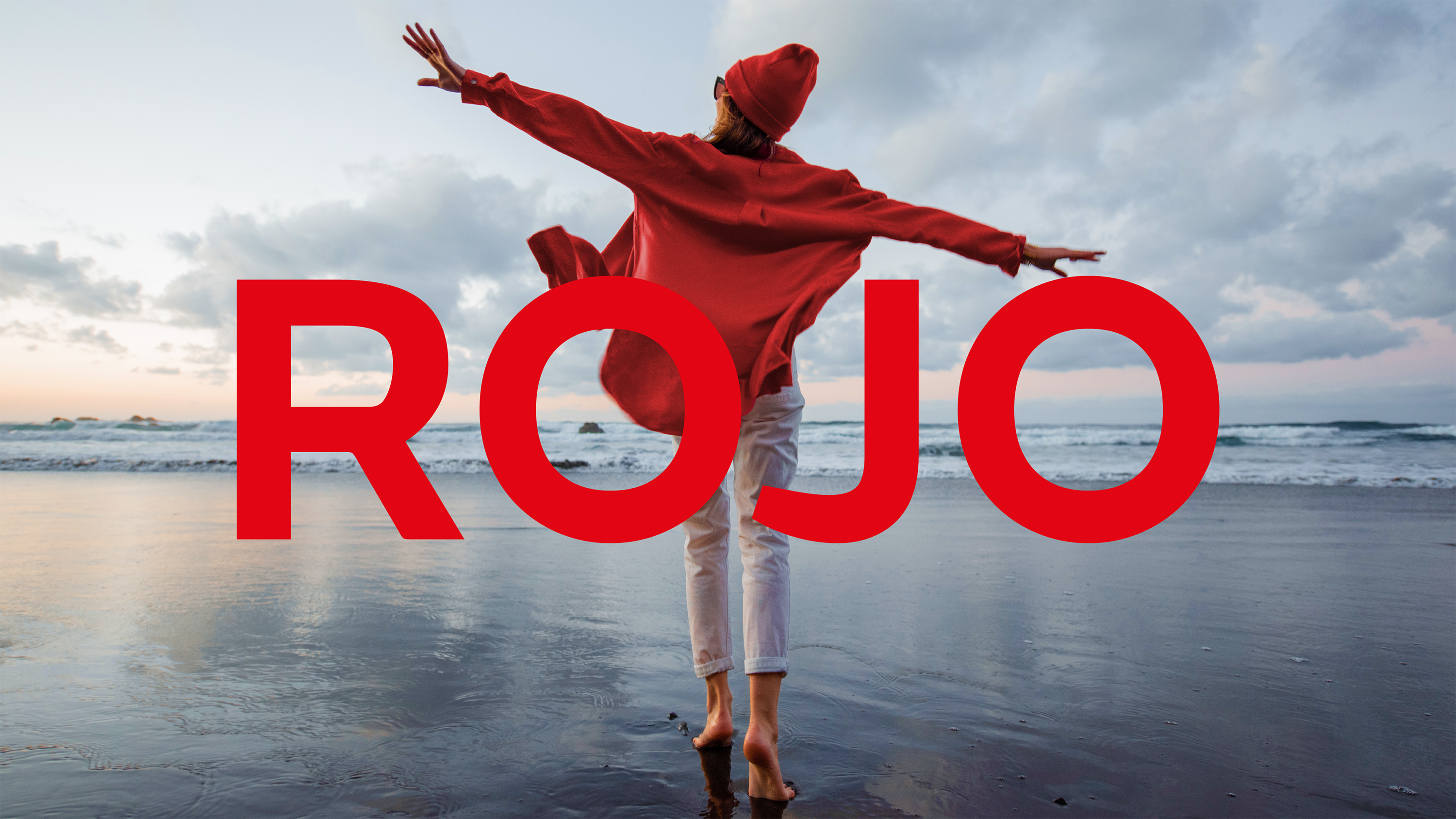
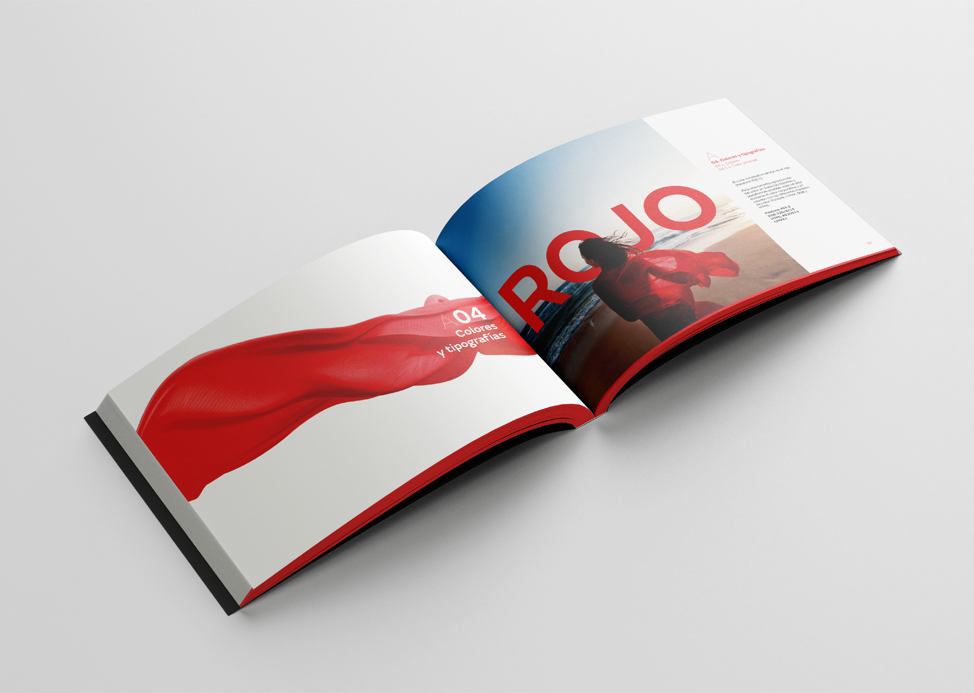
In the same vein, the typography of the logo complements the scarf with geometric forms that evoke technology, personalization, and efficiency. Other elements, like the vivid red color, speak to the passion of a brand proud of its Spanish heart, European spirit, and Mediterranean hues.
https://www.youtube.com/watch?v=mXaILqAiXww
https://www.youtube.com/watch?v=_Z6gG3LC9MY
https://www.youtube.com/watch?v=nk4nErJ96GA
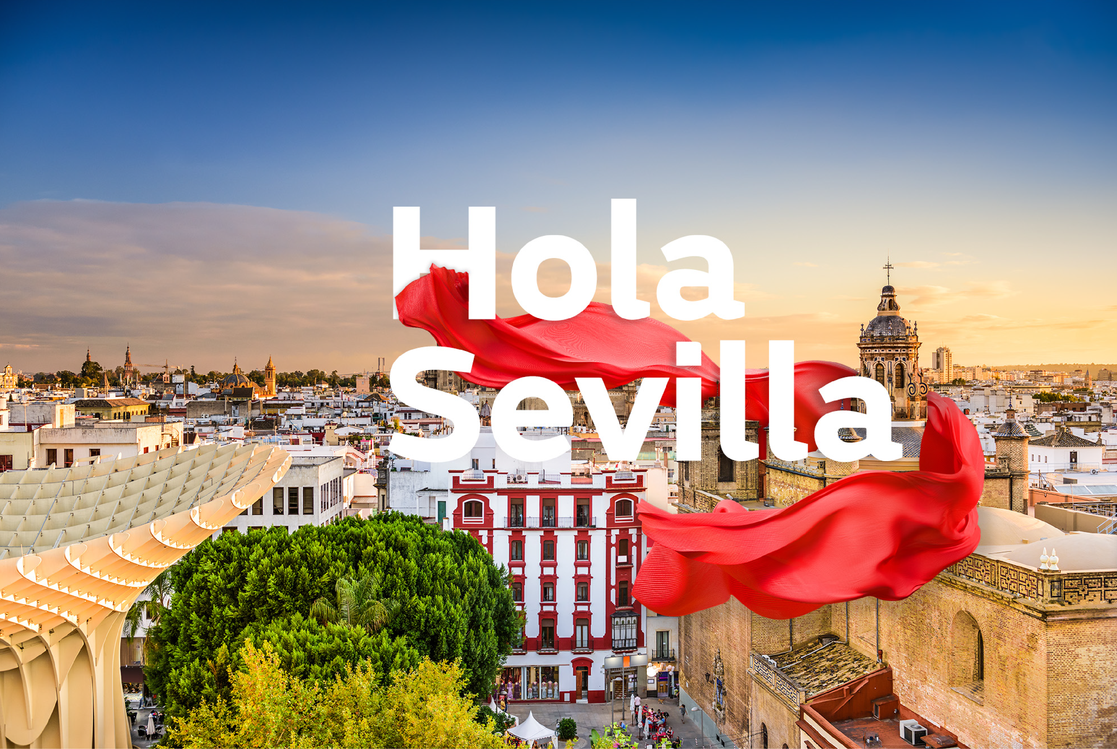
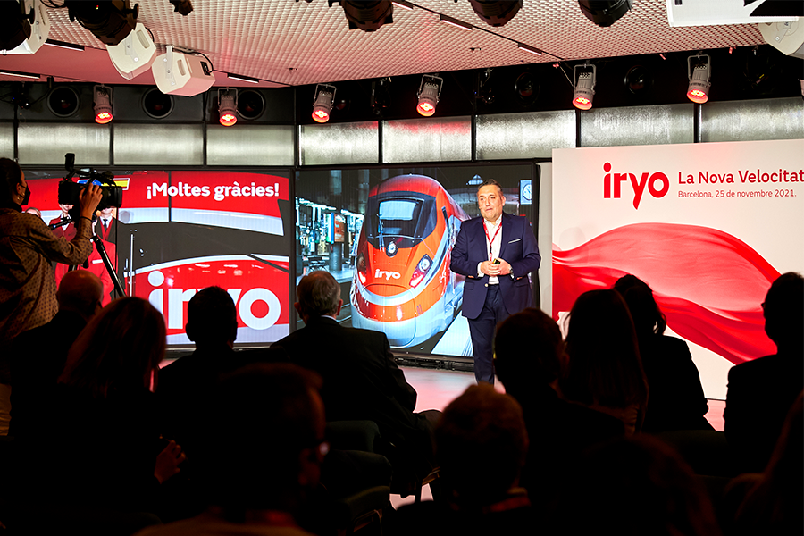
El lanzamiento