
In response to increasingly conscious and ingredient-aware consumers choosing products for their children, Dodot set out to develop the most natural and pure range in its brand portfolio. Aqua Pure is the new product in the “super premium” segment of DODOT. It features a formula that combines organic cotton and 99% water. The result? Wipes with minimal ingredients that still deliver effective and pleasant cleansing.
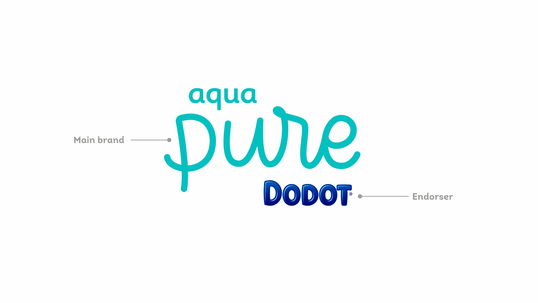
Aqua Pure was created to meet the needs of the most demanding consumers: fewer ingredients with the same trusted effectiveness. As for the role of the brand, we defined that Dodot should act as an endorser—a seal of quality and guarantee of the product’s high performance.
Soft and emotional
The packaging design needed to be softer, more emotional, and more natural than the rest of DODOT’s products, yet still convey the superior product quality that defines the brand. The challenge was to clearly communicate the main benefit of the product: 99% water.
Naturalness
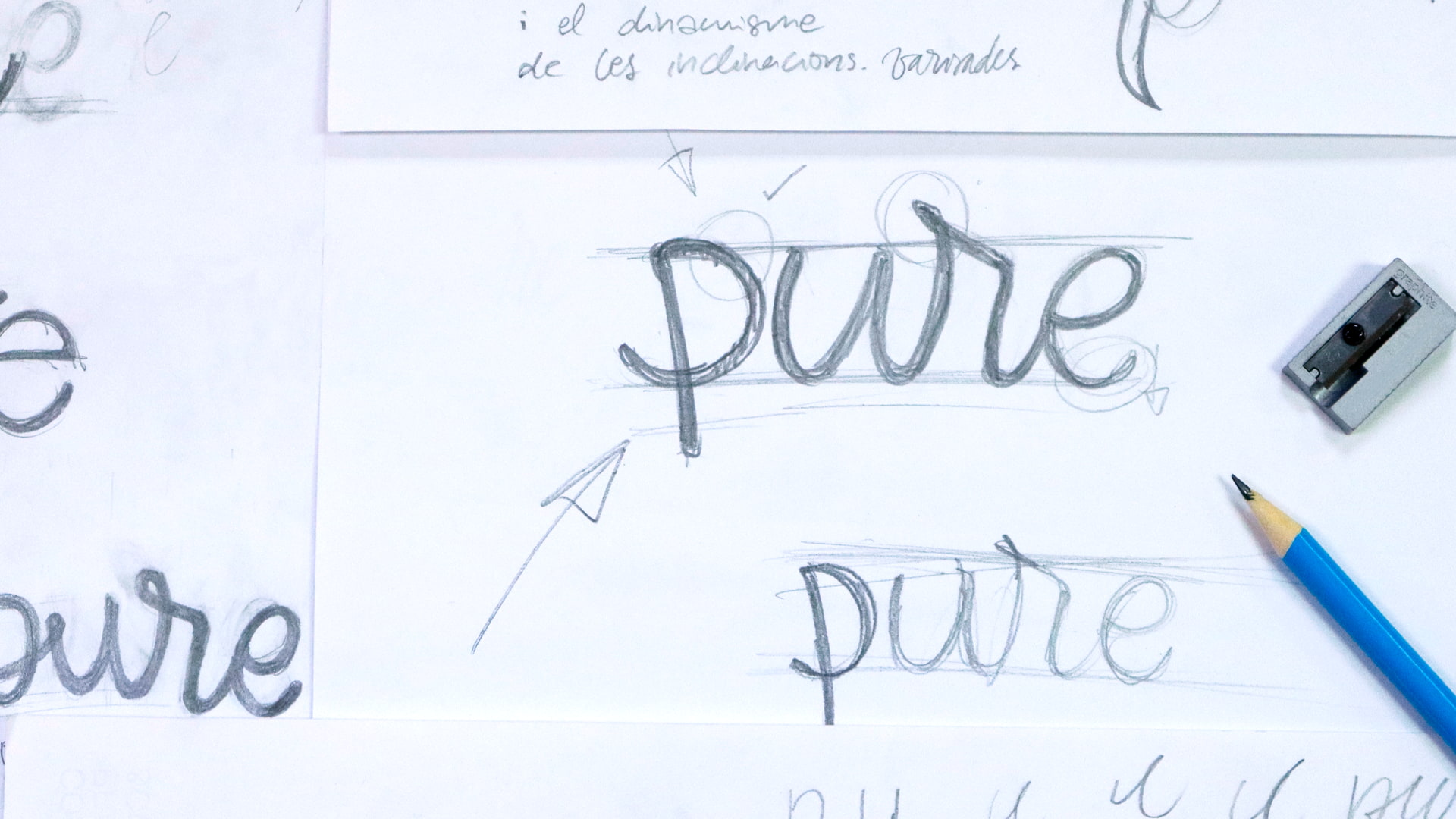
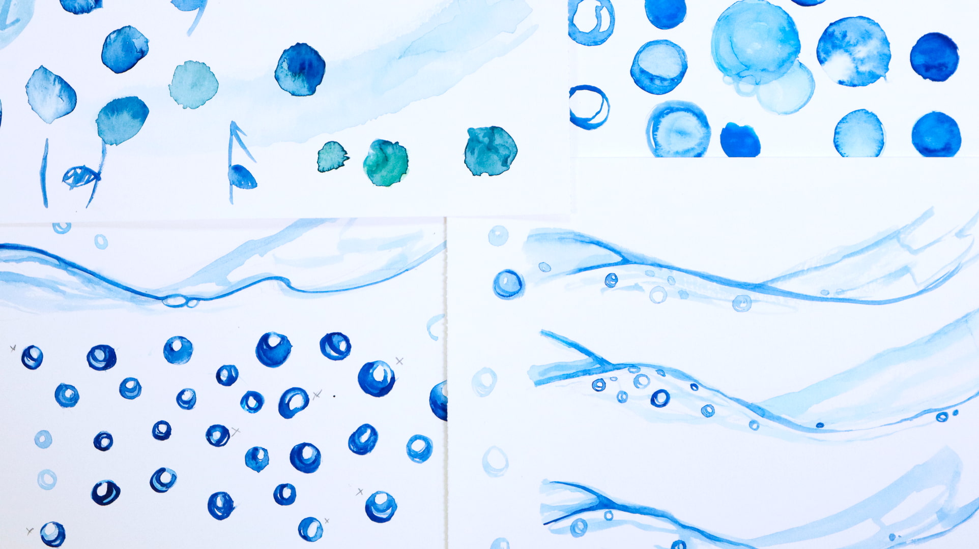
The product’s naturalness would be conveyed through the creation of a new, more hand-made visual language. The use of hand-drawn watercolor strokes speaks to the softness and delicacy of cotton. The logo, also hand-drawn, is simple and flat; through the use of pastel colors and clean, rounded calligraphy, it evokes purity and the protection of our babies.
A hand-drawn reinterpretation of the “Dodot Curve” with a green touch links our product to the rest of the range. The replacement of Dodot’s traditional blue brand block at the top with white conveys purity and cleanliness—the two main values of the product.
