Dodot is one of the most recognised brands in the baby care market in Spain and Portugal. With a broad portfolio of diapers and wipes, Dodot positions itself as a trusted ally for parents, supporting them throughout parenthood with products tailored to their babies’ needs at every stage of life.
Antes


Después


The challenge: redesigning the portfolio
Dodot, a long-standing client with whom we have worked on numerous occasions, turned to Columna this time to redesign its diaper portfolio, with the aim of creating a design more closely aligned with its positioning. A design that, through emotional appeal, would clearly and simply communicate the main benefit of each product to consumers.
Connecting with new families
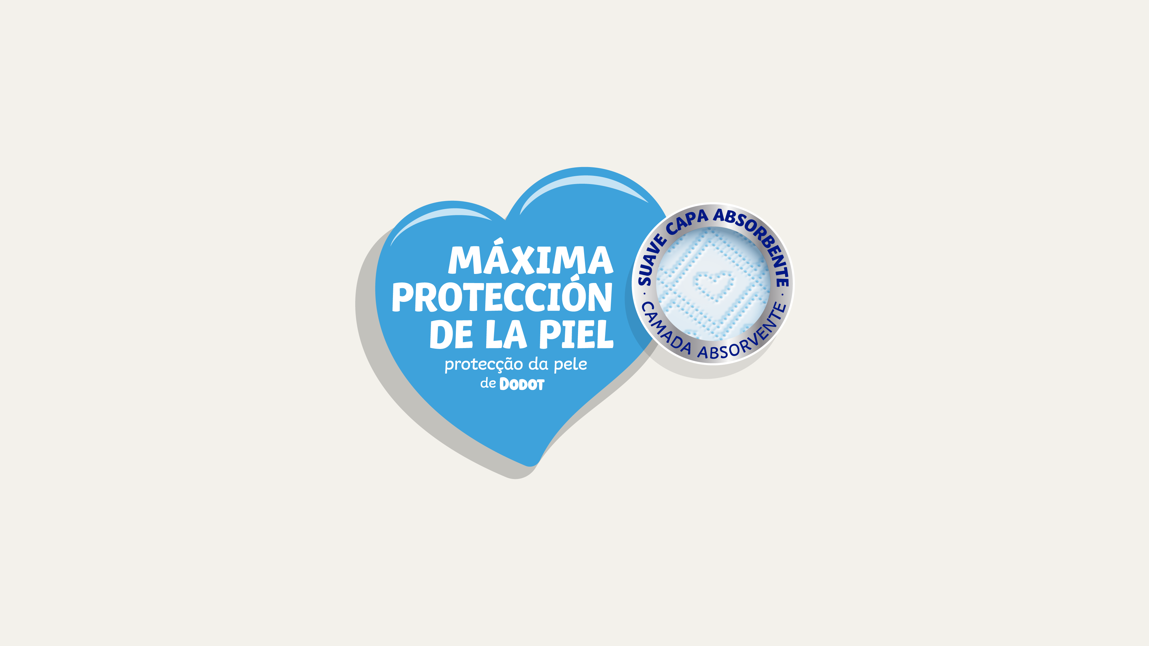
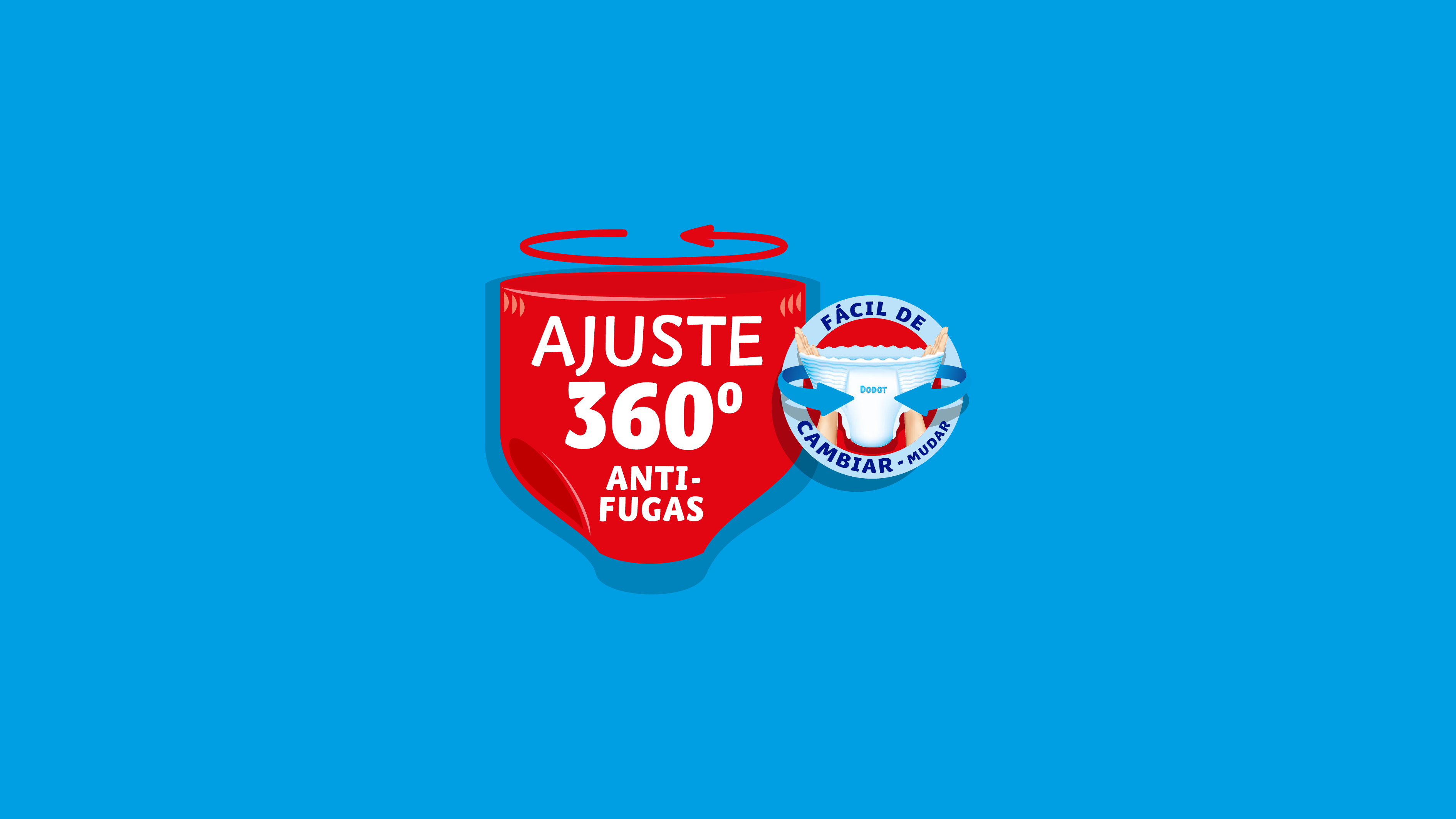
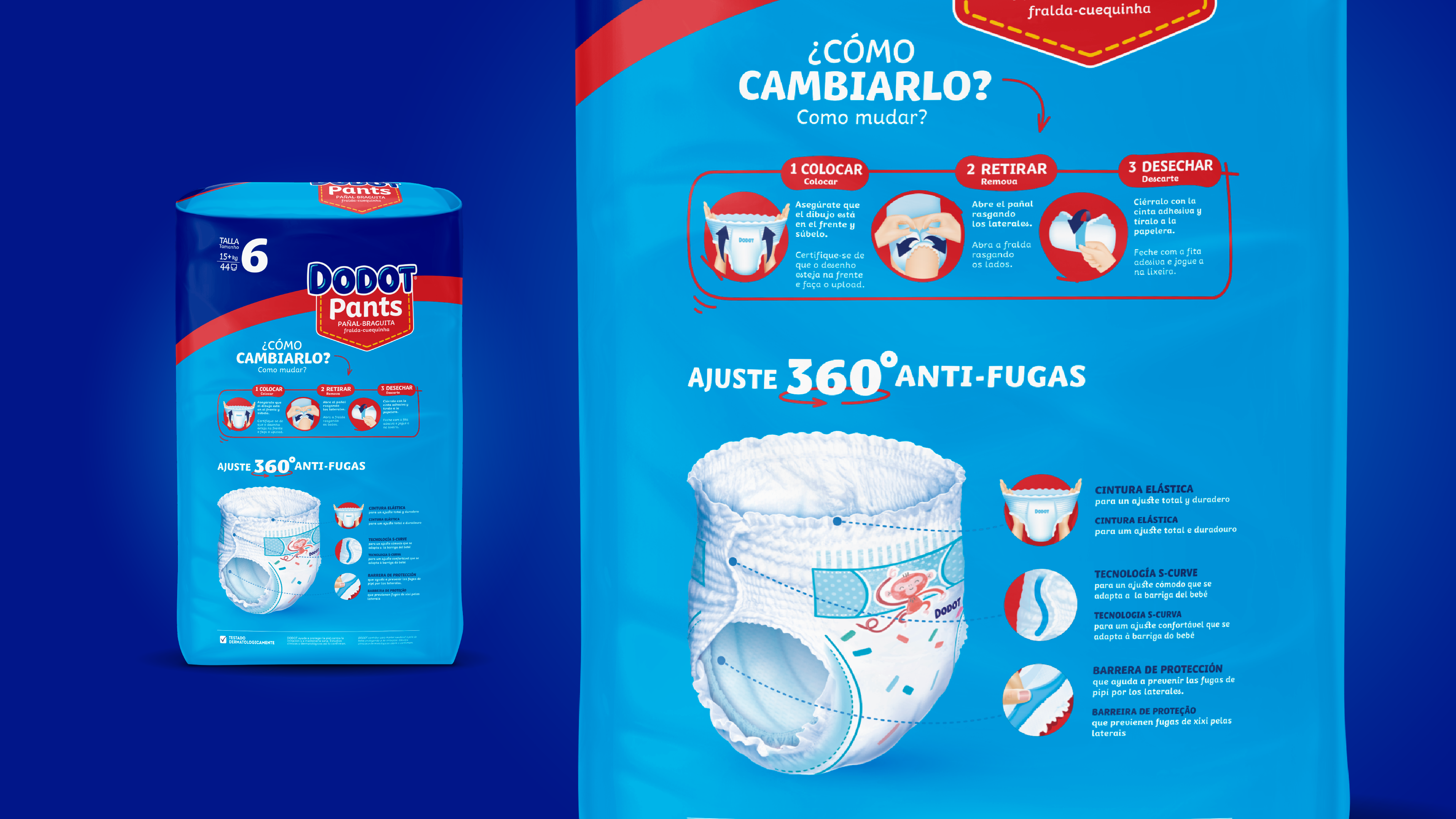
In this context, at Columna we worked on simplifying the levels of communication on pack to create a new hierarchy that would allow the key messages to stand out within a clean and contemporary design. Within this new structure, the brand and baby photography grow in prominence to become the most relevant elements on pack. This is followed by the main benefit, designed to convey the added value of each sub-brand in a clearer and more concise way, without losing rationality, as it is supported by the RTB/innovation, communicated through illustrations of the product’s more technical properties. Finally, the simplification of elements allows the size to be enlarged, making it more visible on shelf.
We identified the need for the brand to reconnect with the millennial generation, a generation with very different concerns around parenthood compared to previous ones. For Dodot to maintain its role as a trusted ally in baby care, it needed to understand these new generations, adjusting its language and adapting its communication to future mothers and fathers.


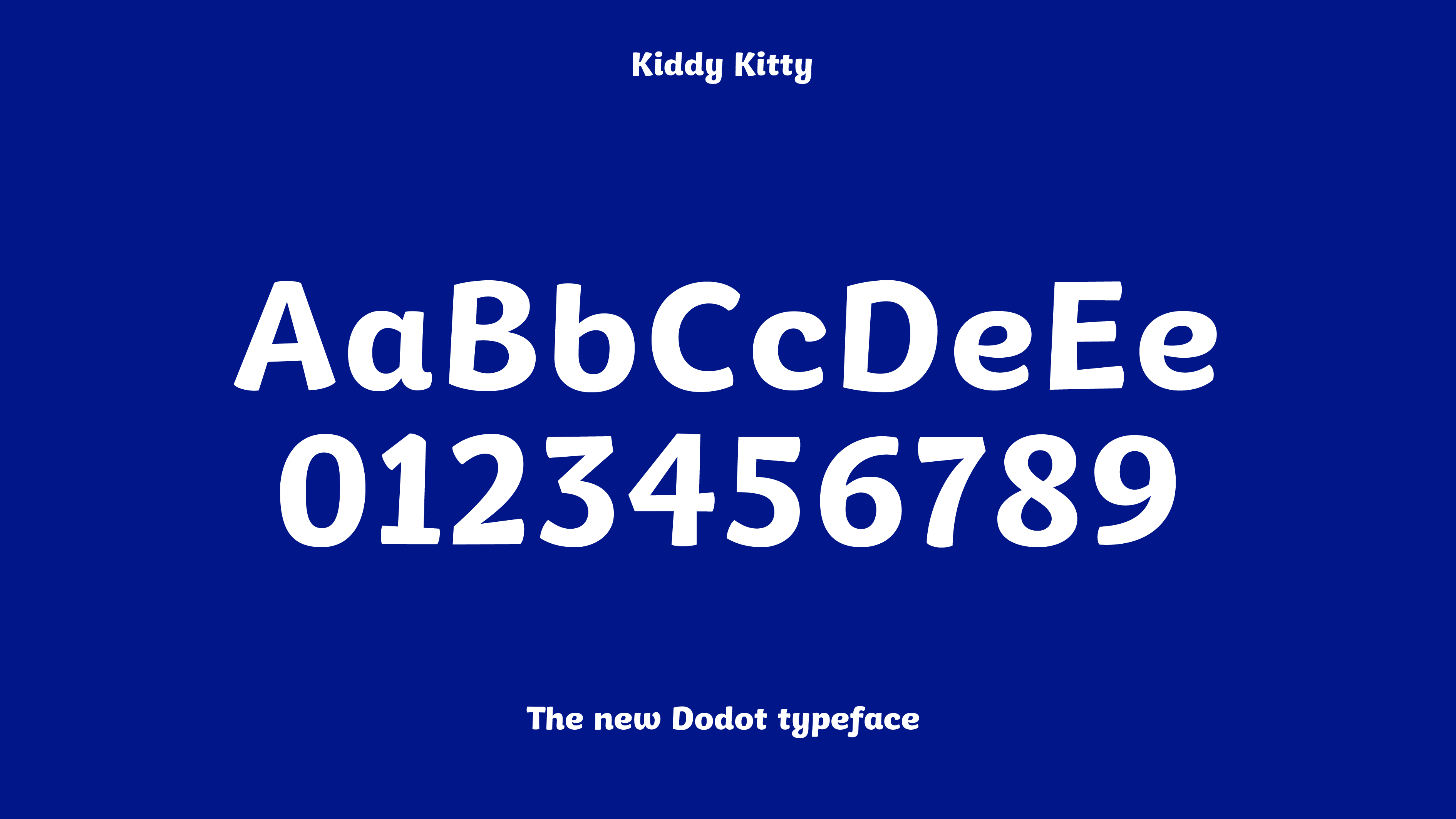
The new language was also extended to the brand’s visual identity, starting with the simplification of the logo. Gradients were removed in favour of flat colours, updating the design and making the brand easier to reproduce and manage in digital environments. From a typographic perspective, a new brand typeface was introduced: Kiddy Kitty, a sans serif with rounded terminals that conveys warmth and clearly places the brand within the baby care world. On pack, the removal of gradients is also reflected in Dodot’s brand block, with the corporate blue maintained at the top, creating a strong colour presence and ensuring consistent brand cohesion across the entire range.
As unique as no one else, like Dodot
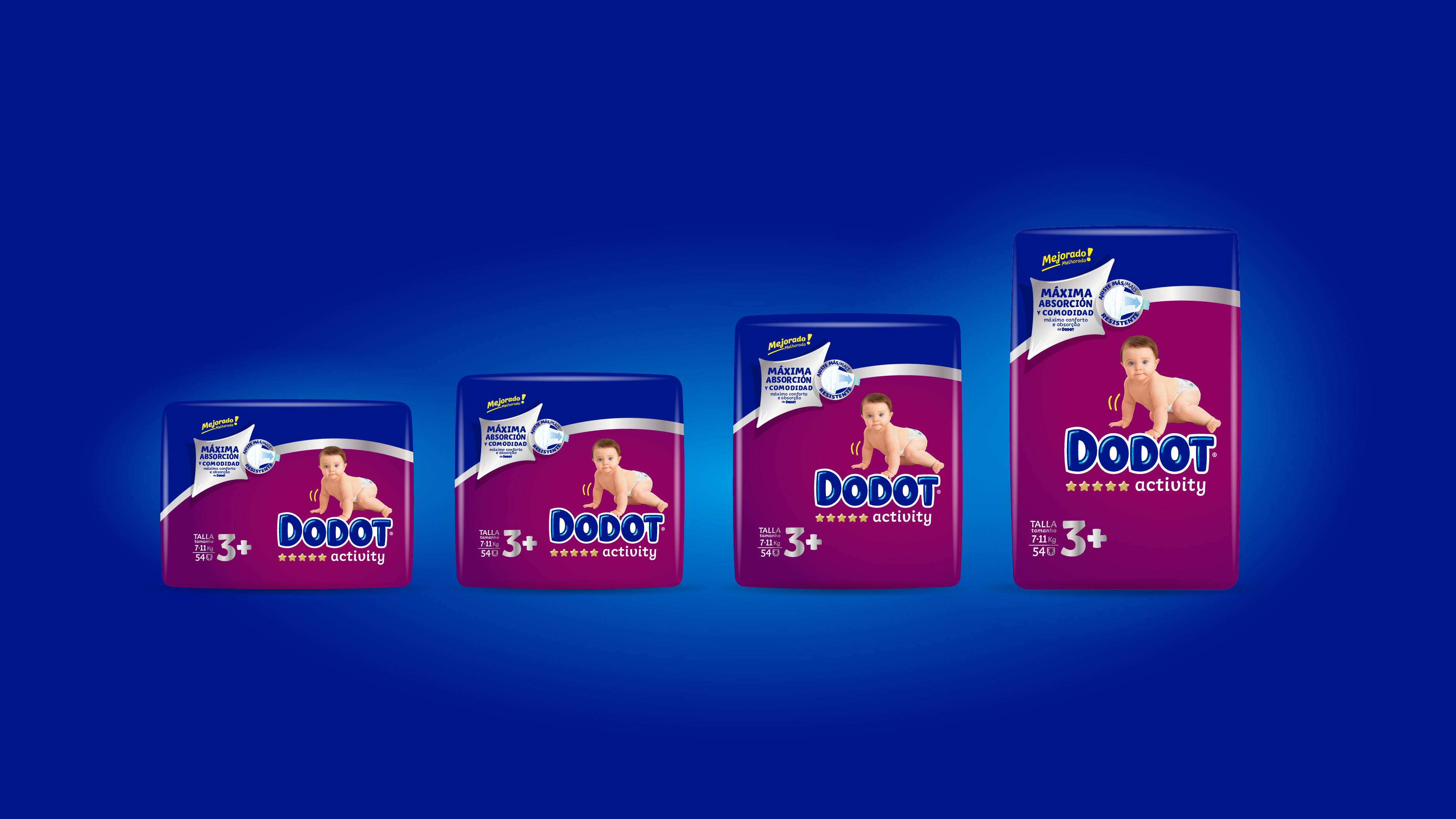
Dodot knows that no two babies are the same, which is why it constantly innovates to ensure its diapers adapt better to each baby’s body, helping them feel comfortable so they can focus on exploring and expressing their personality. Over the past year, at Columna we have worked on the design of its major innovation, Total Care, as well as on the redesign of Splashers and Happyjamas.
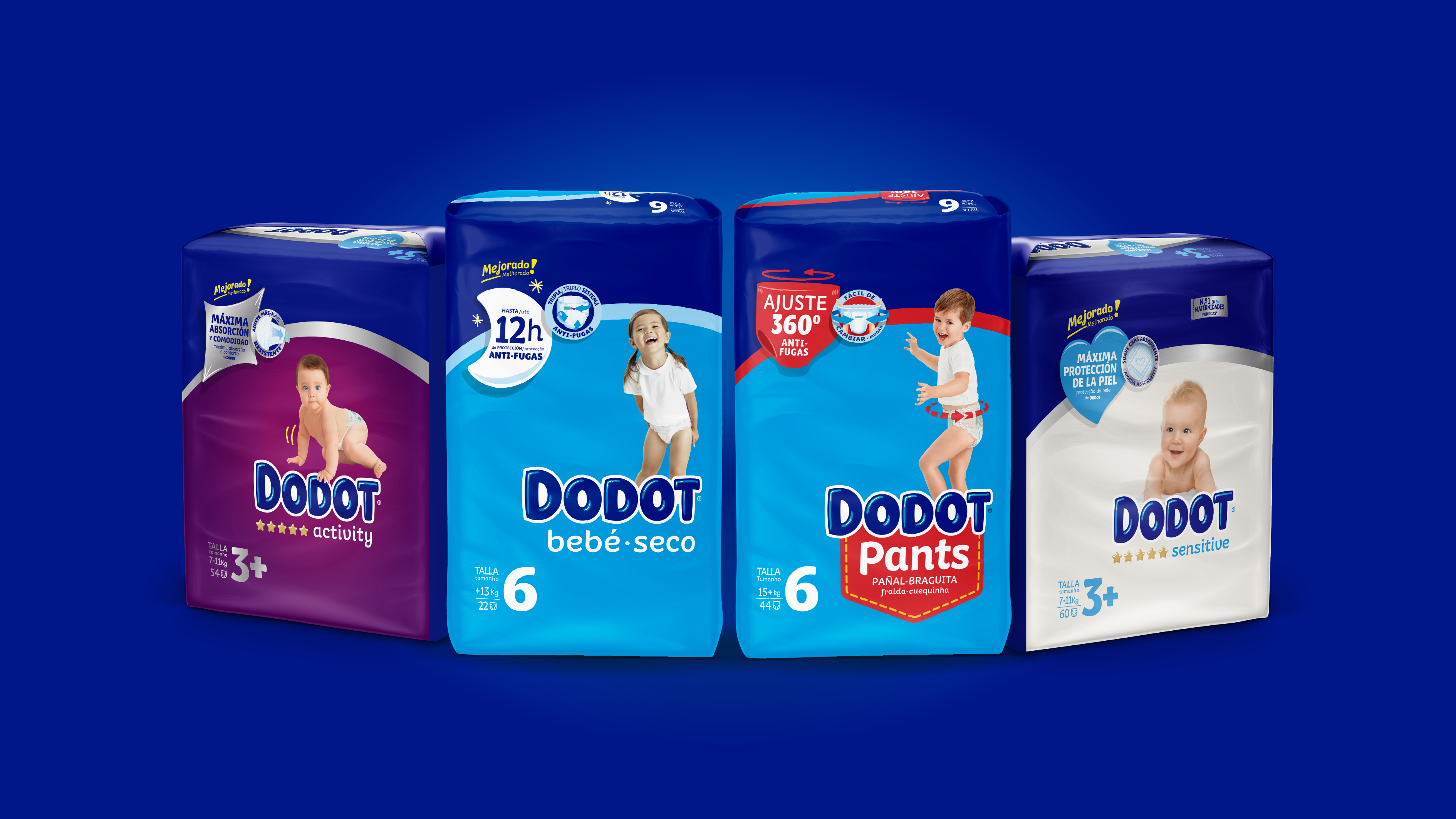
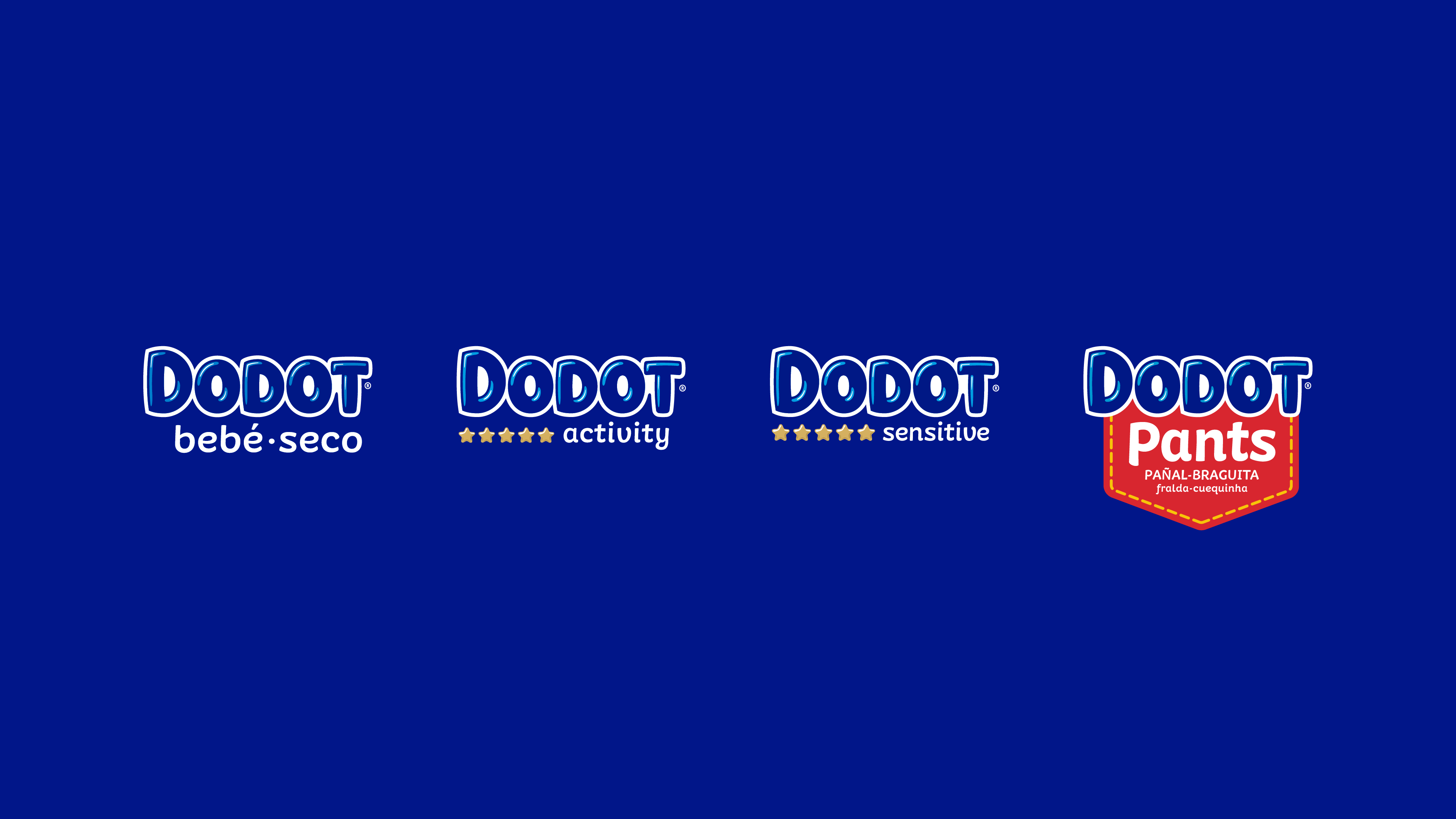
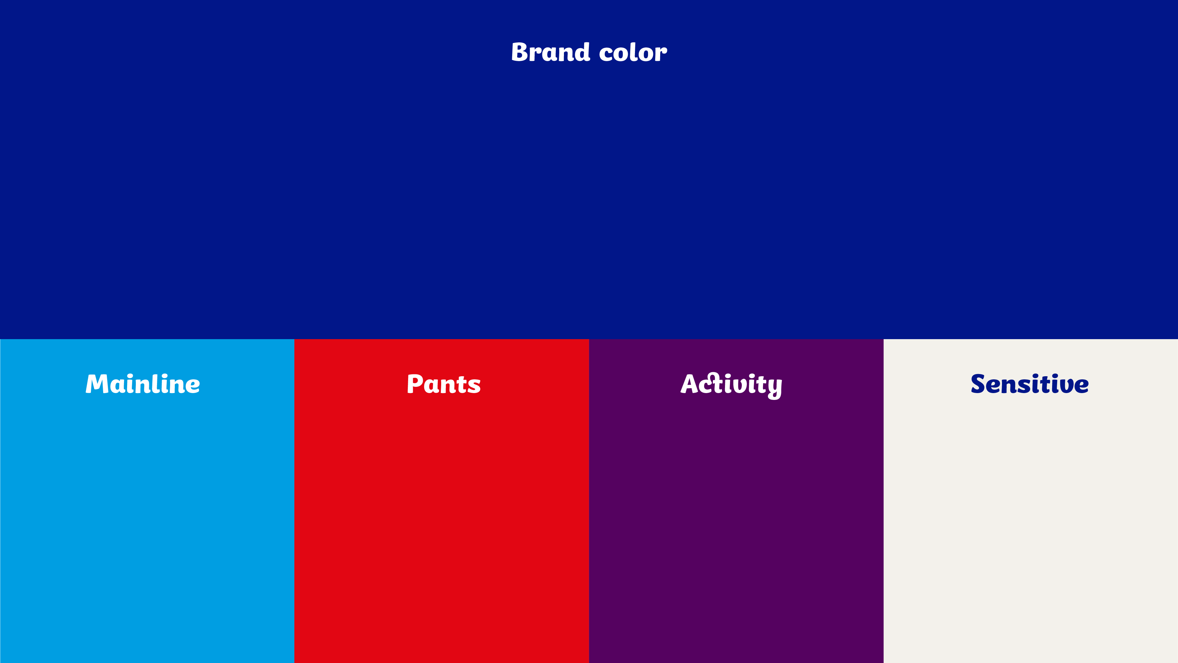
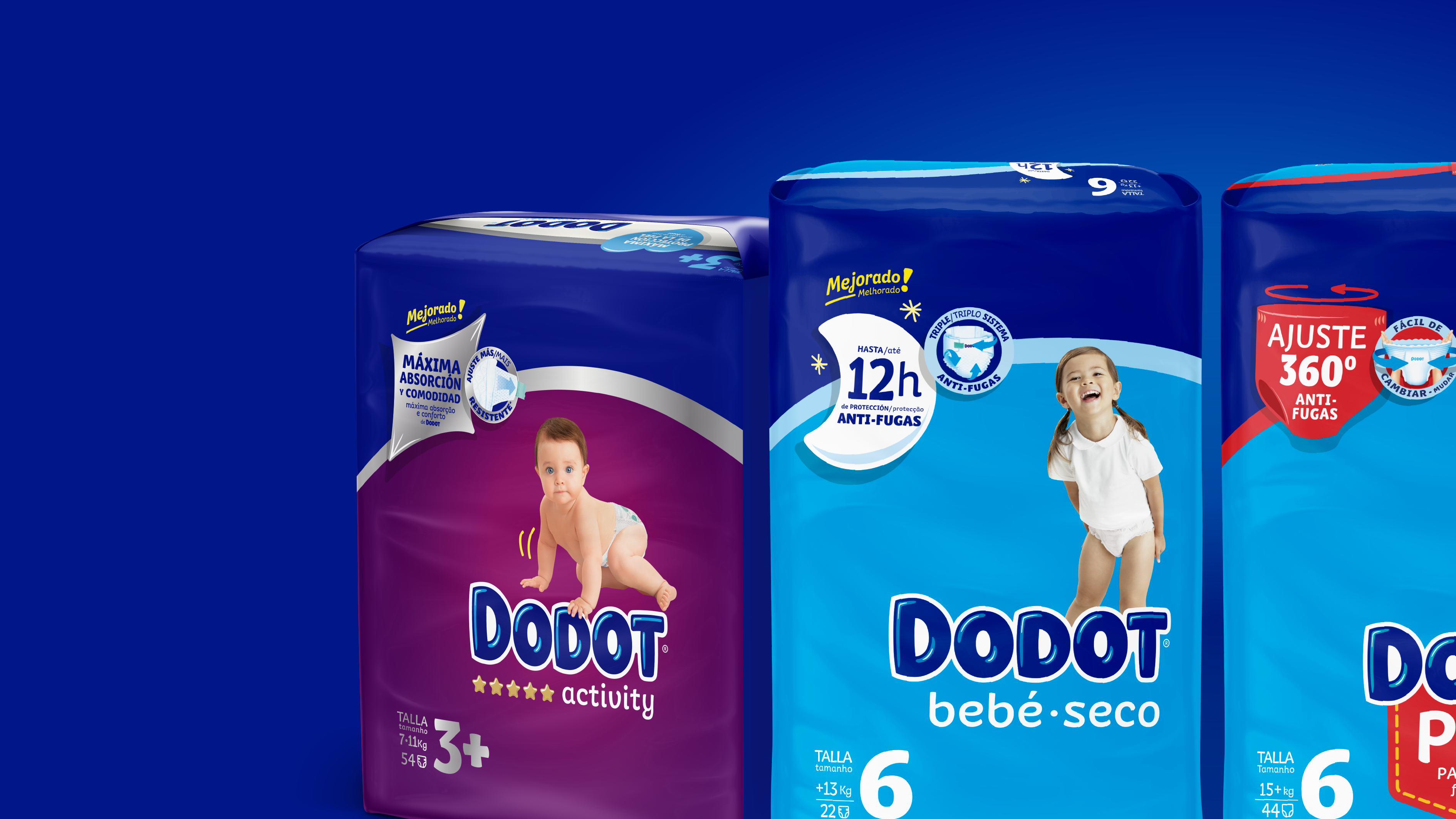
Taking into account the company’s innovation plans, we worked on reorganising the portfolio through a range-based segmentation. Bebé Seco was positioned as Dodot’s mainline brand, while Activity and Sensitive occupy a higher tier, and Total Care sits within the premium range. Splashers and Happyjamas fall outside this segmentation, as they are not everyday products but designed for specific use. In these references, unlike the rest of the portfolio where Dodot acts as the master brand, the sub-brands take centre stage while Dodot plays an endorsed role.
However, Dodot’s experience and credibility were key drivers of trust for consumers at the point of purchase and something that needed to be reinforced on shelf. For this reason, at a visual level, regardless of the sub-brand, we sought to create a strong colour block by implementing the reflex blue brand block across all packs.
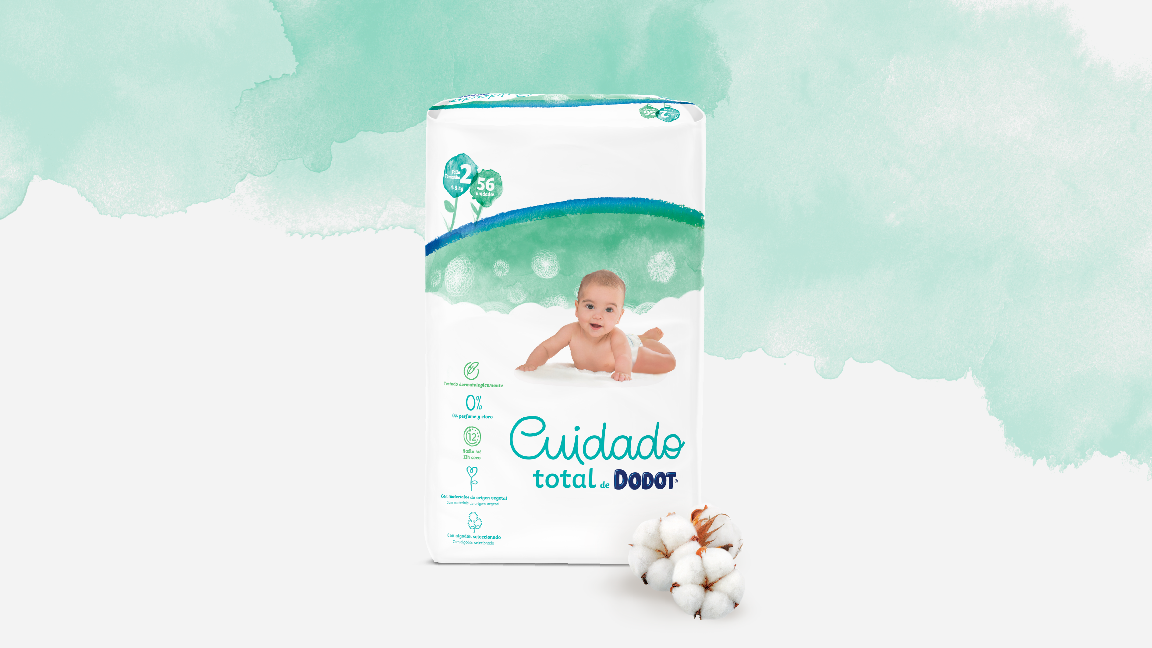
Made with materials of natural origin, such as cotton, and using 100% renewable energy, Total Care is Dodot’s most caring range, both for babies and for the environment. At Columna, we sought to elevate the language with a design that moves away from the structure of the rest of the packs and enhances the product’s purity using white, supported by greens and blues that evoke the natural world and are applied in soft watercolour brushstrokes.


Happyjamas is Dodot’s disposable absorbent underwear designed for older boys and girls. For this pack, we applied the colour purple and darkened Dodot’s reflex blue, creating a pack aimed at nighttime use and a slightly older target. In the context of Covid-19, when photo shoots were not possible, illustration allowed us to better fine-tune the message while also moving away from the visual universe the brand had previously developed for diapers.

Splashers is Dodot’s disposable swim diaper brand. In this case, the challenge was to ensure consumers understood that it is a product specifically designed for use in water, rather than for everyday use. To achieve this, the solid colour background becomes a beach scene, providing context for the baby photography. To maintain Dodot’s flat visual language and enrich the design, a range of sea-related graphic elements are incorporated.