https://www.youtube.com/watch?v=EgwBPPUpe0Q&feature=youtu.be
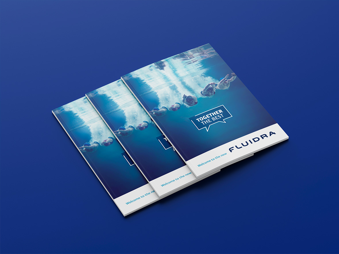
The merger of Fluidra and Zodiac marked a turning point for the pool and wellness industry, giving rise to the leading company at an international level. At such a pivotal moment, a comprehensive review of the corporate brand identity was required to ensure consistency and alignment with the company’s new business reality.


A comprehensive project
A comprehensive project was proposed to preserve the recognition that Fluidra had built to date, while updating and renewing the brand to clearly convey its positioning and leadership.

The challenge
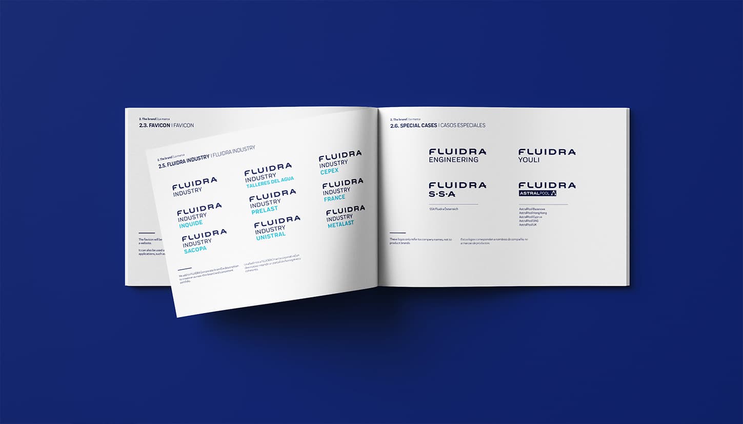
Our challenge was to review and define, together with the client, the brand’s strategic concept and positioning; to articulate them through a new, solid and relevant verbal and visual identity; to implement it rigorously across all required touchpoints; and to communicate the new identity to the different stakeholder groups, both internal and external.
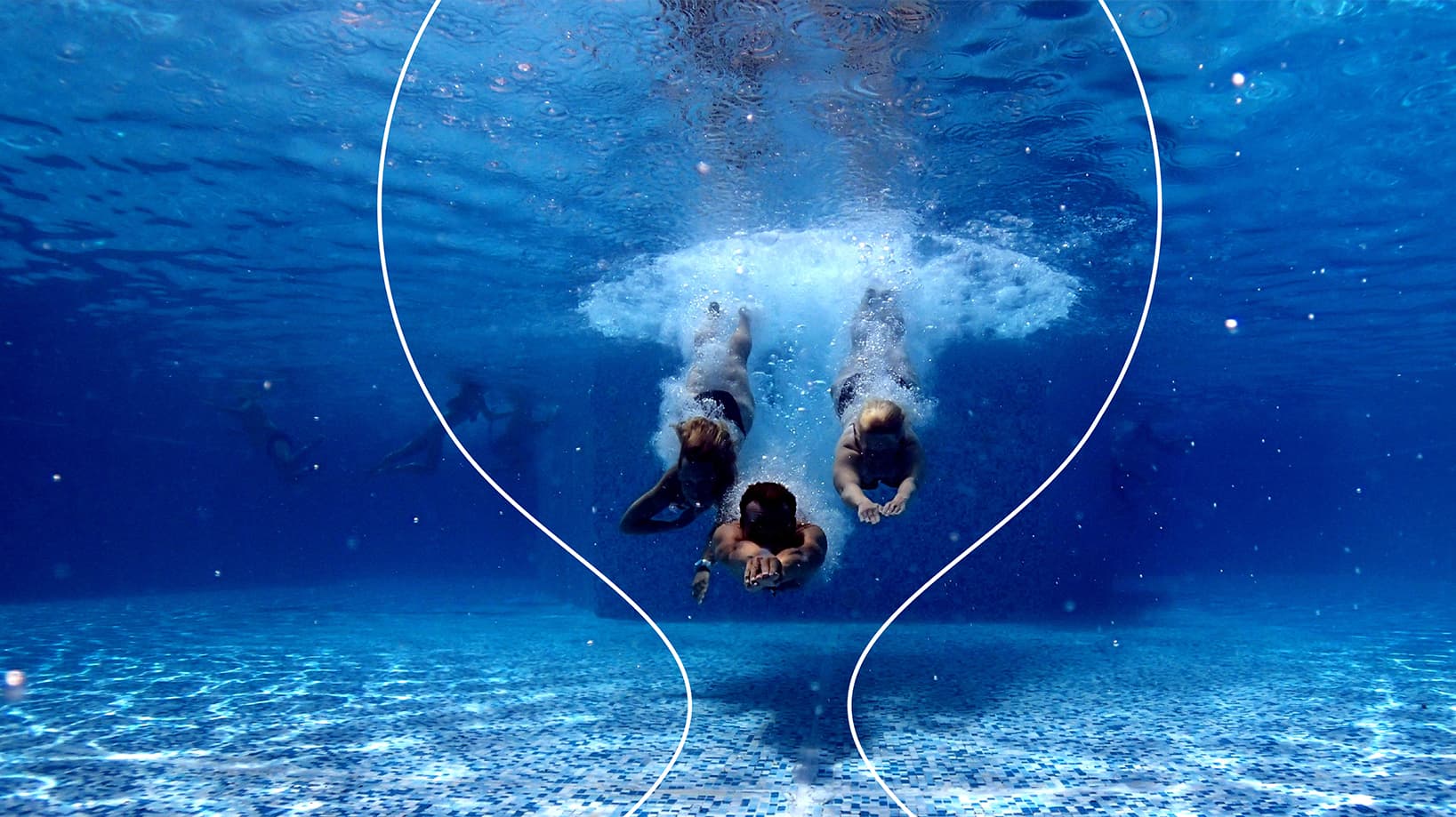
Modernity and fluidity
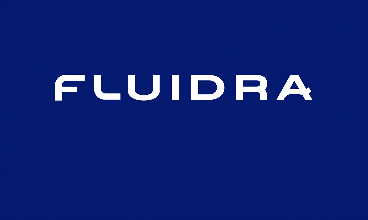
The first visible sign of the merger was the creation of the new logo, reflecting what the company has achieved through the merger: becoming a leading, strong, and innovative organization.
The new logo needed to express modernity and “fluidity,” defining characteristics of Fluidra. To achieve this, we designed a new typeface by softening the angles of the letters and giving them greater personality, aligning the visual identity with the brand’s values and attributes.
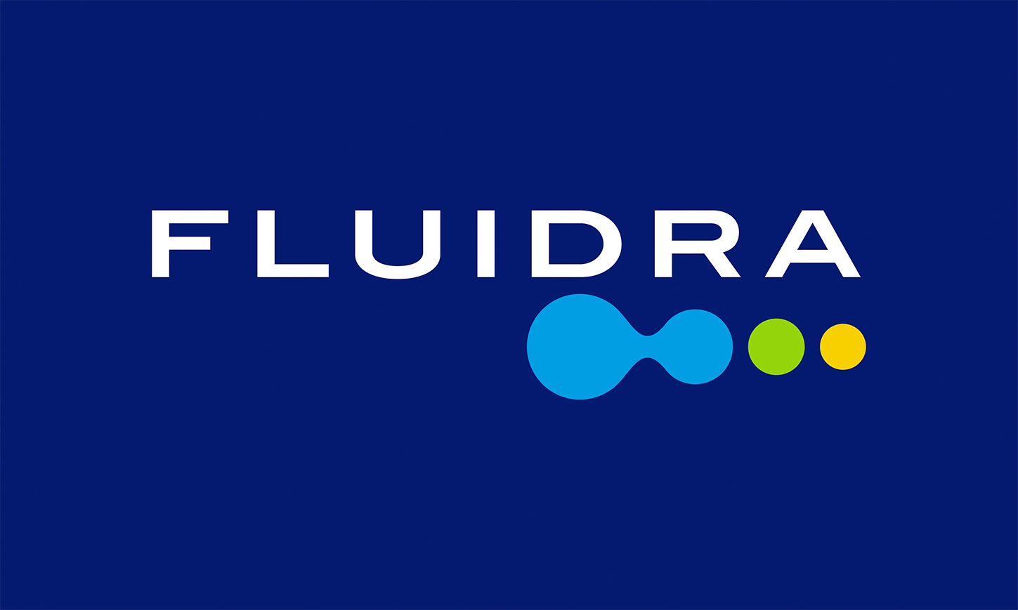
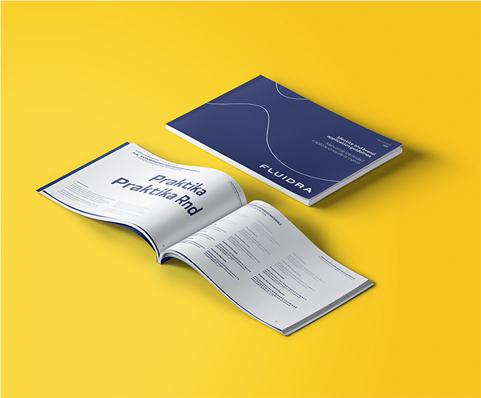
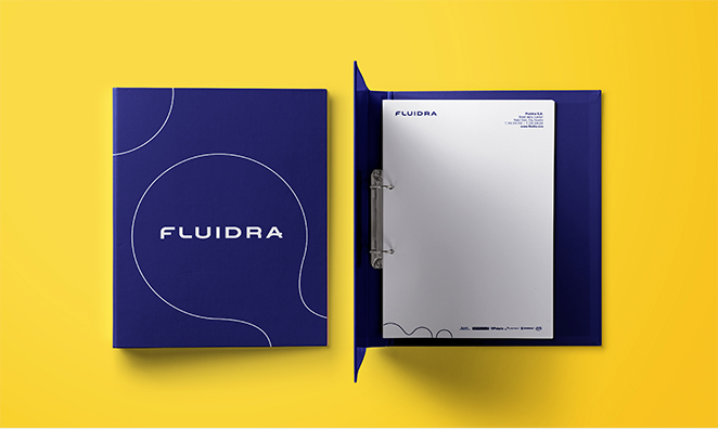
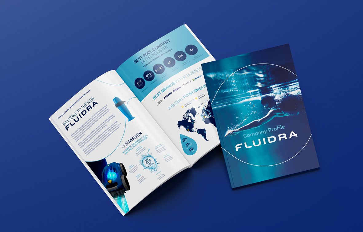
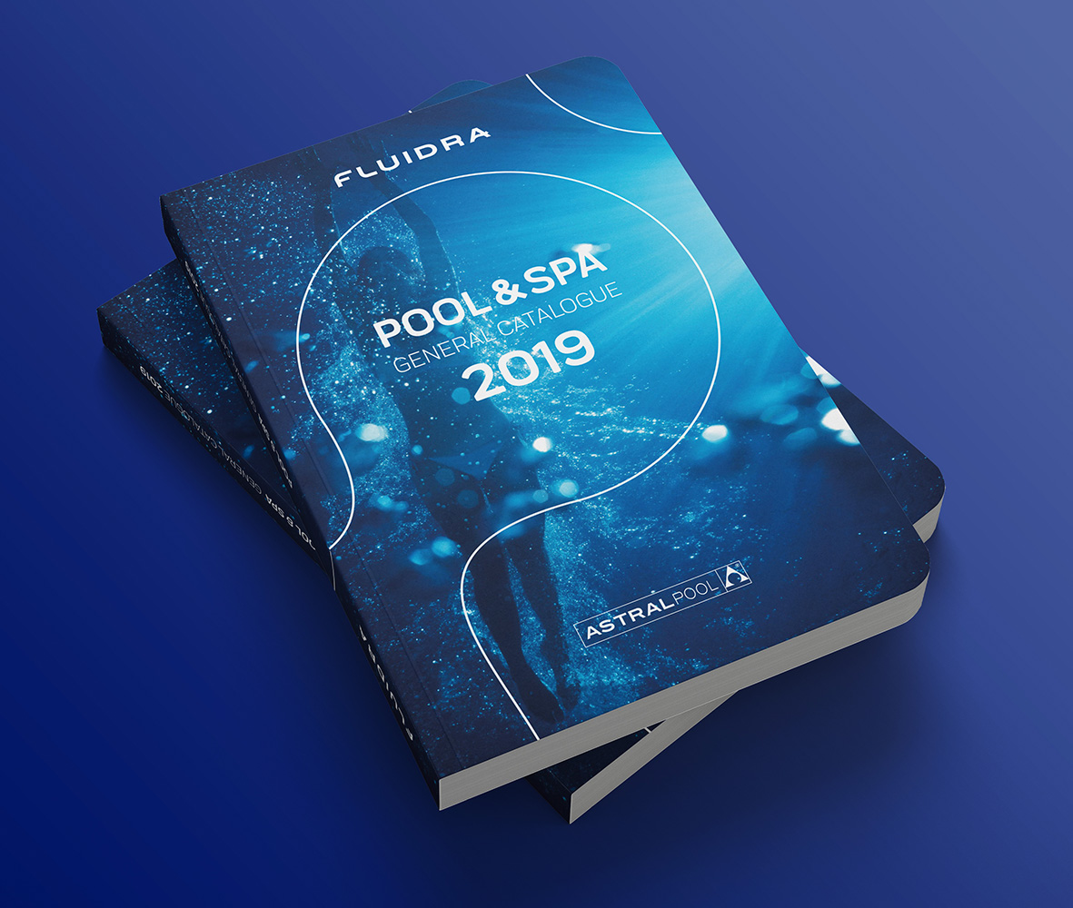
Visual universe
A visual universe was also developed, building on the symbol that had previously accompanied the brand, but reinterpreted through a renewed approach. The result is a sober and minimalist expression that is at once distinctive and ownable. This visual universe was applied across every brand touchpoint, creating a coherent and singular whole.
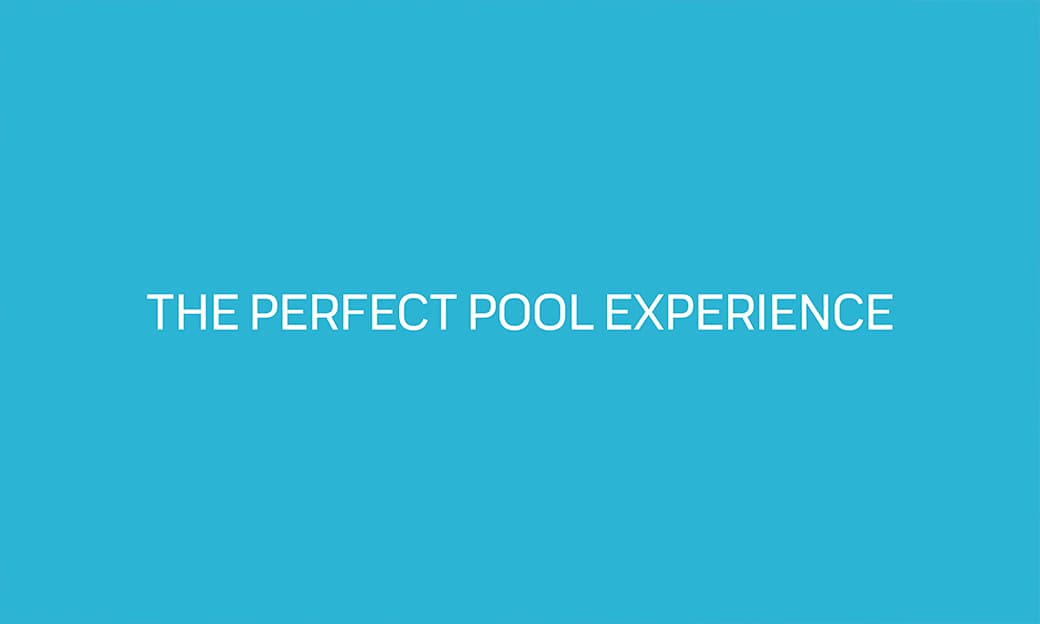
The result is a renewed brand, equipped with a visual universe and a verbal identity that reflect in every detail the company’s new positioning and purpose: to create the perfect pool and wellness experience.