https://www.youtube.com/watch?v=791w920ojnA
ESEIT is a higher education institution in Colombia positioned as a hub for nurturing talent in engineering, technology and business, connecting it with the country’s entrepreneurial and technological ecosystem.
With a strong local focus, the project aims to foster national development, becoming a benchmark in specialised, high-quality academic training that responds to the professional needs and aspirations of Colombian society.
Planeta Formación y Universidades acquired ELITE and integrated it as an active member of its network of universities and higher education institutions.
The challenge: a new positioning,
naming and identity
As part of the Planeta Formación y Universidades network, ELITE needed to adapt to a new context. The objective was to create a new positioning, naming and identity, shaping a brand perceived as a leading higher education institution in Colombia.
A contemporary, pragmatic and rational brand, with an international outlook, a forward-looking vision and a strong commitment to local needs.
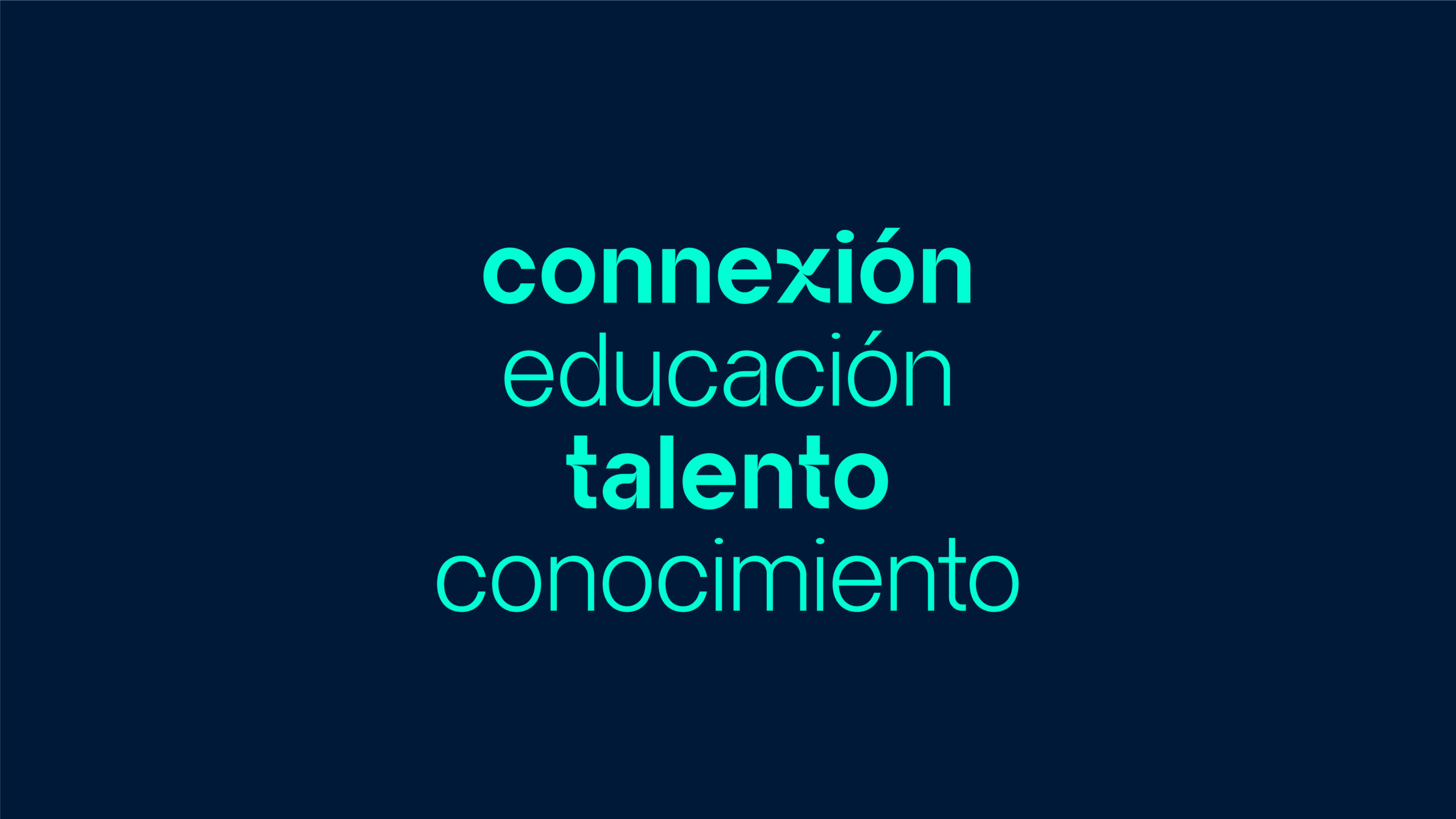
A brand capable of connecting with multiple stakeholders, particularly audiences interested in technology, engineering and business.

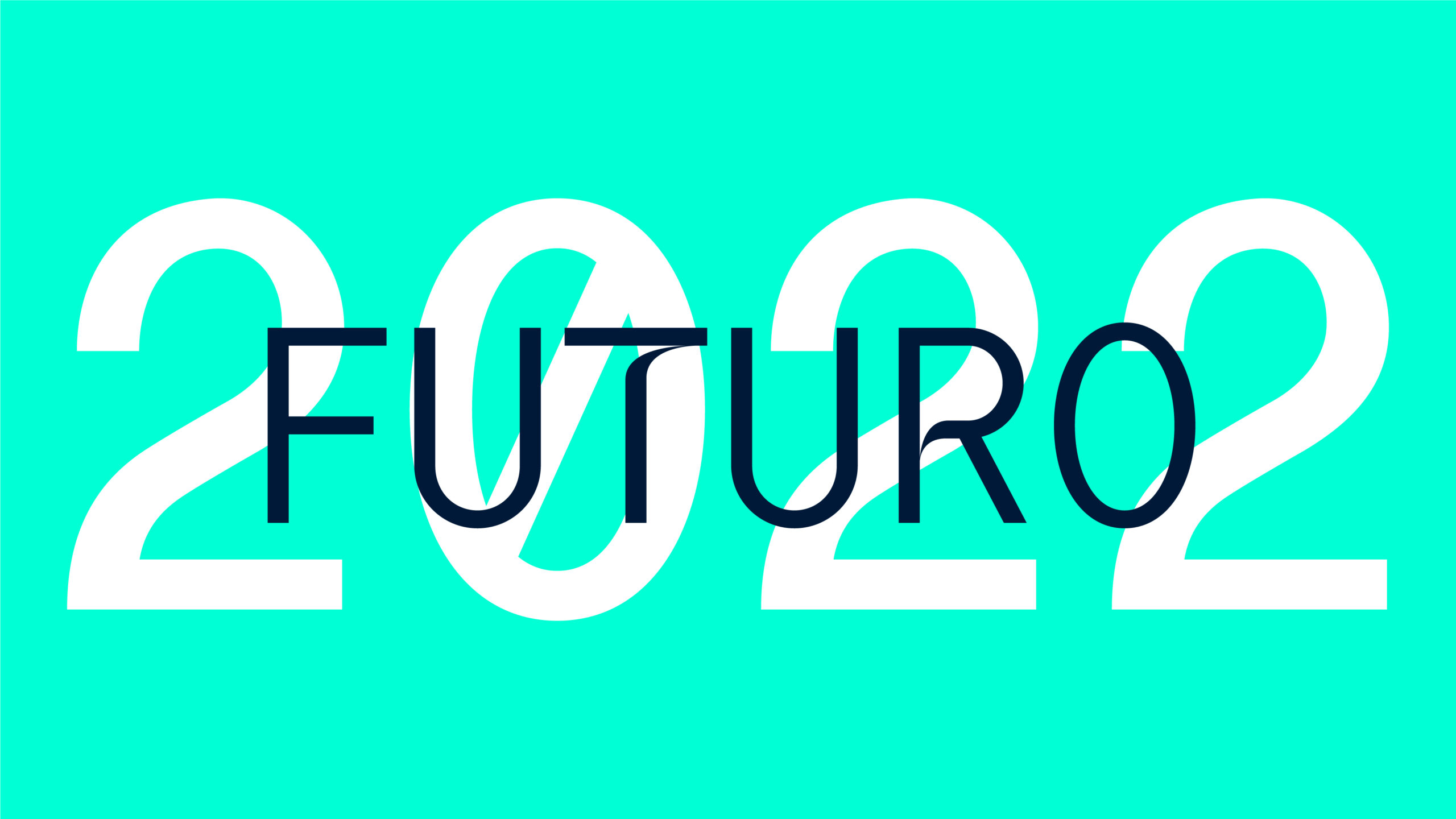
A new story, a new vision for the future
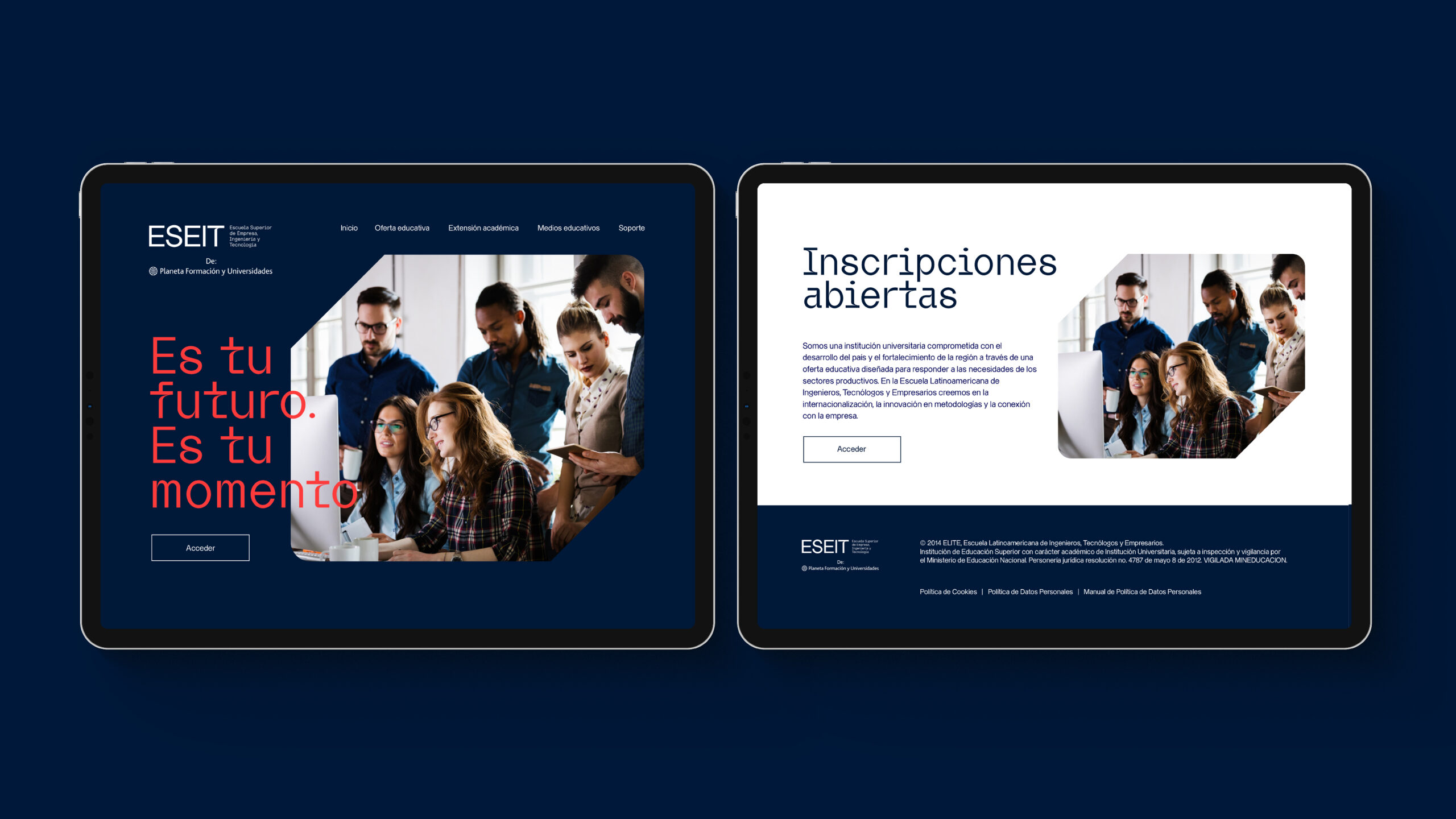
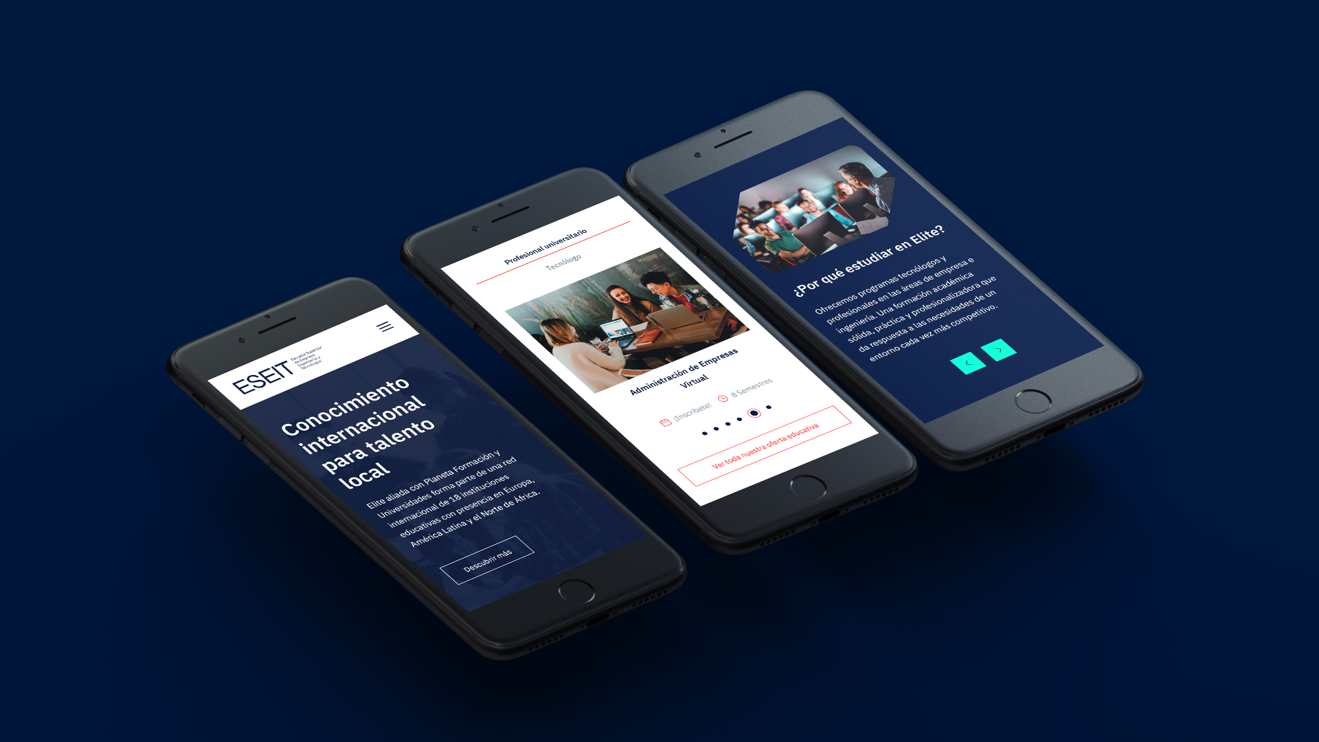
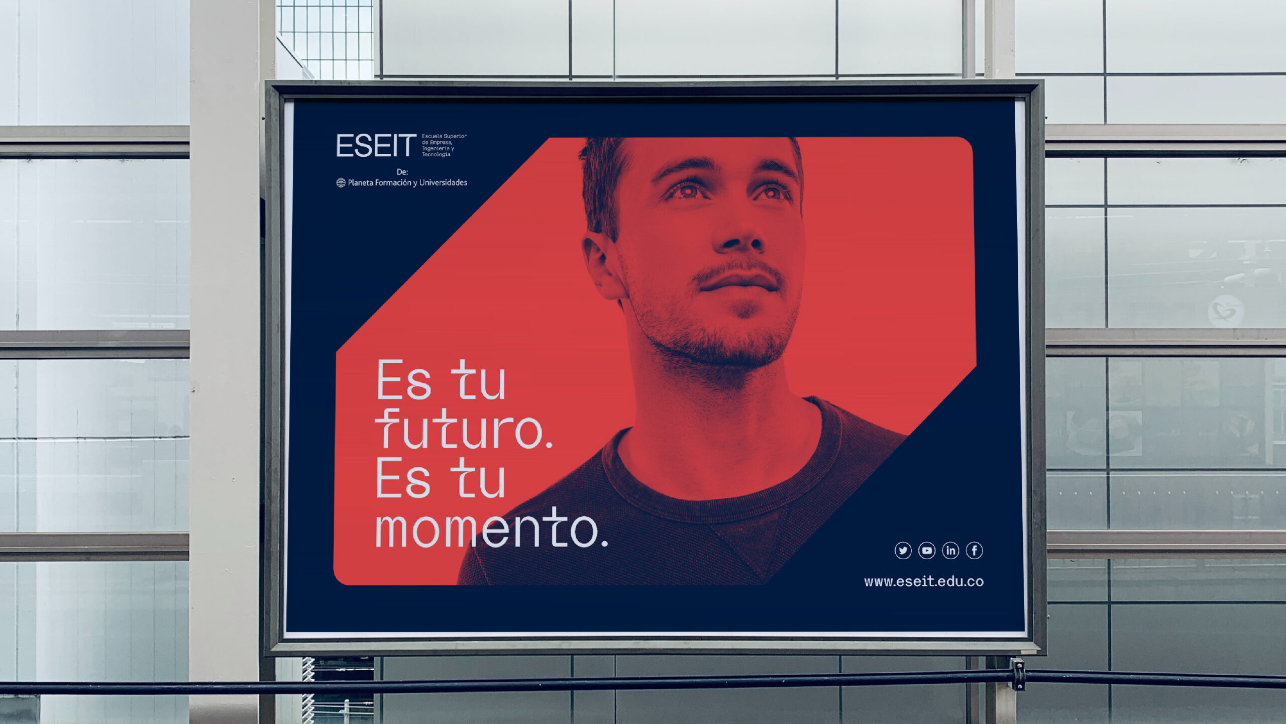
ESEIT is a leading educational solution in Colombia, with a forward-looking vision that creates opportunities today. At Columna, we redefined its positioning and value proposition, articulating them through a new verbal and visual identity.
The new narrative was distilled into a clear brand message: “It’s your future, it’s your moment.”
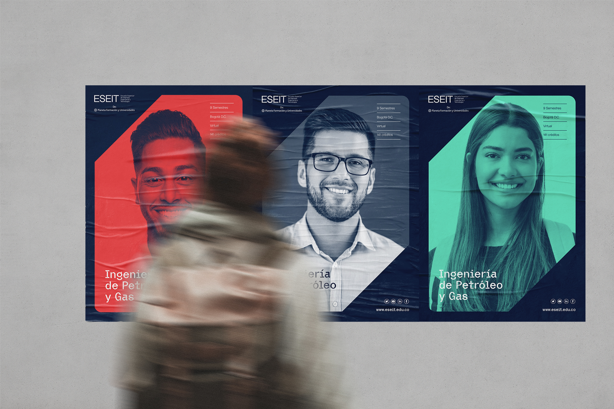
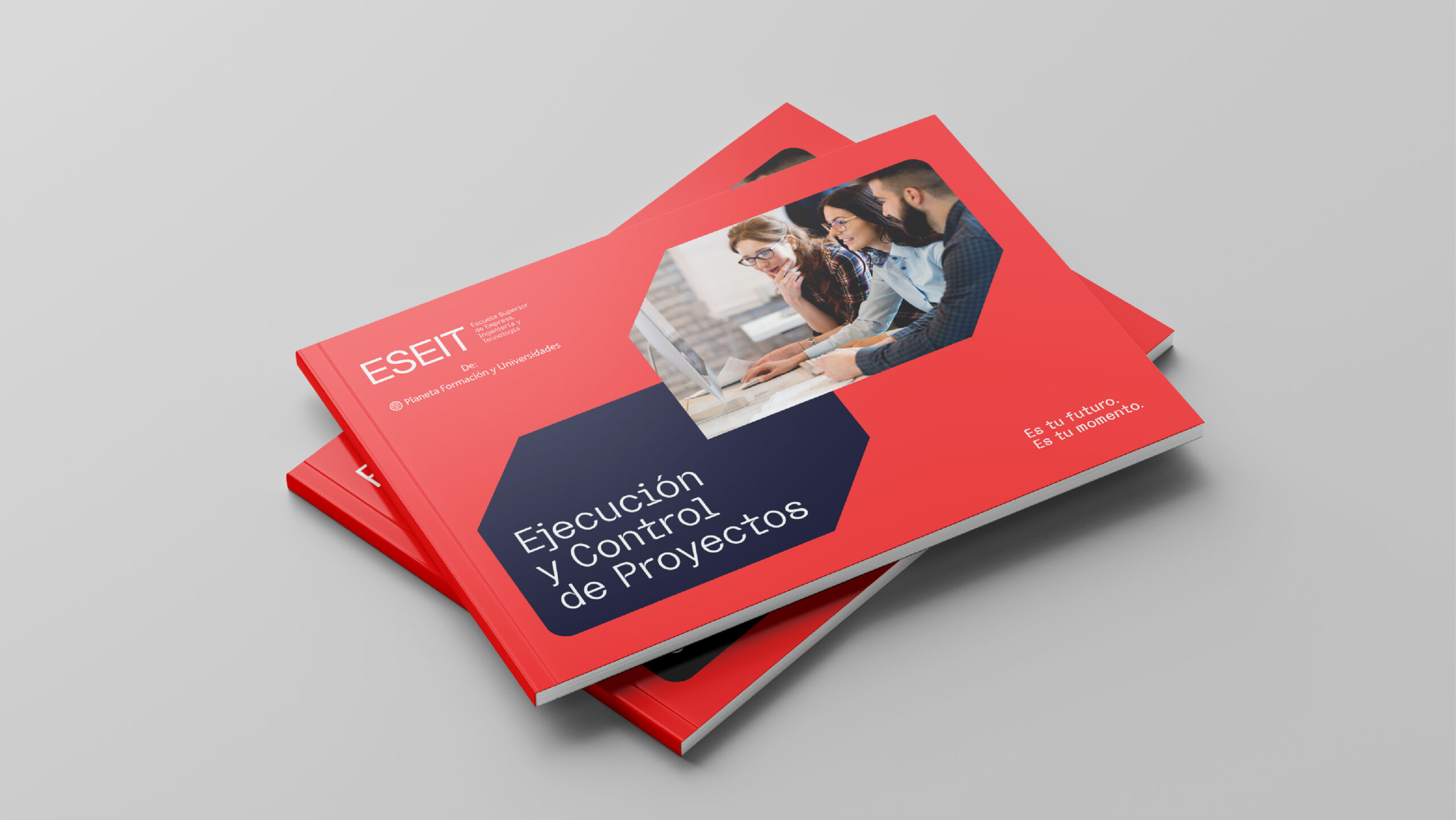
From a visual identity perspective, we equipped the brand with graphic elements that convey projection, relevance and a world of possibilities opening up to ESEIT’s students and collaborators.

A focus on the present, with a vision for the future
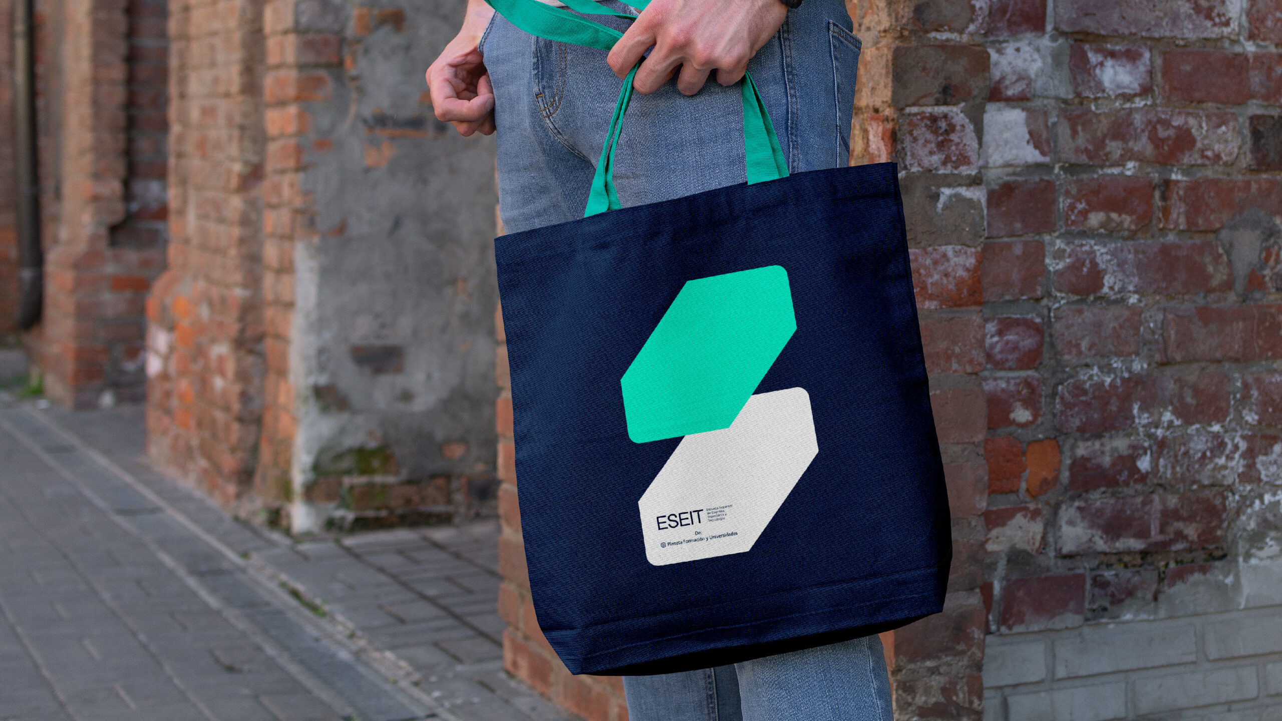
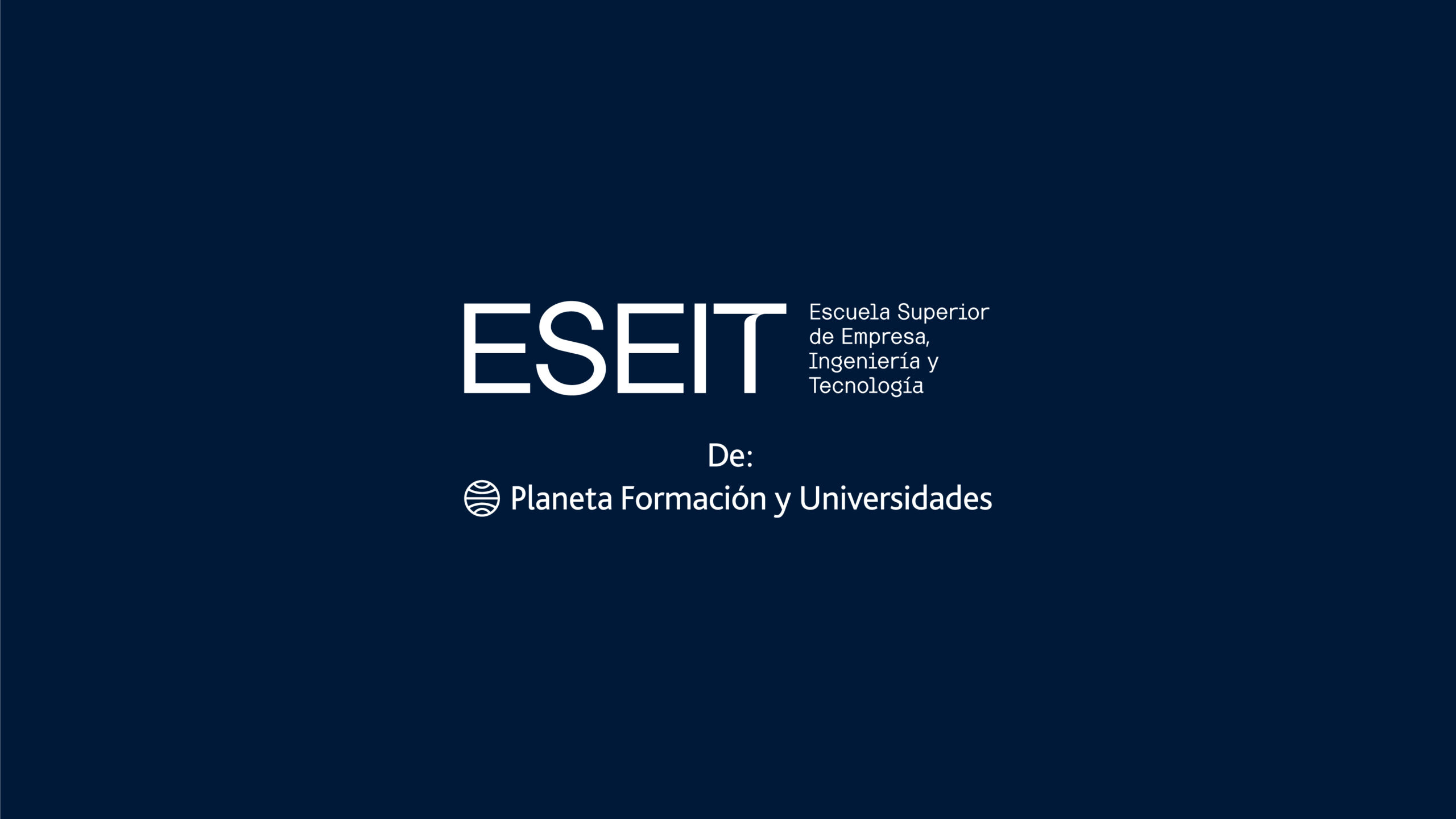
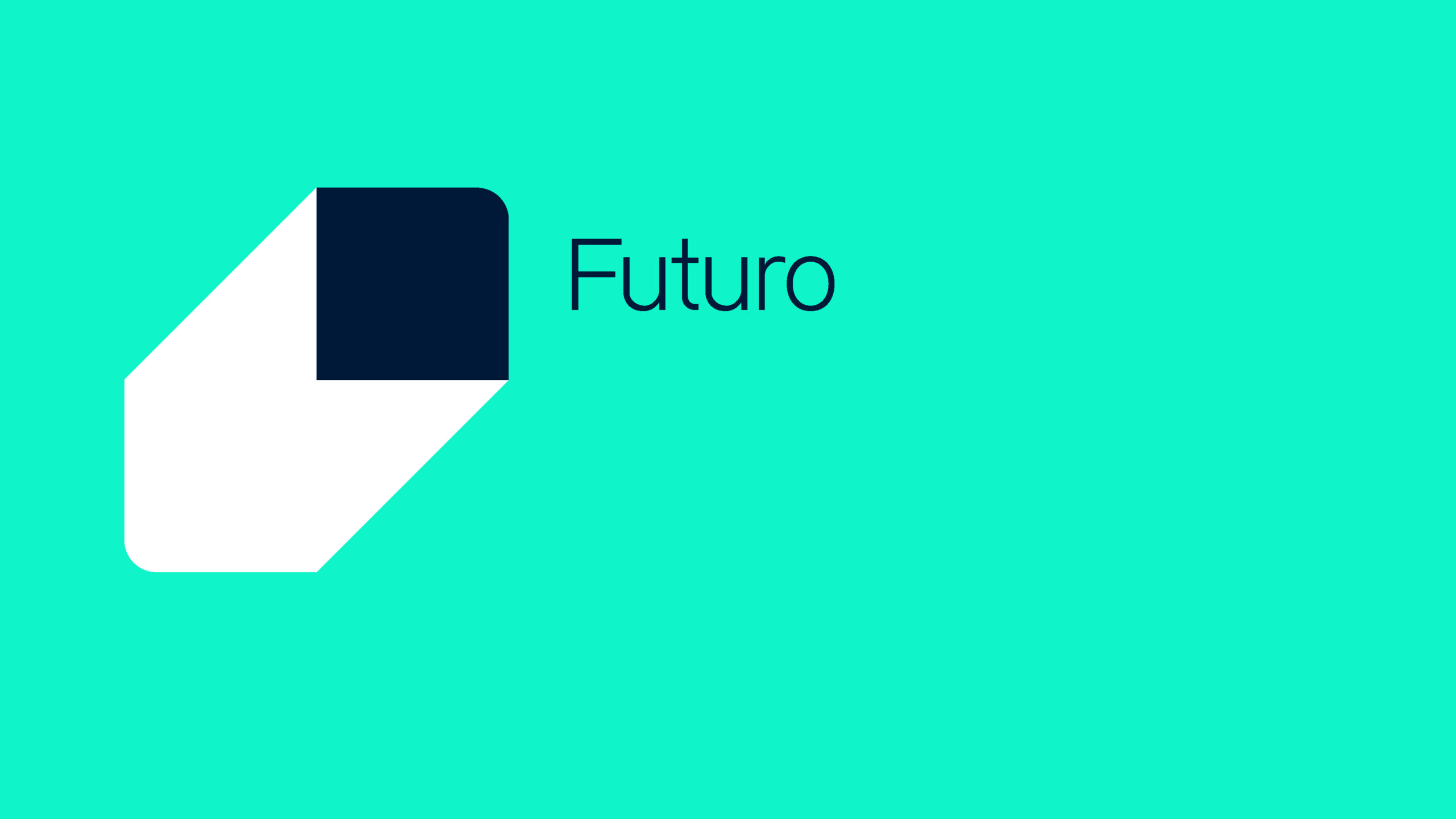
The logotype was created using uppercase lettering, with the brand name endorsed by the line “by Planeta Formación y Universidades.”
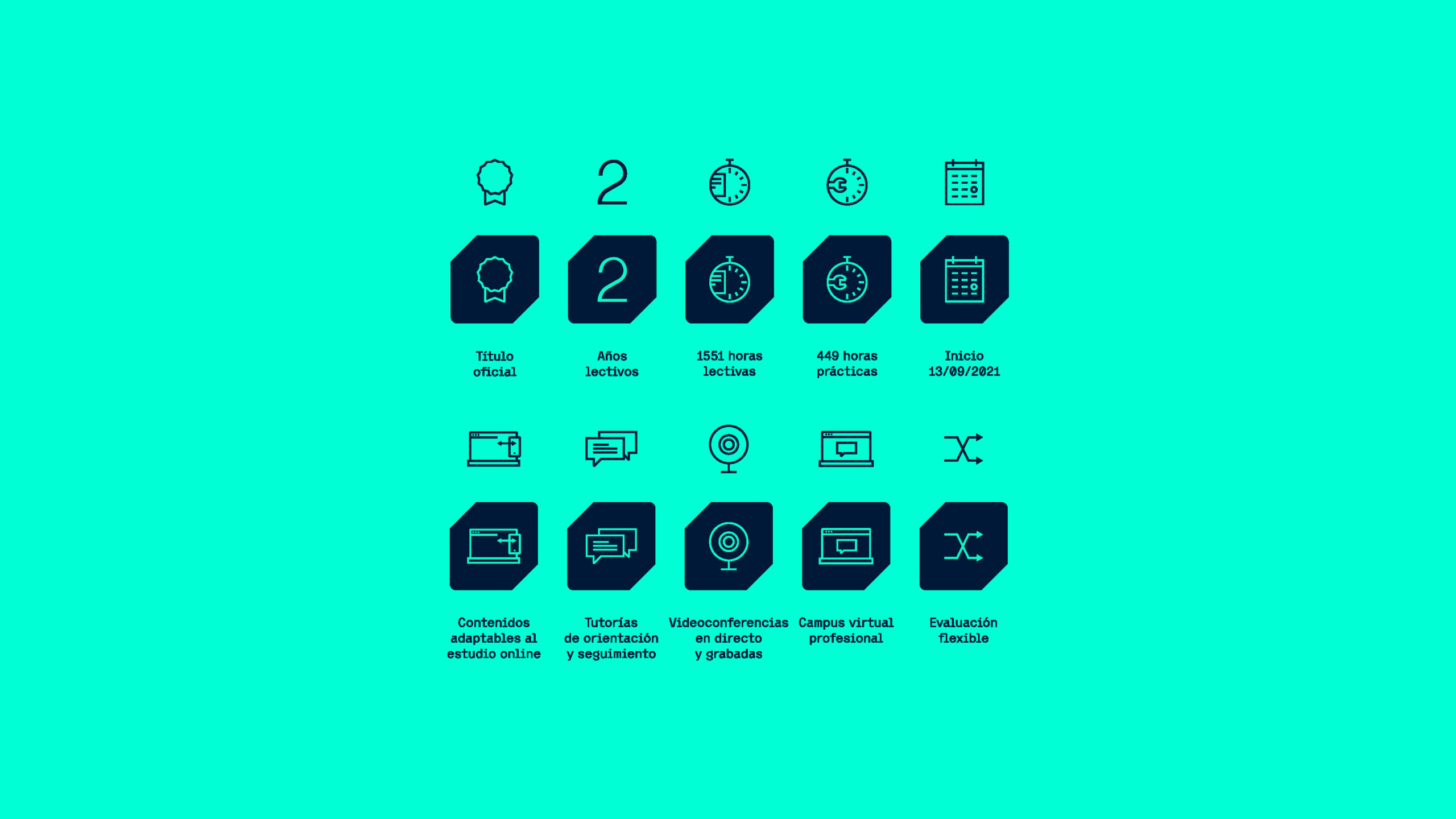
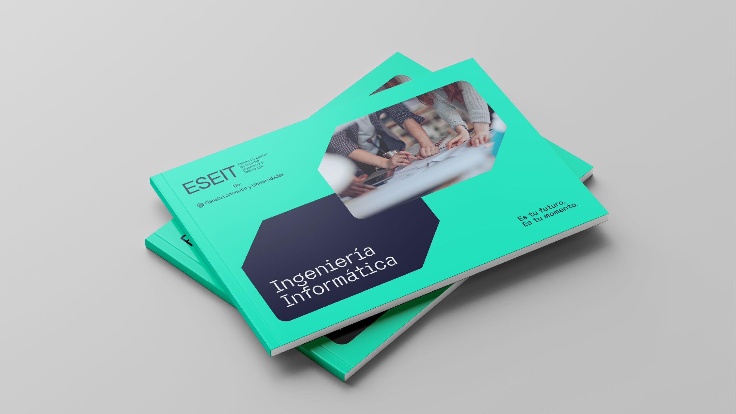
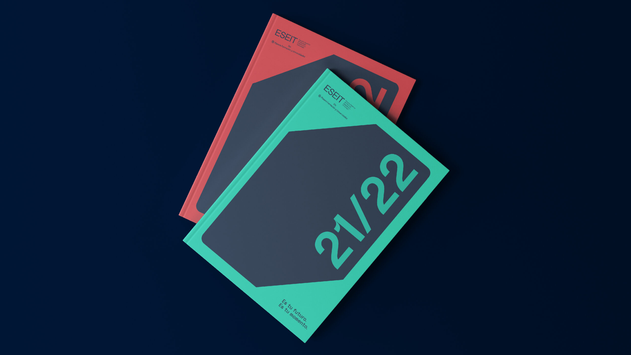
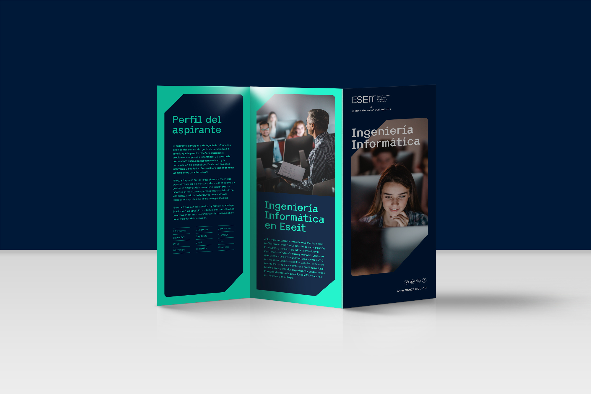
The visual universe is built around a rhomboid shape derived from a square (the present), which, through two ascending diagonals, connects with another square (the future), symbolising projection and growth. In terms of colour, a primary dark blue was defined, conveying the elegance and seriousness expected of a university, while coral and turquoise were introduced as secondary colours to bring freshness, technology and modernity to the visual system.
Given the scope of the project, the brand and its visual universe were also applied across key corporate touchpoints, including stationery, signage and the website.