https://www.youtube.com/watch?v=9wSS1jBhrRY
Anartxy is a Valencian jewelry brand founded in 2009, specializing in the use of steel as its signature material for the creation of its pieces.
Over the years, Anartxy has brought the style of fashion into the world of jewelry, adding spontaneity and color. This vision and intuitive approach to design have positioned the brand as a trend leader, with an entrepreneurial, approachable and distinctly Mediterranean spirit.
Anartxy began as a jewelry brand focused on multi-brand retailers, but its unique, fresh style and active presence on social media have achieved national reach. This growth has enabled the brand to expand, launch its own e-commerce platform and, ultimately, open its own physical stores in Valencia and Zaragoza.

The challenge: Reconnecting with Consumers
The brand required a project focused on defining its value proposition. This led to a holistic rebranding aimed at enhancing the value of both the brand and its products through a new storytelling approach centered on its consumers and on the moments in which Anartxy jewelry is worn.
To build a stronger connection with its audience, a new Brand Essence was defined, enabling the brand to develop a distinctive and differentiated identity and to engage clearly and meaningfully with new audiences.

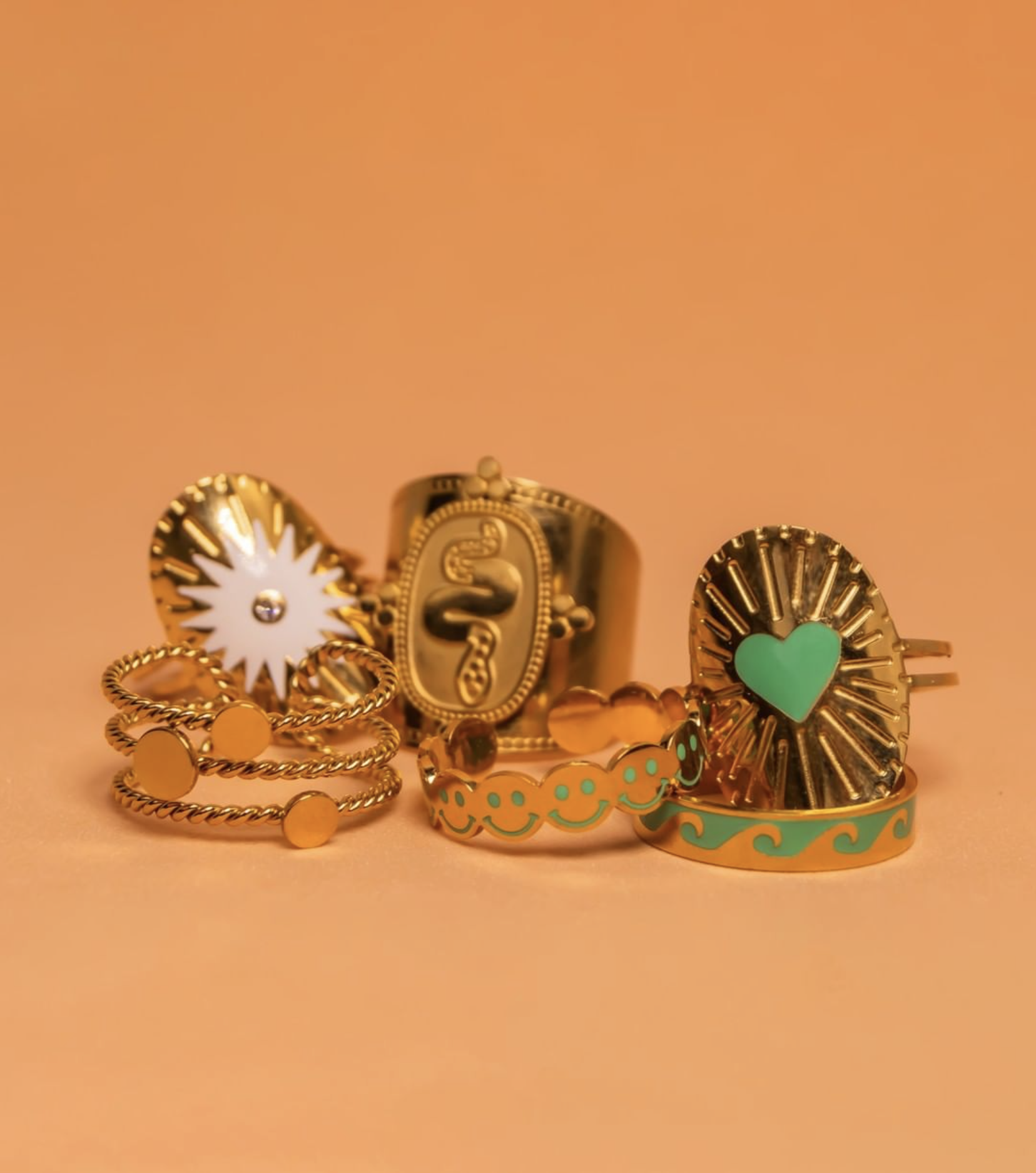
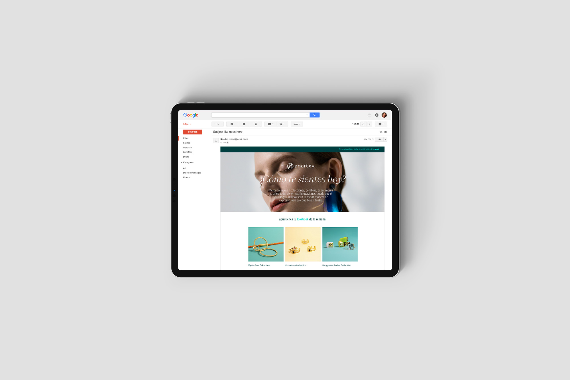
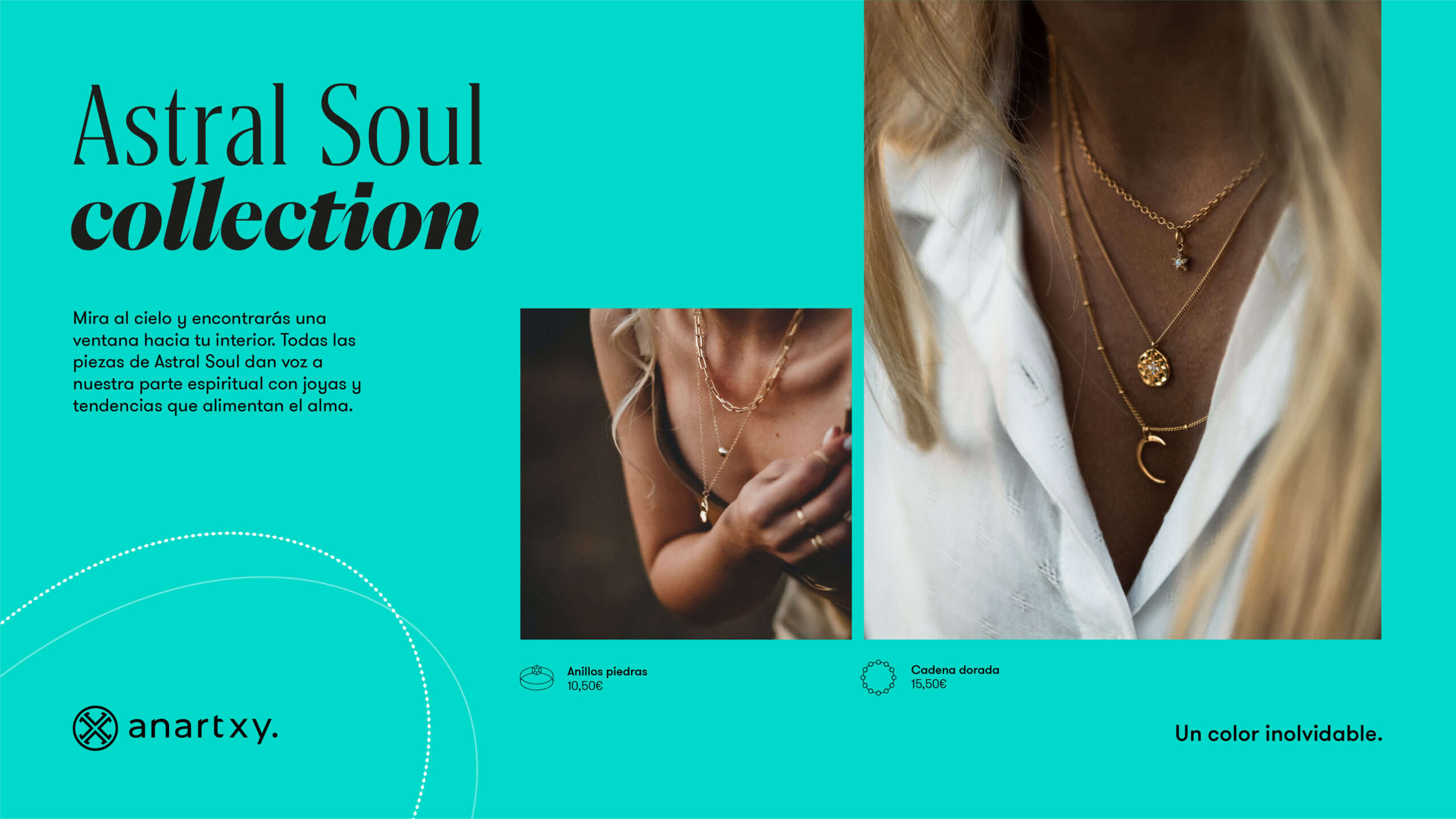
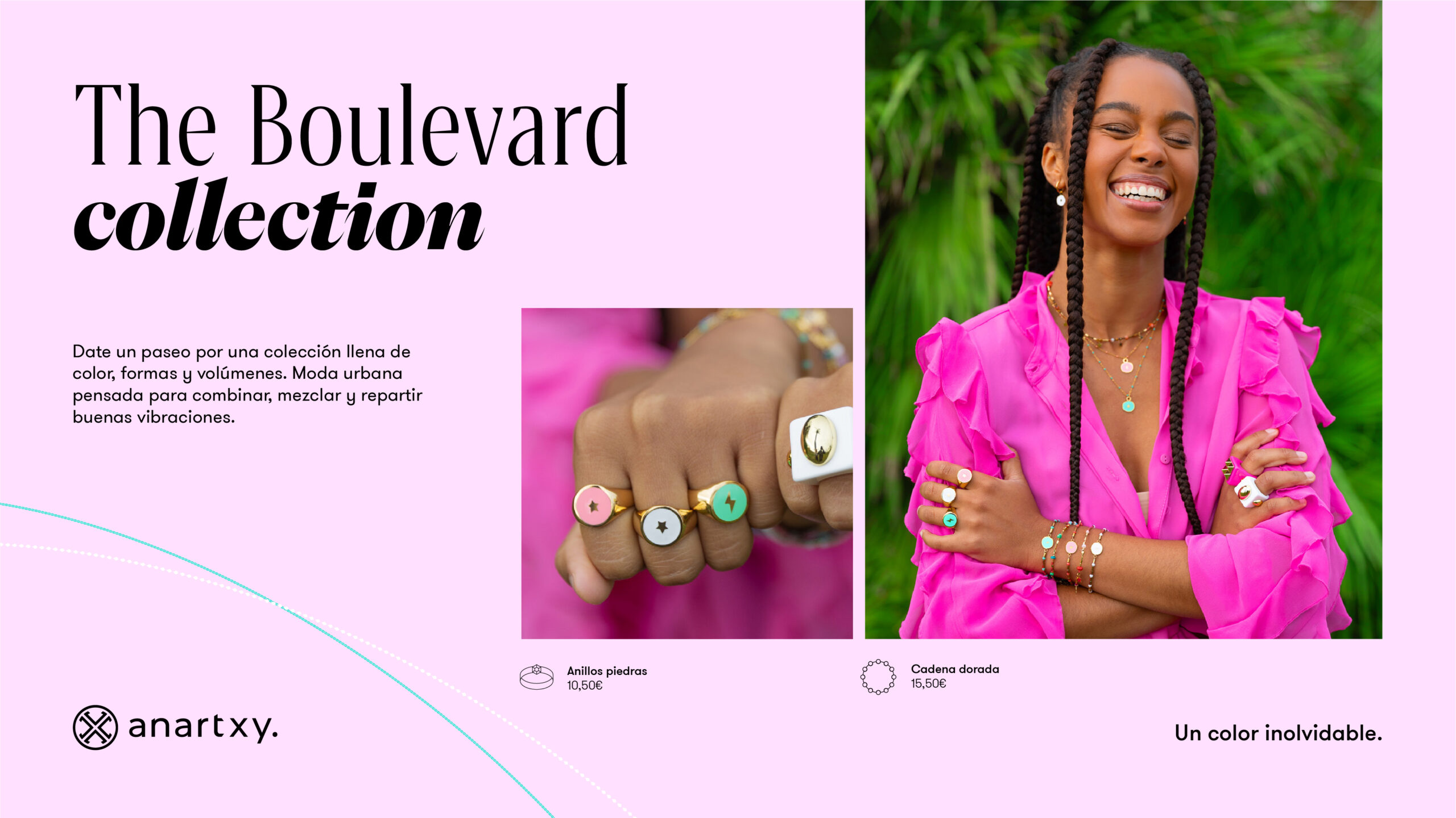
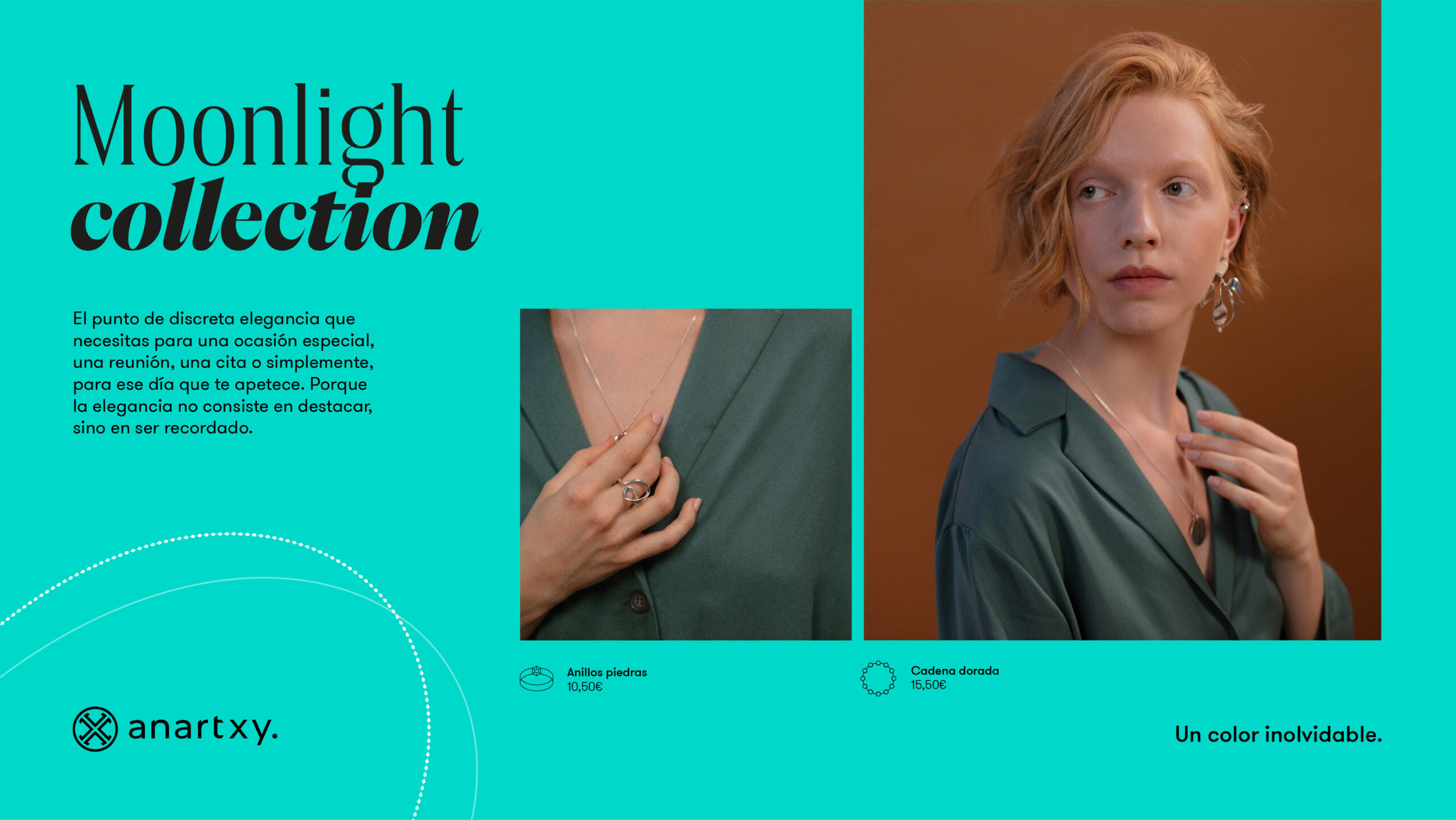
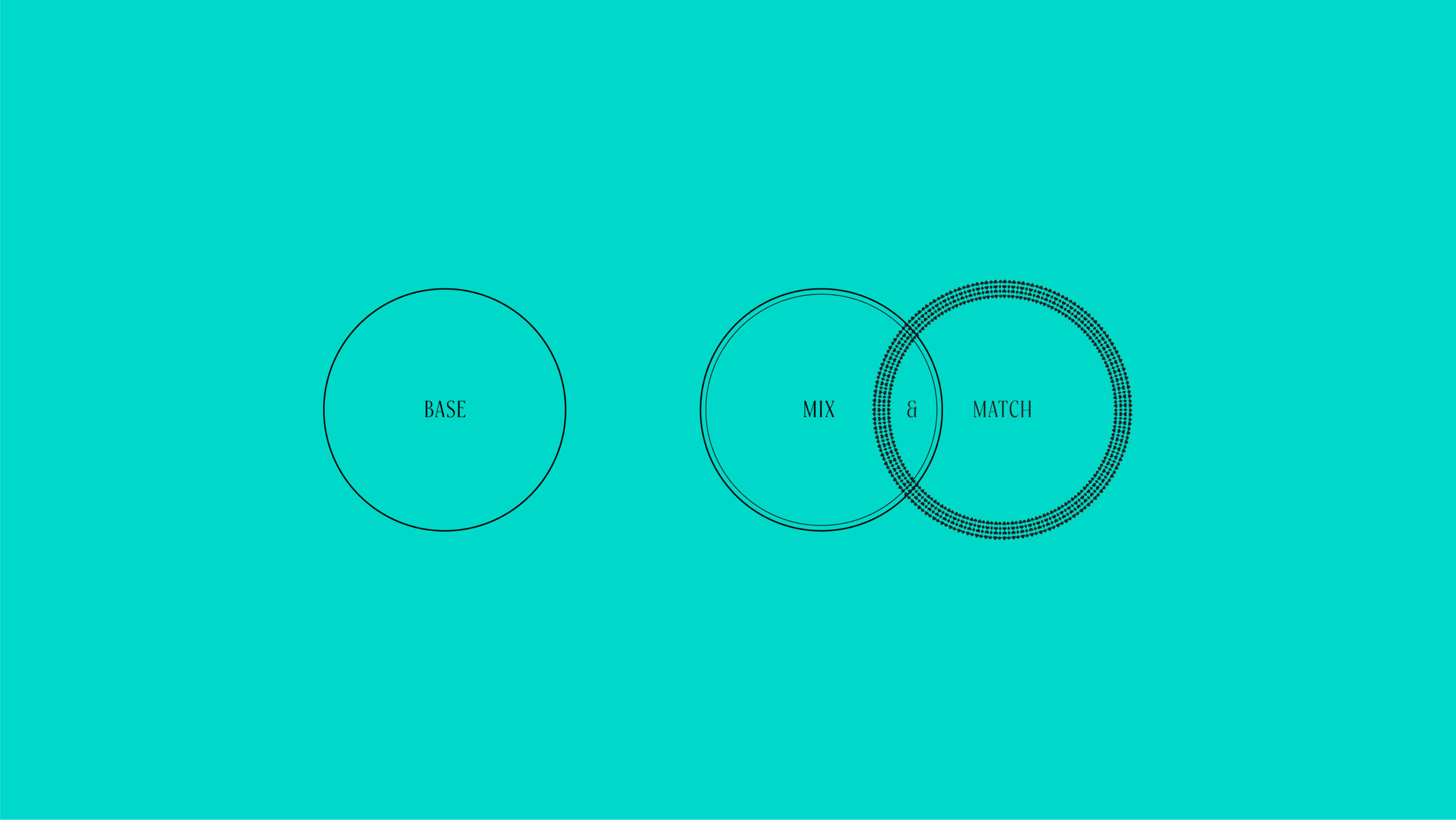
A Collection for Every You
Through consumer research and an analysis of the product portfolio, a new, simplified segmentation was developed, one that connects with users through their personality and lifestyle.
This new segmentation introduced the idea of a collection for every “you”.
https://www.youtube.com/watch?v=XlIvZFIEMTs
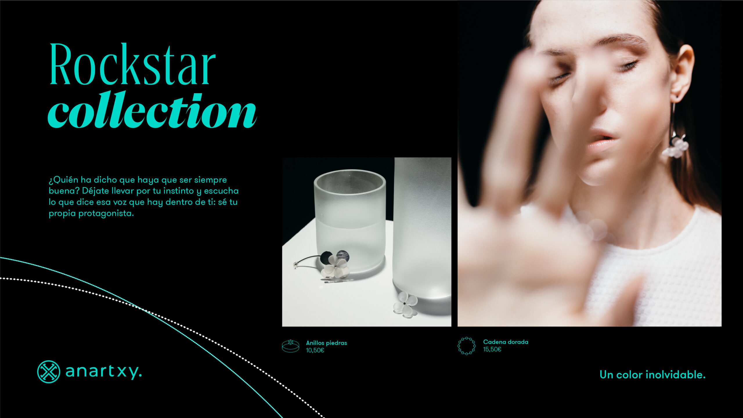
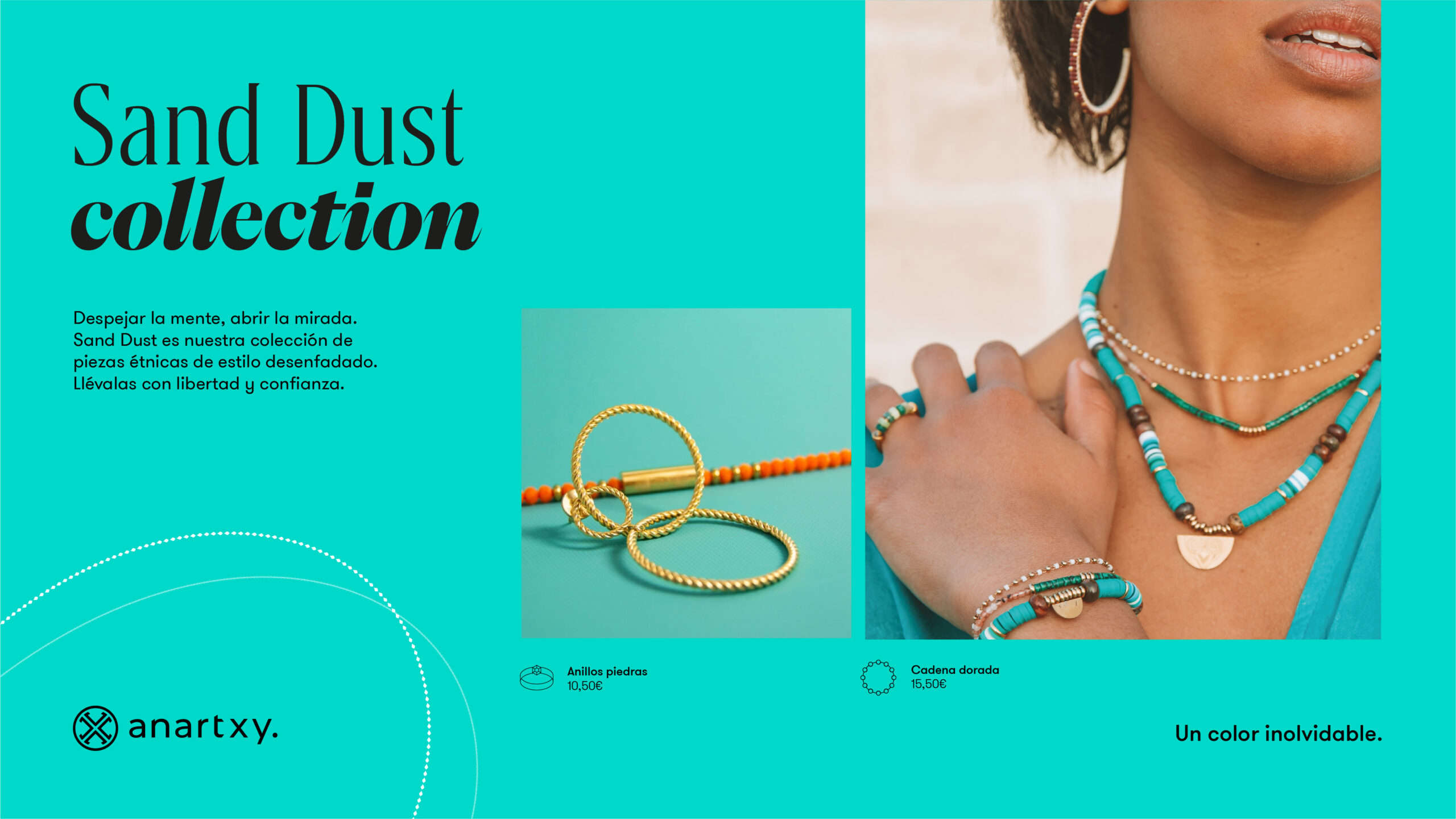
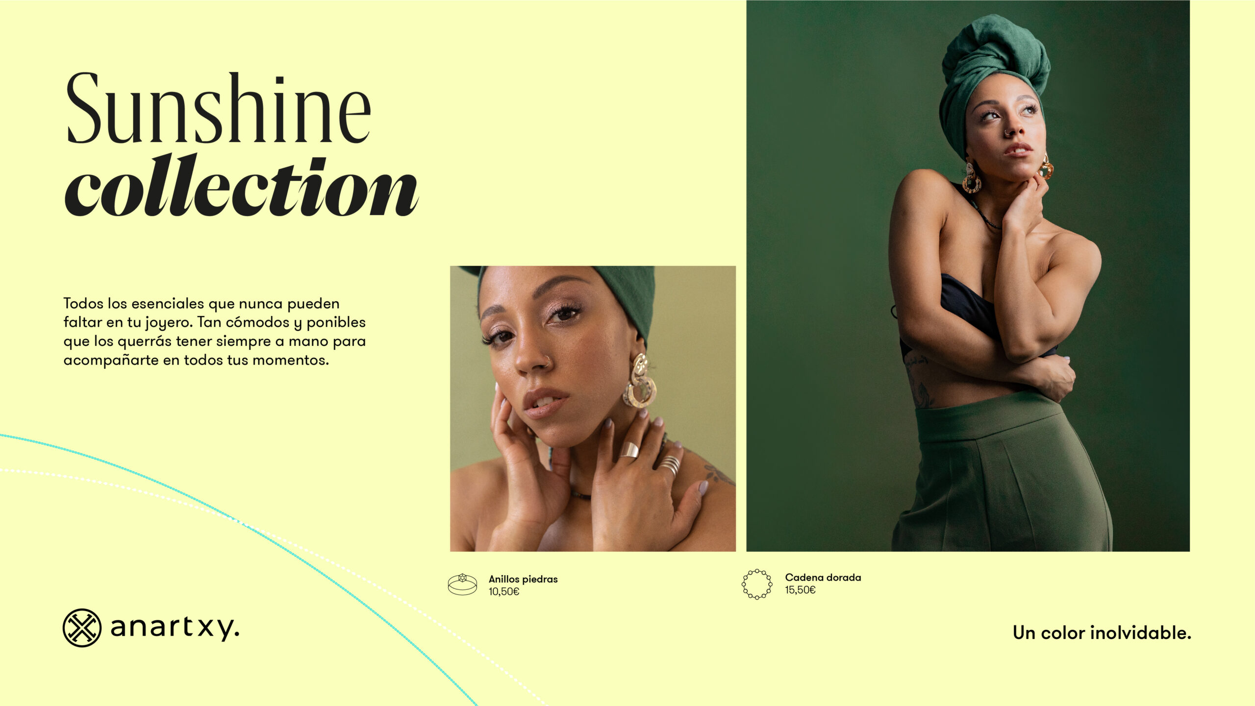
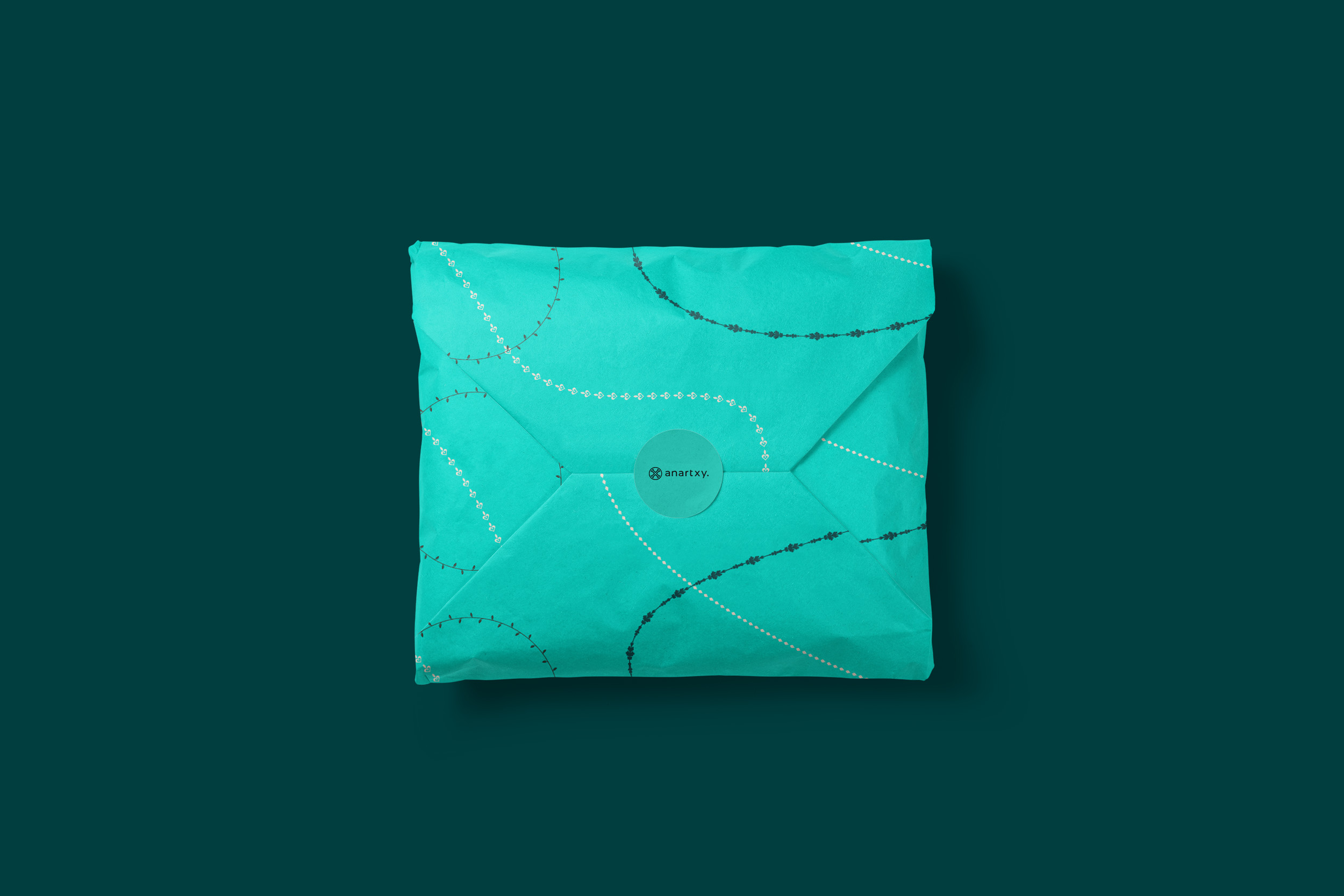
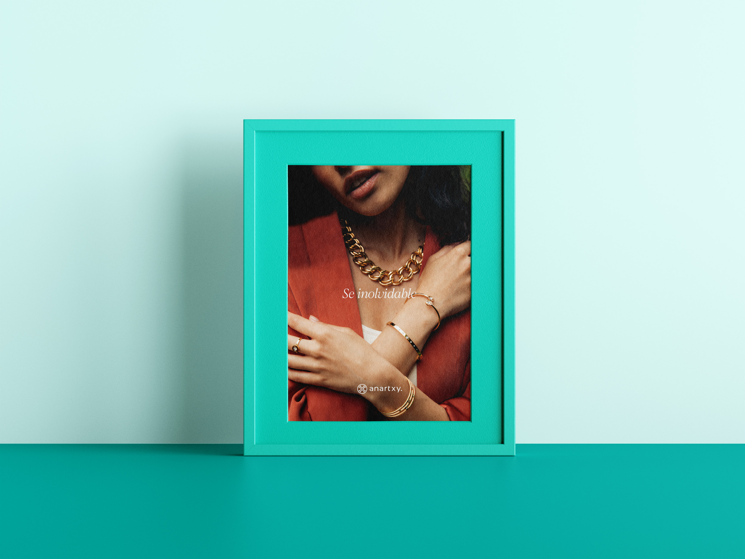
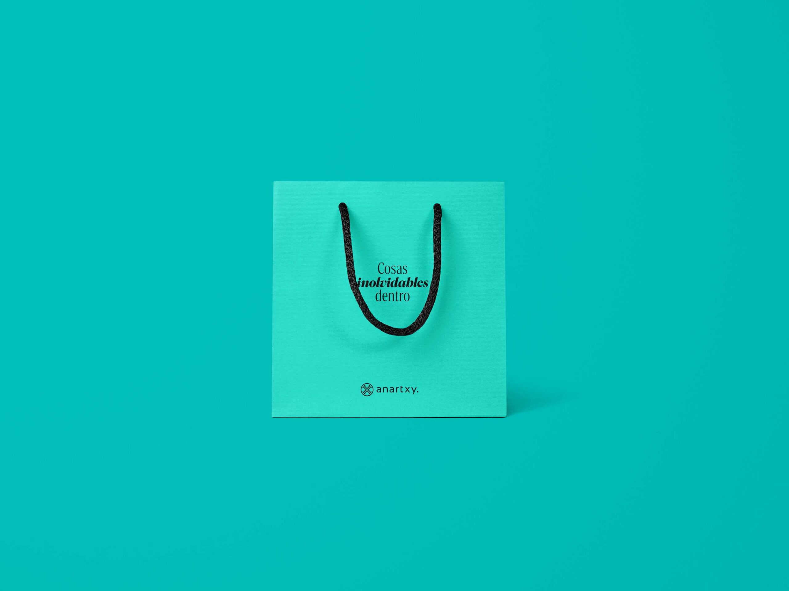
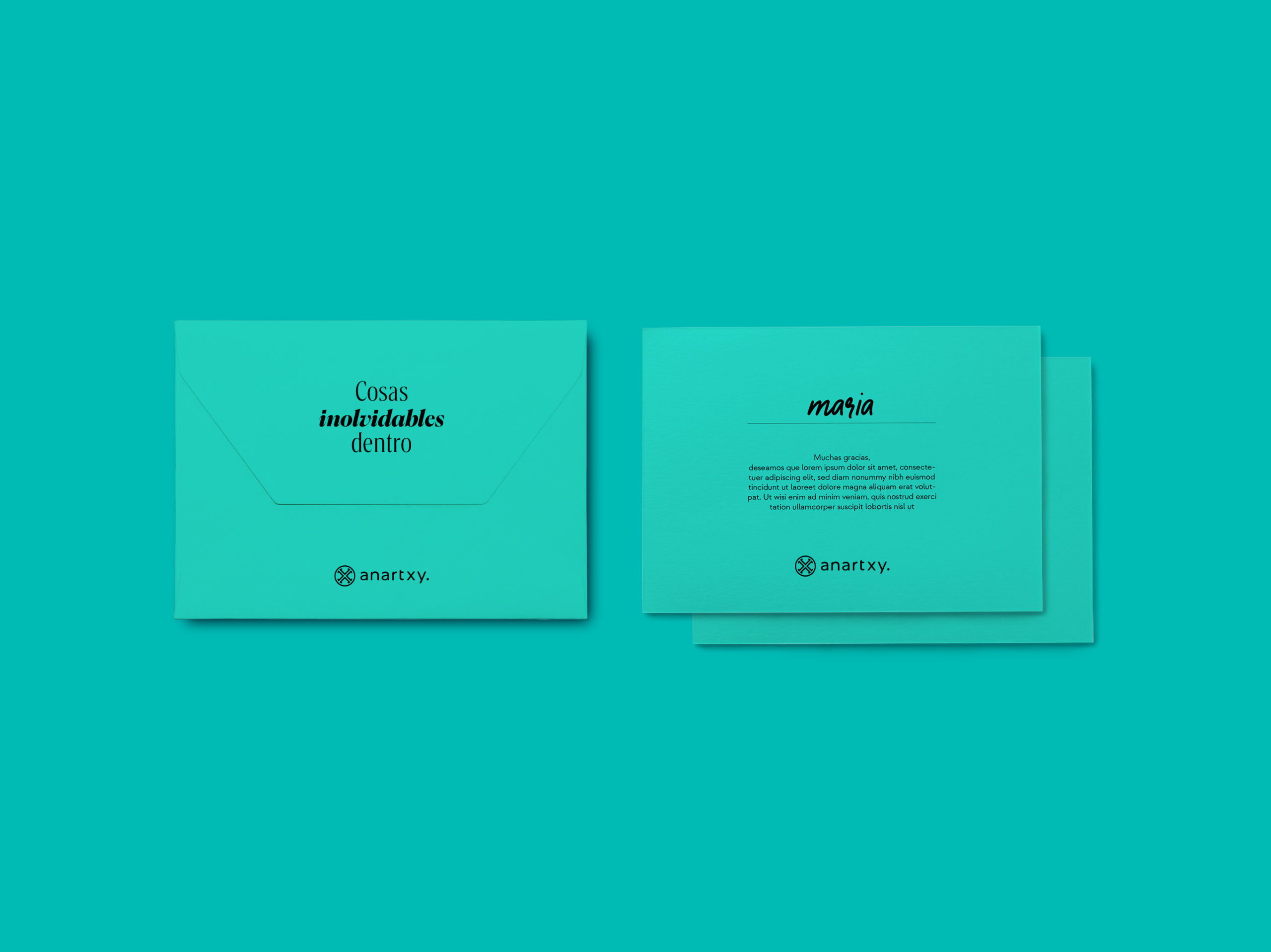
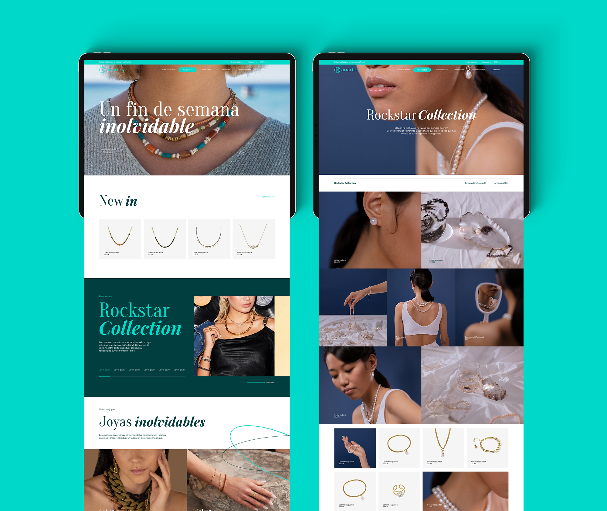
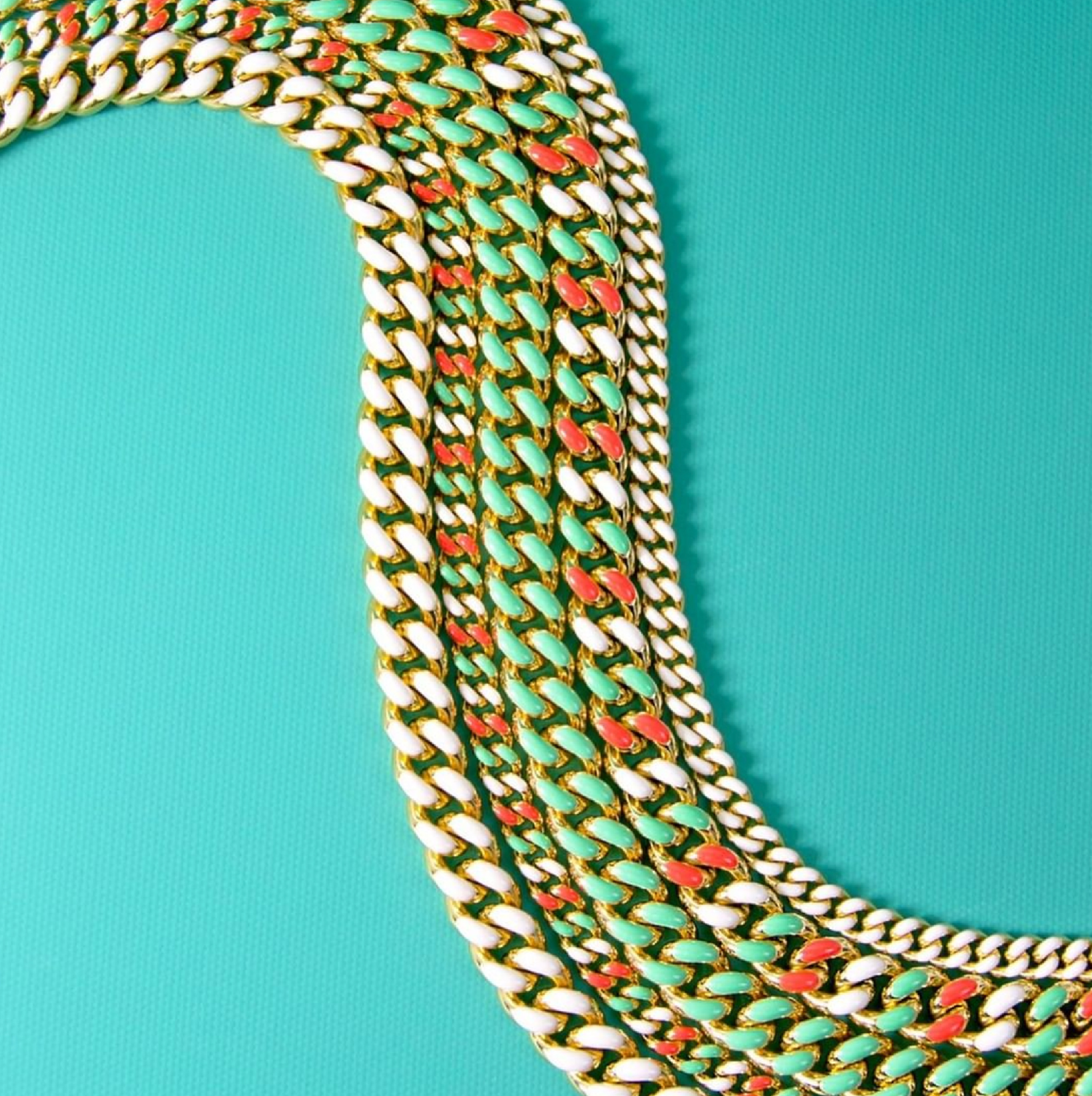
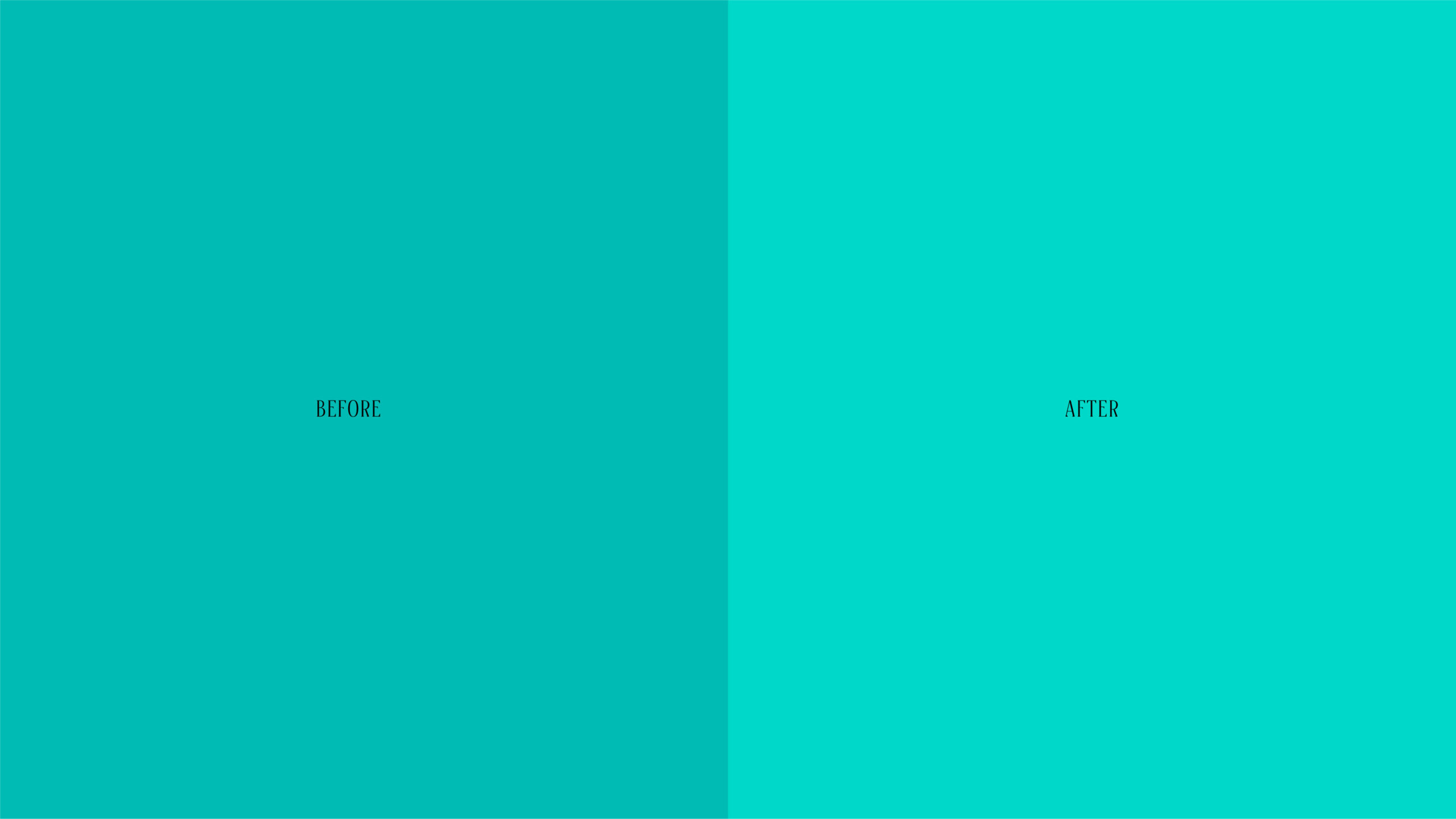
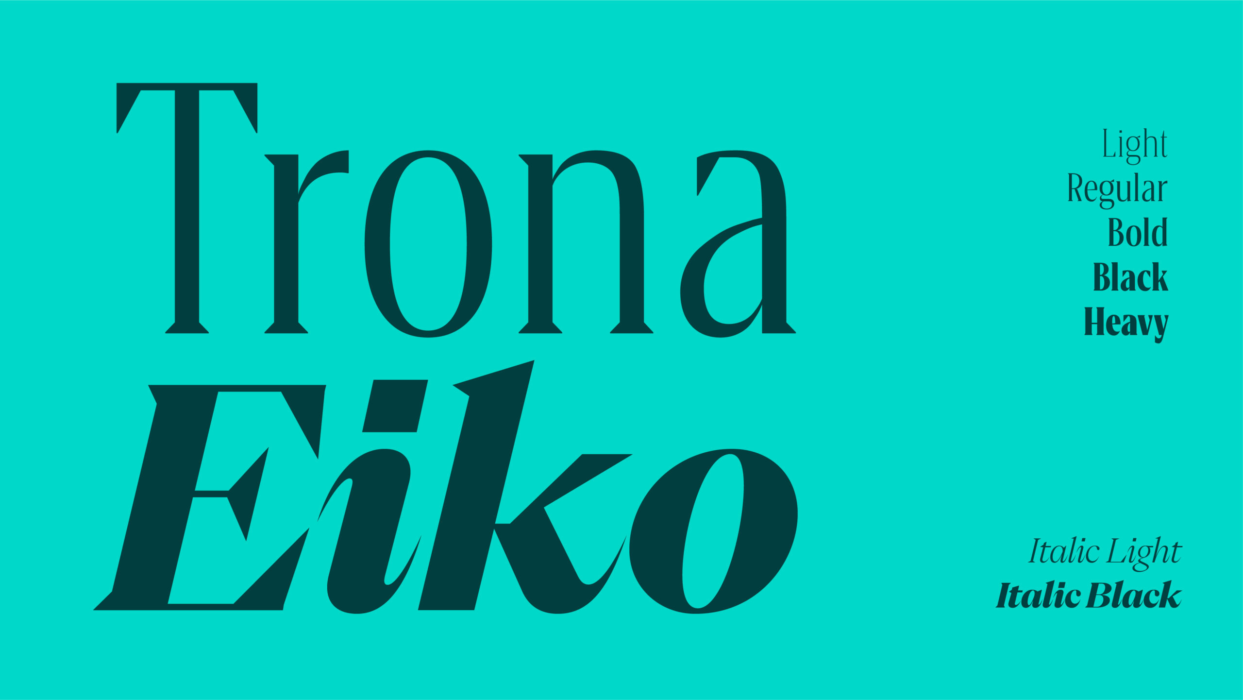
A Color That’s Hard to Forget
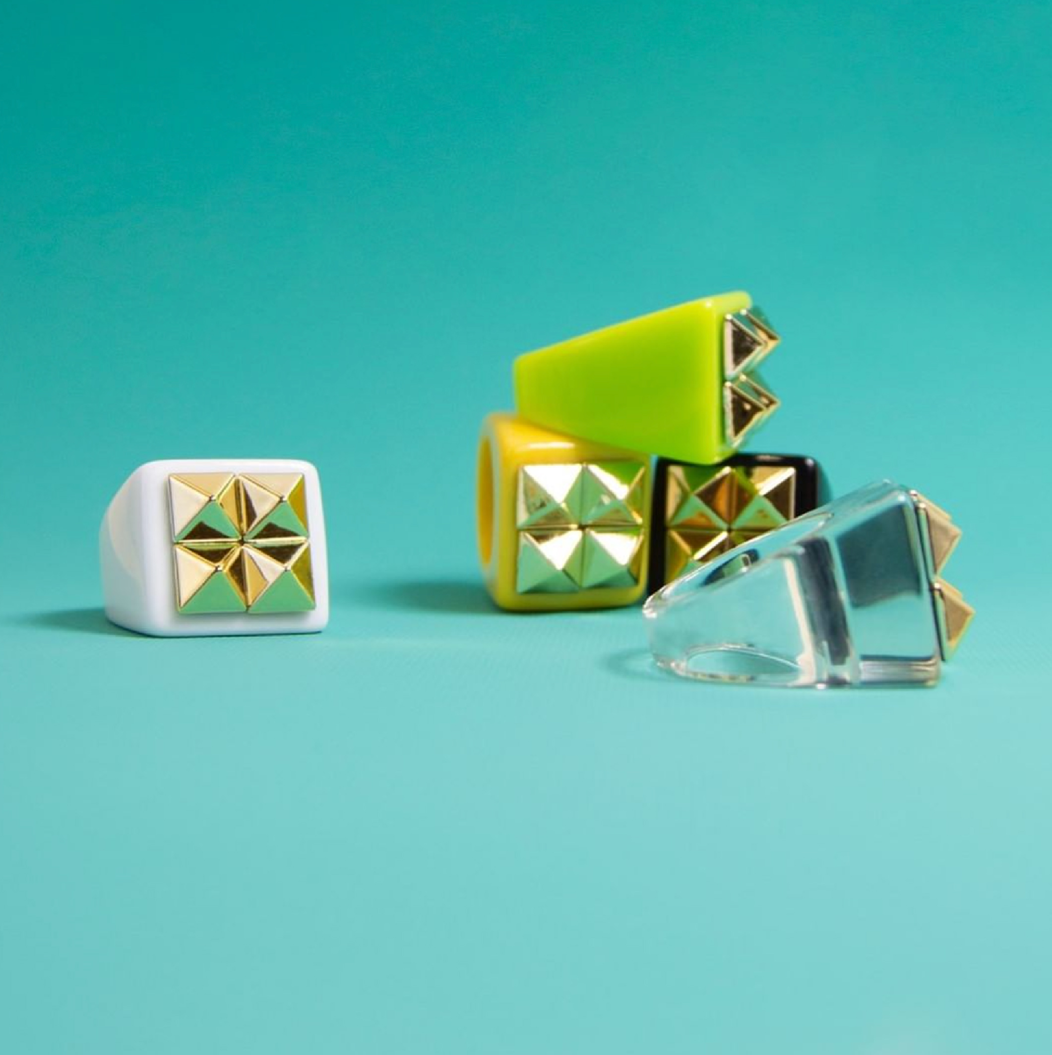
The defined Brand Essence was “A color that’s hard to forget”, a reference to the brand’s iconic color, a distinctive element throughout its history, as well as to the tone of its jewelry: eye-catching, bold and hard to forget, just like all the Anartxists who wear them.
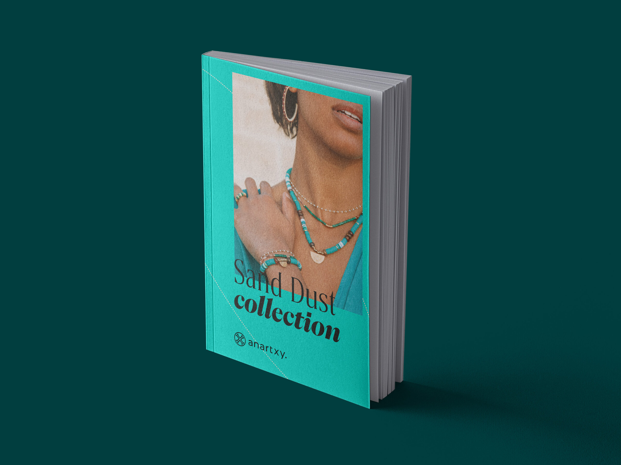
For this reason, the brand’s visual universe also needed to be striking and memorable. A new color system was developed, spanning all brand touchpoints, with brighter and more contemporary colors that enhance both digital and print applications. This system also allows the brand to define its seasons, creating specific color palettes for Fall–Winter and Spring–Summer.
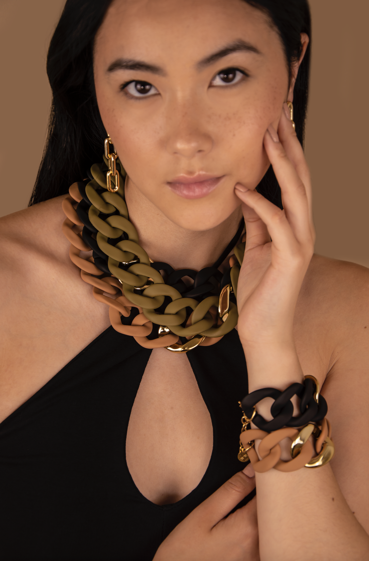
In the same way, a photographic style was defined to give Anartxy a colorful and spontaneous look while remaining instantly recognizable and always allowing the jewelry to take center stage.


The Result: A Brand That’s Hard to Forget
Anartxy is bold, creative, inclusive and accessible. A brand that reflects the Mediterranean spirit of color and daring the project set out to convey, emphasizing diversity and a joyful attitude, all expressed through elegance.
Anartxy: A brand that’s hard to forget.