The context
AC Marca is a Spanish multinational company with nearly 100 years of history, manufacturing and marketing widely recognized brands with a strong commitment to innovation and growth.
The group operates through four business areas (home care, personal care, DIY and construction, and dermo cosmetics) under a shared purpose: to provide people with the most innovative solutions to care for themselves, their families, and their homes.
At a corporate level, the group operated under a somewhat complex multi-brand architecture, with limited visibility and recognition of the corporate brands. This situation hindered the communication of the group’s true strength and prevented the development of a unified, global brand sentiment.
The challenge
We were faced with the challenge of aligning the brand strategy and identity with the group’s corporate strategy by defining and creating:
- A distinctive, relevant, credible, and long-lasting positioning.
- A flexible, clear, and focused brand architecture.
- A distinctive verbal and visual identity, consistent and coherent across all touchpoints.
The AC Marca engine
Advancing in Care is AC Marca’s reason for being, the synthesis of its positioning and the philosophy that unites and defines the group.
It is the driving force behind the continuous growth of its brands, which proposes new ways of responding to evolving care needs and preferences.
It means constant innovation: bringing together technology and the talent of its people to create value propositions that make people’s lives easier.

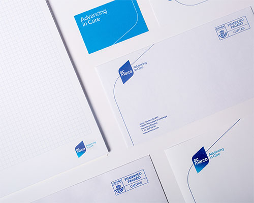
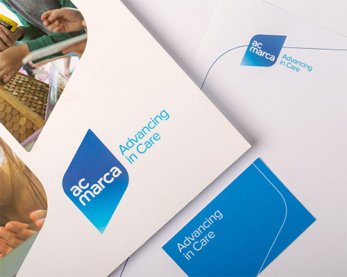
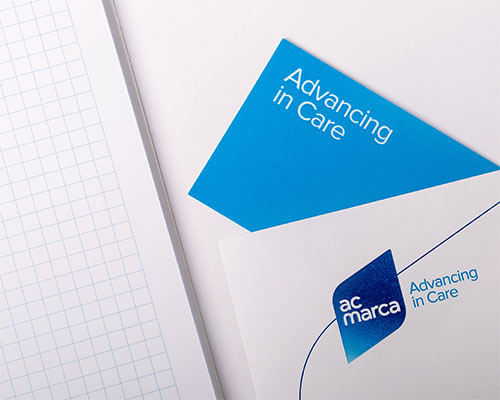
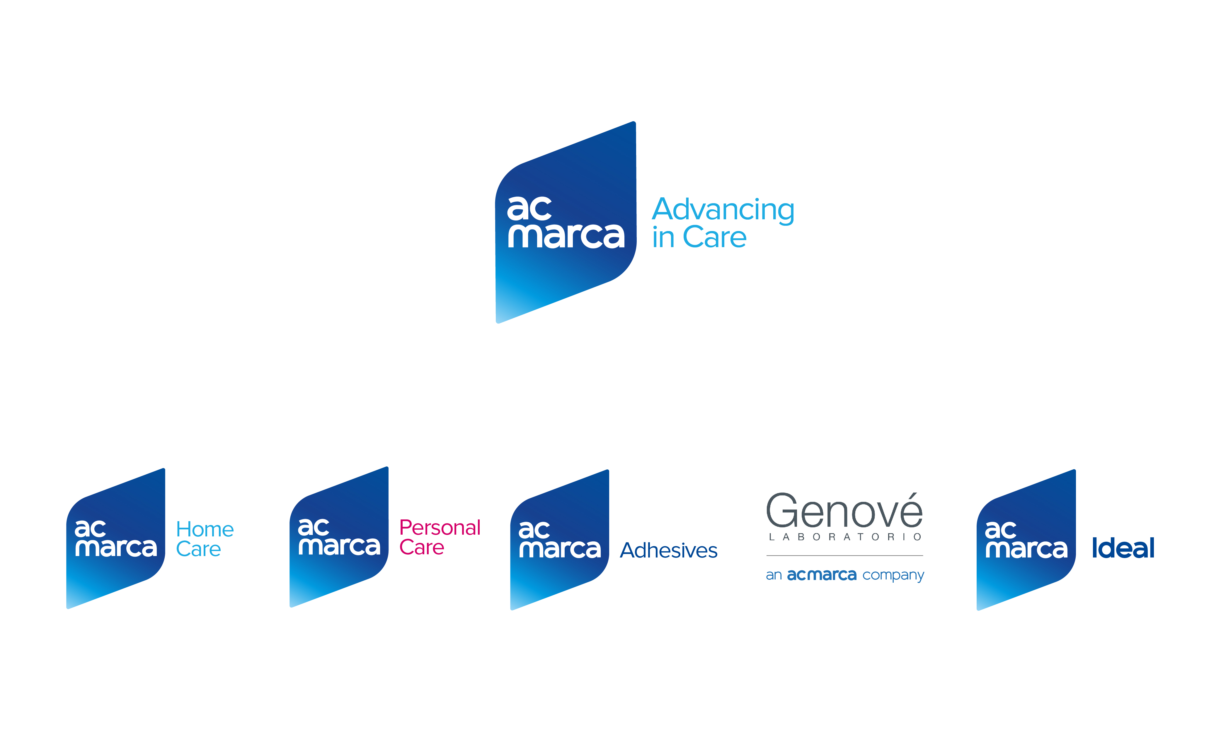
The visual identity
In relation to the Advancing concept, the visual identity was designed to bring together solidity, movement, and projection. It reflects the strength of a multinational group that brings together numerous product brands, while also expressing the dynamism and forward-looking mindset of a company driven to always go one step further.
A tilted diamond, vertically supported on one of its sides, creates a diagonal axis that projects upward, forming a robust, distinctive, and highly recognizable symbol. The identity also draws on the heritage of dark blue (evoking solidity) while introducing a touch of light to enhance the sense of movement.
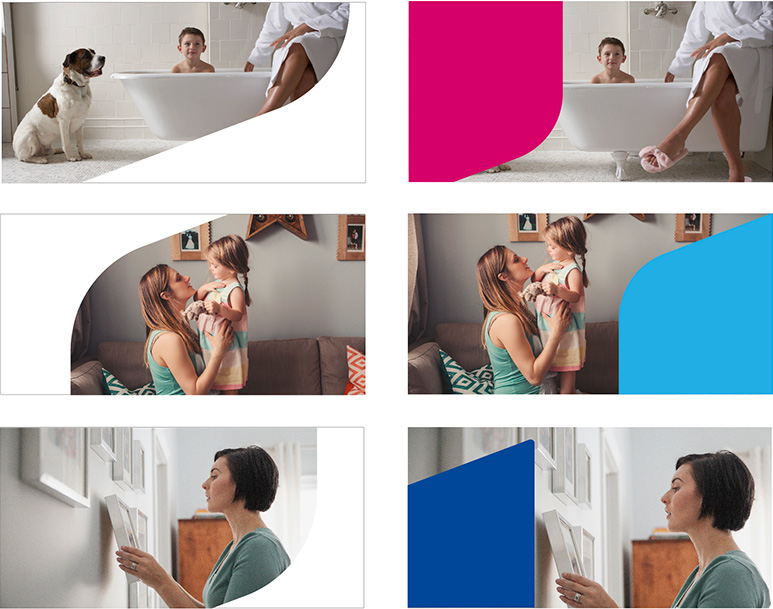
The visual universe created is enriched through the use of diagonals, incorporating fragments of the icon and a contemporary photographic style. Clean, overly cold imagery is deliberately avoided in favor of a more vibrant approach, with photographs that capture authentic moments of everyday life and portray care in a more human way.
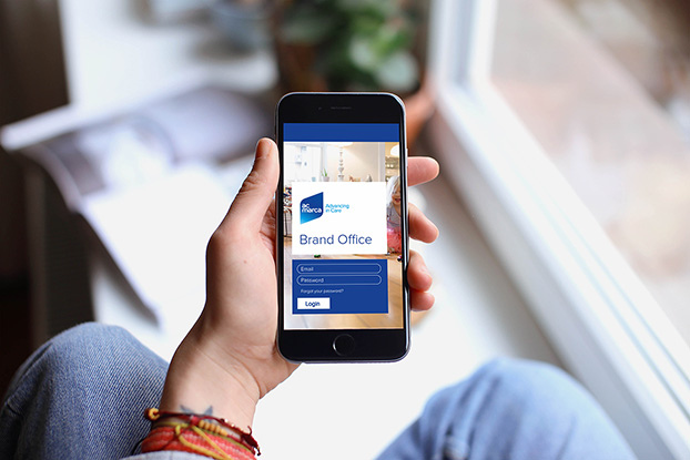
Ultimately, this is a comprehensive and global project, from brand strategy and identity creation to expression across all touchpoints, and through to the launch across different stakeholder groups.