Drink better
Kombucha Flax
Background
In the 1970s, Teresa Carles was a pioneer, crafting her own artisanal kombucha inspired by kefir, which she served in her vegetarian restaurants as a healthy and natural alternative. Her purpose was clear: to create a functional beverage with a balanced and pleasant taste, far removed from the acidic and complex profile of traditional kombucha. This is how a brand was born that brings together heritage and avant-garde, with a distinctive proposition within the competitive healthy beverages market.
The challenge
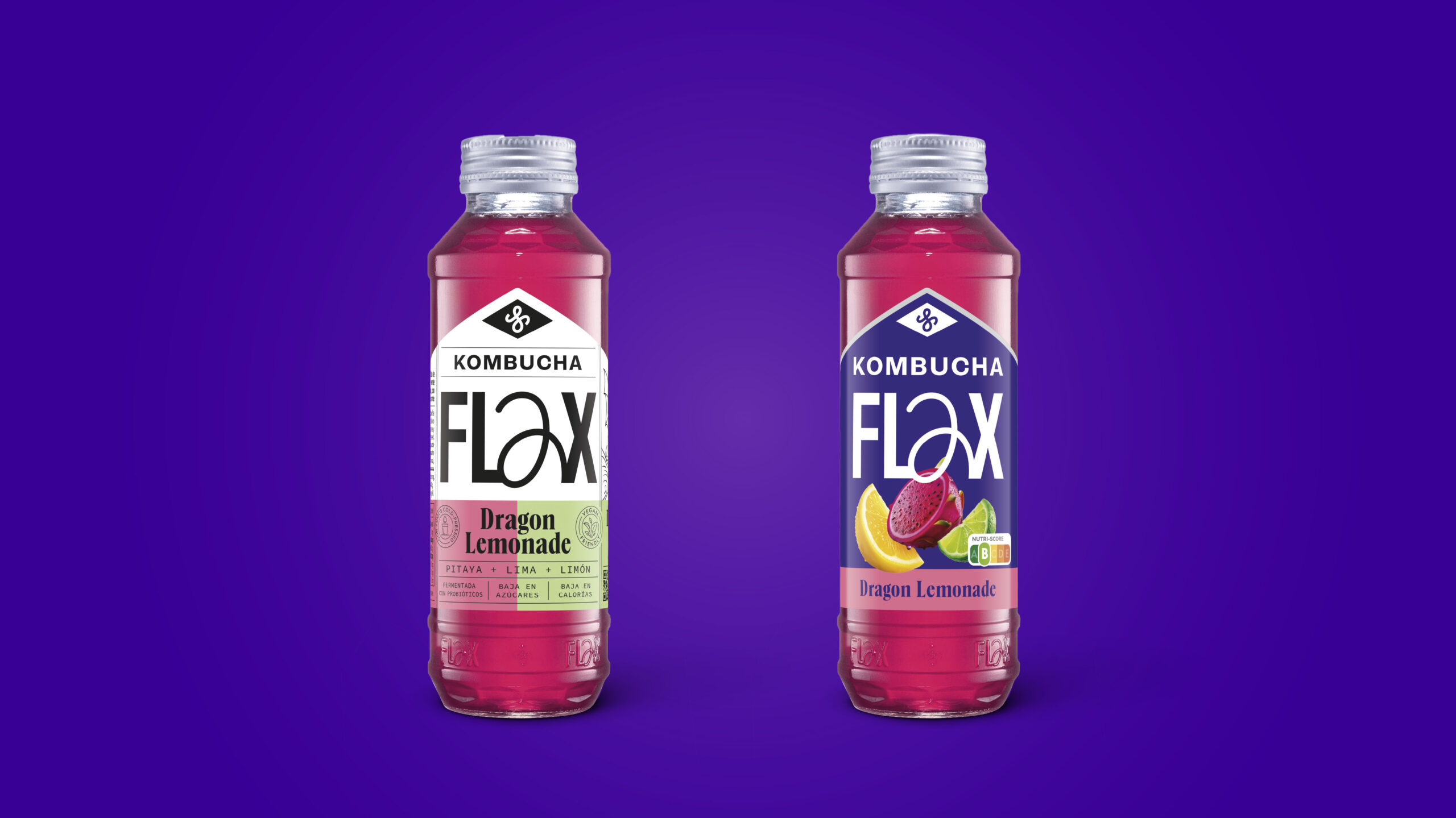
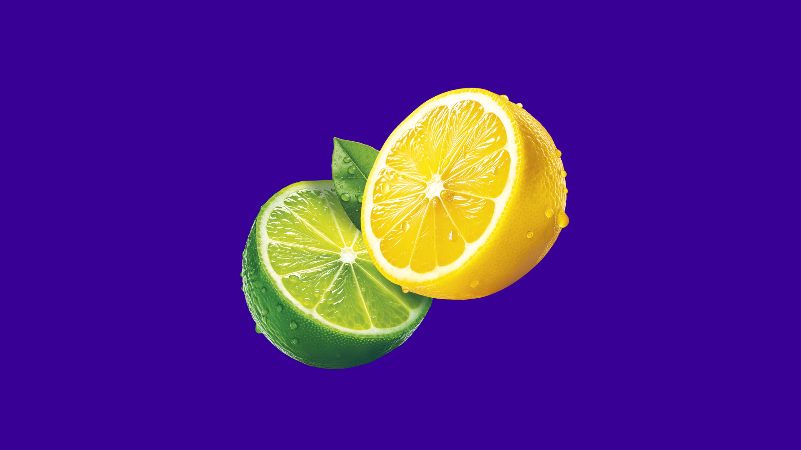
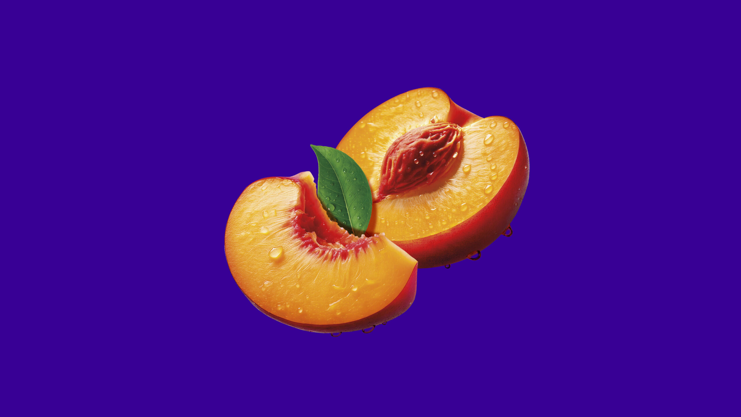
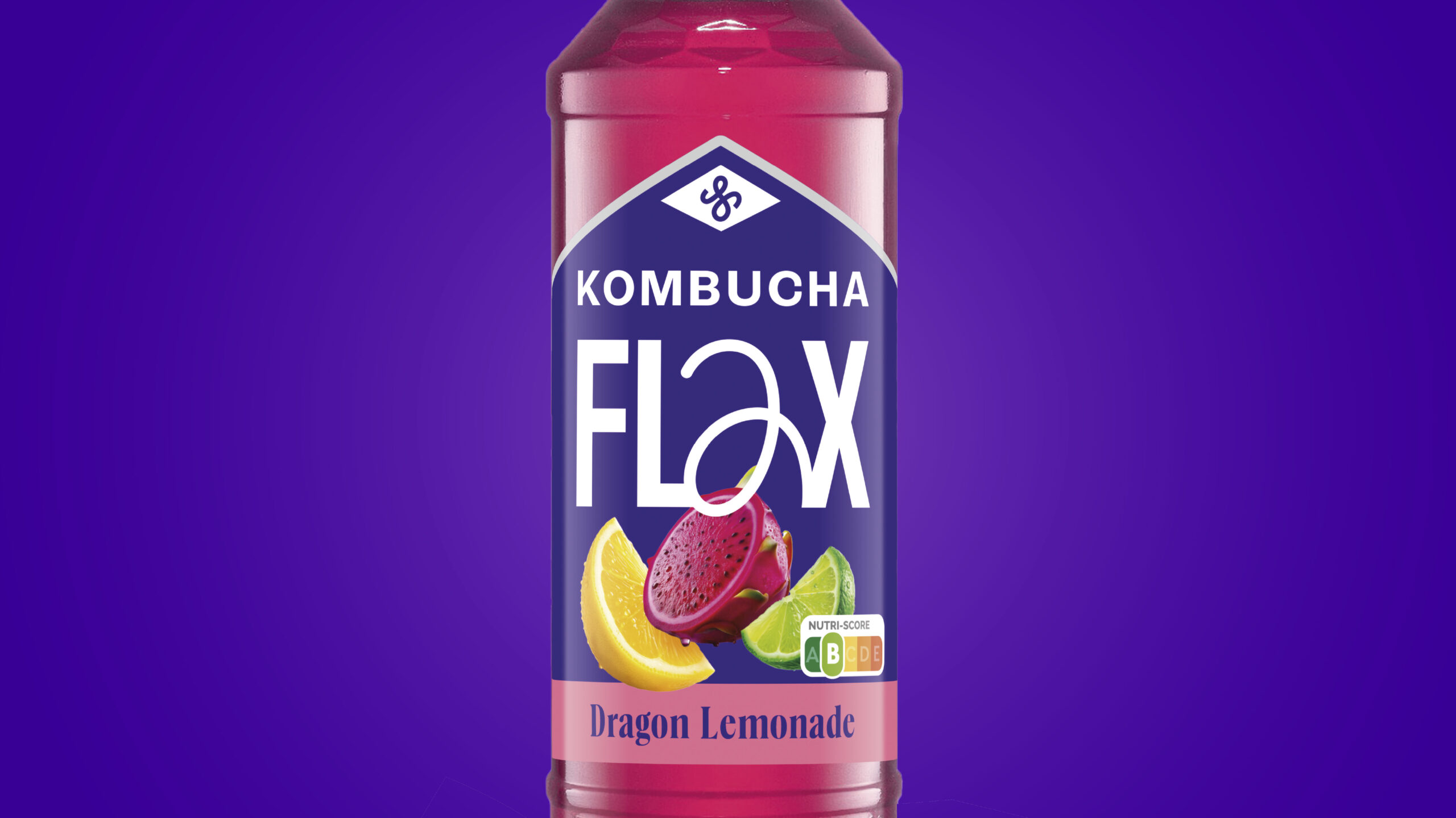
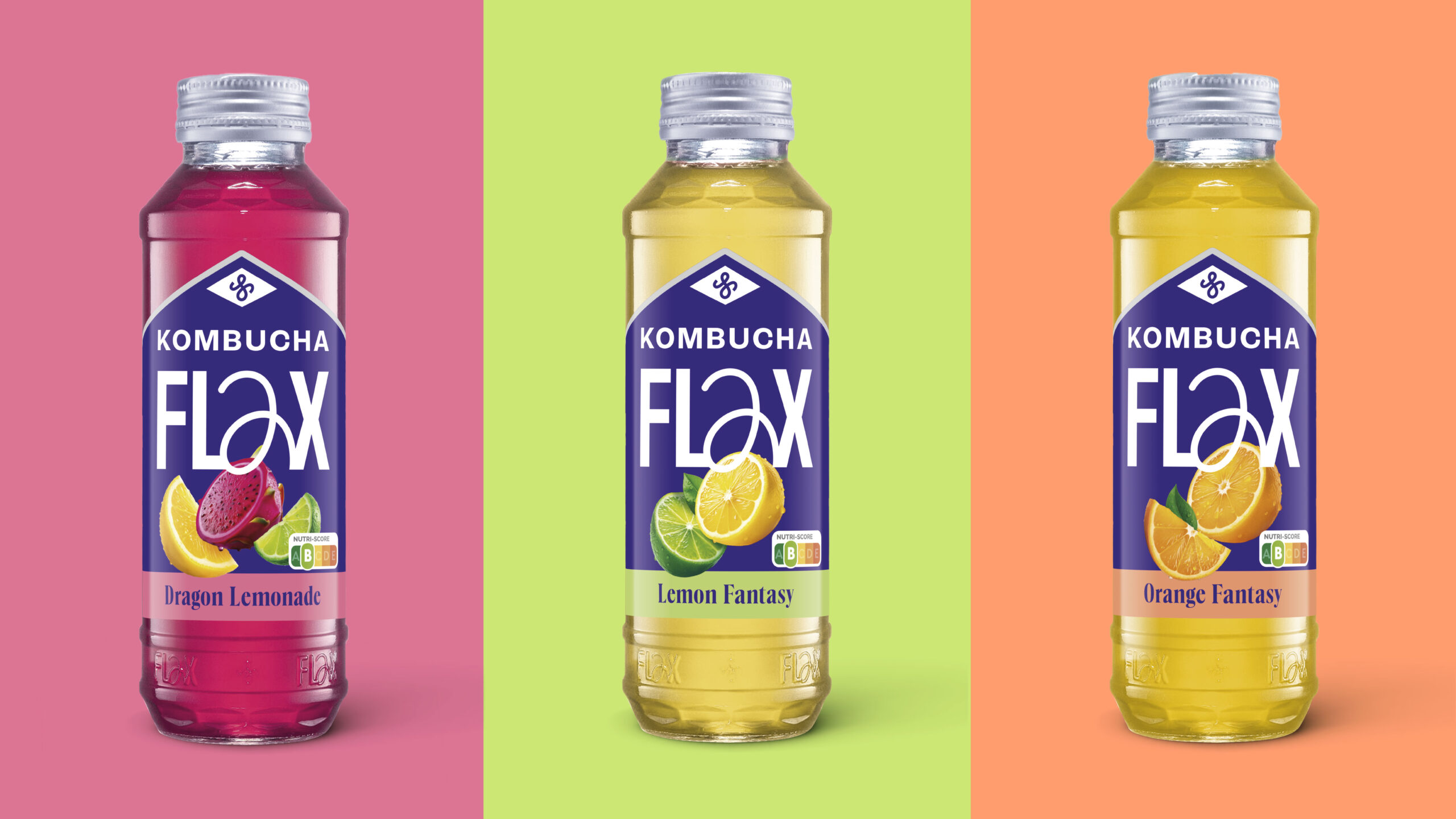
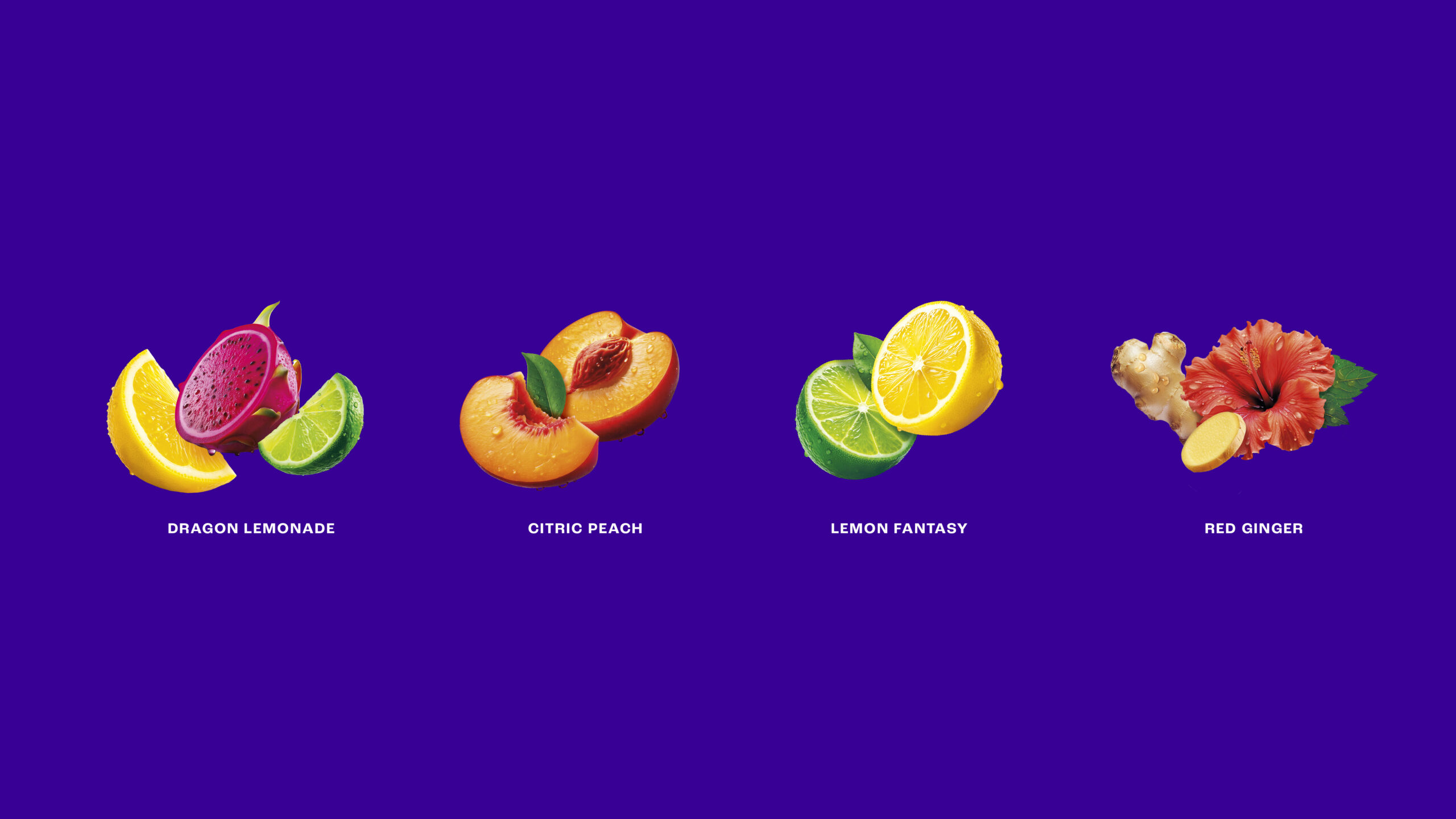
The brand needed to evolve its packaging system towards a territory with greater impact and emotional connection with new audiences. The challenge lay in redefining hierarchies, optimizing legibility and establishing a coherent design for the new photographic style, where ingredients would become the protagonists of the range. Defining a distinctive and proprietary chromatic language was key to consolidating this positioning, providing flexibility and consistency to a brand ready to grow, diversify and innovate.
The solutionn
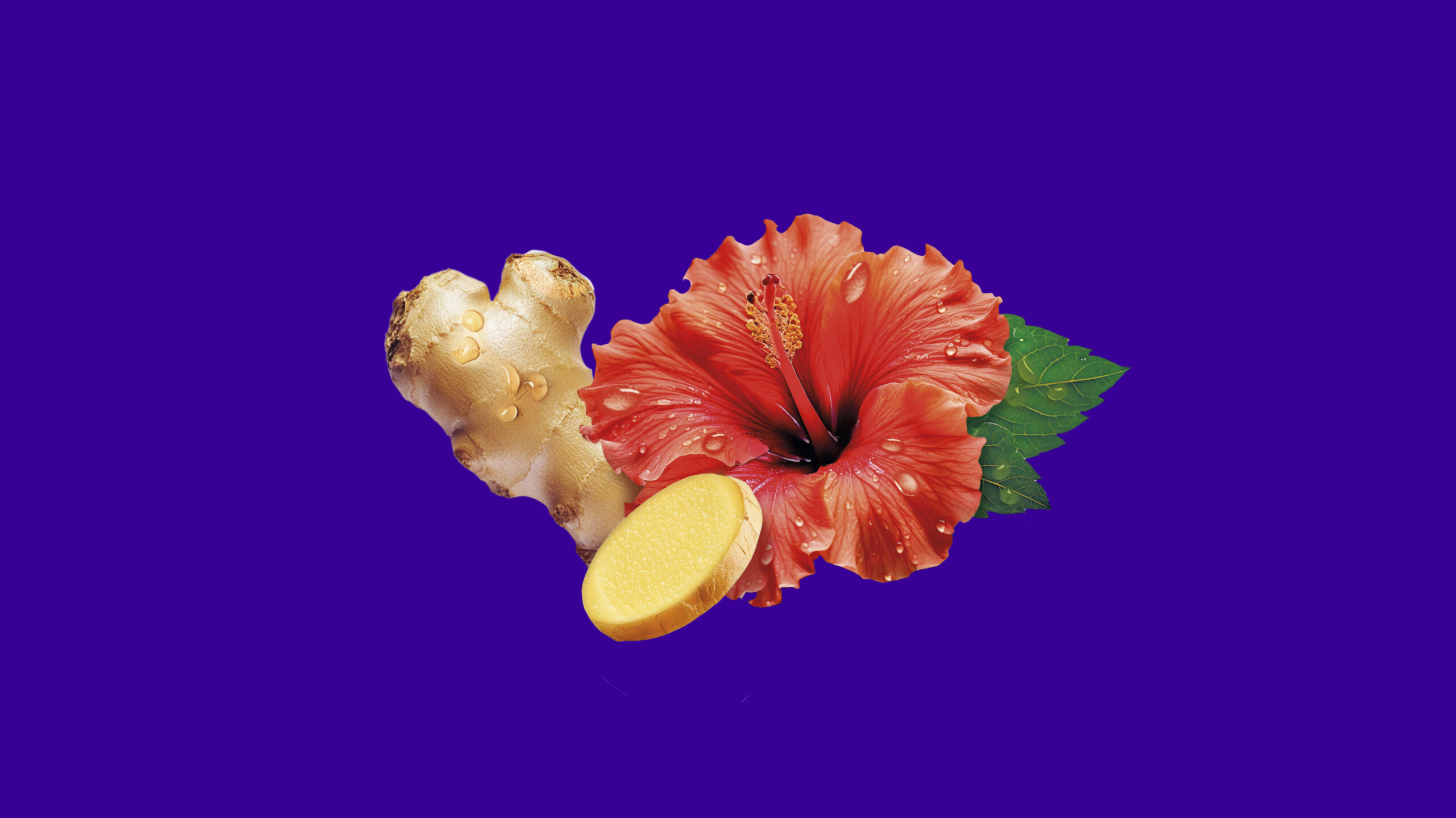
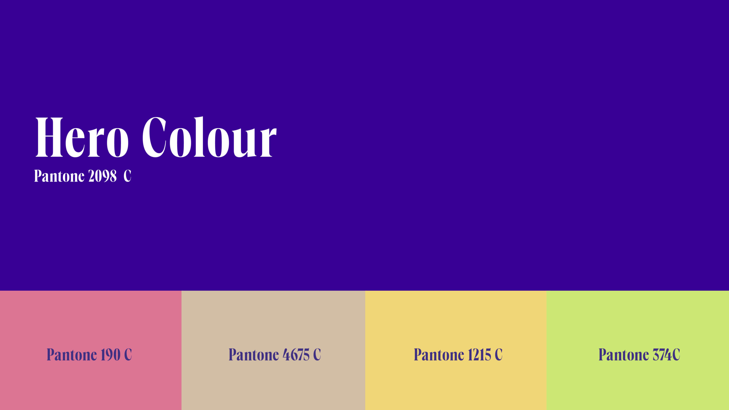
We developed a visual system that balances visibility and dynamism, structured around two strategic axes: the creation of a proprietary photographic universe, and the definition of a distinctive chromatic code that turns the colour purple into a true Brand asset.
The result is a solid and structured identity that strengthens Flax’s storytelling and turns each variety into an invitation to “Drink Better”.