https://www.youtube.com/watch?v=_pFvAItqlPE

with
Stayforlong

stayforlong-03
stayforlong-02
stayforlong-01

Ready, steady, go!

Stayforlong is not just another web for hotel booking, it is the first platform online specialised in long stays. The idea is very simple: the good clients who book more nights are rewarded. Because a good client deserves to be looked after.

The exponential growth of the company during recent years was not reflected in the initial visual identity. The value proposal for Stayforlong and its brand had to be at the standard required.

We based ourselves on co-creation as the start of the process of fitting the business and brand together, in which both teams from Columna and SFL took part.

The challenge…

Our great challenge was to create a concept and a singular identity, aligned to the business, with a high-profile and relevant logotype that would help explain the proposal of value: more days, better price. A new brand positioning where we had to define and project a good verbal and visual identity, designing all the corporate and communication graphic elements.

The unique typography of the logotype, designed by the specialists at Columna; kind, but solid, singular, positive and with high legibility. The symbol of the “o” represents the long journey.

comparativa stayforlong
stayforlong responsive


Kind, close, plural…

The plural, modern and close visual universe, with gestural, drawn, human typography. An already existing colour code, but greatly strengthened, based on a “magenta befitting SFL” accompanied by “lifestyle” photos based on the trends in the leisure world.

In few words

A kind, agreeable, close and honest verbal identity, makes Stayforlong an experiential brand that has come to stay… for long!

columna-stayforlong-10
columna-stayforlong-11
columna-stayforlong-12
https://www.youtube.com/watch?v=_pFvAItqlPE

con
Stayforlong

stayforlong-03
stayforlong-02
stayforlong-01

¡Arrancando motores!

Stayforlong no es otra web de reservas hoteleras, es la primera plataforma online especializada en largas estancias. La idea es muy sencilla: se premia a los buenos clientes que más noches reserven. Porque un buen cliente merece ser cuidado.

Nos basamos en la co-creación como inicio del proceso de encaje entre el negocio y la marca, en el que participaron ambos los equipos de Columna y SFL.

El reto…

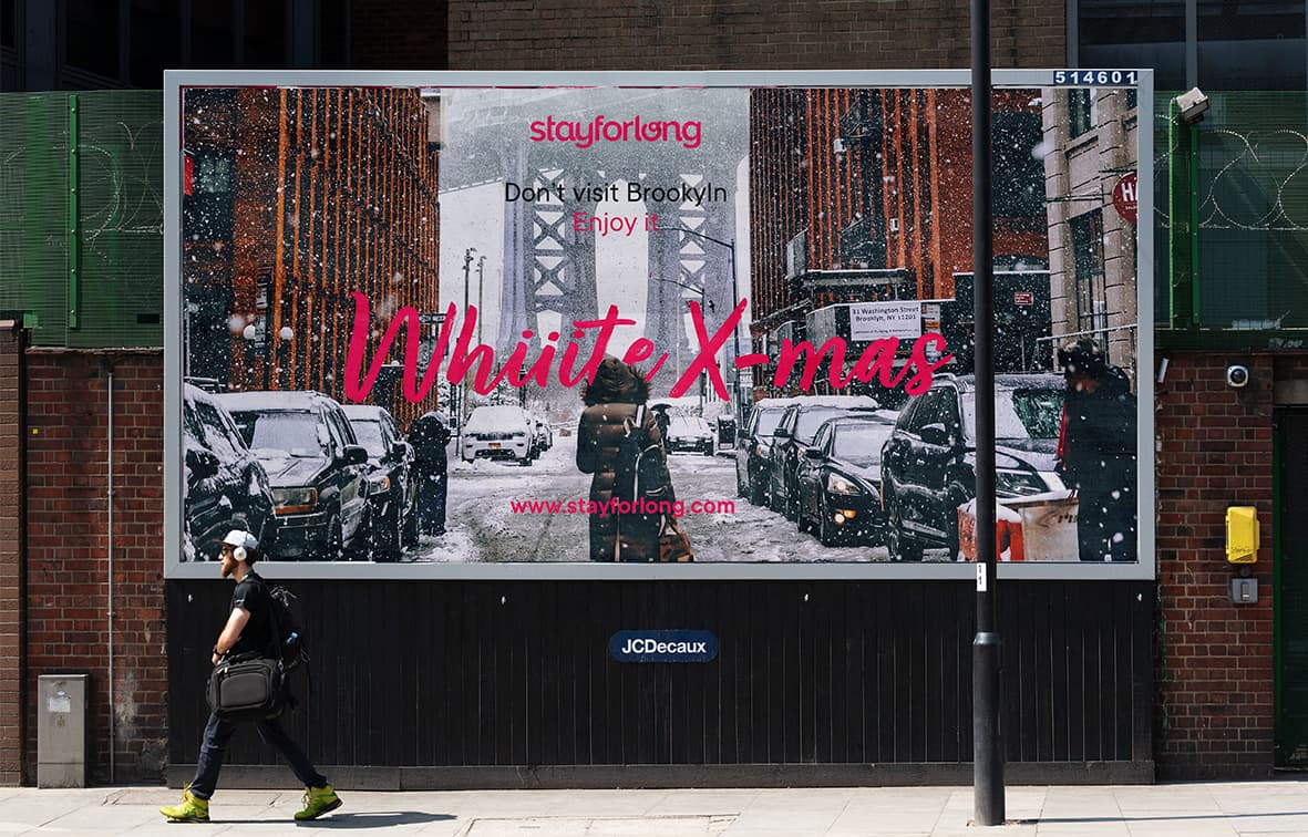
Nuestro gran reto fue crear un concepto y una identidad singular, alineada al negocio, con un logotipo notorio y relevante que ayudara a explicar la propuesta de valor: más días, mejor precio. Un nuevo posicionamiento de marca donde debíamos definir y proyectar una buena identidad verbal y visual, diseñando todos los elementos gráficos corporativos y de comunicación.

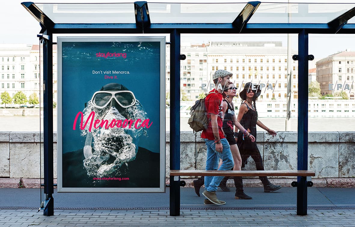
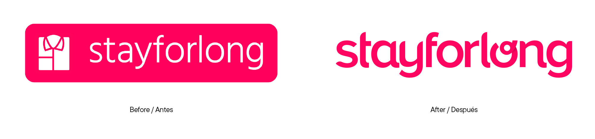
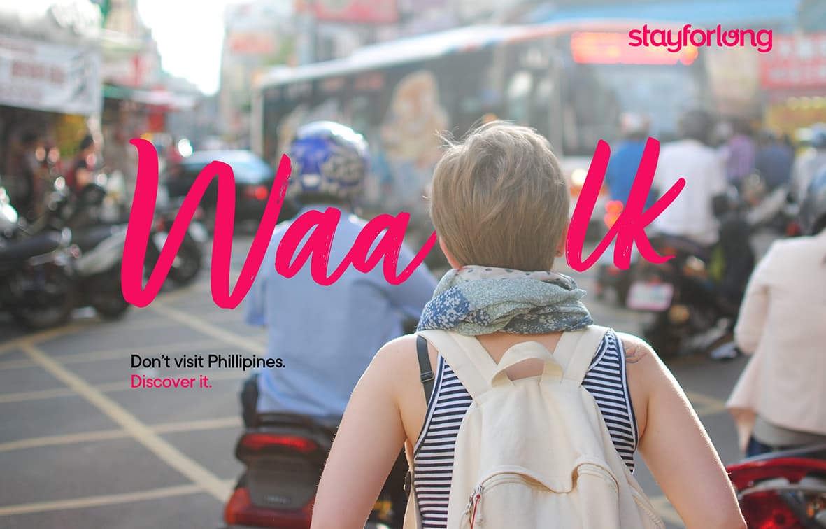
La tipografía del logotipo única, diseñada por los especialistas de Columna; amable pero sólida, singular, positiva y con alta legibilidad. El símbolo de la “o” simboliza el largo trayecto.

comparativa stayforlong
stayforlong responsive


Amable, cercano, plural…

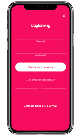
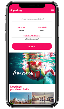
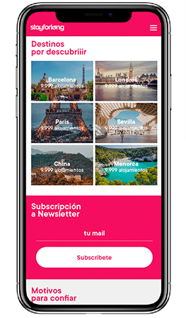
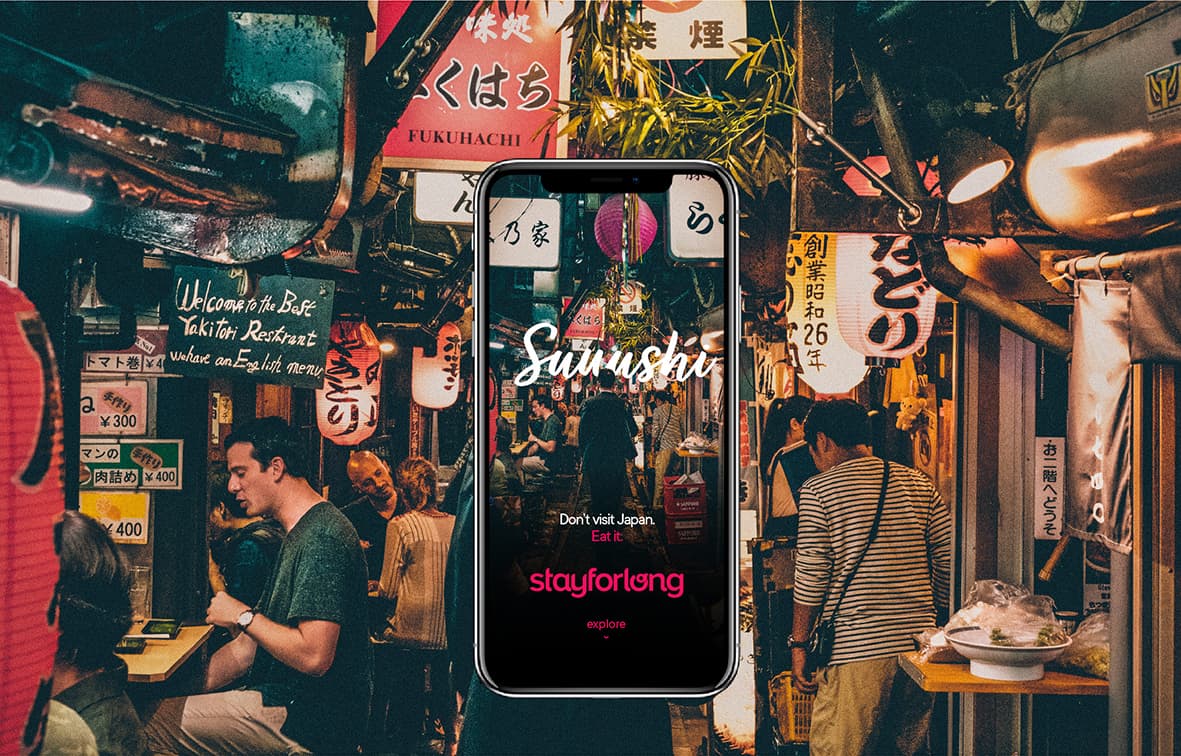
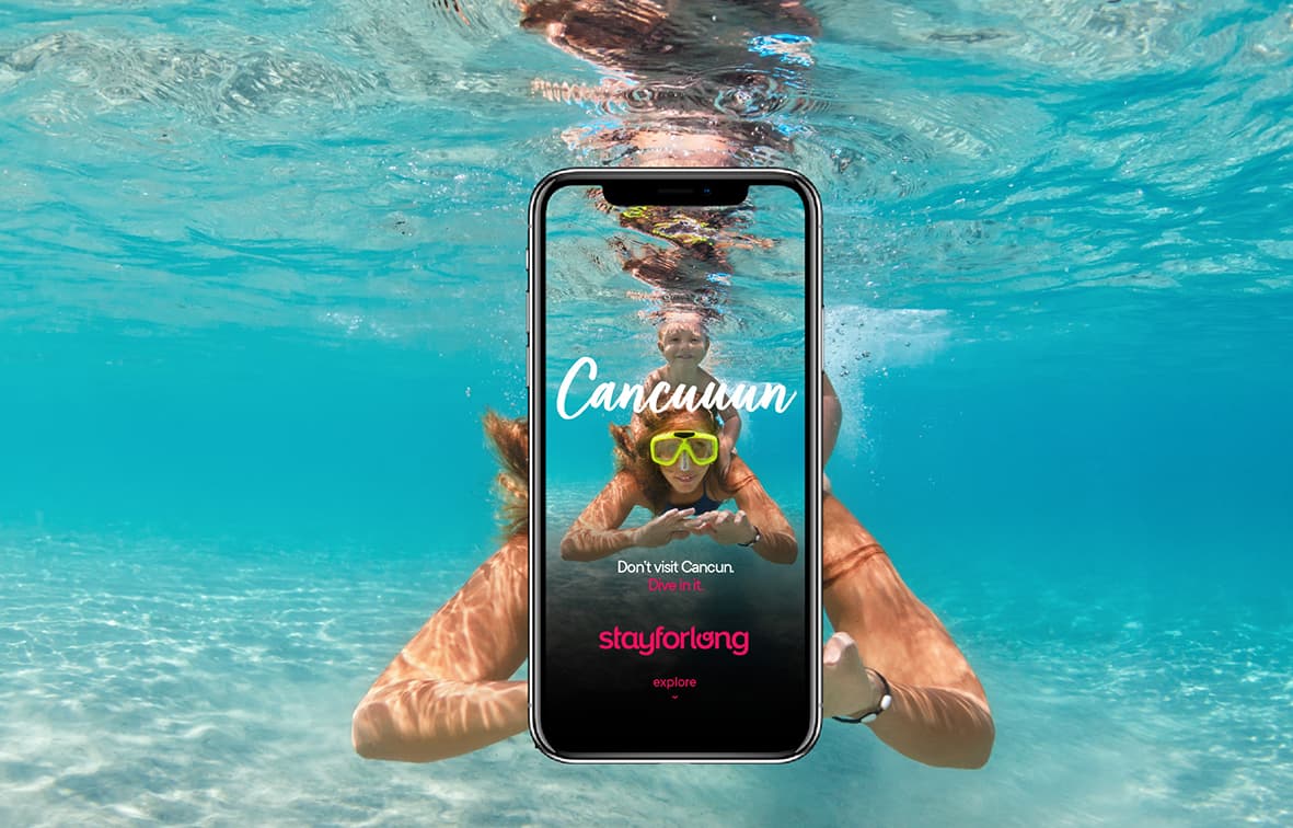
Un universo visual plural, actual y cercano, con tipografía gestual, de trazo, humana. Un código de color ya existente, pero muy reforzado, basado en un “magenta propio SFL” acompañado de fotografías “lifestyle” basadas en las tendencias en el mundo del ocio.

En pocas palabras…

Una identidad verbal y tono amable, simpático, cercano y honesto, hacen de Stayforlong una marca experiencial que ha venido para quedarse …for long!

columna-stayforlong-10
columna-stayforlong-11
columna-stayforlong-12