with
AC Marca

The context

AC Marca is a Spanish multinational with almost 100 years’ history, which manufactures and commercialises widely known brands with a clear vocation for innovation and growth.

The group operates through four business areas (home care, personal care, DIY and construction and dermocosmetics) under one common denominator: providing people with the most innovative solutions to take care of them, their family and their home.

In the corporate sphere, the group operated under a rather complex multi-brand architecture, with little visibility and notoriety of the corporate brands which confined the transmission of the real power of the group as well as the presence of a global brand feeling.

Grupo-ac-marca
El reto

The challenge…

We were set with the challenge of aligning the corporate brand strategy and identity of the group defining and creating:

  • A differentiating, relevant, credible and long-lasting positioning.
  • An elastic, clear and focused brand architecture.
  • A distinctive, consistent and coherent verbal and visual identity in all the points of contact.

The AC Brand Engine

Advancing in Care is AC Marca’s raison d’être, the synthesis of its positioning, the philosophy that joins and identifies them.

It is the driving force of the continuous growth of its brands that proposes new ways of responding to needs and preferences in care.

It is constantly innovating, bringing together the technology and the talent of its team to generate valuable proposals that make people’s lives easier.

El-motor-de-AC-Mara
Cascading-01
Cascading-02
Cascading-03

The visual identity

Regarding the visual identity and link with the Advancing concept, a brand is created that joins solidity, mobility and projection; the solidity befitting a multinationsl that is a unifying force of so many product brands and the mobility and projection of a company philosophy of always going one step further.

An inclined diamond, supported vertically on one of its sides creating a diagonal from axis to axis that projects towards the sky creating a very robust, distinctive and notorious symbol. Moreover, rescuing the inheritance of dark blue that evokes solidity but giving it a touch of light to enhance the movement.

The visual universe created is also enriched by the diagonals with fragments of the icon and a modern photographic style, where clean and excessively cold images are replaced by the commitment to a lively style, with photographs that show authentic moments of enjoying daily life, showing care in a more human way.

In brief, it is an integral and global project, from the brand strategy and creation of identity and expression in all their points of contact to the launch towards the different interest groups.

06-identidad-visual


08-AC-marca-02

con
AC Marca

El contexto

AC Marca es una multinacional española con casi 100 años de historia, que fabrica y comercializa marcas ampliamente conocidas con una clara vocación de innovación y crecimiento.

El grupo opera a través de cuatro áreas de negocio (cuidado del hogar, cuidado personal, bricolaje y construcción y dermocosmética) bajo un denominador común: facilitar a las personas las soluciones más innovadoras para cuidar de ellas, de su familia y de su hogar.

En el ámbito corporativo, el grupo operaba bajo una arquitectura multimarca algo compleja, con una escasa visibilidad y notoriedad de las marcas corporativas que limitaba la transmisión de la potencia real del grupo así como la existencia de un sentimiento global de marca.

Grupo-ac-marca
El reto

El reto…

Se nos planteó el reto de alinear la estrategia e identidad de marca a la estrategia corporativa del grupo definiendo y creando:

  • Un posicionamiento diferencial, relevante, creíble y perdurable.
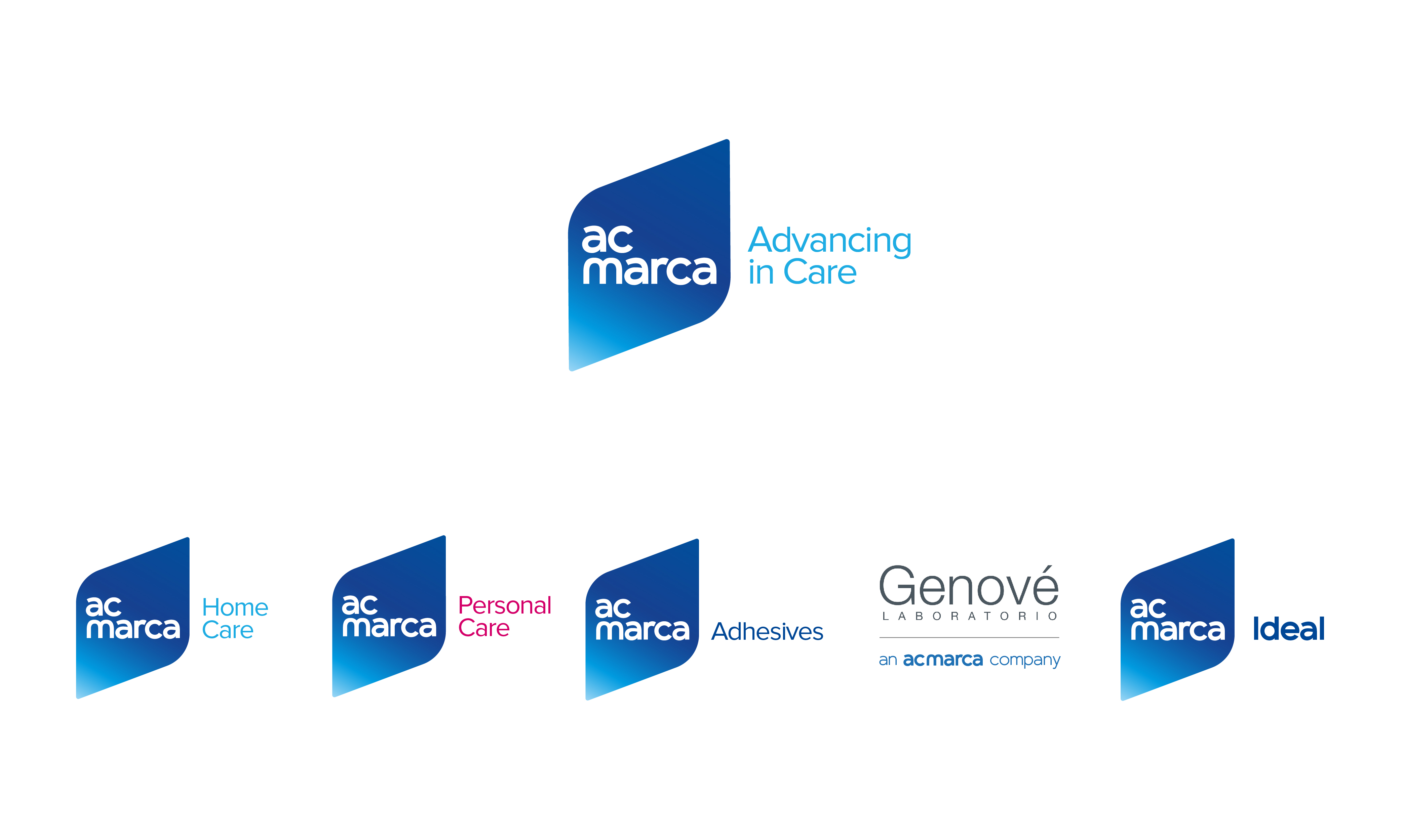
  • Una arquitectura de marca elástica, clara y enfocada.
  • Una identidad verbal y visual distintiva, consistente y coherente en todos los puntos de contacto.

El motor de AC Marca

Advancing in Care es la razón de ser de AC Marca, la síntesis de su posicionamiento, la filosofía que los une y los identifica.

Es el motor del continuo crecimiento de sus marcas que proponen nuevas formas de responder a las necesidades y preferencias de cuidado.

Es innovar constantemente, aunar la tecnología y el talento de su equipo humano para generar propuestas de valor que facilitan la vida de las personas.
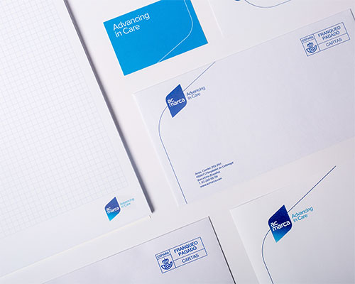
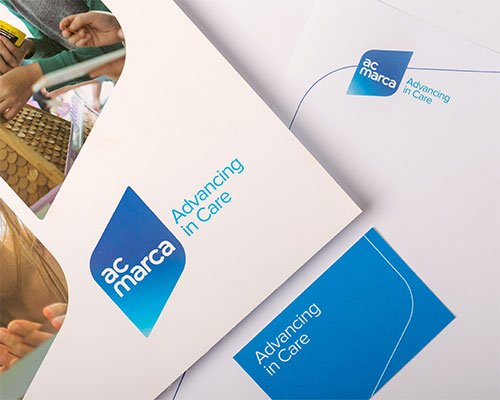
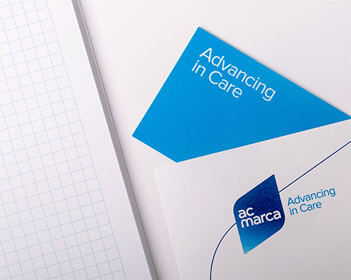
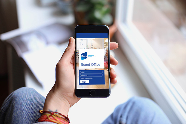
El-motor-de-AC-Mara
Cascading-01
Cascading-02
Cascading-03

La identidad visual

Respecto a la identidad visual y vinculado al concepto Advancing, se crea una marca que aúna solidez, movilidad y proyección. La solidez propia de una multinacional aglutinadora de tantas marcas de producto y la movilidad y proyección de una filosofía de empresa de ir siempre un paso más allá.

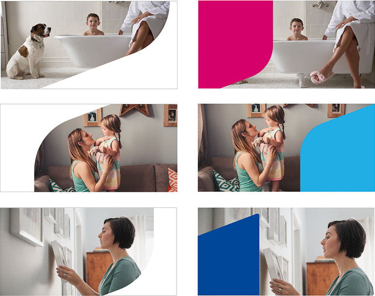
Un rombo inclinado, apoyado verticalmente en unos de sus laterales creando una diagonal de eje a eje que se proyecta hacia el cielo creando un símbolo muy robusto, distintivo y notorio. Y rescatando la herencia del color azul oscuro que evoca solidez pero dotándolo de una nota de luz para realzar el movimiento.

El universo visual creado se enriquece a partir de las diagonales con fragmentos del icono y un estilo fotográfico moderno, donde se huye de imágenes limpias y excesivamente frías y se apuesta por un estilo vivo, con fotografías que muestran momentos auténticos de disfrutar de la vida cotidiana, mostrando el cuidado de una forma más humana

En definitiva, un proyecto integral y global, desde la estrategia de marca y creación de identidad y expresión en todos sus puntos de contacto hasta el lanzamiento a los diferentes grupos de interés.

06-identidad-visual


08-AC-marca-02